Assignment 1-5.
At the very beginning, I was really excited to start something new. I had the passion but had only basic drawing skills, not much experience and never practised regularly. My visual skills, knowledge of the medium, techniques needed great improvement. At that time I had a very “shy” approach, using only graphite pencils – occasionally charcoal – and my drawing style was very tight – due to the fear of failure. I did not enjoy the first couple of exercises wholeheartedly because my sketches were way too far from my expectations. The first valuable lesson was from this course that I had to be in less control and I also had to introduce the regular practice into my everyday life if I wanted any improvement. Slowly but surely it happened so even though my first assignment was done with a pencil and still looked tight I felt I had the ability to improve. In the formative feedback for Assignment 1. I was advised to do more preparatory work and overall practice – like thumbnail sketches. From Part 2. I started drawing more and did more quick sketches for the next Assignment.
In part two, there was an introduction to colours. The second feedback from my tutor suggested understanding colours more and offered some really useful reading materials. Apart from the liquid medium, I tried a very wide range of colouring tools. I found pastel is very expressive and I really enjoyed Inktense pencils because of their powerful and bold colours. I was determined to learn more about how colours related to each other, how you can reach certain effects with different tonal values, blending and generally about harmony and intensity. Later on, I used many times the ‘Interaction of Color’ from Josef Albers suggested by my tutor. Still, my favourite exercise remained the still life using line, because of the fresh and clean image done with black ink.
Part Three Expanse was the most troublesome, though I enjoyed learning about different perspectives. I think the reason for not being drawn particularly to landscape is that I tend to draw every small detail (leaves, pebbles) instead of suggesting their presence so it was overwhelming sometimes and seemed an impossible task to finish. However, those exercises did loosen me up noticeably. Part 4 made an improvement in my observational skills especially the drawing exercises in three dimension. I really enjoyed every part of it but clearly, I had to (and still have to) work on proportions and tones a lot. My personal project in part 5. was a really good experience and reflected my journey through this course. In this last feedback, my tutor suggested attending life drawing classes. I feel that would do good, too and planning to look for classes once the lockdown situation is over.
In the beginning, I was not really keen on the research part but the more I did the more I enjoyed to the point when I spent long hours online just wandering from painter to painter through centuries and art movements. Overall I learned a lot through this course, I am happy with the improvement I made and looking forward to the next chapter.
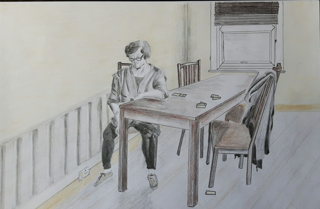
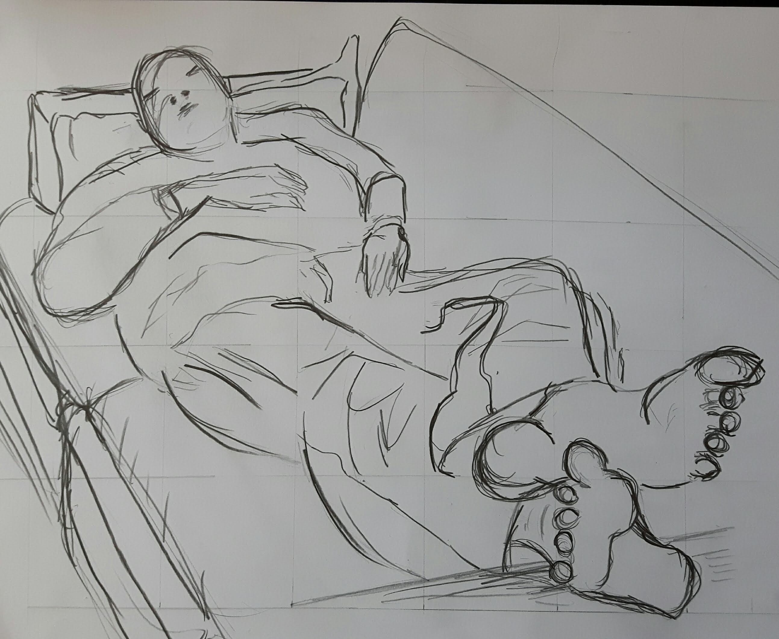
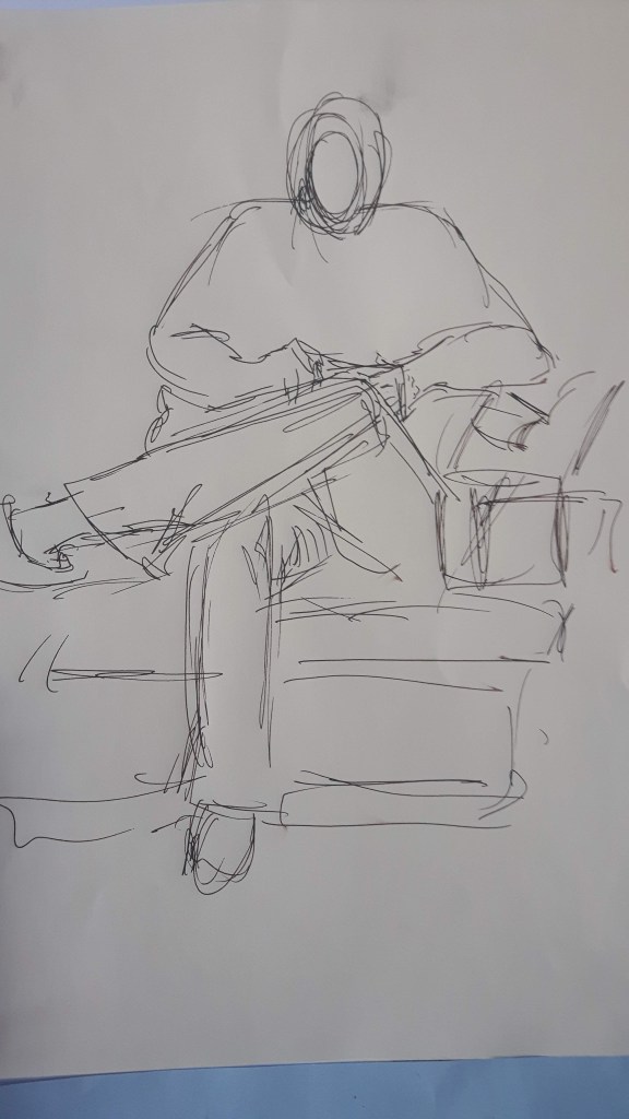
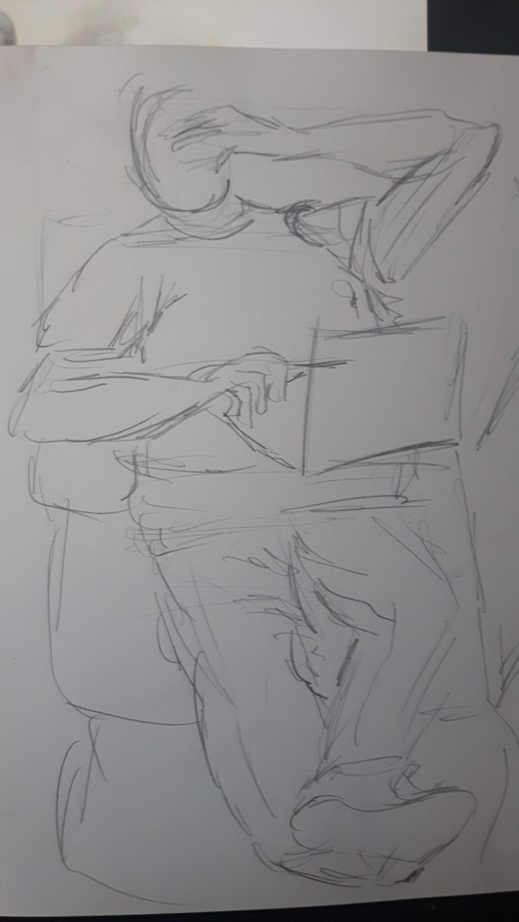
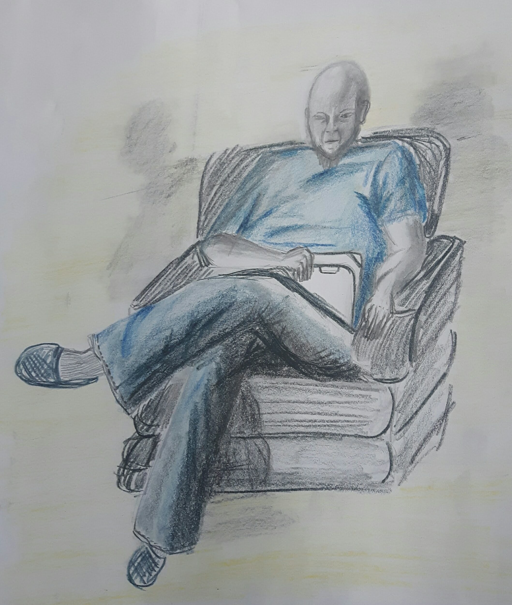
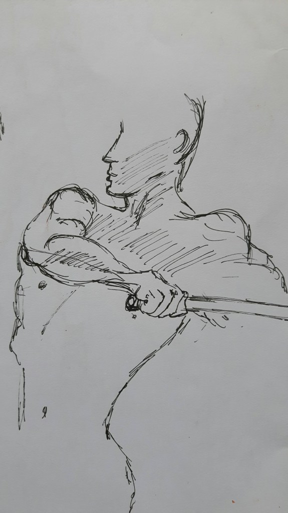
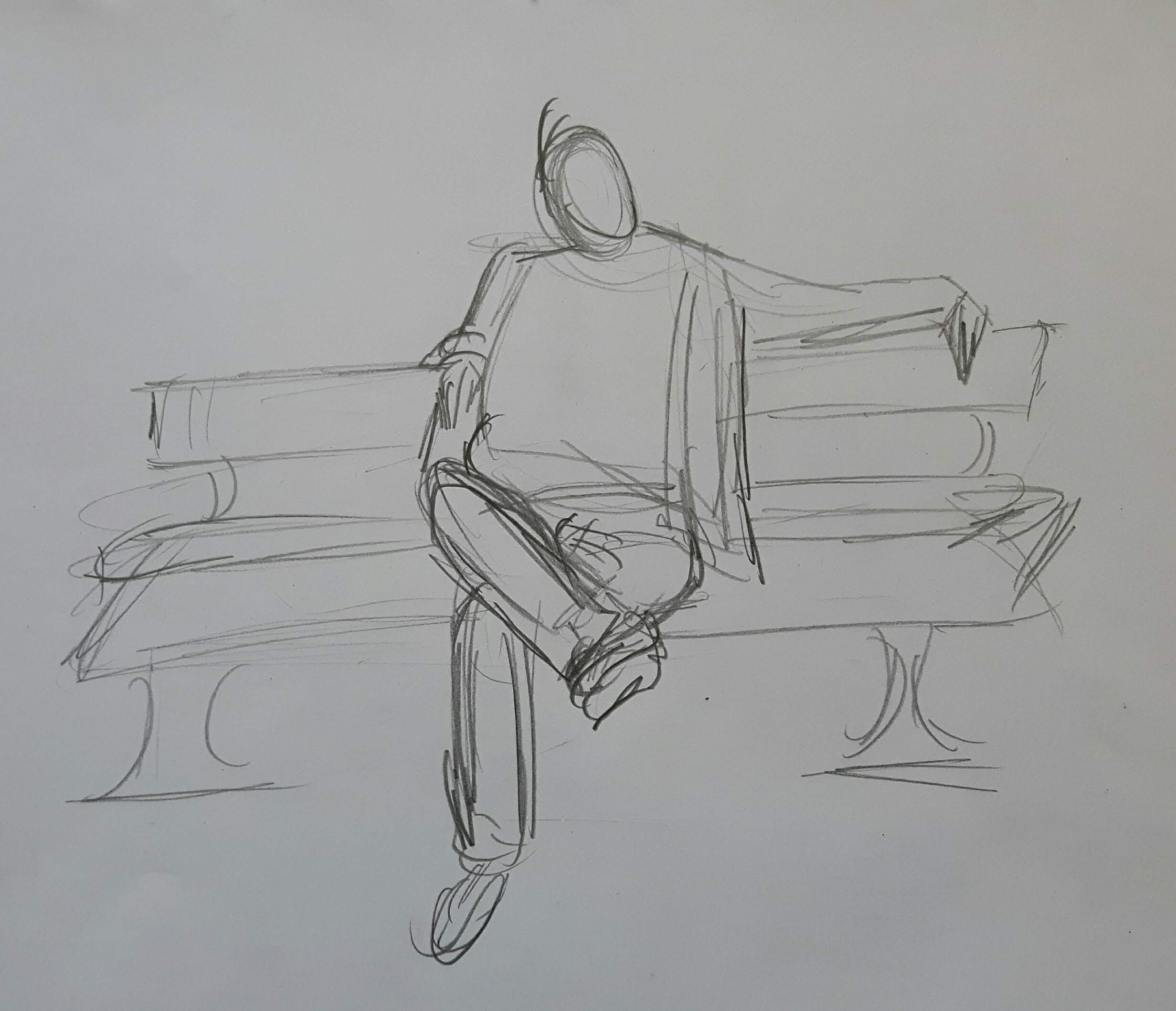
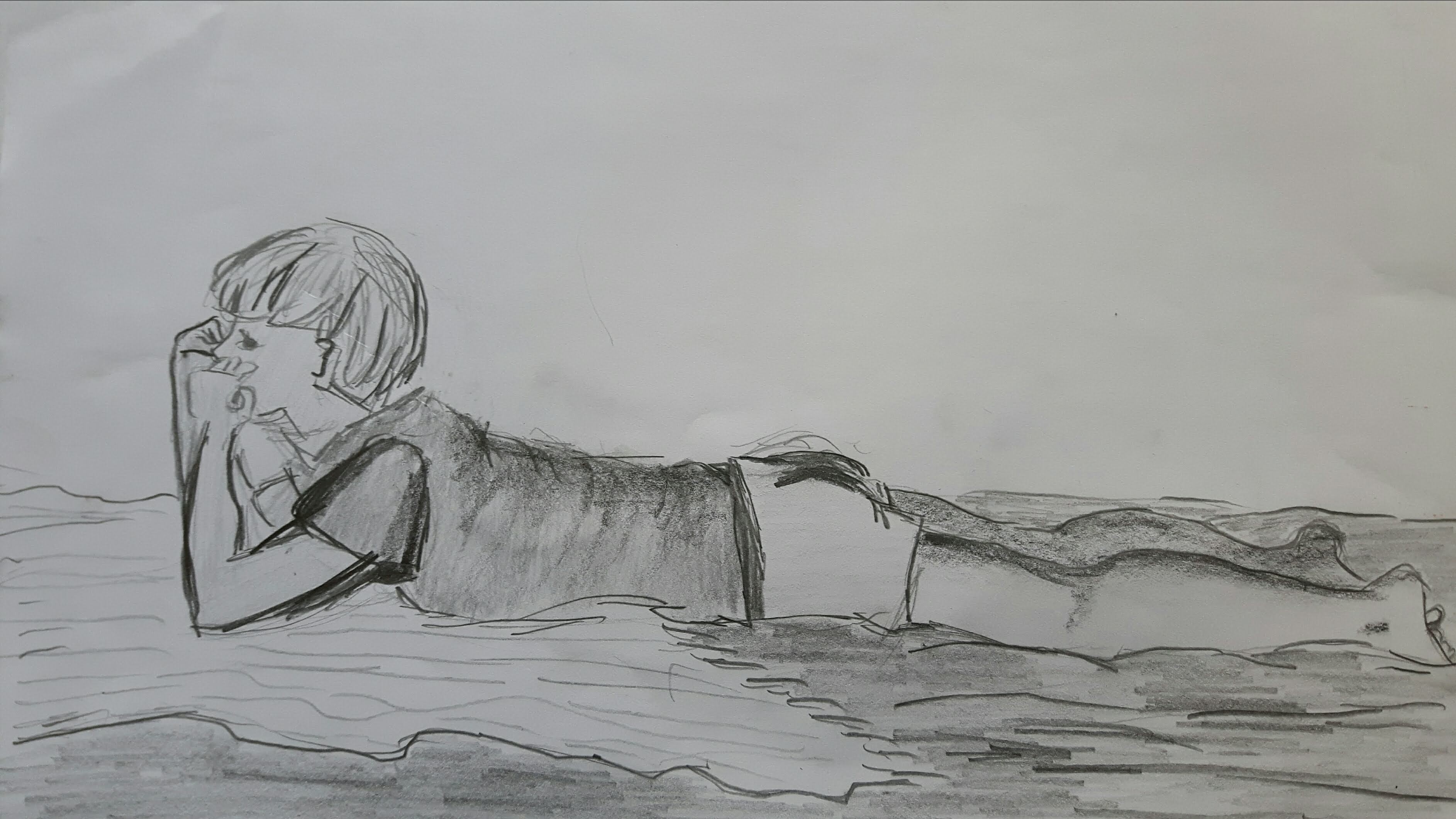
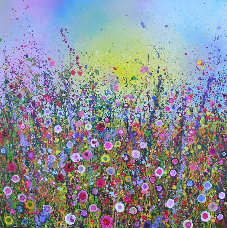
When I looked through this course I found Part 4 was clearly the most enjoyable for me. I was drawn to this subject due to my interest in the detailed observation of the human body. Also – even though most of the time I had no model – the variety, the endless possibilities inspired me to work much harder. From the start, I wanted to depict figure(s) and still life in the background. I really fancied the idea of cardplayers at that time since over Christmas I saw my relatives playing almost every evening. I tried quick compositions with different media as a start.
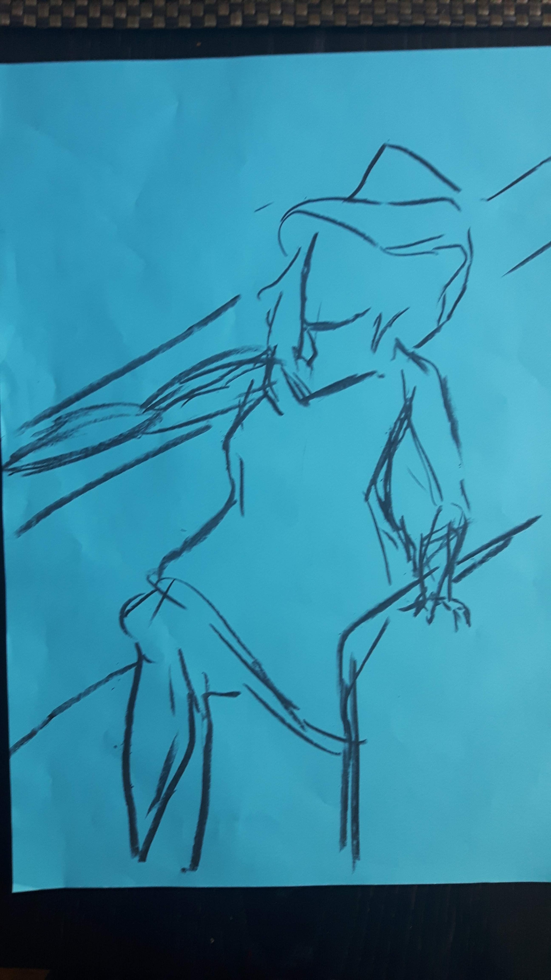
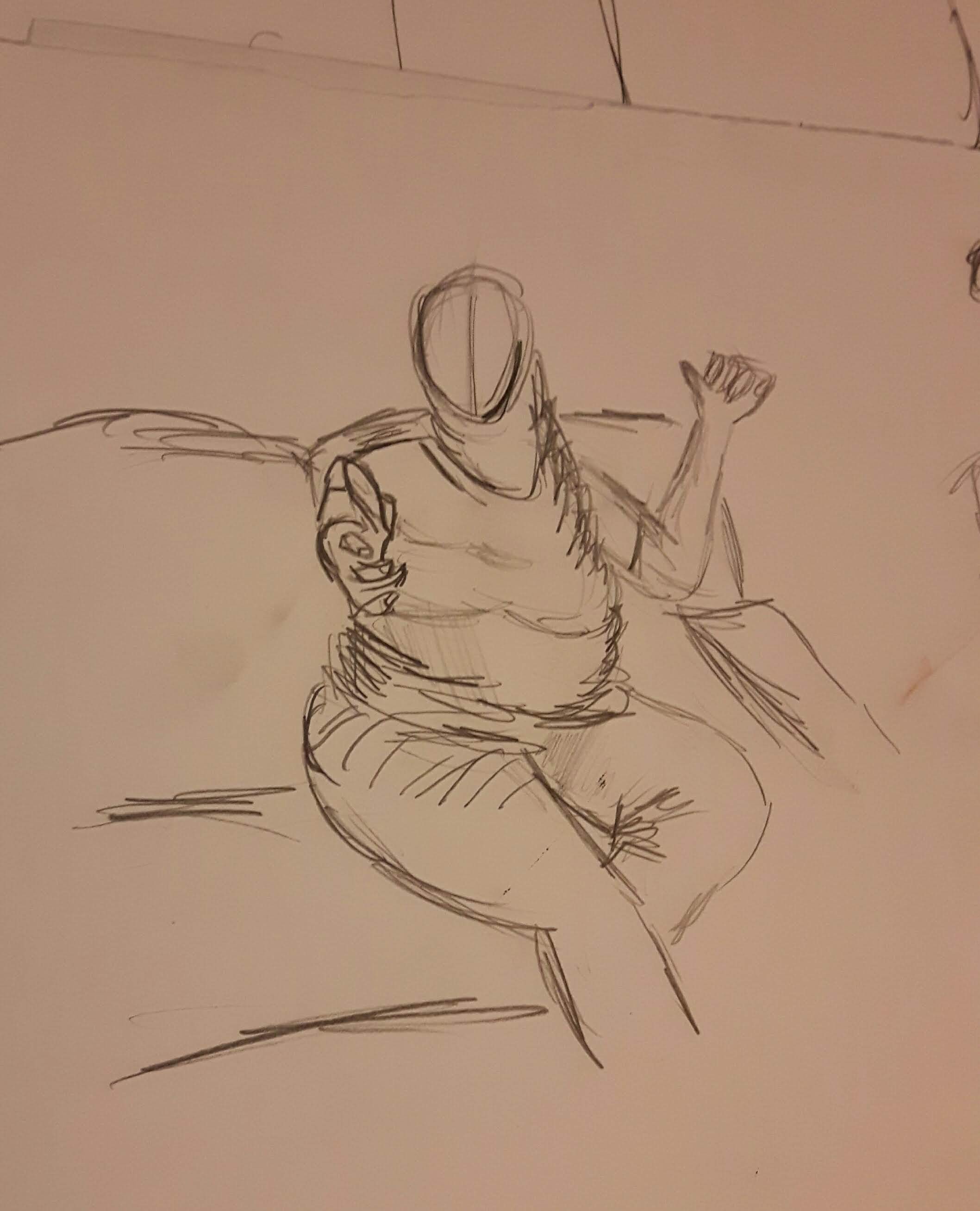
I liked the idea of the figure just getting up from a chair so I made a longer study with colours.
I didn’t really like it. Then one evening one of the players hurried upstairs during the game and there was this empty chair with a jumper negligently hanging on it (he dropped a card on the floor when I made the very first sketches and since then I always draw one card on the floor, too) I realized that I do not need the presence of the other cardplayer. I just need to know that he’ll be back soon. I was gonna use lots and lots of colours. Recently I read a book Interaction of Color from Josef Albers which was a really useful tool for this adventure. I played around with colours on the man-made and natural objects I originally wanted to include in my picture.
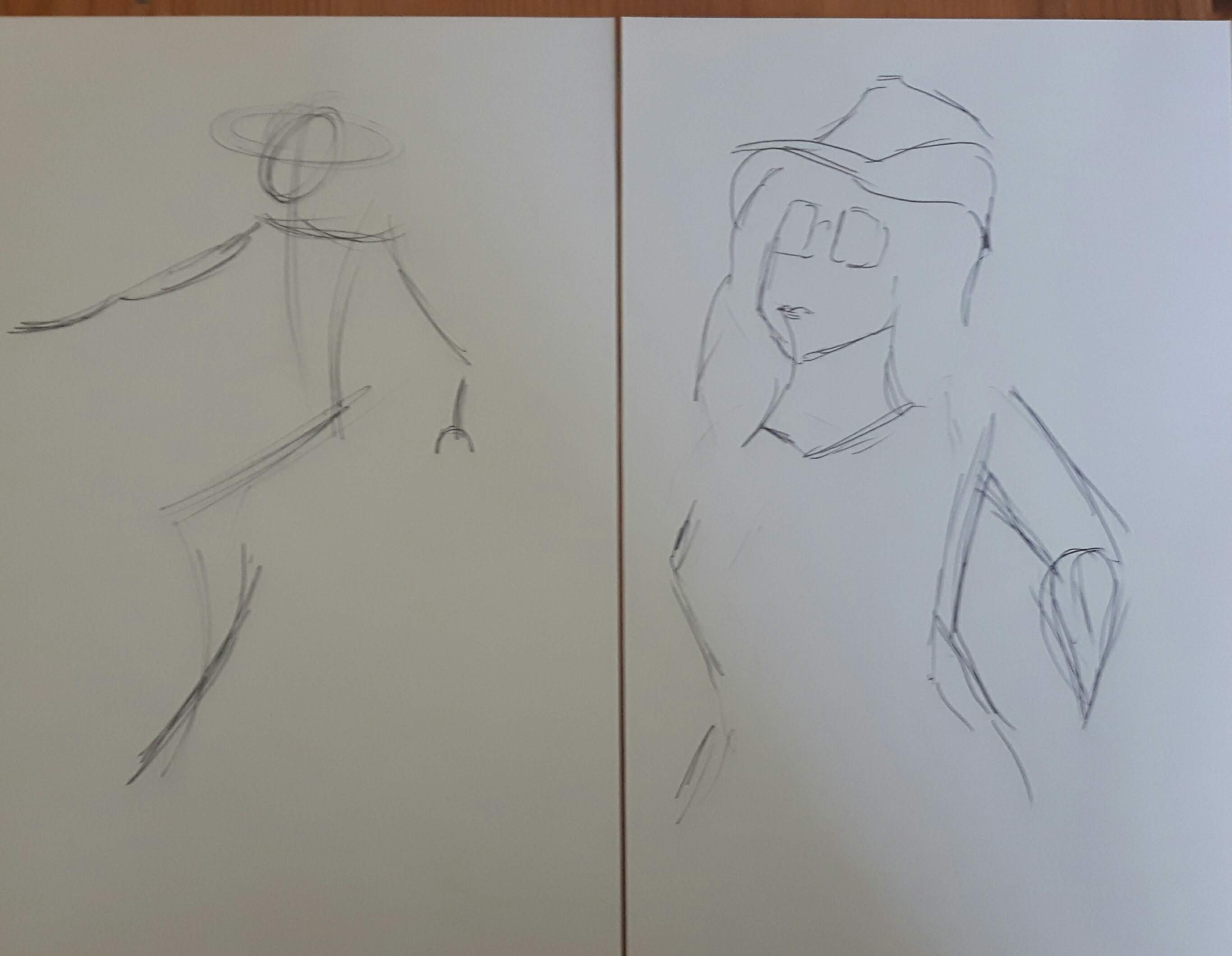
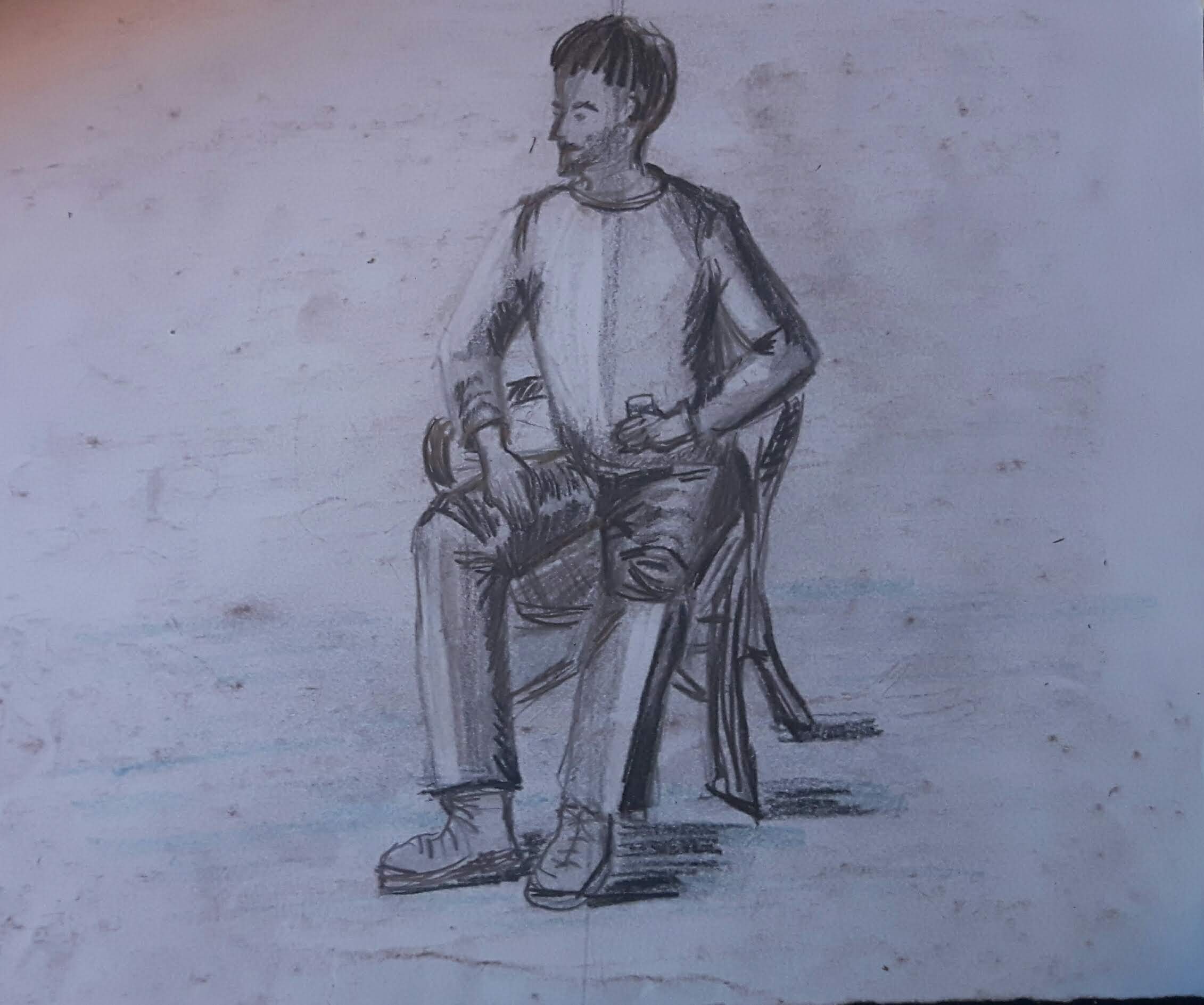
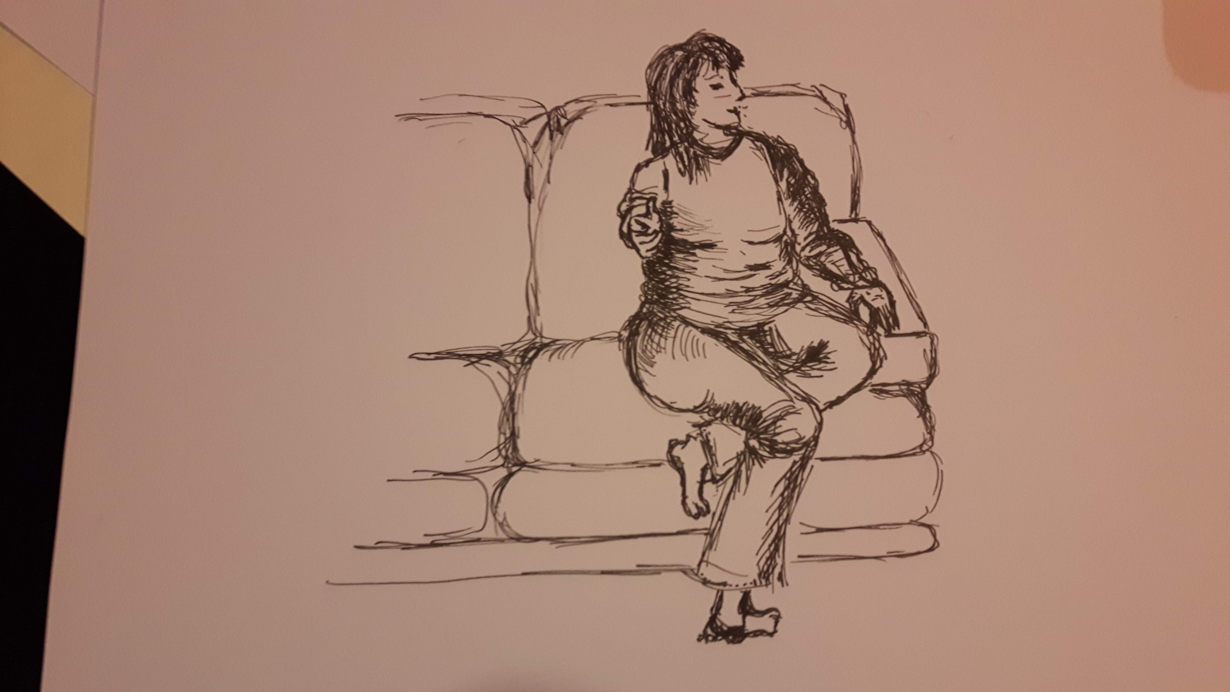
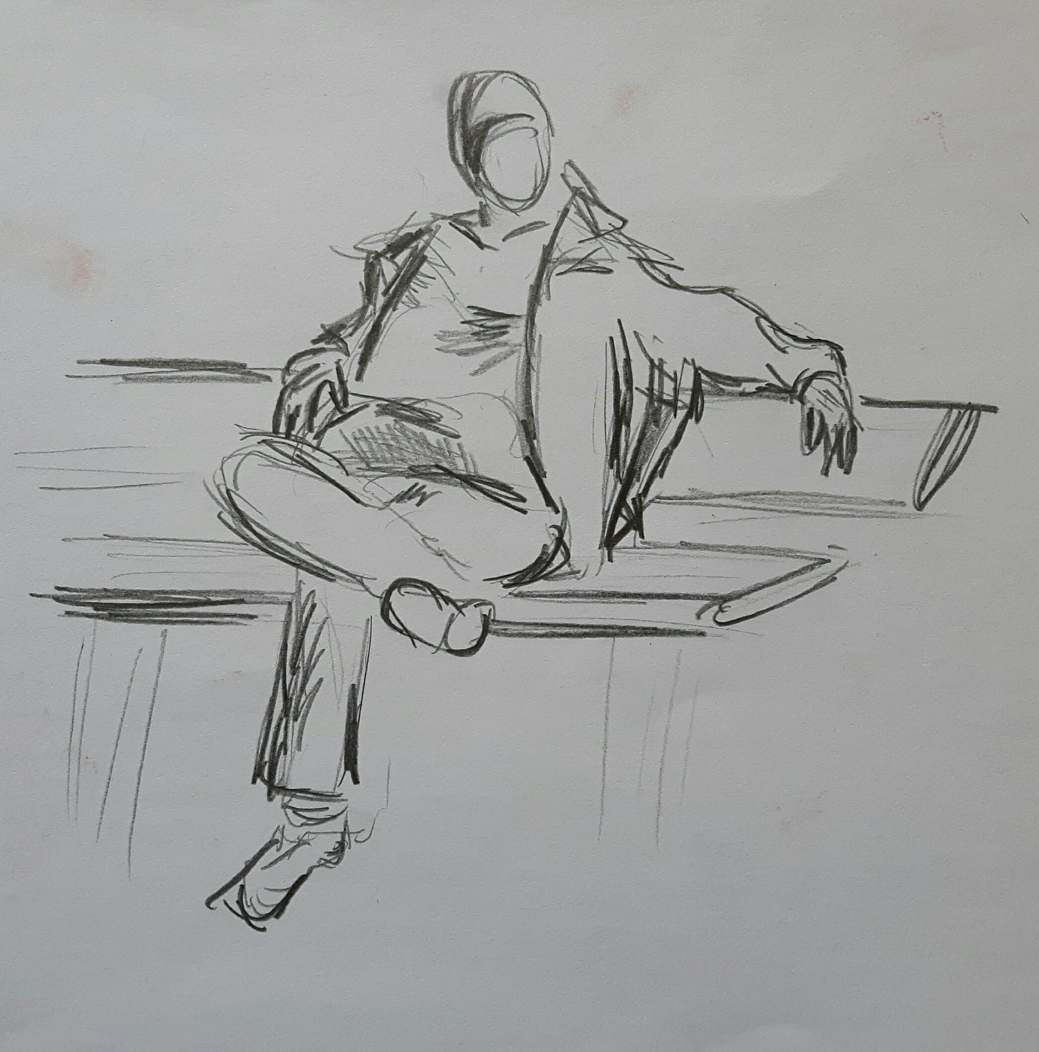
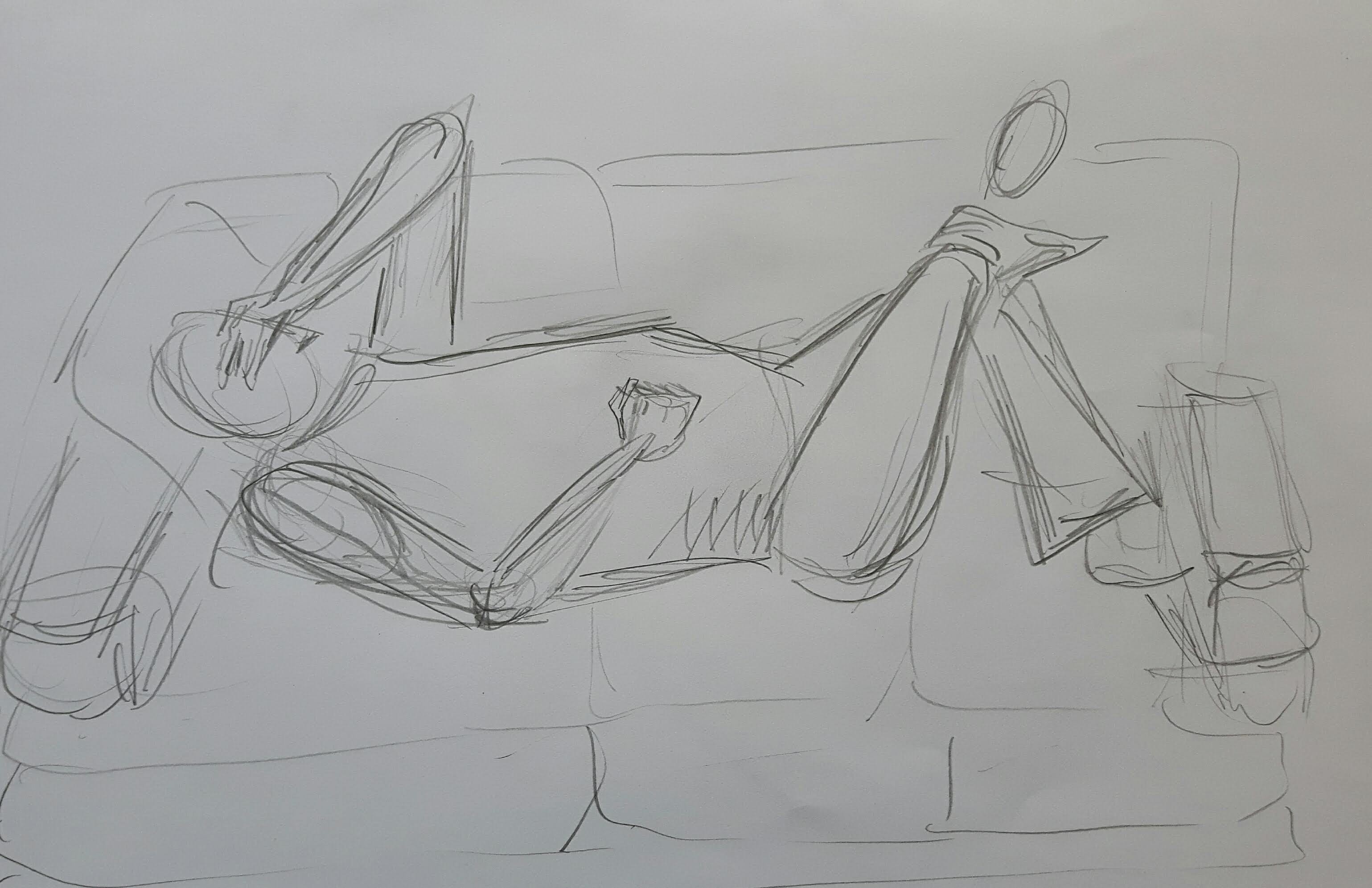
There are some sketches of the seated figure
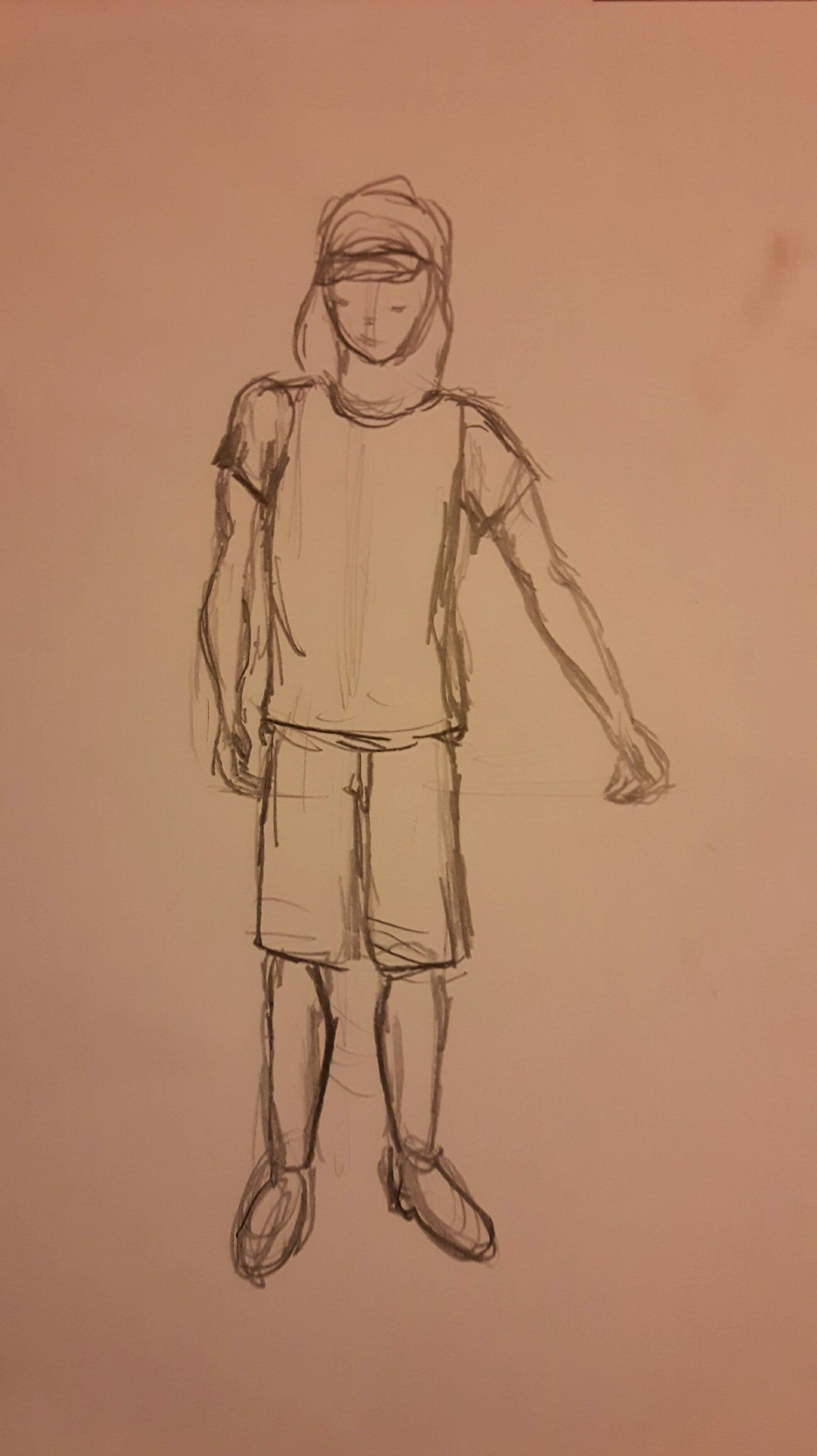
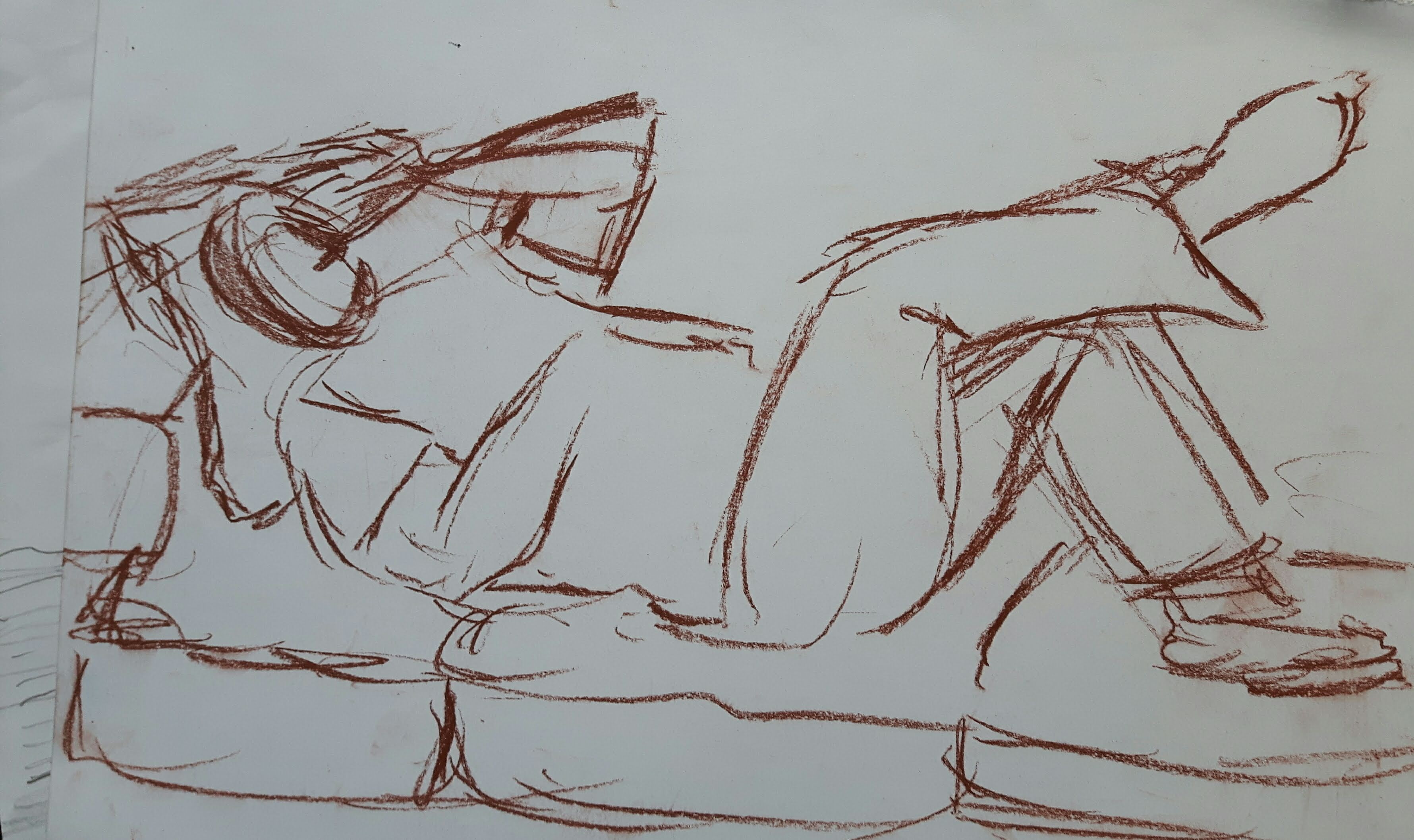
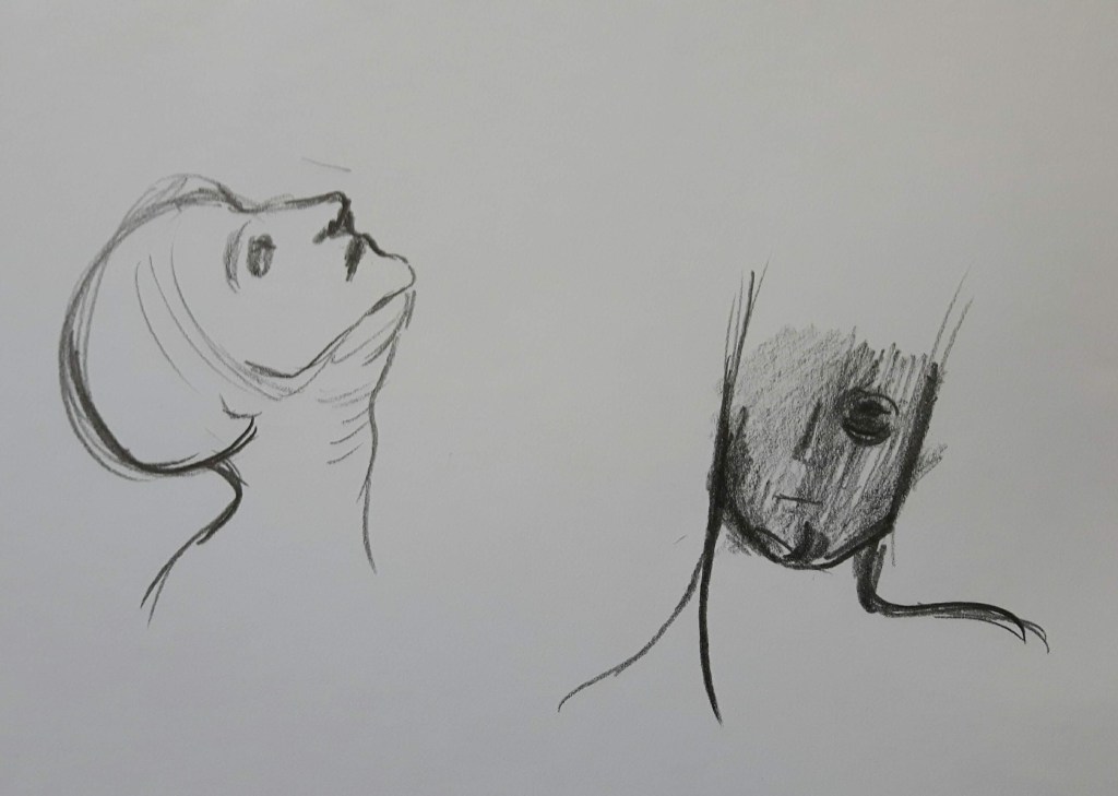
I tried to draw the head in a different style to see which one would be the most interesting
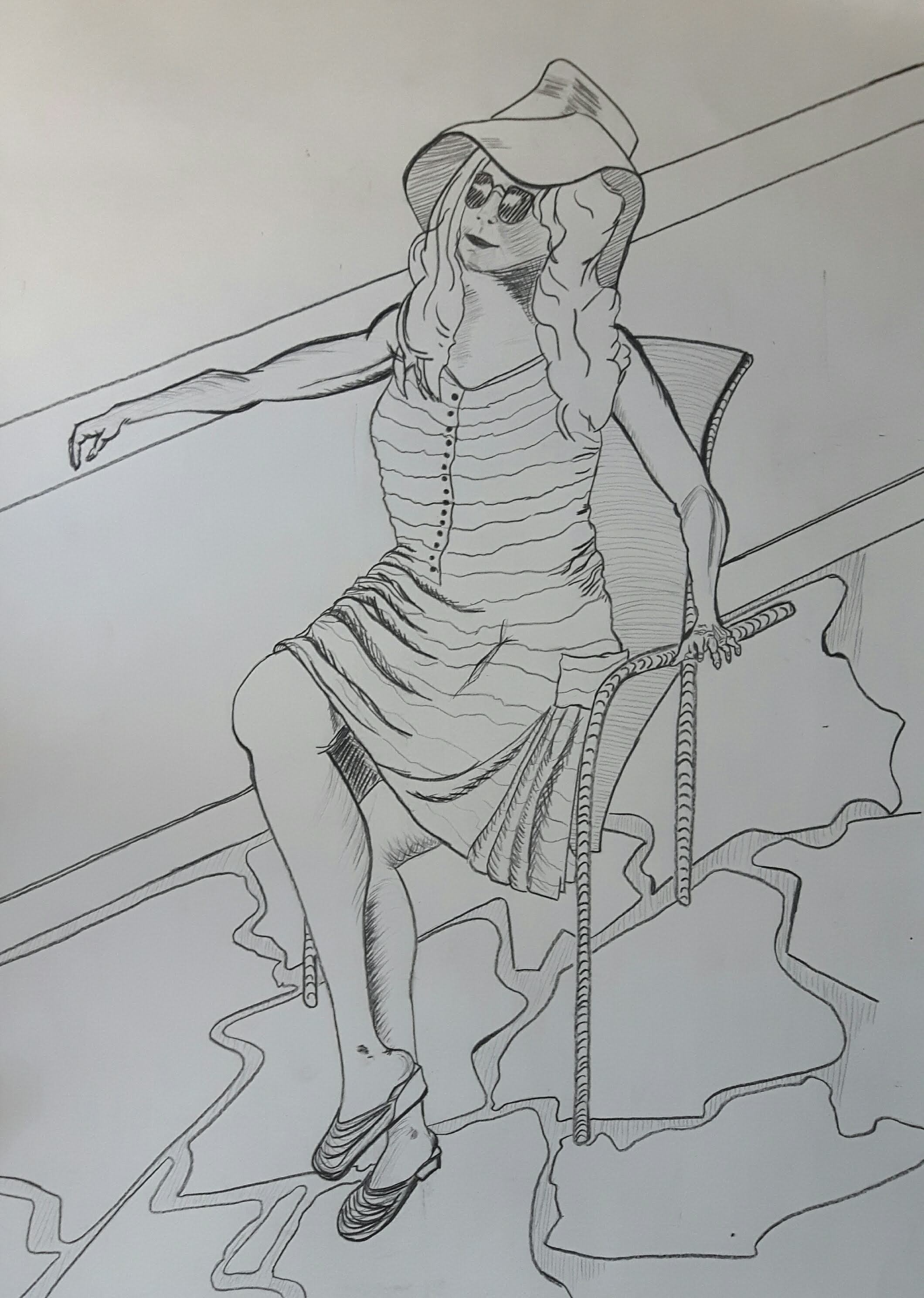
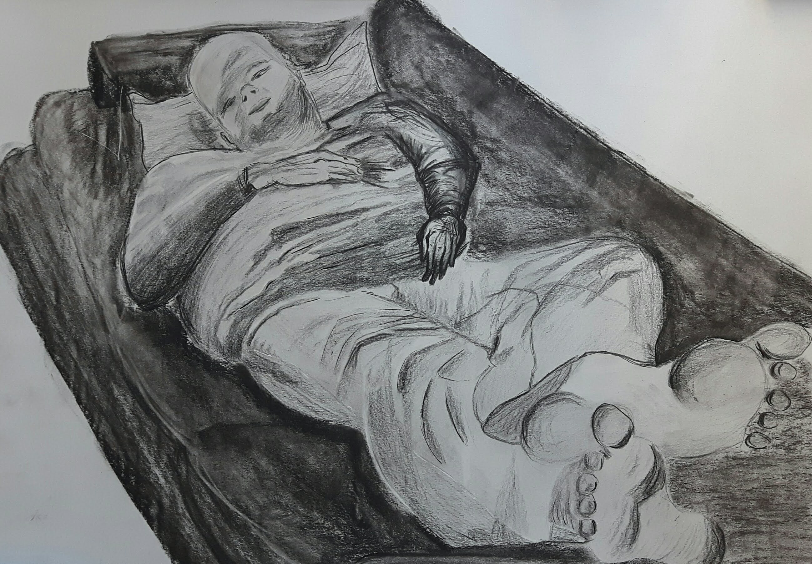
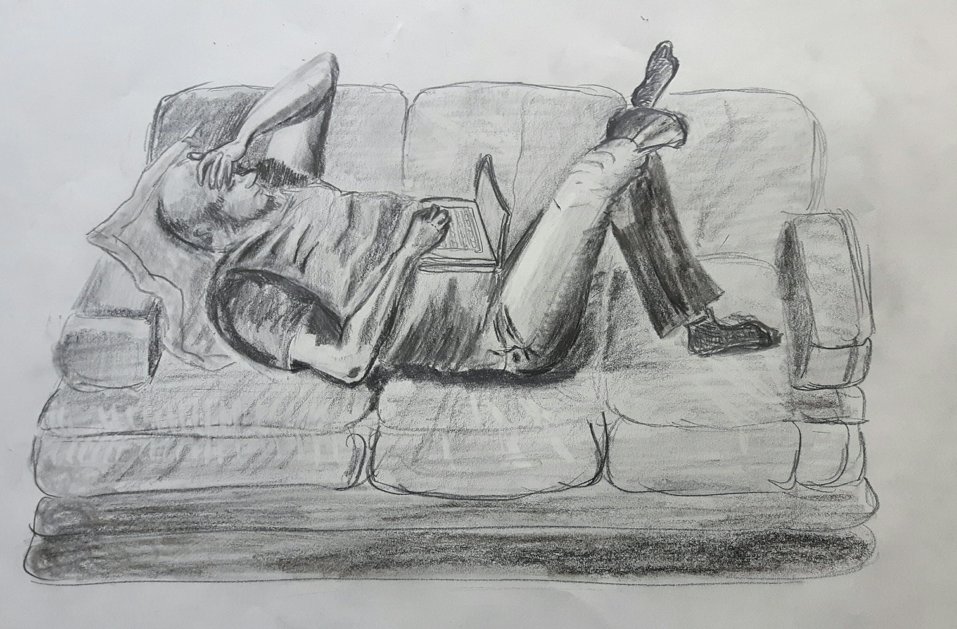
Finally I started drawing using HB pencil
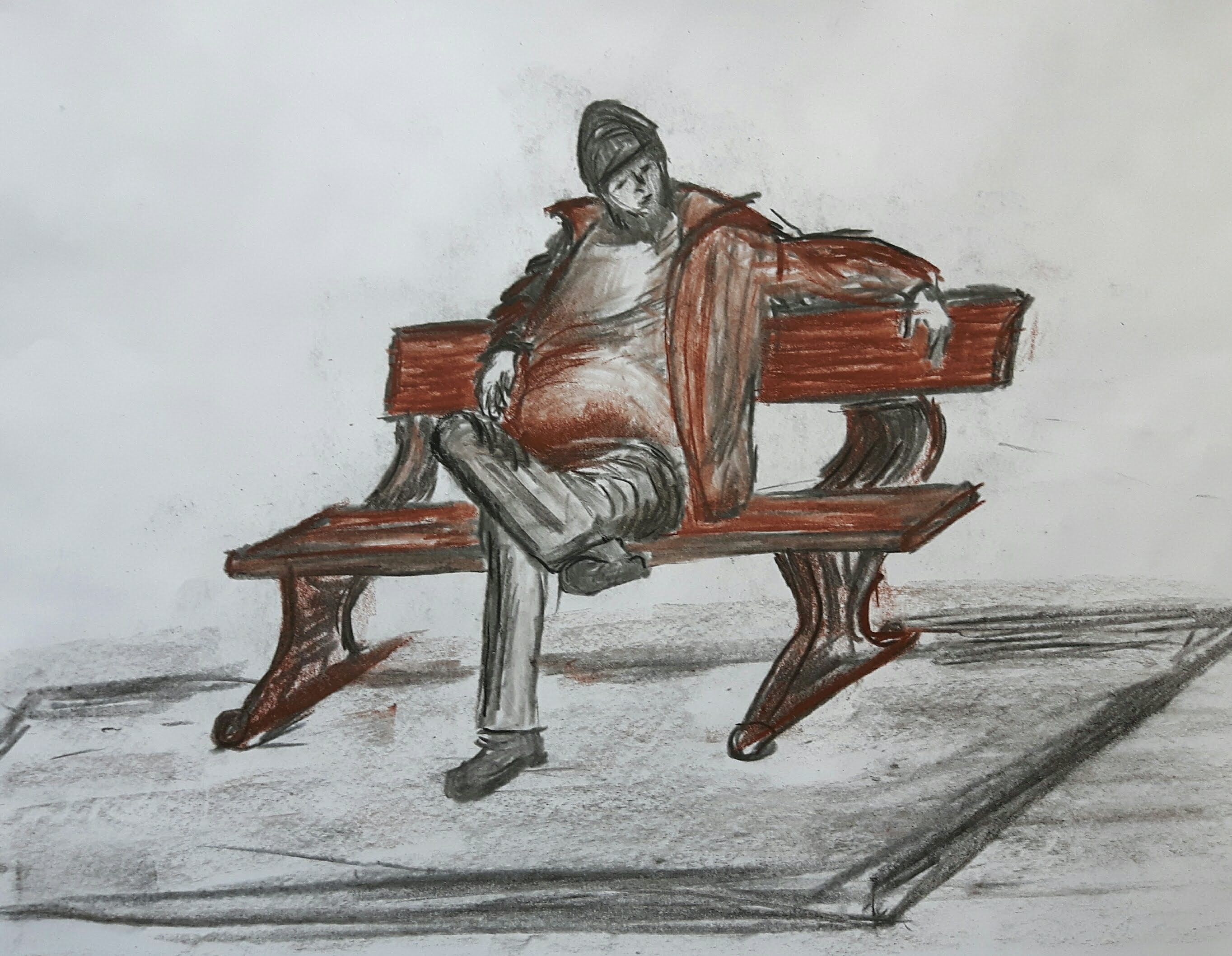
I decided that I would draw with pencils only because -though I like the crispiness of ink drawings – blending with 4B-8B pencils and Inktense would give the soothing impression I wanted. For the same reason, I reduced the variety of colours so my final drawing was made with limited palette. The natural light came from the window mixed with less artificial light from the lamp.
The final drawing
ARTIST’S STATEMENT
I chose my subject because of my deep interest in depicting the human body and the fact that I had a chance to watch cardplayers for a relatively long time and found the subject really promising. At the very beginning, I did not really have any other real direction so I checked some related drawings/paintings online and in the library. I tried to work with live model as much as I could because the finer tones seemed to fade away on the photos. The idea of using ink dropped quickly when I realized I wanted to include reflective surfaces and some soft material thrown on the chair. Though I left the bottle out of the drawing at the end, pencils were still a much better choice because of the smooth blending. I used brownish shades – bark and baked earth colour, the latter is slightly reddish – with yellows. I left both the clothes – the jumper on the chair and the baggy top on the figure – with no colours as I noticed earlier too many different shades could look overworked and exhausting at the same time if a small format is used and my final work is on A3 size that is relatively small. It really helped me to work on this part to have a look back to Part 4. Project 1 Fabric and form exercises where I had to identify the light and dark areas.
When I planned the perspective of the table I was inspired by Felix Vallotton The Poker Game, and the Chairs and Table by Sophie Walraven. I also liked Cezanne Card players series including 5 paintings with different sizes and different numbers of players especially one of the sketches that were made in preparation for the final paintings. This particular one – ‘Study for Card Players – is graphite on paper emphasized with small colour detail in watercolour. I was not happy with some of my poster-like colourful images so I decided that I choose not too many colours, possibly a limited palette.
The other painting that really moved me in the right direction was Hugo Oehmichen – The card game. This picture tells me a story about the mother and daughter seem to be in happy league with each other with a standing figure behind who fills the whole picture with warmth. I wanted to express something similarly obvious feeling with the figure’s posture and facial expression, I tried to depict this little bit of other-worldly gaze on the face that I saw on the painting ‘Young man at the Table’ by Mihaly Munkacsy. Probably I could have worked more on the contrast on one side someone waiting patiently and on the other side, someone just left quickly, dropped a card on the floor without being noticed… Whilst this work may not be very good technically I learned from it a lot to follow my instincts and be more experimental.
Demonstration of technical and visual skills
With this assignment, I tried to work with large gestures but also depicting subtle details carefully when it was needed. I started this course only with graphite pencils and even though this drawing was also done with pencils, I explored line and tonal values on this journey and slowly introduced colours, too.
Quality of outcome
This assignment was partly successful. I liked the message in it but I could have emphasized more because it looks a bit ’empty’.
Demonstration of creativity
I could have worked more on tones especially with the shadows, also I left out the still life part on the table and it should have been there. However, I found the composition interesting and expressive.
Context reflection
I enjoy more the research now than I enjoyed in the past. I realized it did help me to find more interesting compositions and pushed me to dare and explore rather than staying in my comfort zone. At the beginning of this course I thought it was a bit of waste of time, now it is a useful tool.
Reflection on Drawing Skills 1. course
Assignment 1-5.
At the very beginning, I was really excited to start something new. I had the passion but had only basic drawing skills, not much experience and never practised regularly. My visual skills, knowledge of the medium, techniques needed great improvement. At that time I had a very “shy” approach, using only graphite pencils – occasionally charcoal – and my drawing style was very tight – due to the fear of failure. I did not enjoy the first couple of exercises wholeheartedly because my sketches were way too far from my expectations. The first valuable lesson was from this course that I had to be in less control and I also had to introduce the regular practice into my everyday life if I wanted any improvement. Slowly but surely it happened so even though my first assignment was done with a pencil and still looked tight I felt I had the ability to improve.
In part two, there was an introduction to colours. Apart from the liquid medium, I tried a very wide range of colouring tools. I found to work with sepia pastel is very expressive and I really enjoyed Inktense pencils because of their powerful and bold colours. I was determined to learn more about how colours related to each other, how you can reach certain effects with different tonal values, blending and generally about the relativity of colour, harmony, and intensity. Later on, I used many times the ‘Interaction of Color’ from Josef Albers suggested by my tutor. Still, my favourite exercise was the still life using line, because of the fresh and clean image done with black ink. Part Three Expanse was the most troublesome, though I enjoyed learning about different perspectives. I think the reason for not being drawn particularly to landscape is that I tend to draw every small detail (leaves, pebbles) instead of suggesting their presence so it was overwhelming sometimes and seemed an impossible task to finish. However, those exercises did loosen me up noticeably. Part 4 made an improvement in my observational skills especially the drawing exercises in three dimension. I really enjoyed every part of it but clearly, I had to (and still have to) work on proportions and tones a lot. My personal project in part 5. was a really good experience and reflected my journey through this course.
In the beginning, I was not really keen on the research part but the more I did the more I enjoyed to the point when I spent long hours online just wandering from painter to painter through centuries and art movements. Overall I learned a lot through this course, I am happy with the improvement I made and looking forward to the next chapter.
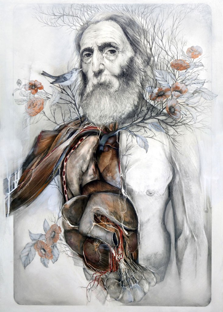
Underlying structure of the body in historic and contemporary art
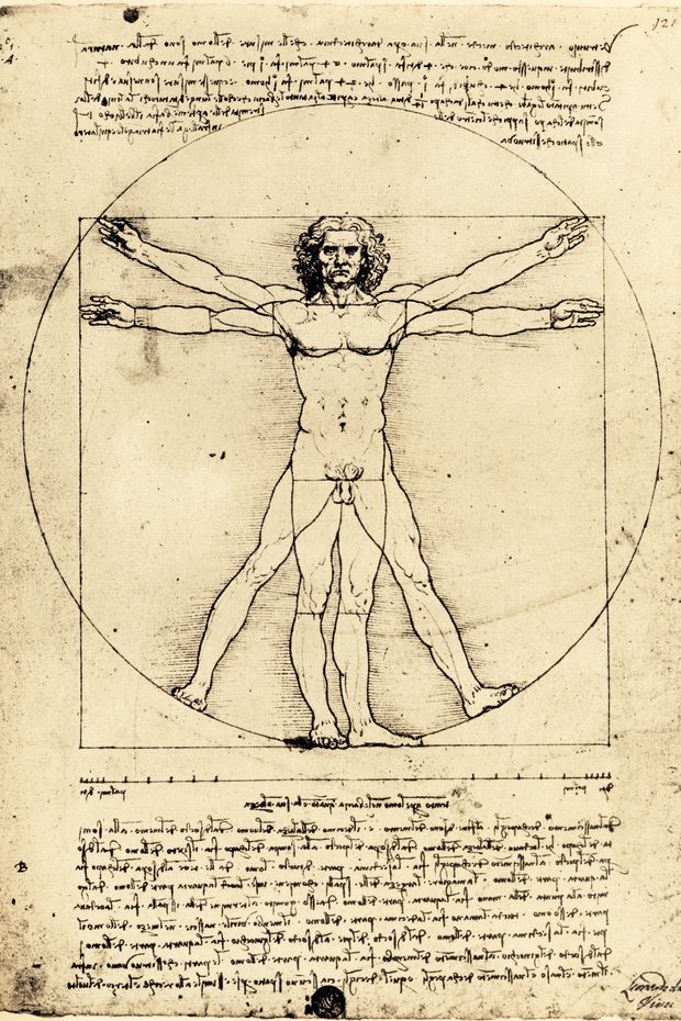
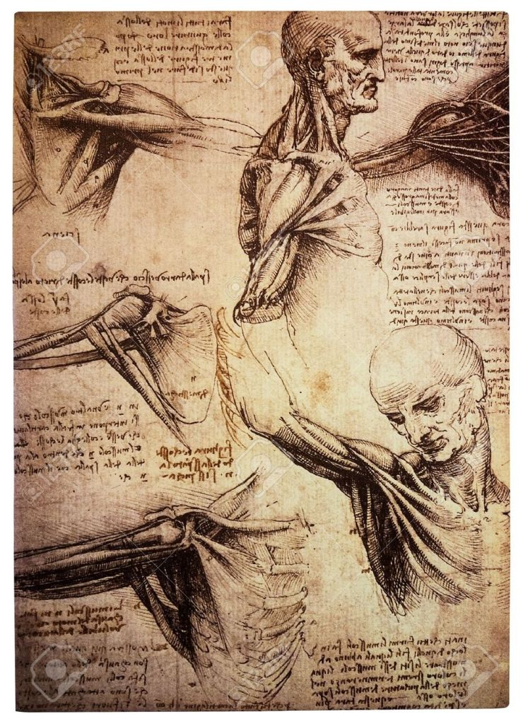
When is about the structure of the human body, among other great historic artist the one who comes first to everyone’s mind is Leonardo Da Vinci (1452-1519 Renaissance artist, scientist, architect) One of his most famous drawing is the Vitruvian Man
Leonardo used pen, ink and metalpoint on paper. This drawing is a great study how human body corresponds with a circle and a square based on the works of Vitruvius, Roman architect. Leonardo performed dissections to explore the structure of skeleton and musculature of body. In 1510-11 he created several precise drawings representing body parts in transparent layers accompanied by his famous mirror writing.
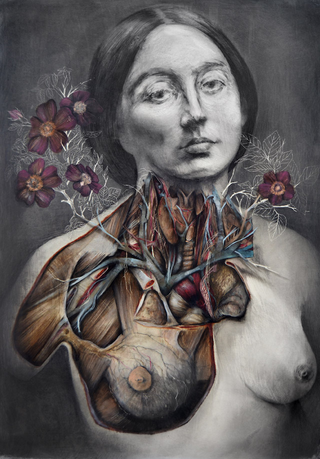
Nunzio Paci is a contemporary artist from also Italy. I am truly fascinated by the astonishing combination of anatomy and nature in his art. His anatomical studies are clearly leading us back to Da Vinci’s drawings. According to the artist “my intention is to explore the infinite possibilities of life in search of a balance between reality and imagination.”
Faces (including self-portraits) in historic and contemporary art
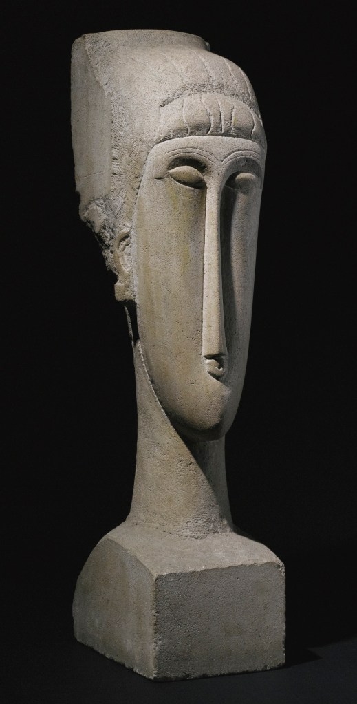
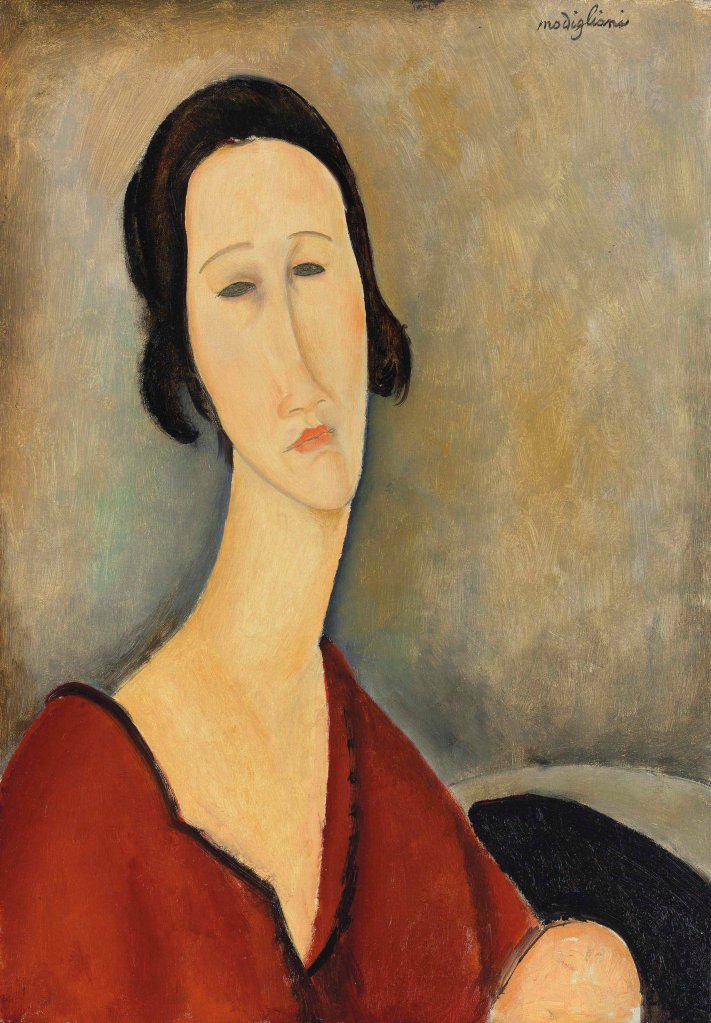
Amadeo Modigliani was an Italian sculptor and painter is known for portraits with elongated faces and figures. Influenced by African sculpture he created stone heads with elongated and simplified forms. Those unmistakable characteristics became typical on his paintings later on.
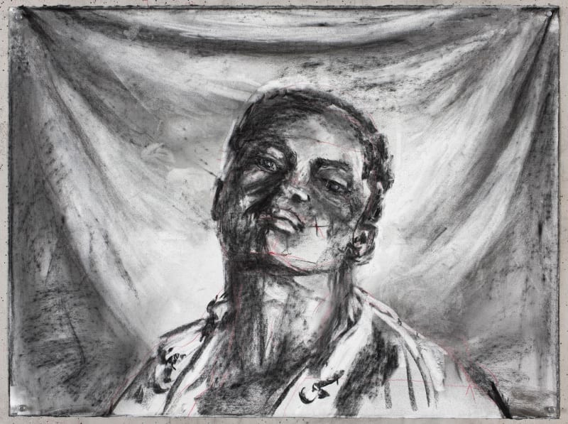
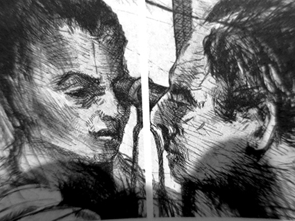
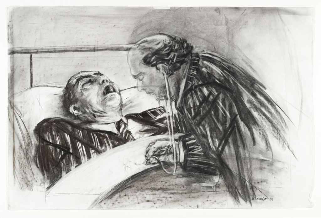
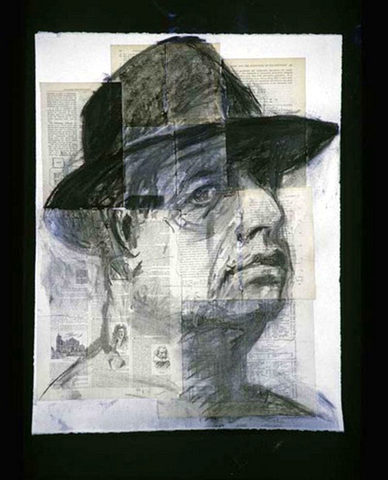
Whenever I am researching contemporary art online it’s always like being a child in a candy shop. There is always something fresh, something different to find. Recently I found William Kentridge beautiful charcoal drawings.
These drawings are very thought-provoking and informative. You can read each and every story behind. Last but not least here is his self-portrait
Through his artwork he is often expressing his view about social and political injustice of his homeland (South-Africa) and more broadly about other (European – leading back to his Jewish roots) conflicts from mostly the history of the 20th century.
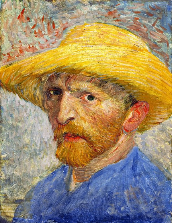
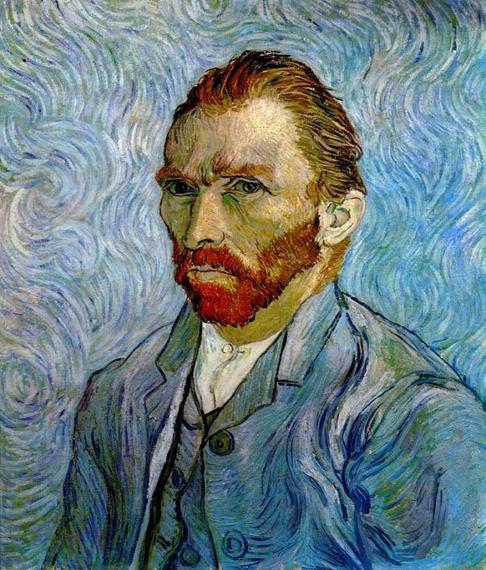
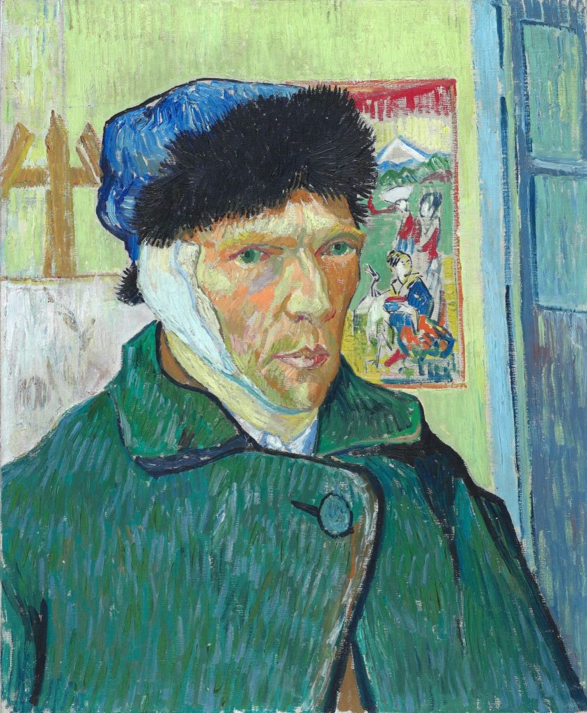
And finally I would like to compare some of the self portraits of Vincent Van Gogh. Between 1886 and 1889 he painted over 30 self-portraits.
Paris, summer 1887Saint-Remy, September 1889Arles, January 1889
In 1886 he arrived to Paris where he met Gauguin. Apart from the difficulties caused by living together with his brother Theo, he had a really creative year then, producing more than 200 paintings within two years. This first painting was made in summer. Although the colours (his favourite yellow) are vivid he looks relaxed and content.
In 1888 he moved to Arles where he painted mostly flowers and trees and from October he lived with Gauguin in a sort of “artist community”. Unfortunately at that time he showed signs of serious mental illness. He spent some time in hospital, and in January, 1889 he painted the third self portrait above. He looks very lonely, this impression is more emphasized by the happy-coloured and detailed Japanese drawing next to his face.
The last one was created in September, 1889. I believe that was his last self-portrait. At this time he was in hospital again. The colour of his shirt and the background is almost the same, his eyes are cool and restless at the same time but he does not have that wounded look nor the hopeful and happy face like on the previous pictures.
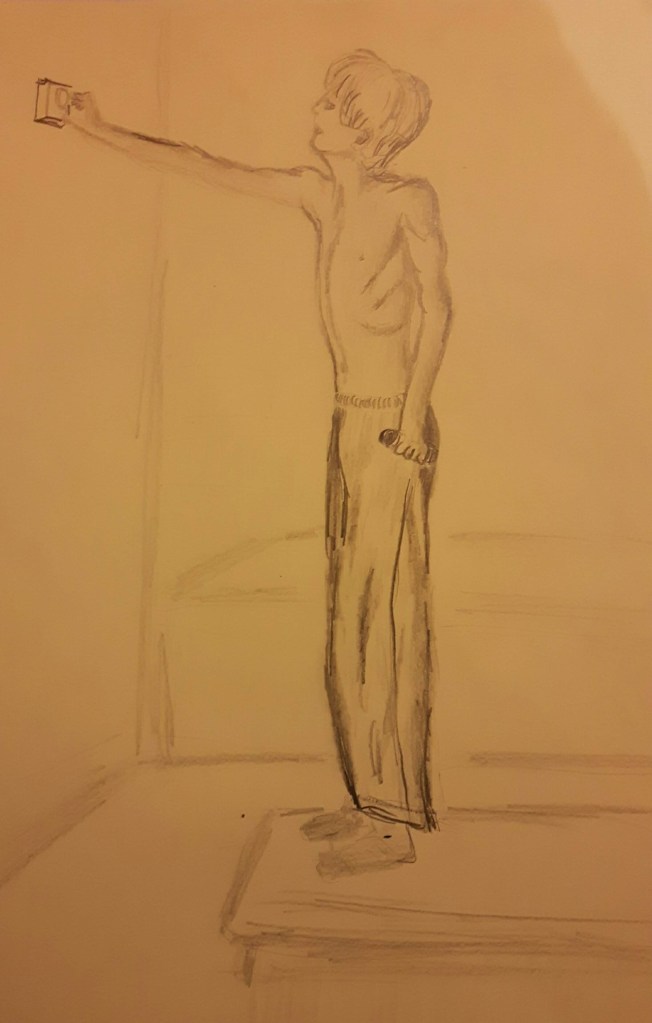
Figure study using line (A1) -Seated model in an upright chair
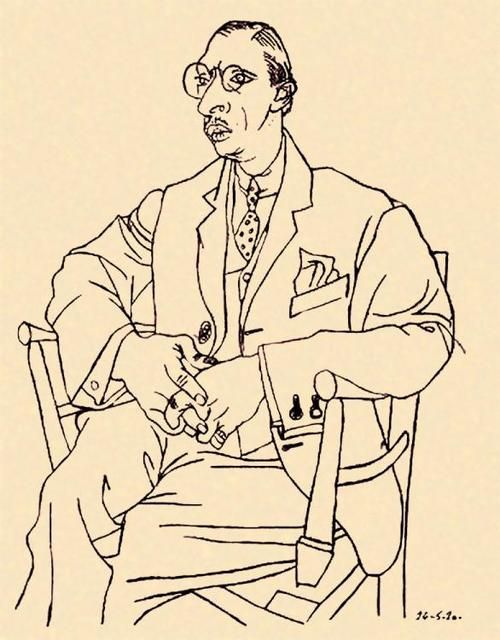
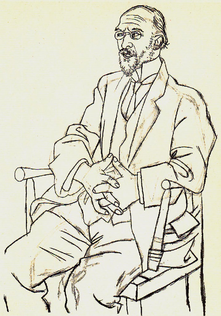
Those two drawings were created by Pablo Picasso. The first is Igor Stravinsky, the second one is Erik Satie. The drawings are very similar, both model were seated on the same chair. The beauty is in their seeming simplicity: he used quick, single strokes.
I like those images because using only the technique of contour line drawing – no shades, colours just simple lines – still makes me feel that both of them are complete and dimensional.
My first drawing is me, sitting on the balcony of a holiday apartman last summer. I was gonna use brush pen first because I wanted the image crisp and simple but then I decided to use Black Inktense which lately became my favourite medium. I started the very first sketch with charcoal though, just to see the difference.
Then I moved on to pen, drawing basic shapes with quick strokes representing the central axis.
Final drawing
I was a bit afraid to fill this large piece of paper with only lines, I thought there would be disturbing “empty holes” but somehow the paper was just enough for this composition. I found difficult to depict the facial expression. I tried to put the shades with not much success. Overall I think there are slight problems with proportion but I like the composition and the chosen medium worked out well, too.
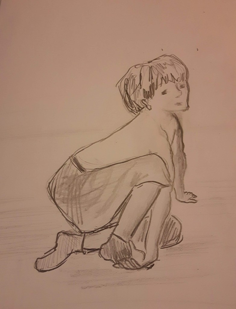
Figure study using tone (A1) – Reclining model
My model wore a jumper and jeans lounging on a couch facing me from the foot end. Natural light came from the window behind his head. I used pencils/charcoal for the final drawing. On the first sketch I outlined the basic shapes.
With the first I just tried to see the shapes, the second one is more about details and composition.
Final drawing
I think the composition looks balanced and I was quite happy with the tones and foreshortening of the lower body part. But then the left arm and the head went completely wrong. I tried to erase them both and draw again differently but it was just getting worse with each attempt.
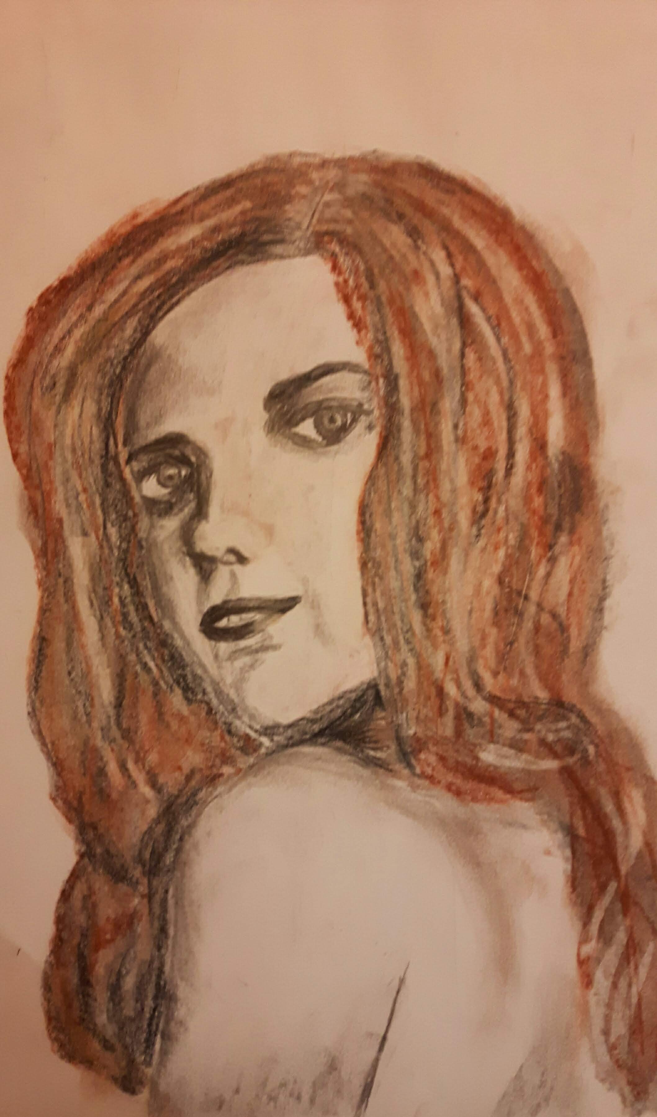
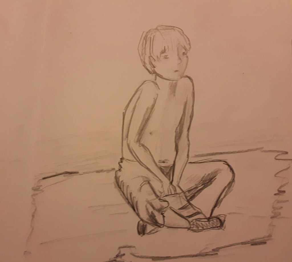
A portrait or self-portrait combining line and tone (any size)
I did not know who to choose for this assignment so I did some sketches from pictures online.
The last one was a young girl looking back over her shoulder I thought the pose was interesting to draw. I used mixed media, crayons and pencils with shades of sanguine and black.
This drawing did not take as long as two hours but when I finished I felt I could only make it worse if I worked on it more. This was more tonal drawing than line using. The pose was really interesting however the use of media or technique was not experimental at all.
Reflection
That was my favourite part in the whole course, I really did enjoy all the exercises. Also developed confidence when drawing figures. Probably that’s the reason why I am a bit disappointed that my assignment did not exactly go as I planned.
Demonstration of technical and visual skills: I feel, the composition worked well on the drawings and I was happy with the chosen medium on the first part.
Quality of outcome: Although I am not satisfied with the pieces this time I can definitely see the improvement due to various exercises.
Context and reflection: during this journey I met some really inspiring artists and in part 4 the book “Art Anatomy” from Jeno Barcsay was a great source.
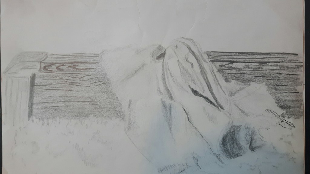
It was much easier to create a sense of depth using tone than just line.
Using line only was more difficult however it gave me the impression of delicacy. Still, probably using tone was a bit more successful this time because the fabric looks soft and fluffy. (As it was in reality.)
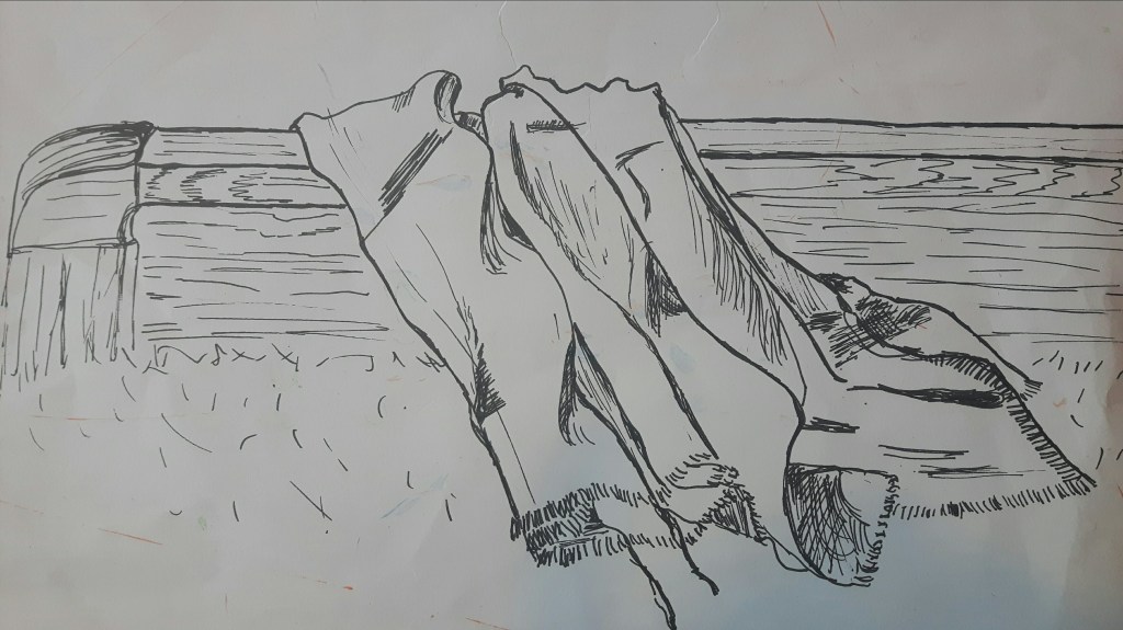
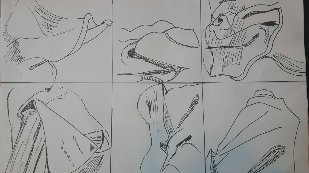
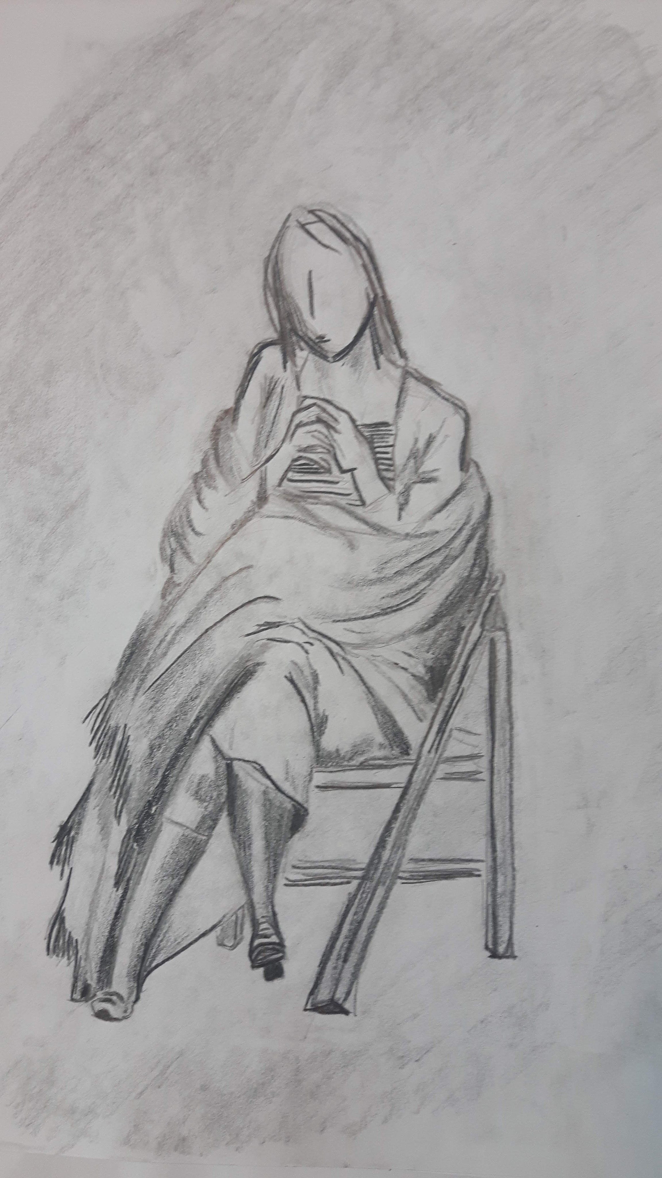
Exercise 2 Emphasising form with cloth
Seated figure wearing a plain and pale coloured shawl. I couldn’t find anybody to sit for me at this time so I found a suitable picture online. I used 2B-3B pencil and black Inktense for this drawing.
I didn’t go into much detail with the head and the hands, tried to focus on how the shawl folds. She became a bit shapeless due to the fabric being loose, I could have done better with the middle part.
Project 2 Exercise 1 Quick studies
In this exercise I have to draw a model in a comfortable position. I chose a seated position for my model.
The first two 1-minute sketches are really out of proportion. Arms too long, head too small. The third one was finished under 10 minutes, maybe it’s a bit better but the left arm is wrong. (The face is all wrong too, but I did not really pay attention to this part in this exercise.)
This is a twenty-minutes drawing. The head is too small and the torso looks unnaturally rectangular however the legs are not too bad.
Exercise 2 A longer study
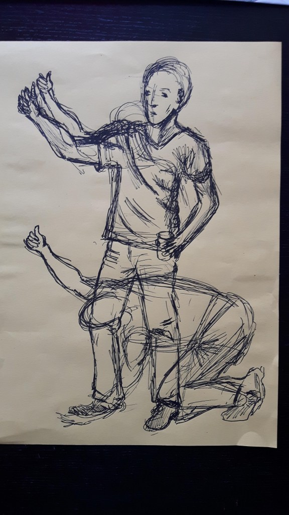
My model is seated, holding a small cup of water.
The model seems to be quite stiff but somehow I only noticed it when I came back to see this drawing after a couple of hours. Probably the upper part of the body is slightly long also the left hand is too short.
Research point Foreshortening
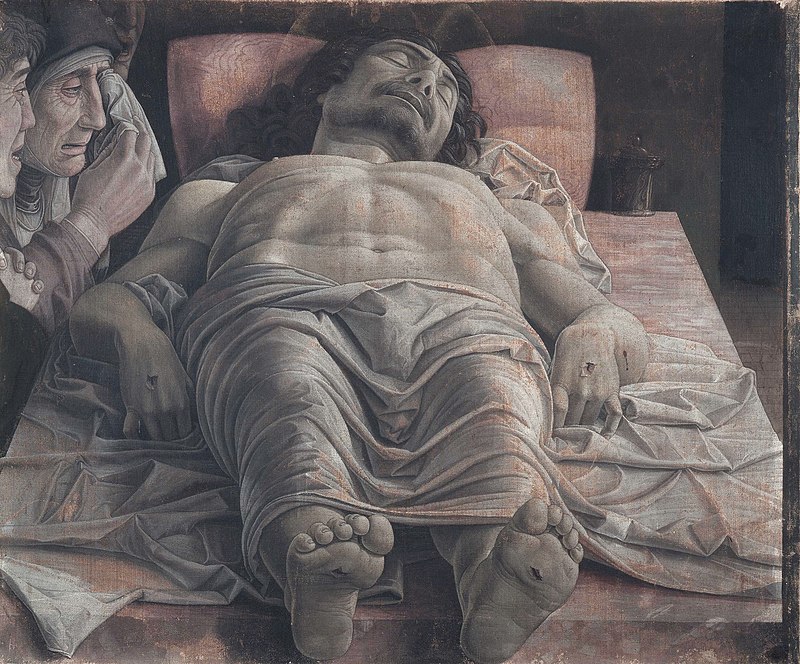
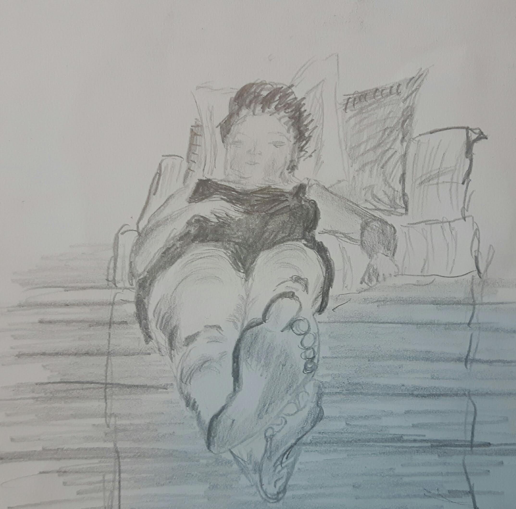
Lounge on a couch with a mirror facing me from the foot end. I have never drawn like this before but ever since I saw the Lamentation of Christ by Mantegna many years ago I always wanted to try it..
This piece is probably the most famous example of foreshortening. It’s not a typical religious painting, the wounds, the discoloured body and the dramatic perspective is not something we get used to in Renaissance art.
I asked somebody to make a photo of me in this position.
It was very challenging but also somehow very exciting as well. It took less than ten minutes to finish and apart from my left arm I am quite happy to achieve this convincing image in short time.
Project 3 Form
Exercise 1 Basic shapes
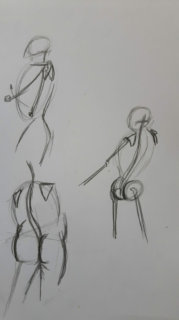
Seated model at a slight angle in a chair. The central axis obviously not only a straight line towards the floor but the line about which a rotating body turns therefore it is moving constantly as you’re changing position. I tried to reduce the form to its basic geometrical shape – square, sphere, cuboid. My model’s right arm is a good example for foreshortening. I tried to build up this two-minutes sketch starting with the torso.
Then I made a ten-minutes sketch.
Meanwhile she changed her position. Unfortunately this one became a little distorted, the upper body is facing us but the legs are in slight angle which looks awkward. Overall, the proposition is not bad, but – apart from the right hand – the foreshortening is clearly something to work on.
Exercise 2 Essential elements
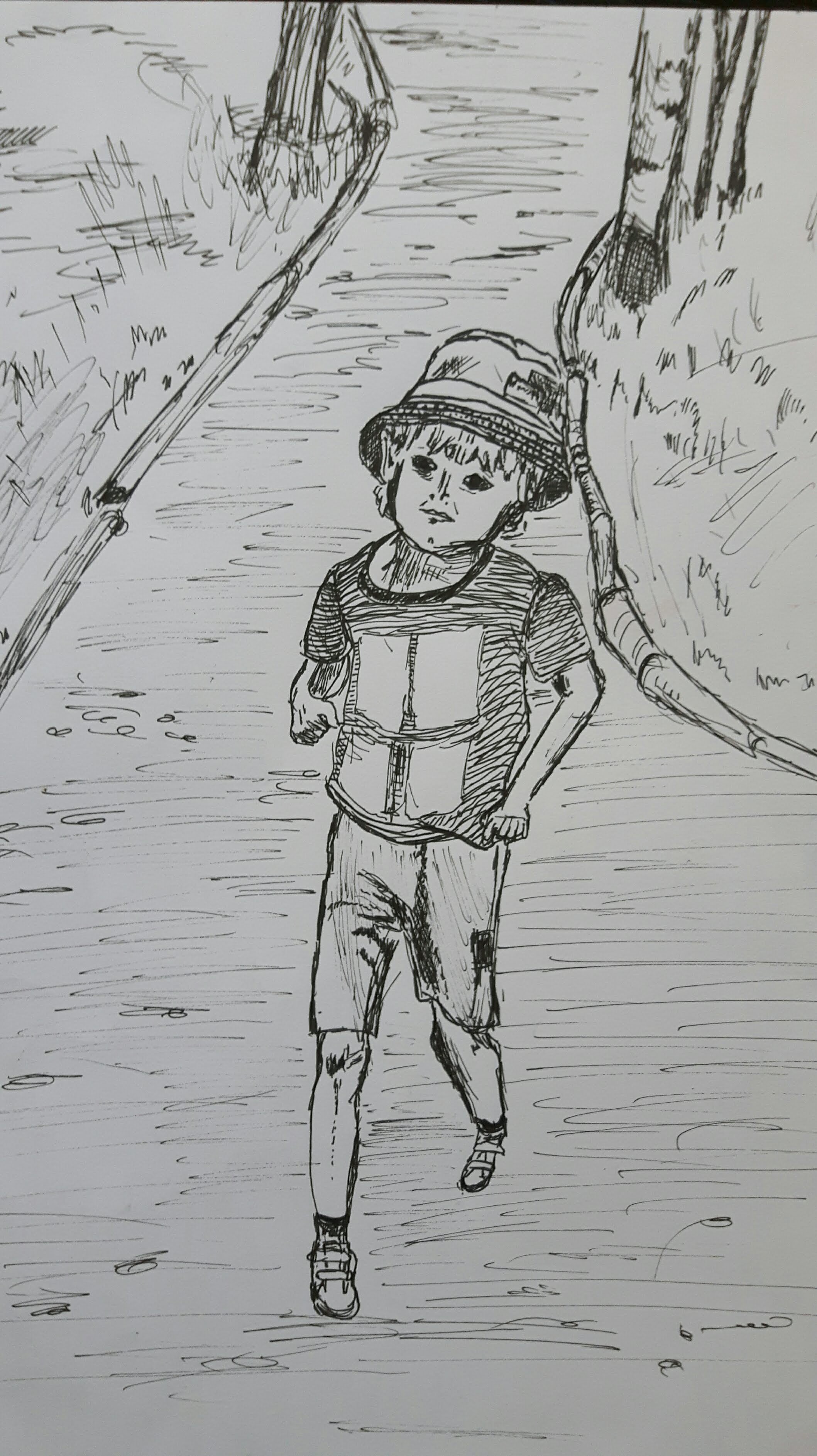
This time draw a sequence of six different poses lasting ten minutes each. I found a willing model – my son – but he wasn’t prepared to stay in pose for ten minutes each time. More like 2-5 and I finished them from my memory.
1.2.3.4. When a six-year-old can choose a pose…5.
I think I created a sense of weight in pictures 3. and 4. The arms too long in 3. and 4. was tricky to draw (but somehow the most enjoyable) then he moved quickly (no power on Earth could move him back to the same position) so I couldn’t reproduce the shoulder part well. I kept erasing but each time it got worse and I gave it up. But still that was the best position because the figure is expressing playfulness.
Exercise 3 Stance
With my first sketches I tried to focus on the central axis and how the weight or mass are shifting with body movement.
The next one took a bit longer, I tried to be more precise with proportion.
I think I got the proportion right however the head was too big first.
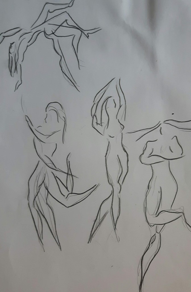
Exercise 4 Energy
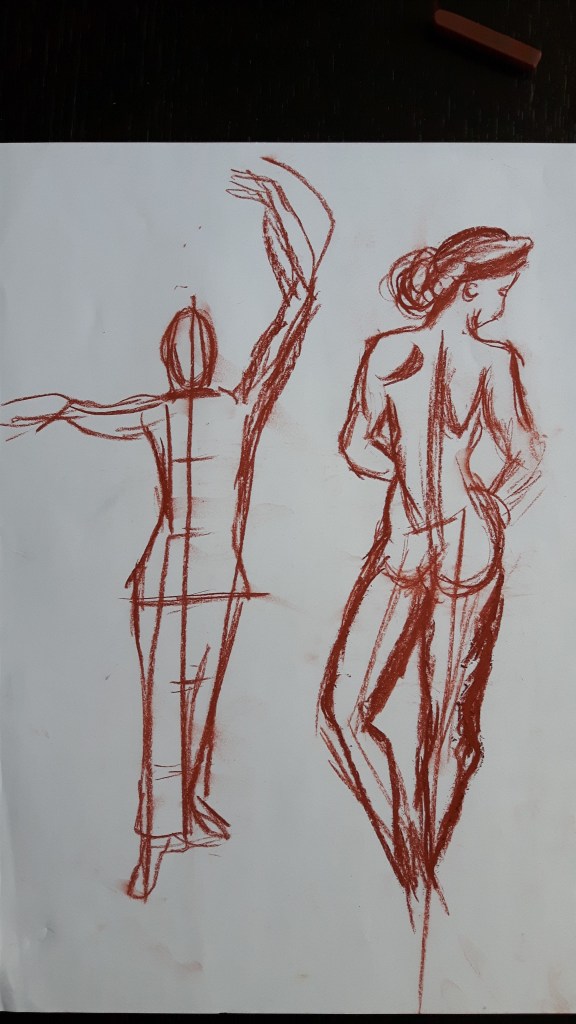
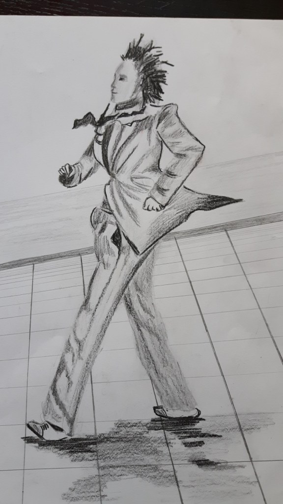
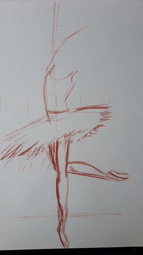
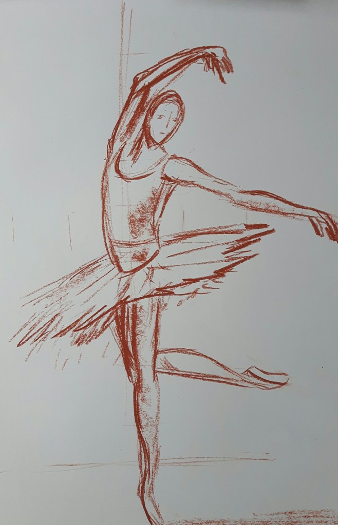
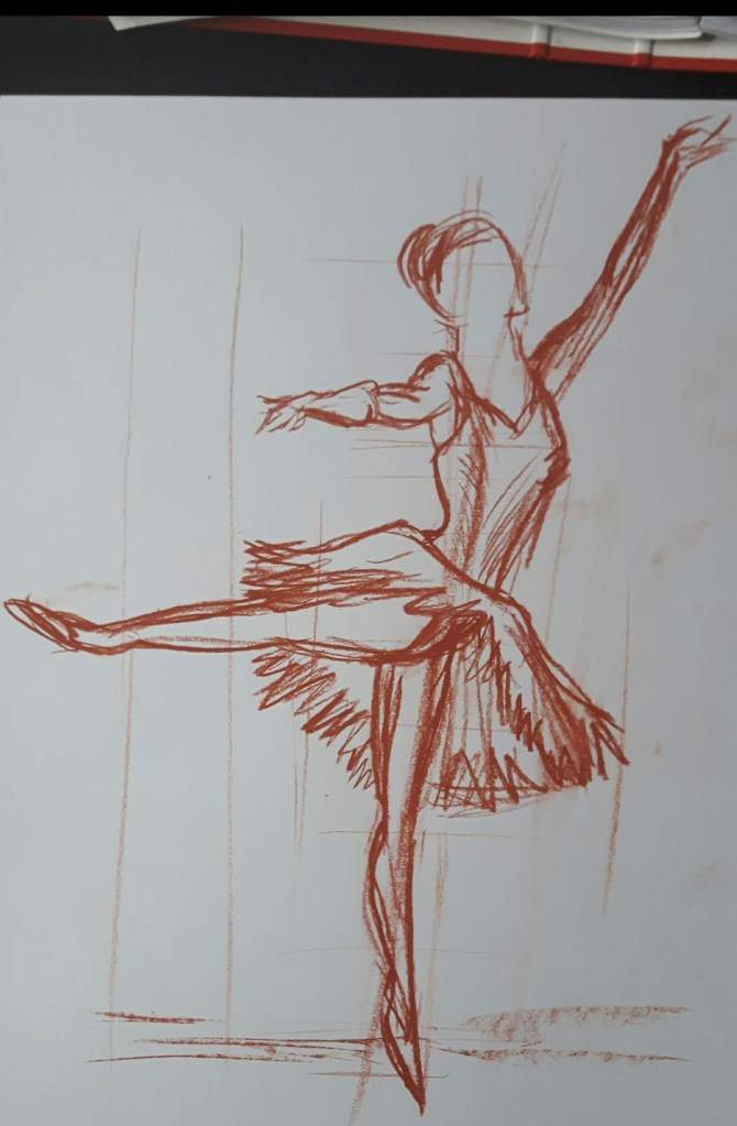
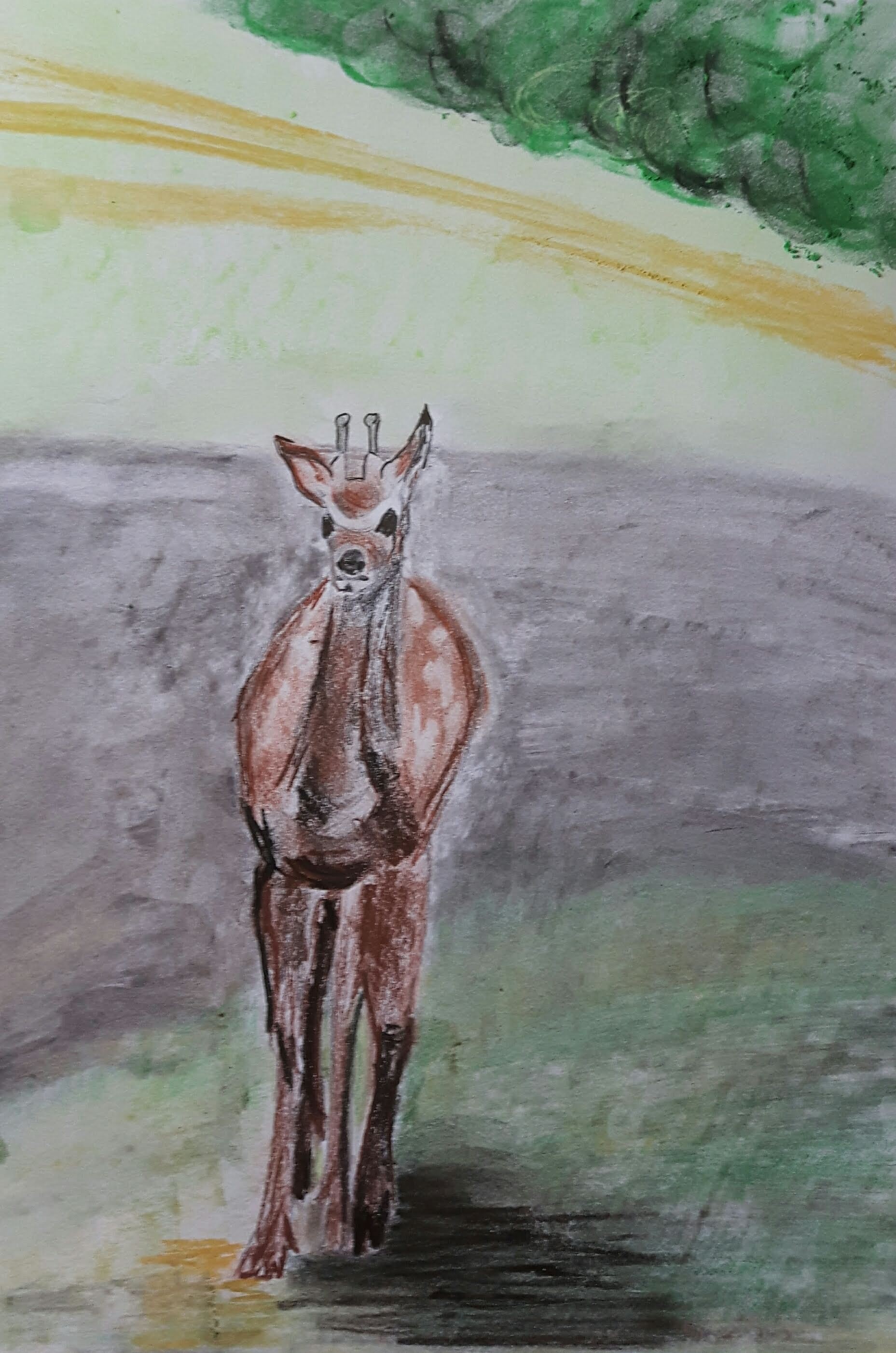
Ask a model to adopt a dynamic position. I found some interesting pictures from holidays, also I have to include some sketches of ballet dancers – it is truly fascinating to draw them!
Las Ramblas, Barcelona – street artist
This street artist is staying in a frozen, uncomfortable position for a long time, his flickering tie and the back of his jacket supported with a thin, invisible metal rod to give even better impression of flowing movement.
In the park
Those were quick sketches only, legs are not great but I think I have just grasped the endless passion of Edgar Degas for drawing dancers (approximately 1500 depictions…). I will definitely come back to this for a longer study.
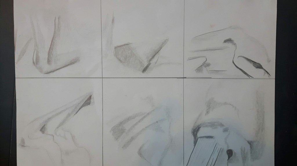
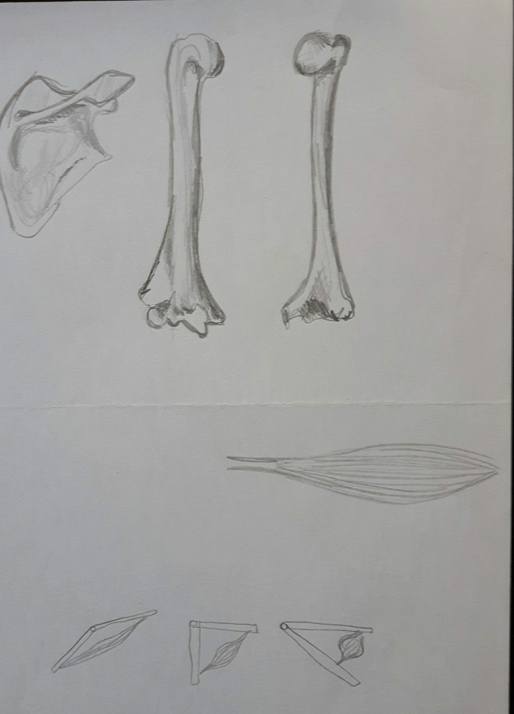
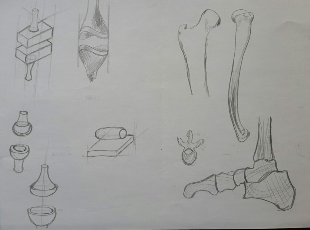
Project 4 Structure
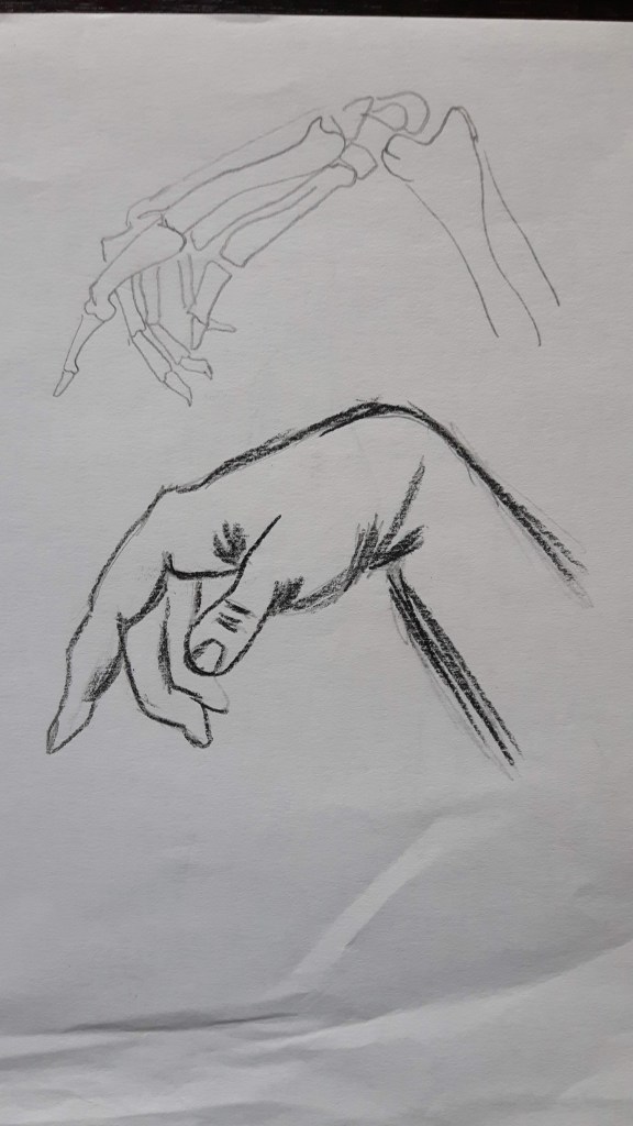
Exercise 1 Structure of the human body
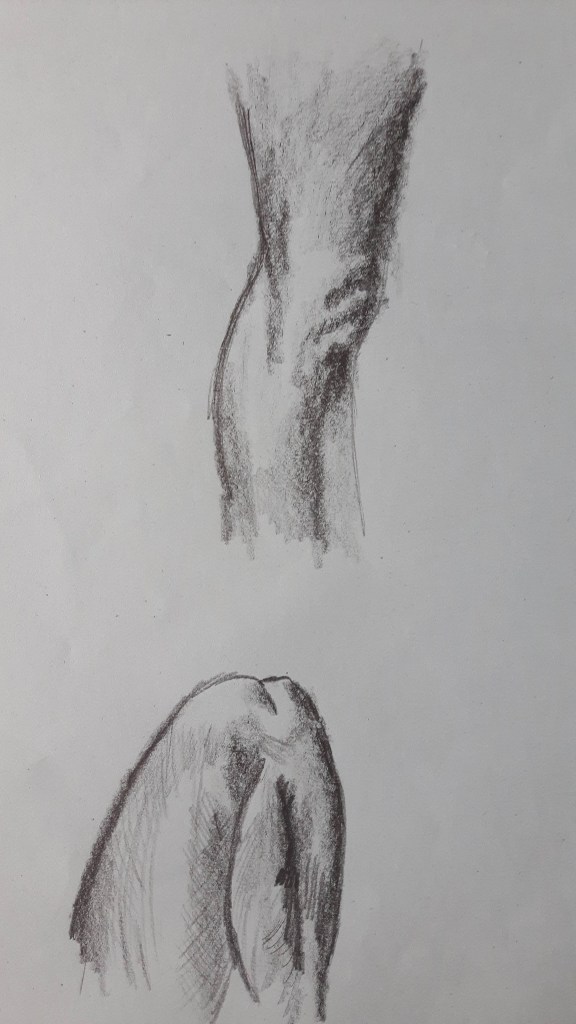
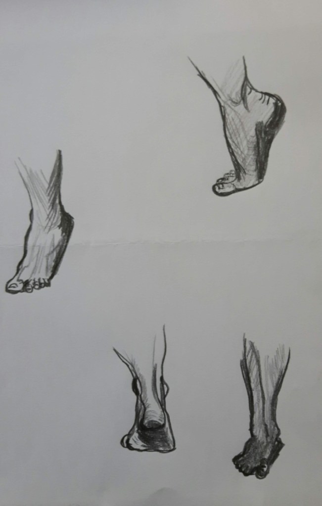
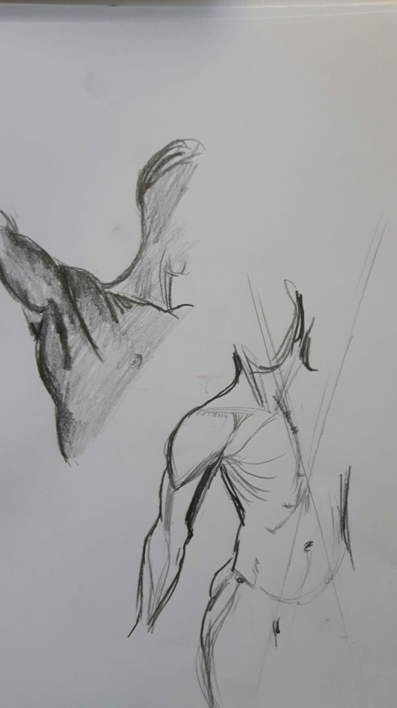
Loosely sketch some of the structures that make up the human body. For this exercise I drew various body parts, muscles and bones too to understand body structure and movement better.
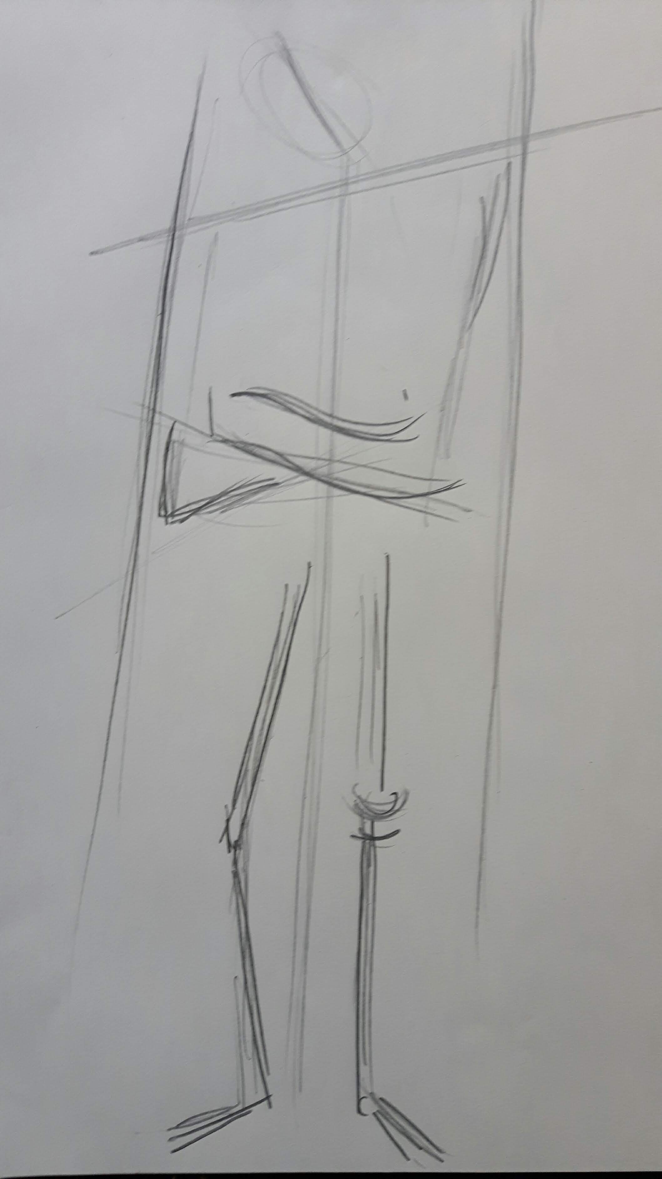
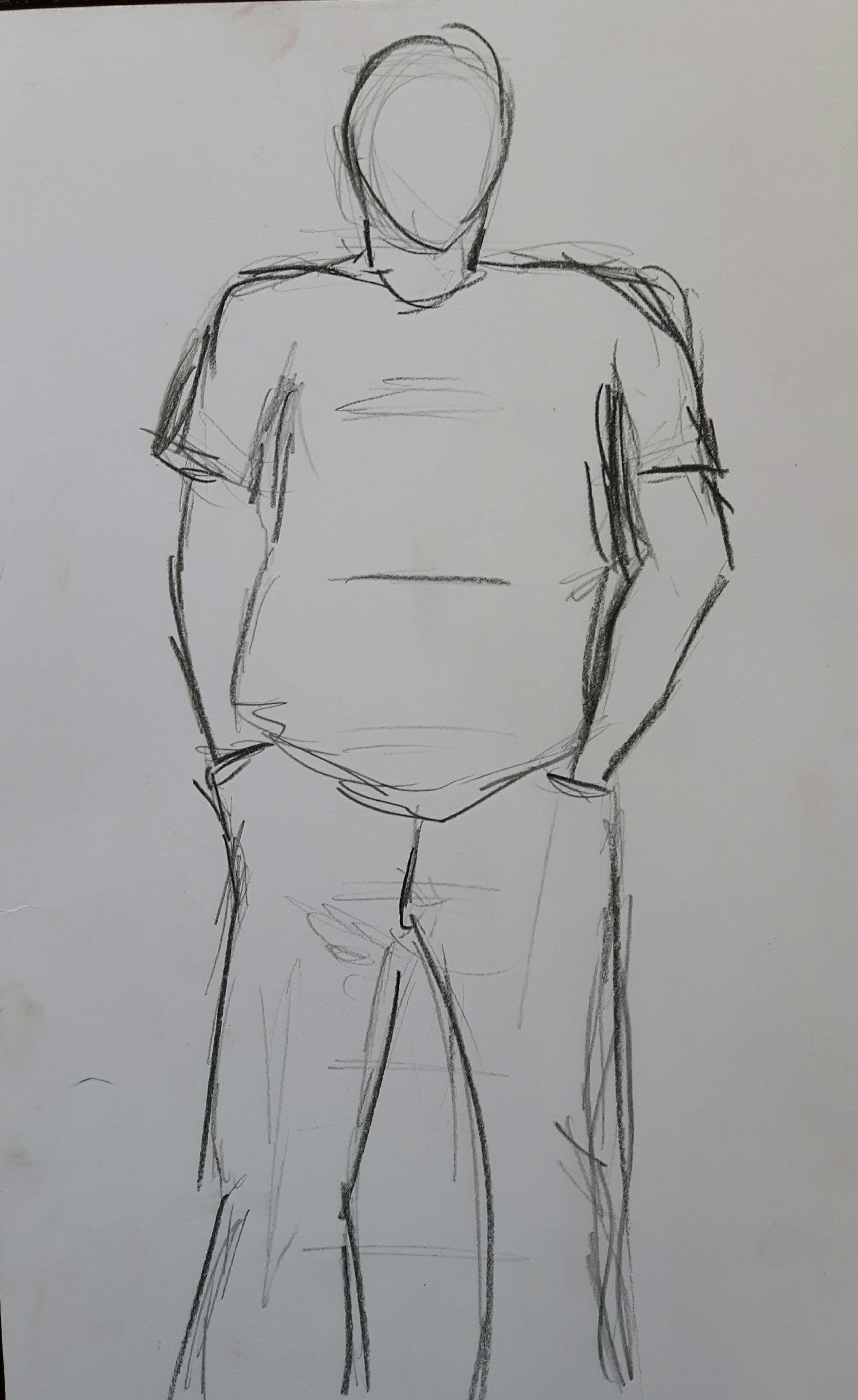
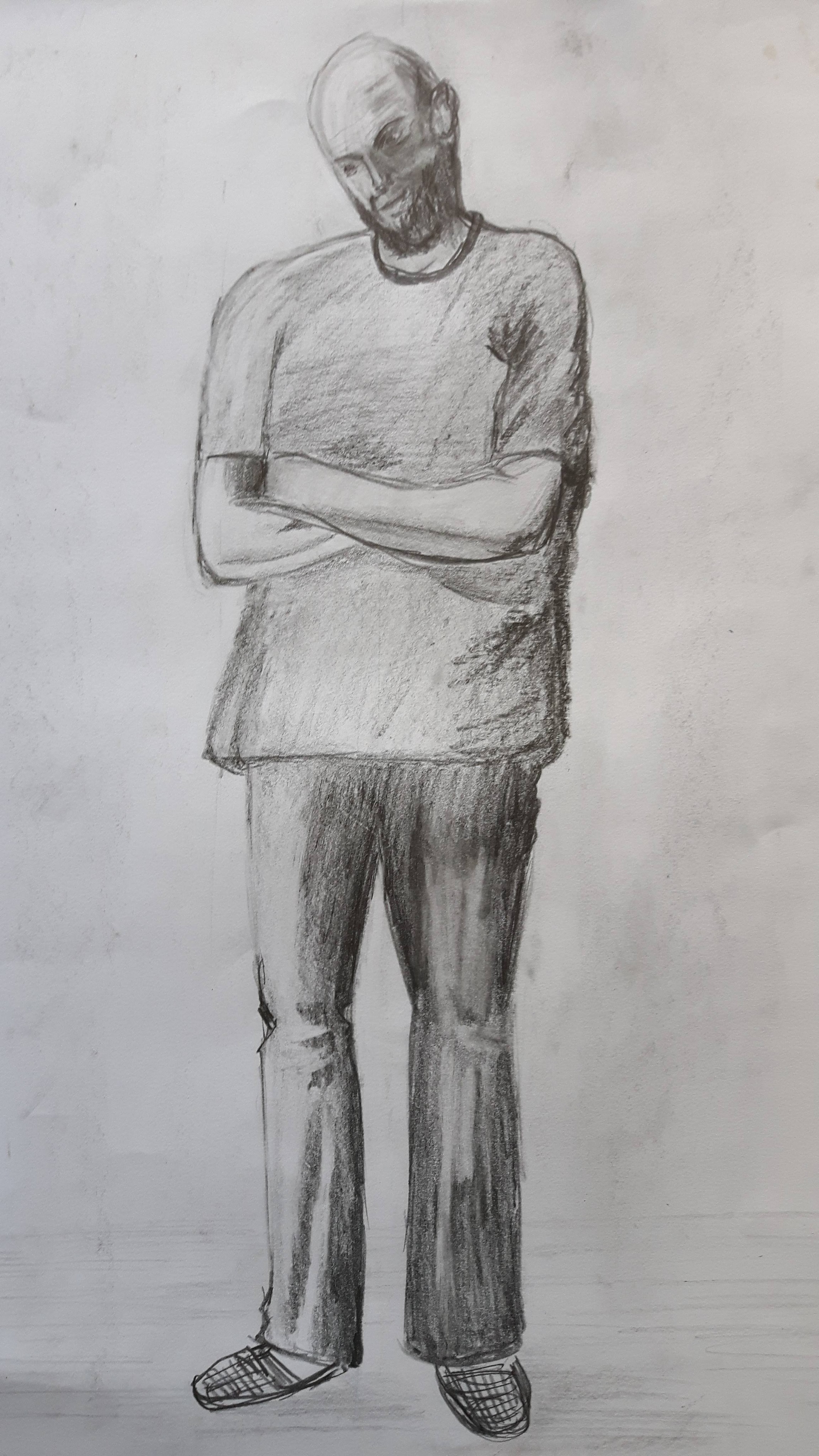
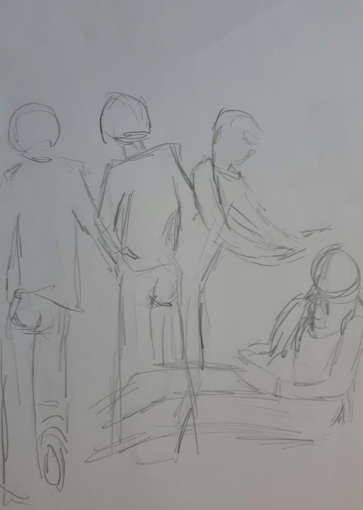
Exercise 2 Three figure drawings
Using different tools, materials and supports, work on three drawings of your model.
Standing
I was lucky to have a live model so I after a couple of quick sketches with pencil I was able to spend a longer time to draw him. The proportion looks good to me except the left upper arm.
Seated
This time with colour
For the seated figure I had to use a photo. I used charcoal pencil and sanguine. The head is small a bit but the rest more or less is all right.
Lounging
For this exercise I was gonna use a different model because there were other opportunities and most of the time he is the only one to choose. I made sketches with pencil and pen but I did not like to outcome so I got back to my original plan and drew him.
This drawing was not really successful and a bit overworked, too. The hands are too small and the right arm is very out of proportion.
Project 5 The moving figure
Exercise 1 Single moving figure
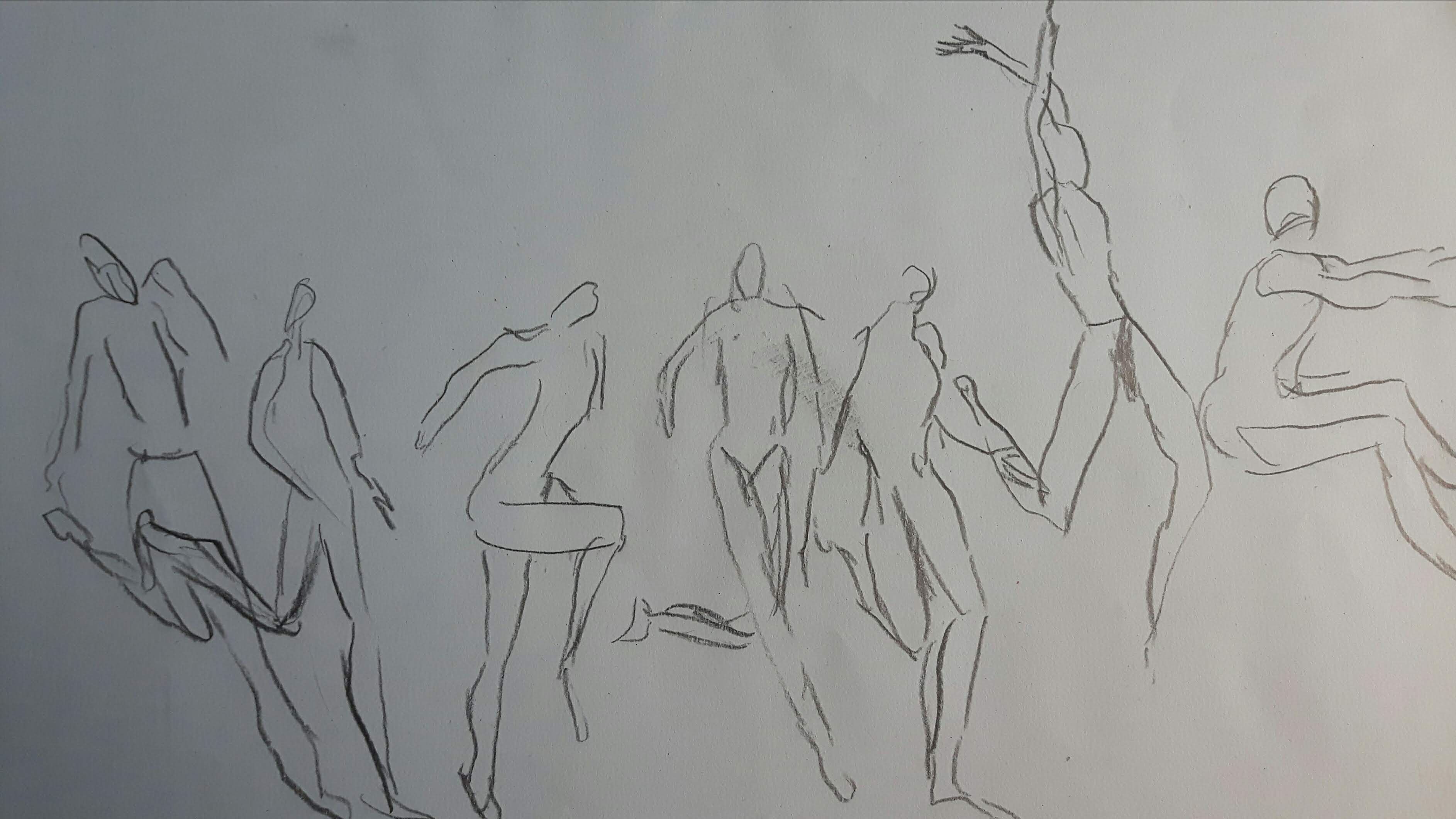
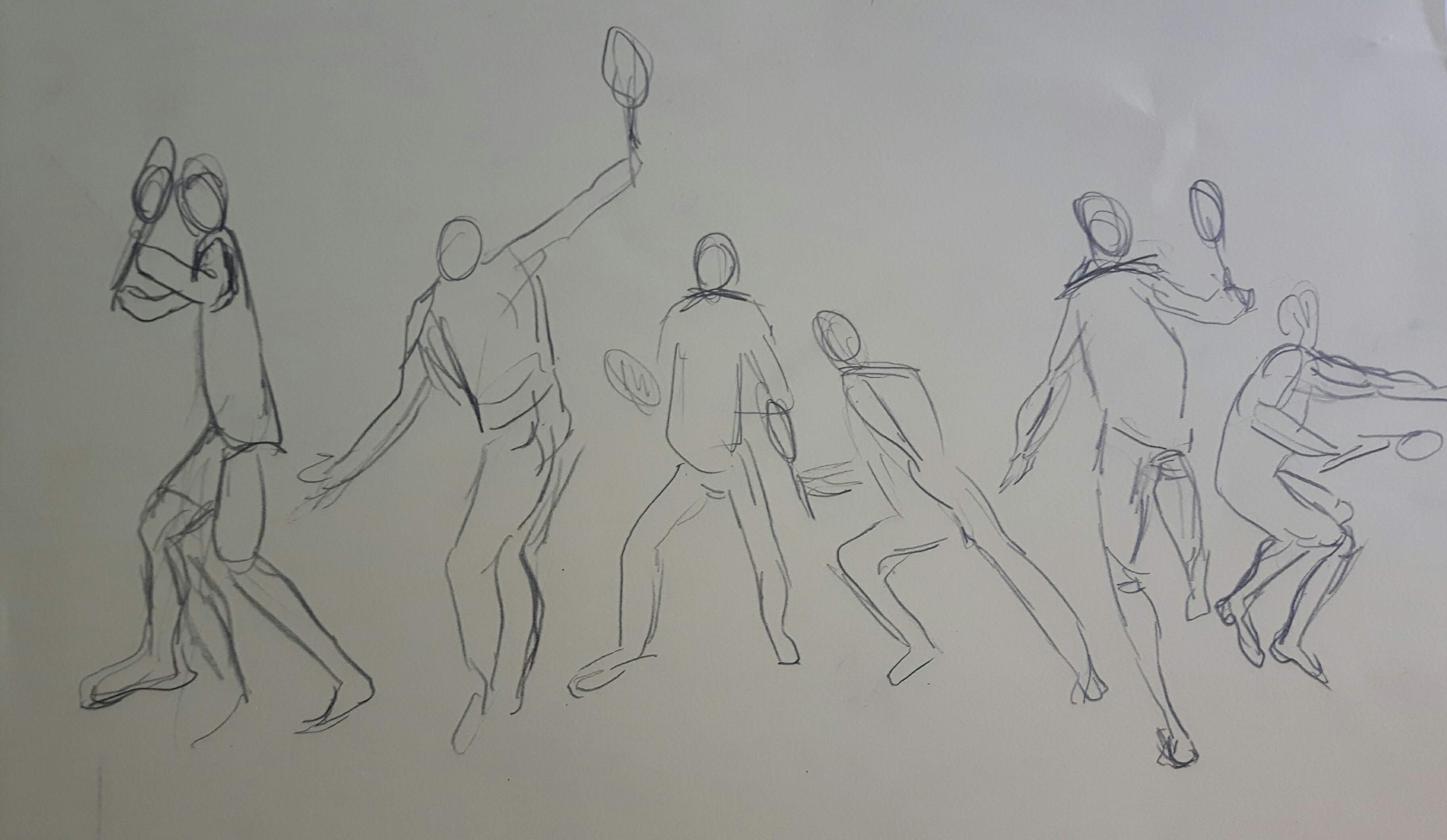
Keep drawing moving figures in your sketchbooks. For this exercise I thought the best would be to watch sportsmen or dancers. I found some useful videos on YouTube. I was not accurate at all, tried to scribble small segments of a flowing movement.
Long jumpTennis
Dance
With some of them I think I managed to create the sense of a moving figure. I went back to the previous exercise about dynamic position to compare and I could see the difference probably because drawing quickly – avoiding to work on details – really helped to express the energetic movement.
Exercise 2 Group of figures
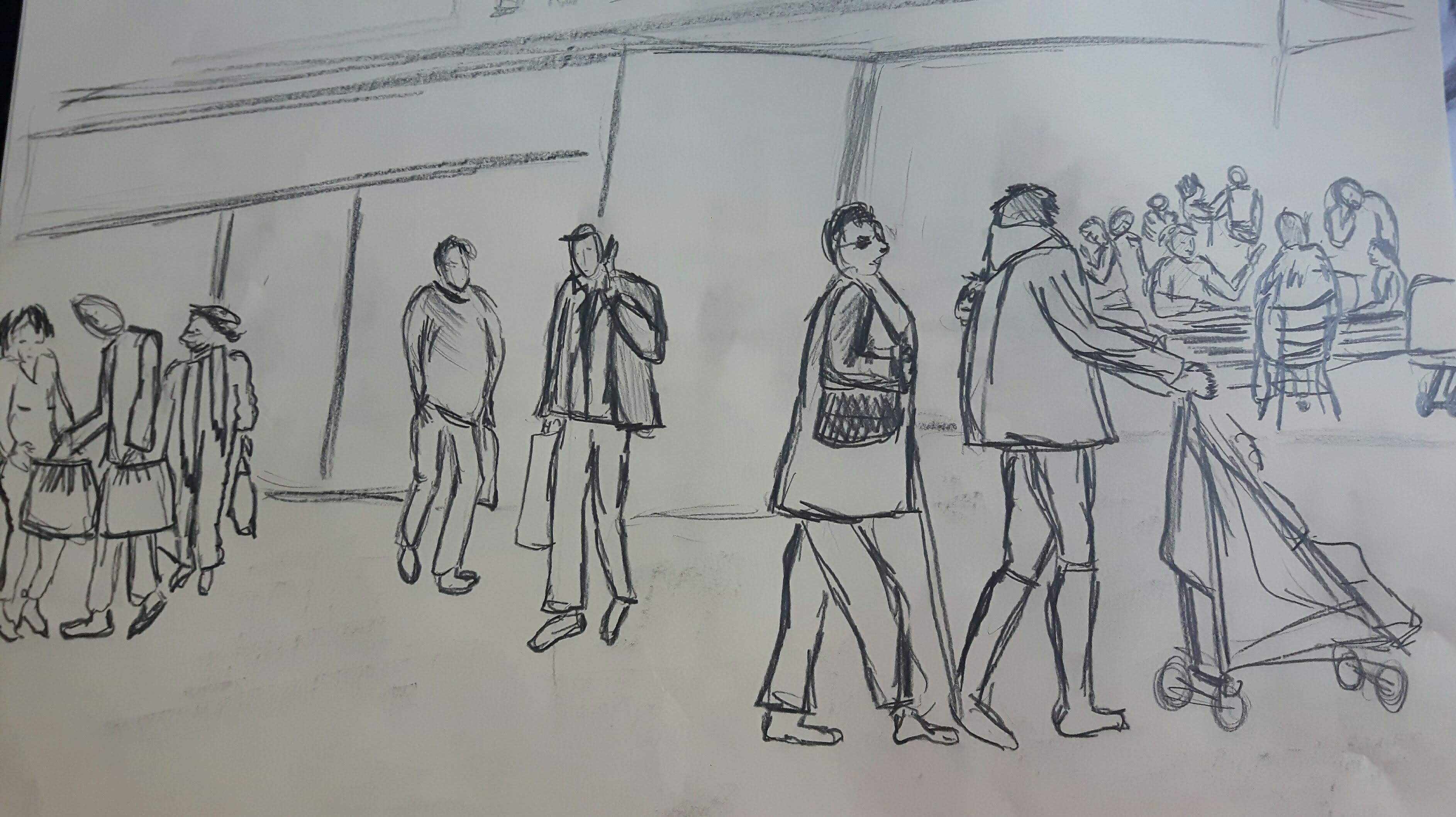
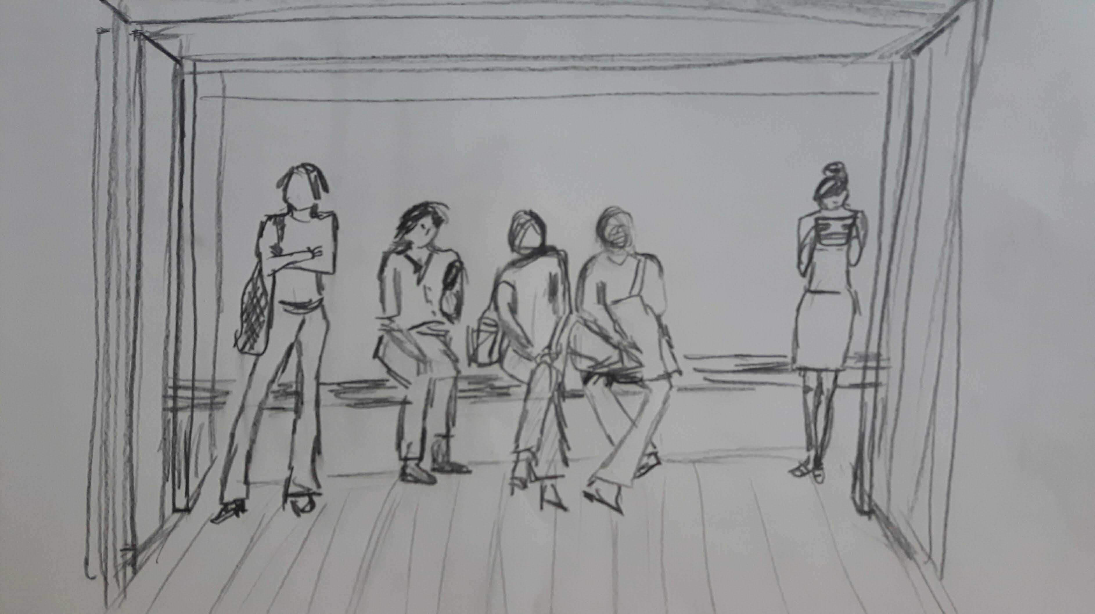
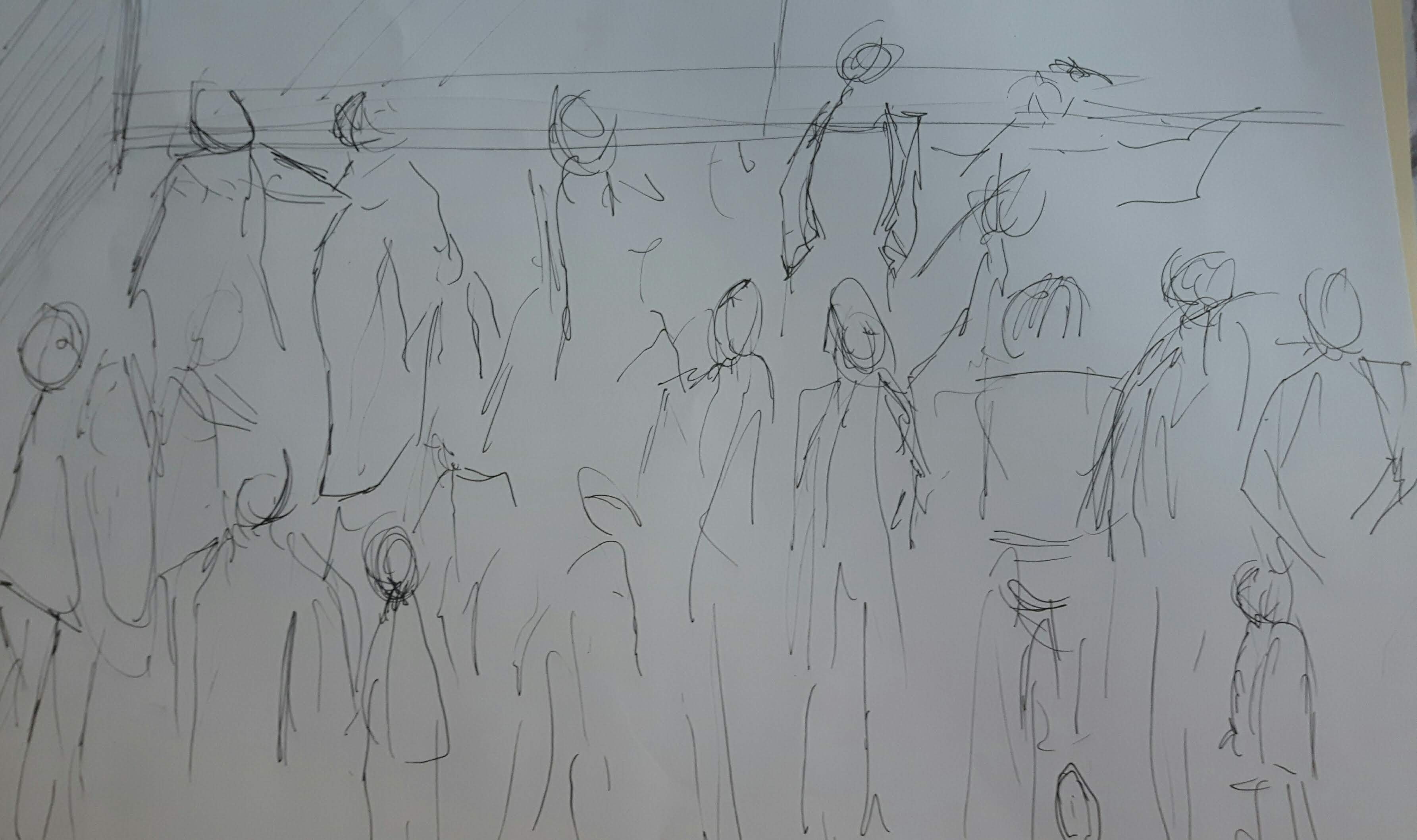
For this exercise I picked a busy supermarket and a bus stop. I did the first two from photos and the third from a video.
1.2.3.
The difference is evident. While you can see the pictures of busy places on the first and second, on the third one I can feel the crowd therefore that is much more convincing to me. (However, I spent less time to draw it.)
Project 6 The head
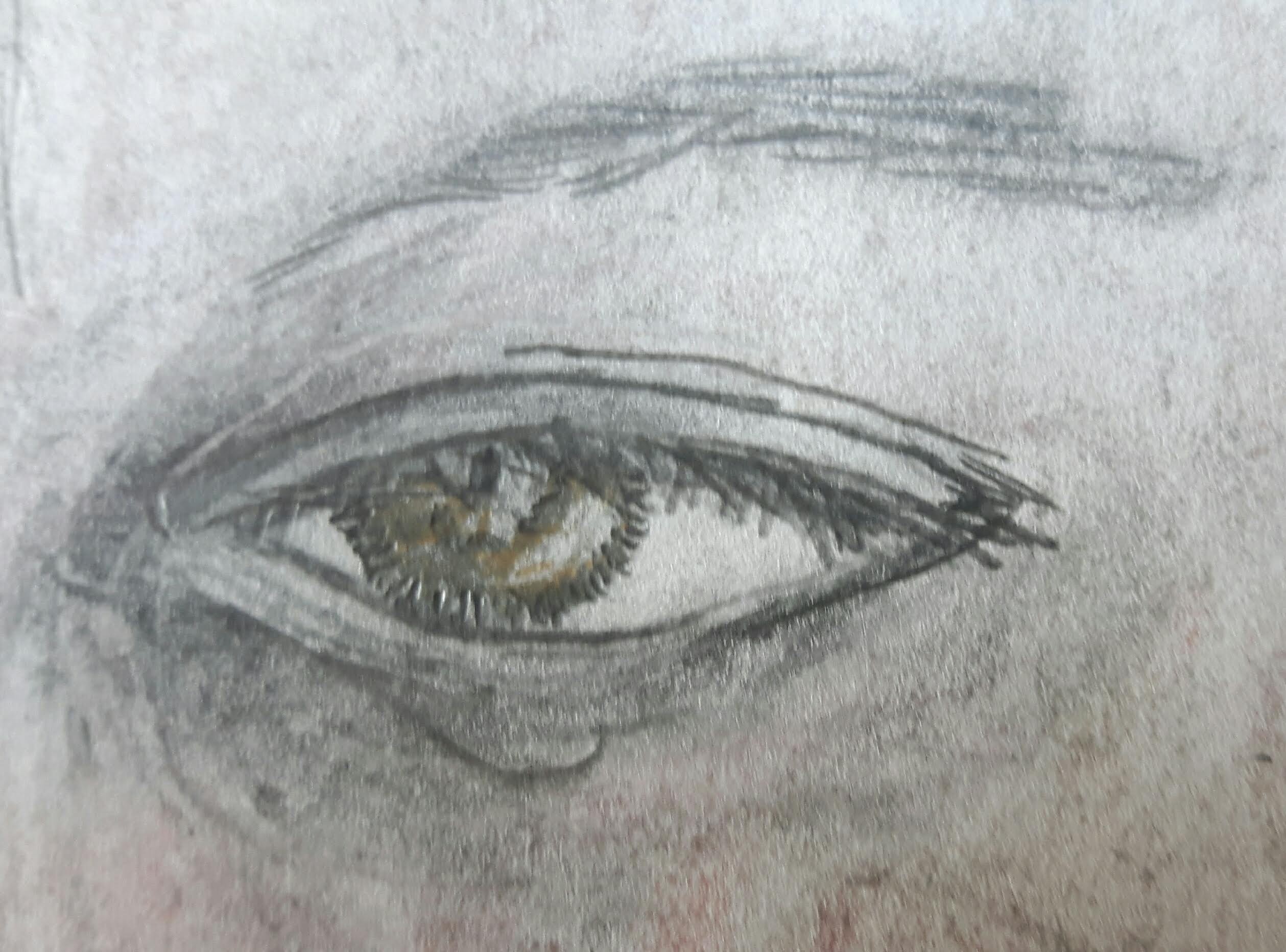
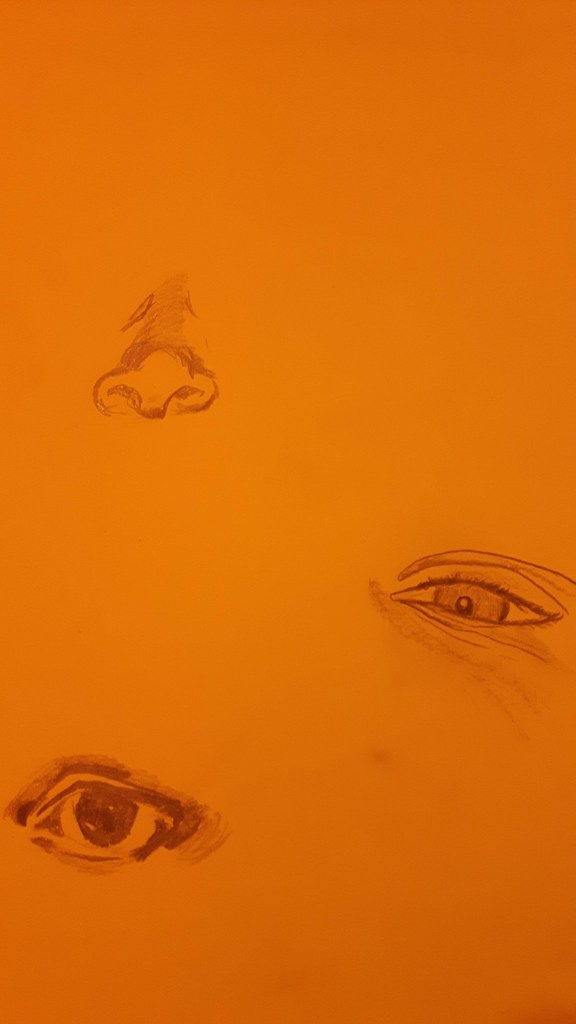
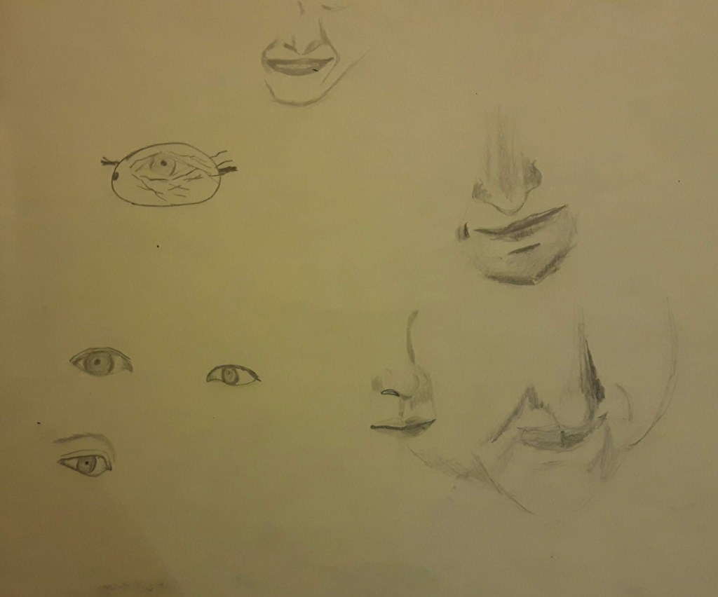
Exercise 1 Facial features
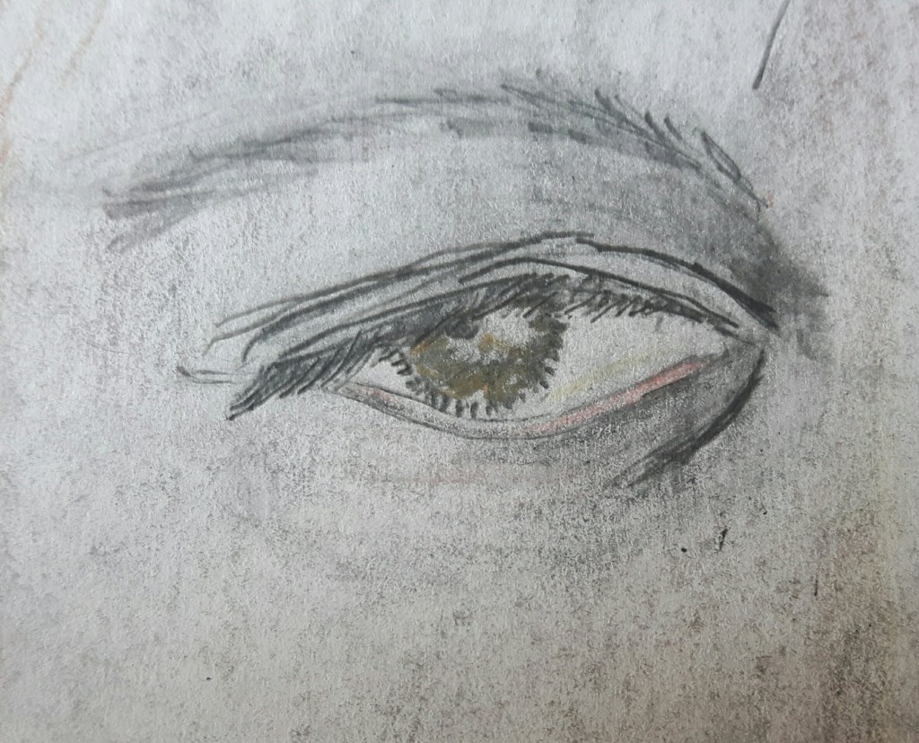
Somehow I always enjoyed to draw anything else (except landscape) than head. Surprisingly by the end of this exercise I felt I would like to do more – especially eyes.
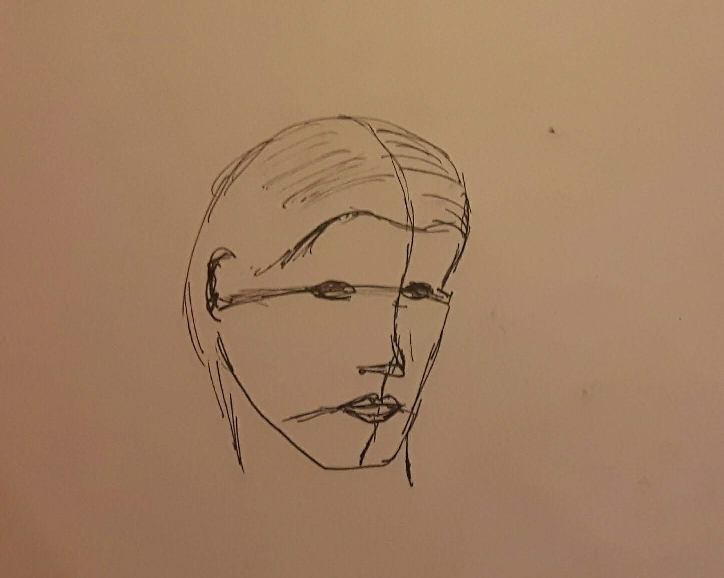
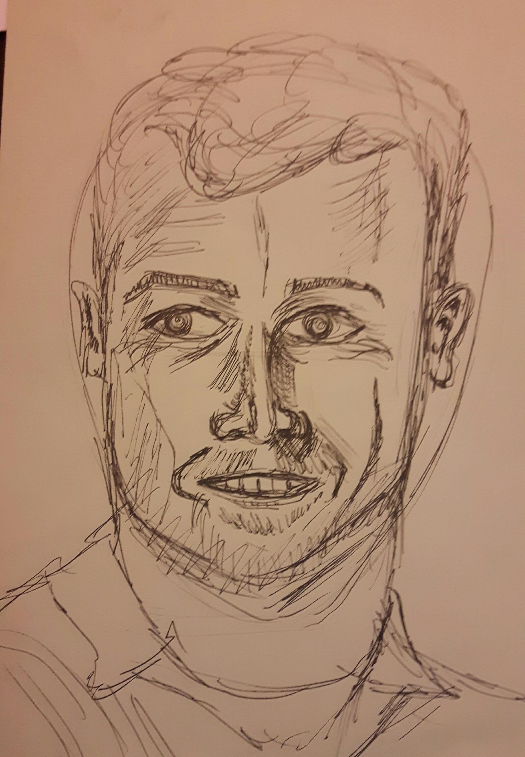
And finally the head I attempted to draw. I used pen to avoid the urge to erase the mistakes.
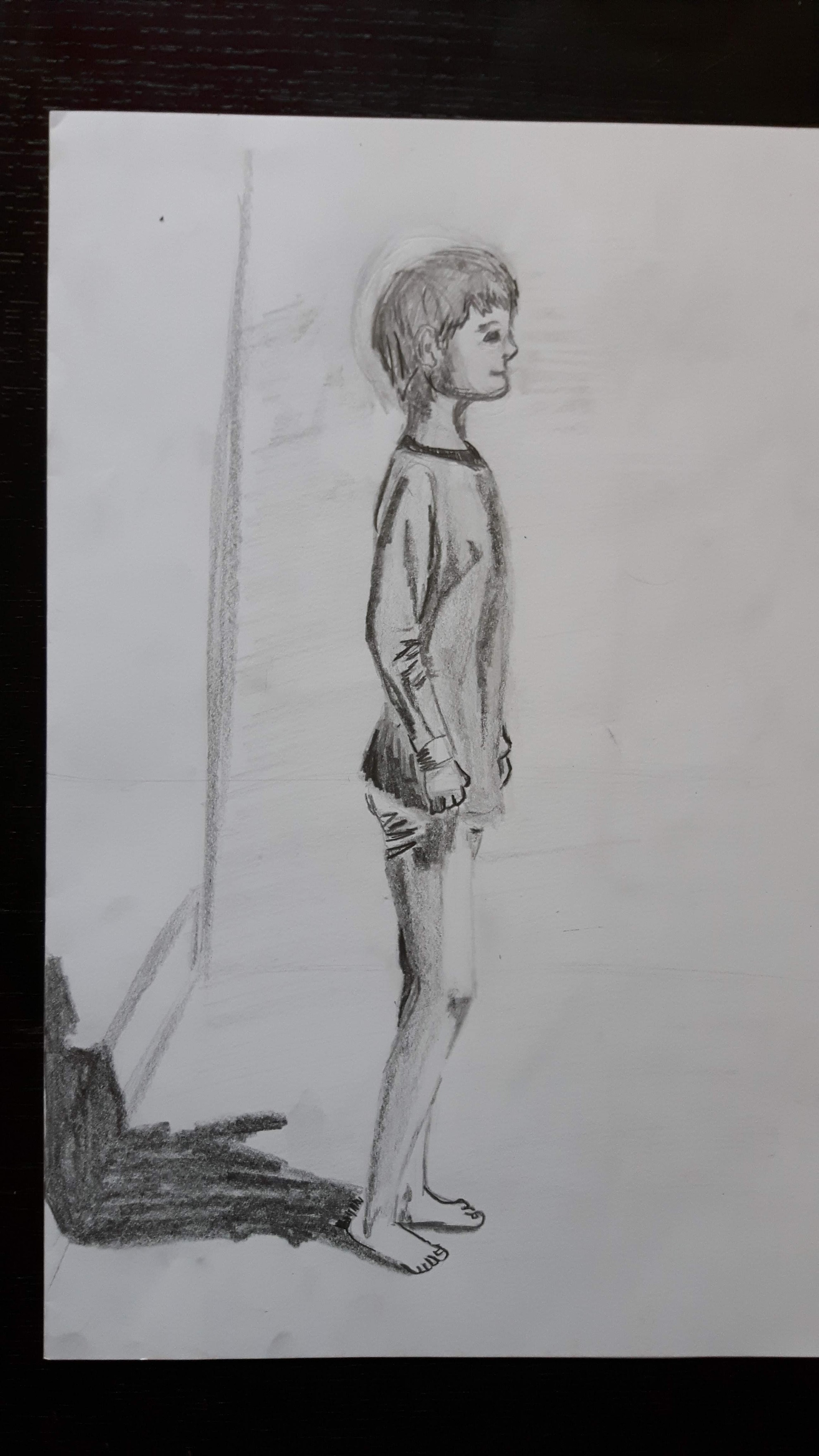
Exercise 2 Your own head
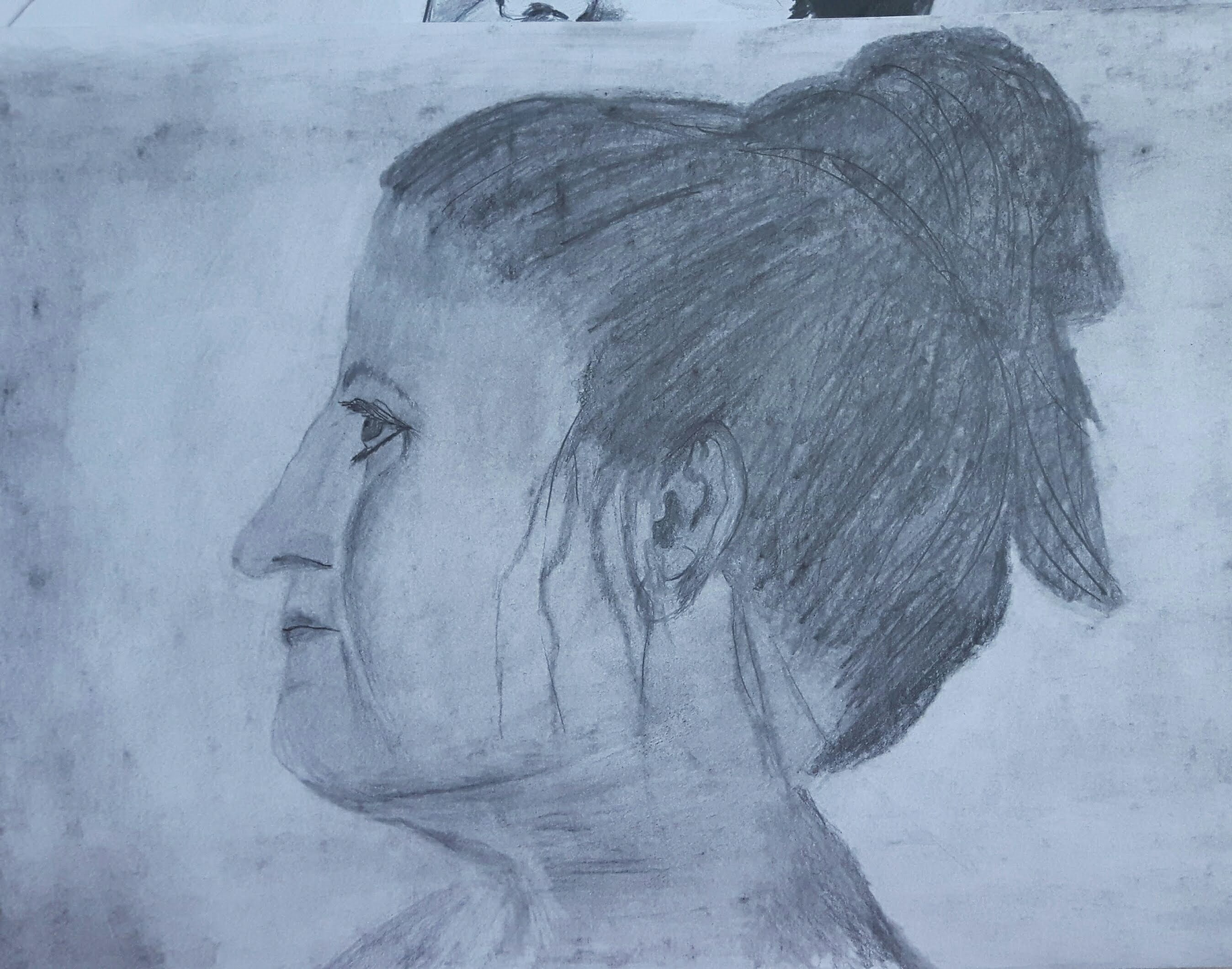
After a couple of quick sketches I decided to draw my profile. I used HB-3B pencils.
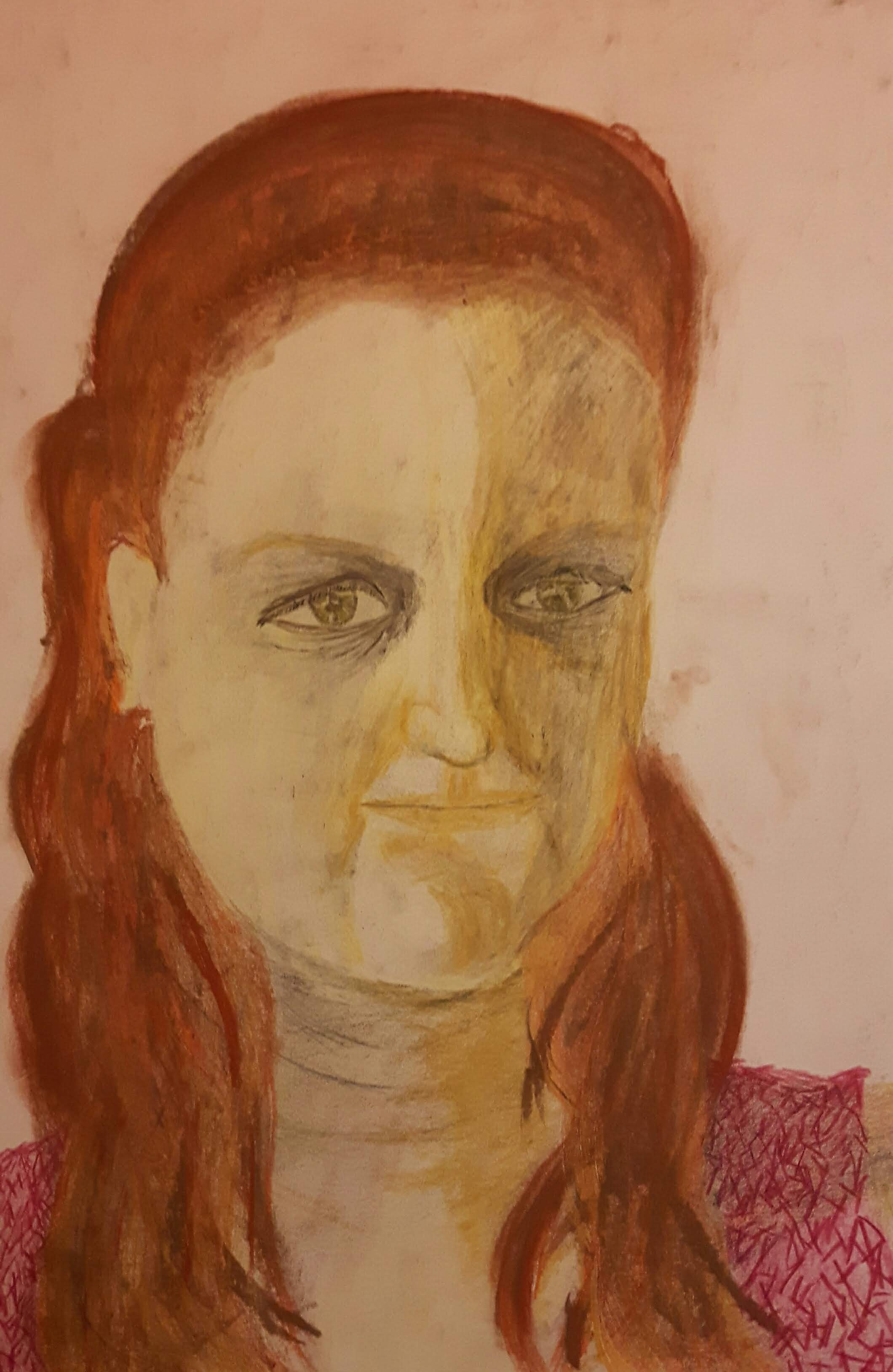
To my biggest surprise the picture actually bears a resemblance to me although my son said he never saw me that serious…I am happy with it, probably I could have emphasized dark shadows more, the image looks a bit flat. For the second image I got brave and tried to do something completely different. I decided to experiment with colours – inspired by a very useful book recommended by my tutor. Unfortunately it went utterly wrong so I just have to learn from it.
The image does not look like me at all but probably that’s the smallest problem among others. The nose is too small and the face looks distorted a bit because I look slightly to one side but the lips looks drawn from a different perspective.
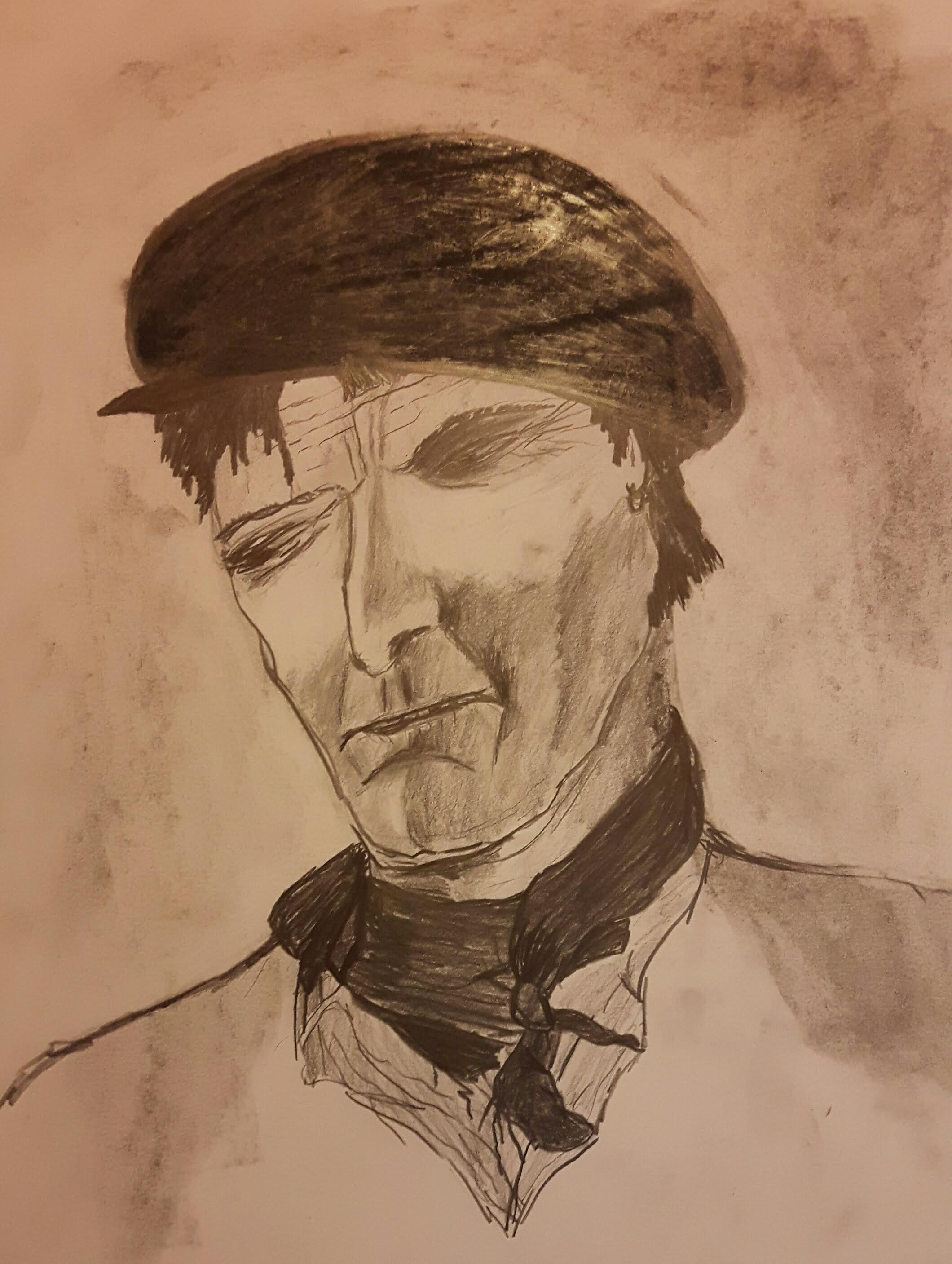
Exercise 3 Portrait from memory or the imagination
I wanted to draw someone to use my imagination. I had to find an interesting character so I thought I would pick someone from Oliver Twist. (my very first thought was Heathcliff from Emily Bronte but I recently watched The wuthering heights with a very talented actor and I didn’t want any picture to influence me) Luckily I have never seen any Oliver Twist adaptation so I choose Bill Sikes.
How I see Bill
I see him as a lost, bitter and angry man with dirty handkerchief about the neck, greasy dark hair (cut by knife), stubbly face with an oily, old flat cap on his head. After I finished I checked the images of him online and for my true delight there was no resemblance at all. They usually picturing him more gentleman-like.
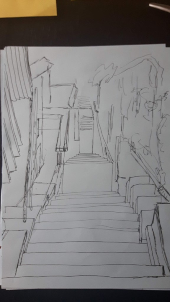
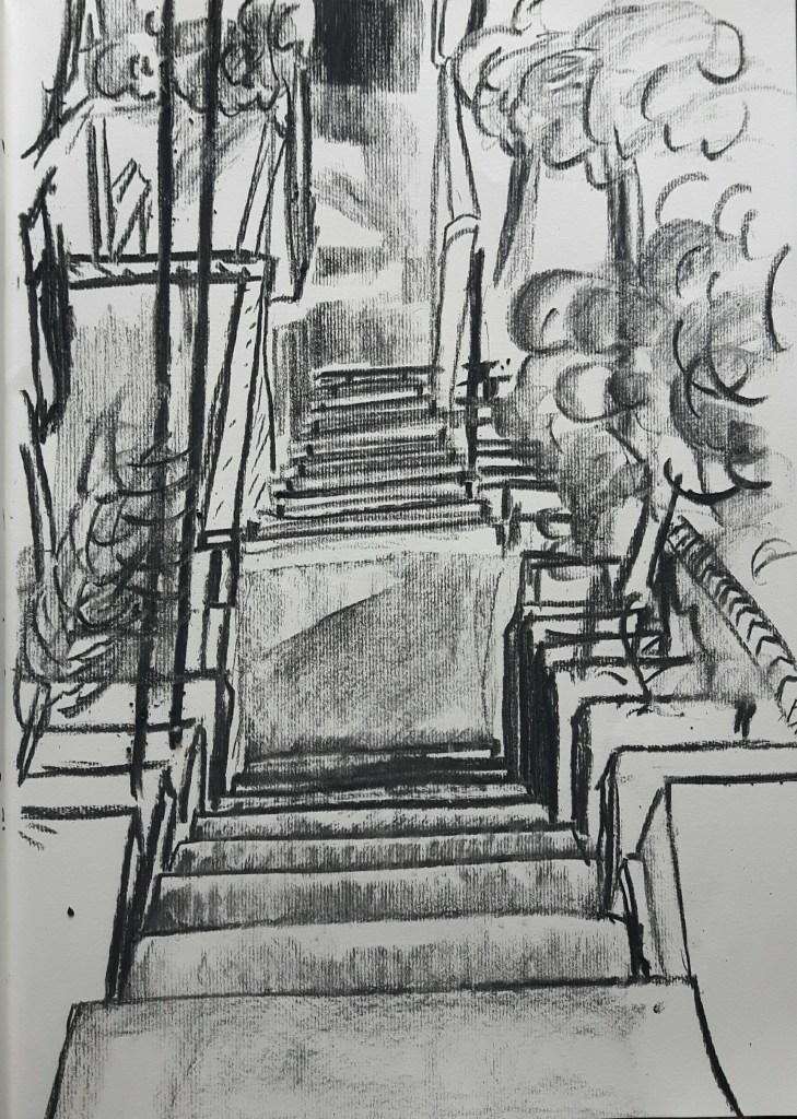
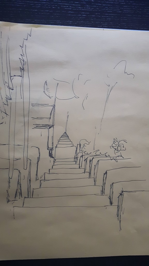
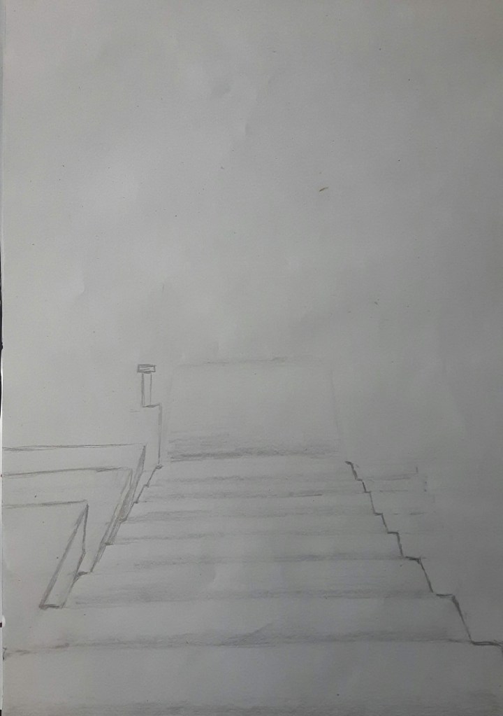
Draw an outdoor scene of your choice. Try to find a view that has some demonstrable depth to it. Spend anything up to two hours on this final drawing. I tried different ideas before I found the one I wanted.
I decided to pick one of my photos from Dalmatian Coast with steep stairs running down to the sea. My first sketches made with different media, charcoal, pen and HB-2B pencil.
For a final piece I decided to use 2B-4B pencils and coloured pencils.
Demonstration of technical and visual skills: I think I chose a really interesting and strong composition, these stairs really work well to give this drawing a sense of depth. I also assume my observation skills seem to be improved since I started. However, I struggled a lot with this part of the unit, especially the landscape bit. I’m still using traditional medium, a bit slow to try new things but I’m working on it.
Quality of outcome: I played by the rules finishing this drawing just under two hours as was advised but – probably I should have done some more preliminary work – I couldn’t get some of the details and colours how I wanted originally. Also I need to put more notes about my challenges, thoughts and ideas, I know..
Demonstration of creativity: More experiments and introducing more techniques and practising, practising and practising.
Context reflection: I love research. I love to discover, to try out, to be amazed. I do not really like to write about it though, that part needs to be improved because it is noticeably inspiring and helpful to make my critical thinking better.
Use your reading list and other sources to find contemporary artist who work with landscape and a range of viewpoints and compare their approaches with those of earlier artist.
Tacita Dean is a British visual artists who lives and works in Berlin. She is best known for her work in 16 mm film, photography and drawing. Her series of six multi-panel blackboard drawings ‘Fatigues’ from 2012 showing the peaks of magnificent mountains of Afganistan.
Georges Seurat was a French post-Impressionist painter. He developed pointillism technique with Paul Signac. His drawing ‘Landscape with houses’ from 1881 was made with conte crayon.
For me, the most obvious difference sits in the feelings awakened due to different technics and medium. The realistic, sharp contrast of black and white on Dean’s picture giving a sense of keeping distance from a viewer, quite cold and Seurat’s drawing kind of warmly luring us closer to the houses like you are in a dream – so much more intimate – as a result of his chosen technique.
The other significant difference is between the choice of the subject: natural and man-made.
Both artist used black and white only, the foregrounds remained black on both pictures, however on Dean’s image the black sky contrasts the white mountains and on the second one the sky is rather light-toned.
As mentioned above, both are monochromic and very still. The presence of houses normally indicate a sign of human or any life but to me both of them seem to be uninhabited places.
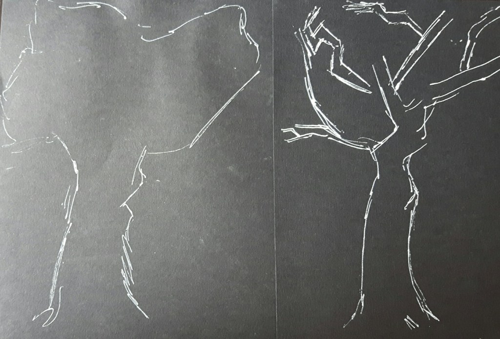
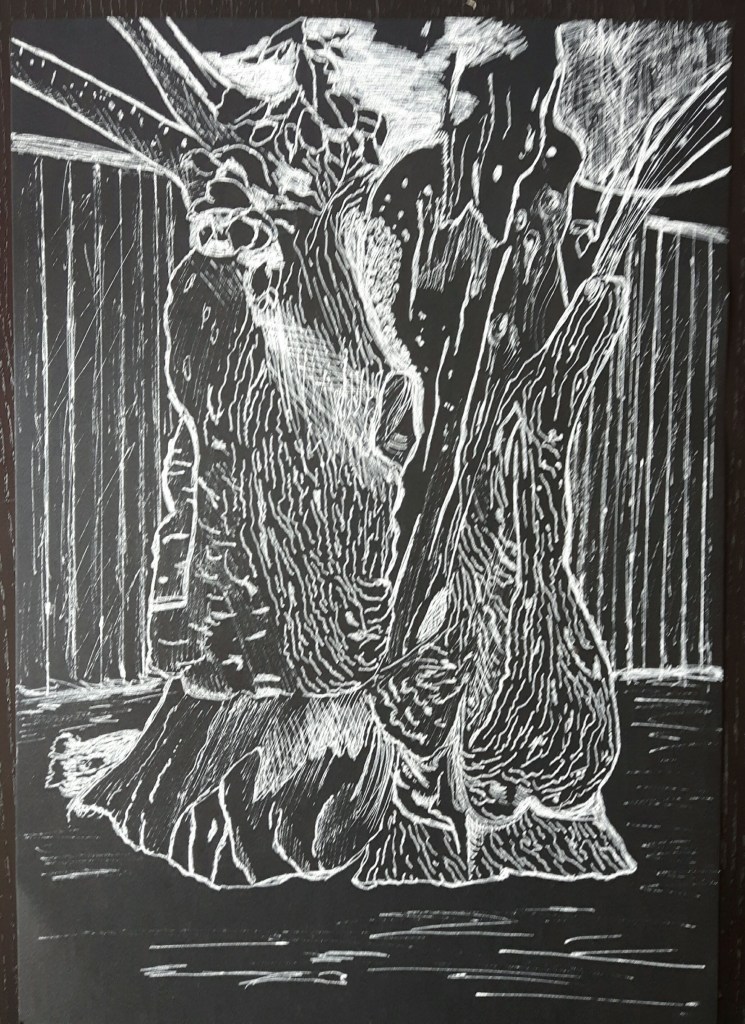
For this exercise I started with some very simplified sketches with white fine pen on black paper.
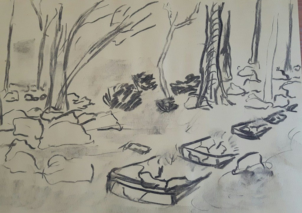
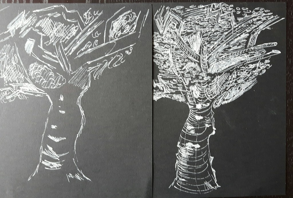
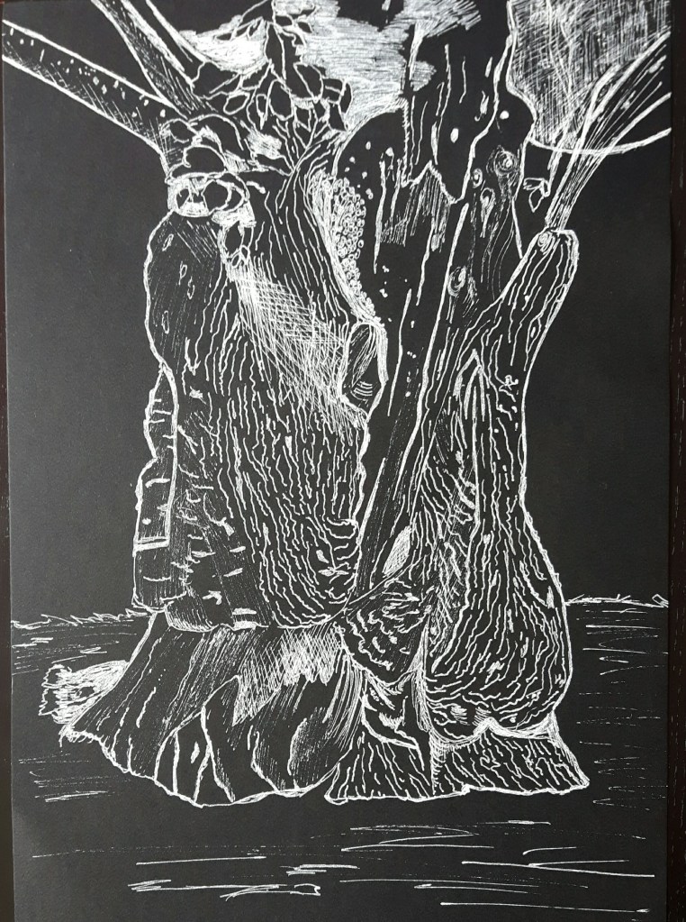
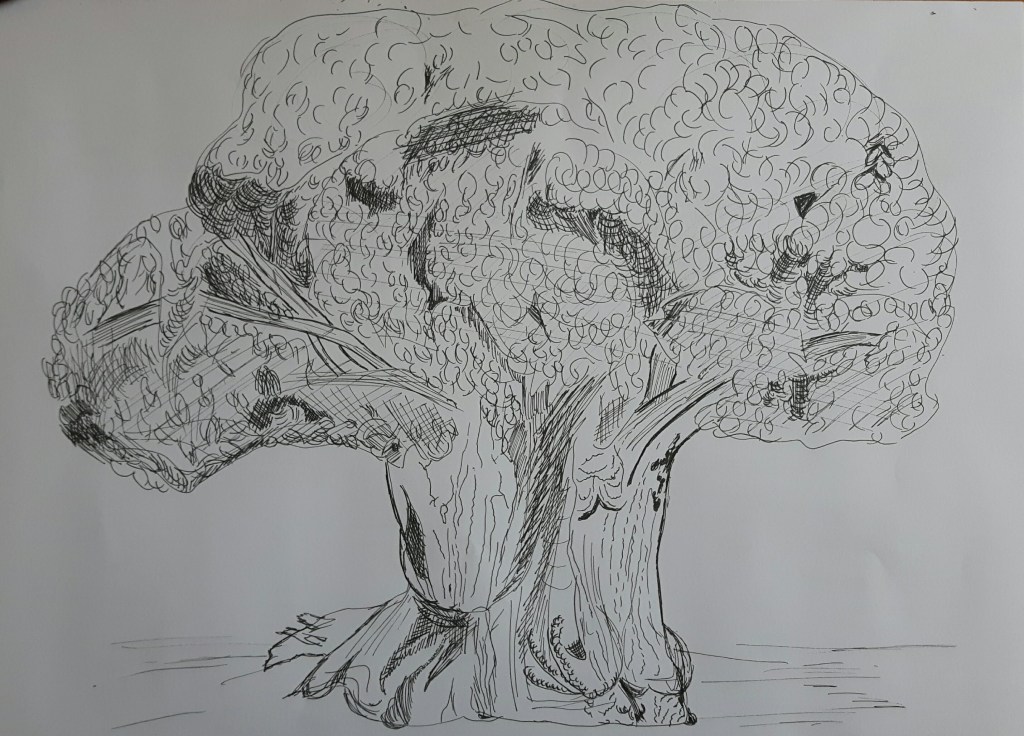
Larger observational study of an individual tree
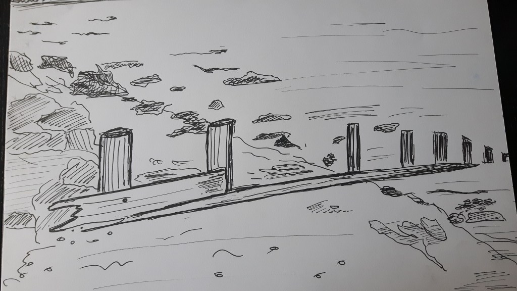
I found several trees interest me to draw and decided to use fine drawing pen which really helped with the small details. However, on this first drawing the tree trunk seemed to disappear after drawing the fence part.
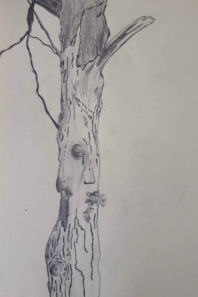
I had to draw the next one from a photo due to this challenging weather and to be honest that applies for most of my drawings in the “Expanse” part for the same sad reason. Luckily I have plenty of pictures of parks, forests and landscapes to choose from. The first was an interesting piece to draw, the second one is a larger tree I tried to add shades with splashing water on the paper with not much success.
Study of several trees
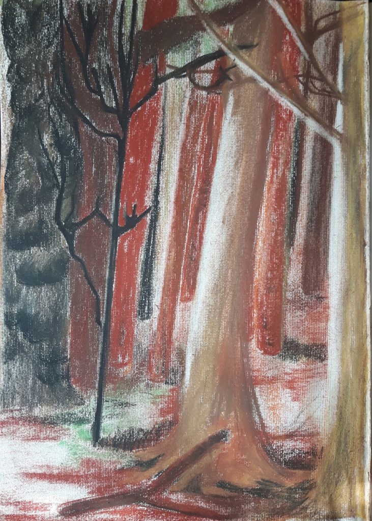
In this exercise I have to work on a group of trees focusing on perspective, lights and introducing colours. I mapped the contours with pencil then worked on it with hard pastel.
The trees were quite different in shape, size and colour so it was easy to distinguish them by capturing the difference of silhouettes. The picture is rather blurry with no detailed leaves, unfortunately the part I drew did not have any to show so there is only a hint of green represents the foliage between the branches. I indicated the fall of light with making marks with soft rubber. There was not much to simplify since the possibly “mass” part of the picture – the leaves/foliage – was almost completely missing. I definitely could have gone for a better scene that includes the top of the trees as well.
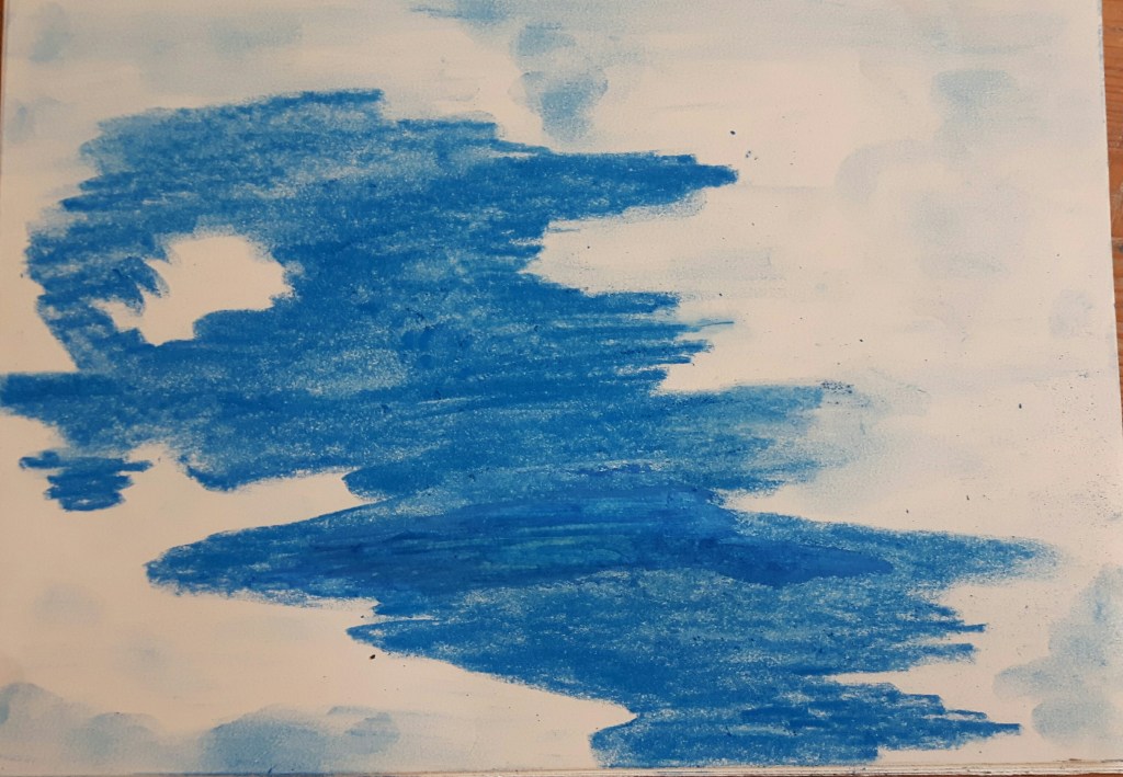
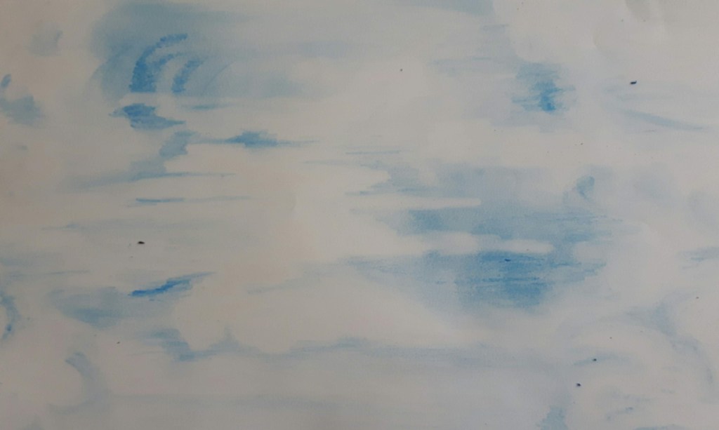
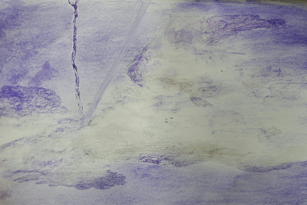
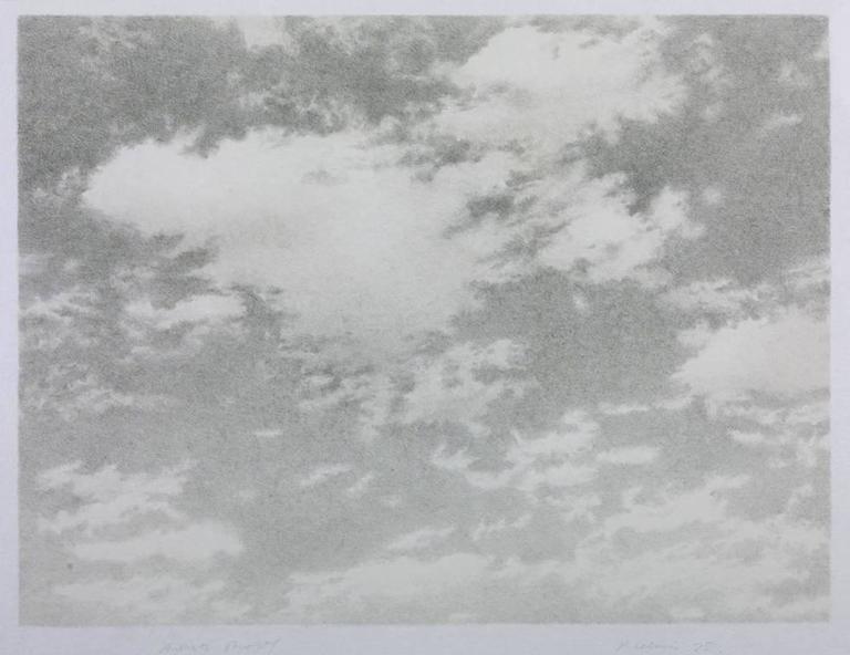
Landscape Exercise 1. Cloud formations and tone
In this exercise I focus on drawing clouds using different tonal media. I used watercolours, crayons, oil pastels. After watching the video of Vija Celmins, I tried to capture the moment only, otherwise that exercise would have been a bit overwhelming.
Research point Landscape
Landscape paintings became really popular through the 18th century following two models: the classical and the Dutch. Many subgenres developed, mostly scenes from villages, farms and woodlands. Richard Wilson – who is known “the father of British landscape” – with Thomas Gainsborough reawakened the landscape genre. The 19th century called the golden age in landscape painting through Europe.
John Constable (1776-1837) was an English landscape painter in the naturalistic tradition. His usual subjects were scenes of daily life, his exceptional sensitivity to beauty is shining through all his paintings.
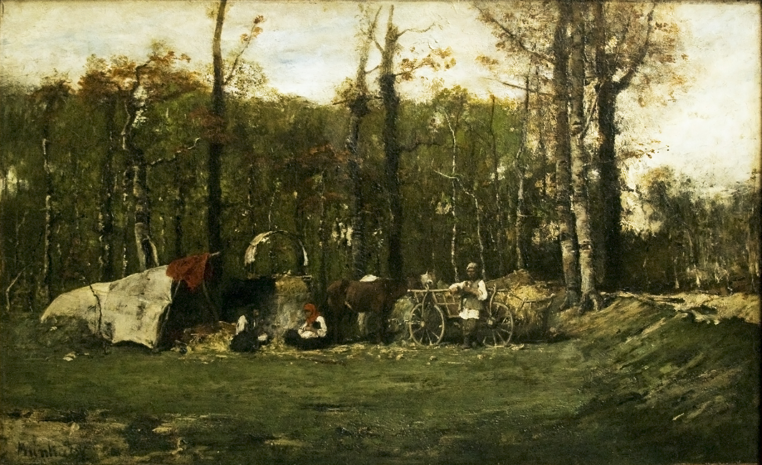
Mihaly Munkacsy (1844-1900) was a Hungarian painter mostly known for his biblical paintings but also had a passion to paint ordinary scenes from peasants/gipsies daily life. His work were always rated highly by critics in his time.
Gipsy Camp
Moving forward into the 20th century landscape genre radically changed, more experimental ways instead of using traditional media and changing the approach with bringing more urban and industrial scenes into it. This century is also bringing great diversity in relationship to the genre from Dora Carrington’s mystical, delicate pictures (Spanish Landscape with Mountains) through Jan Sluijters with a mixture of styles, expressionism and pointillism (October Sun, Laren) to science fiction inspired Simon Stalenhag’s incredible digital paintings.
Research Point: Vija Celmins
Vija Celmins is a Latvian-American visual artist best known of drawings of ocean, rocks, spiderweb and other natural objects. While watching the suggested video of hers, I immediately thought of Jerzy Kosinsky who said once that “The principals of true art is not to portray but to evoke.” This statement probably a bit controversial about an artist who mastered photo-realistic style in her work but she is capturing the essence of the subject – for example one still moment in the continuously splashing ocean or moving clouds – and she makes that precisely caught moment yours forever.
Clouds
Exercise 2 Sketchbook walk
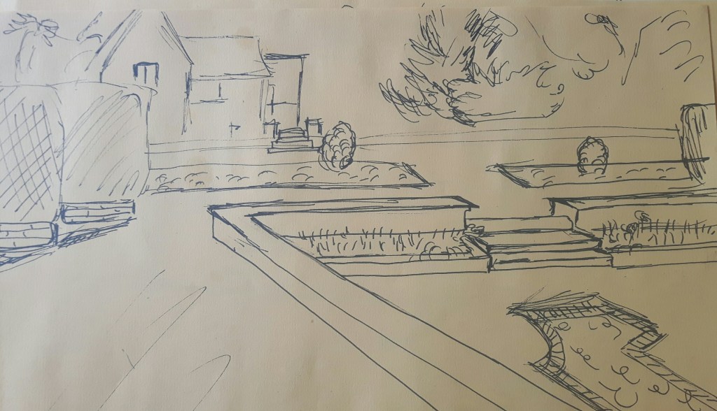
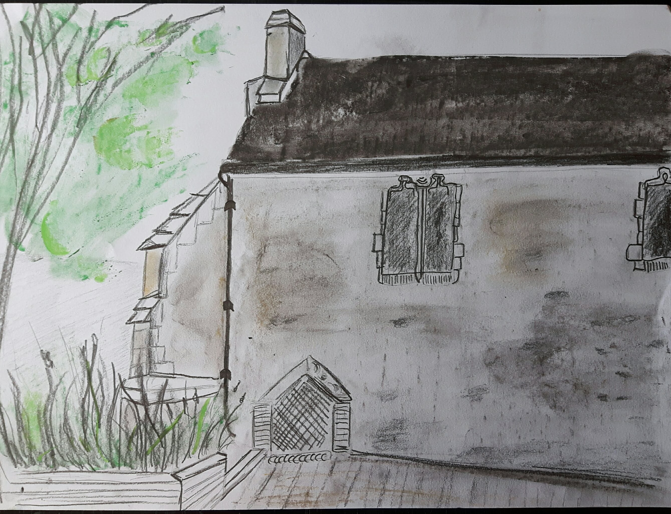
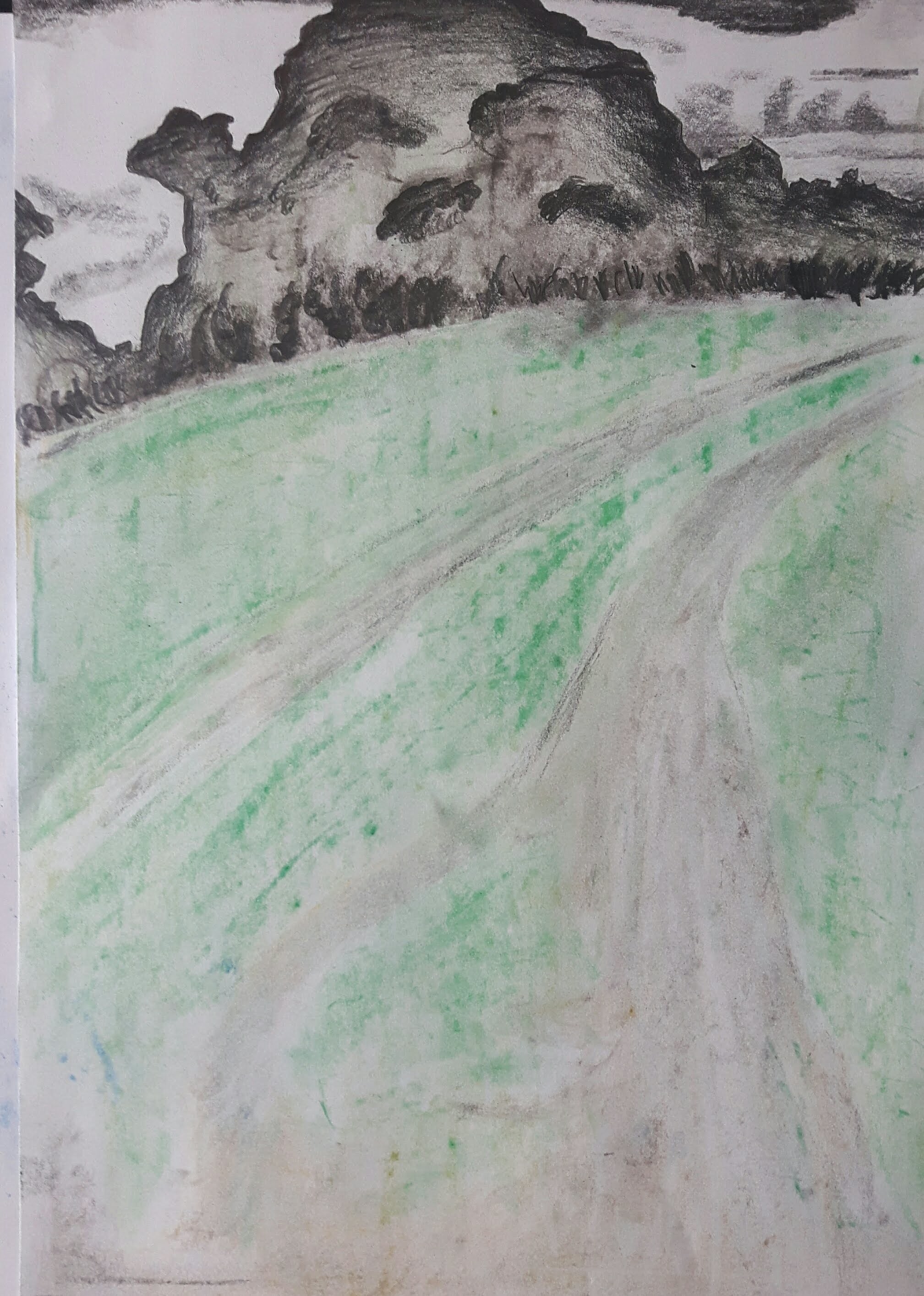
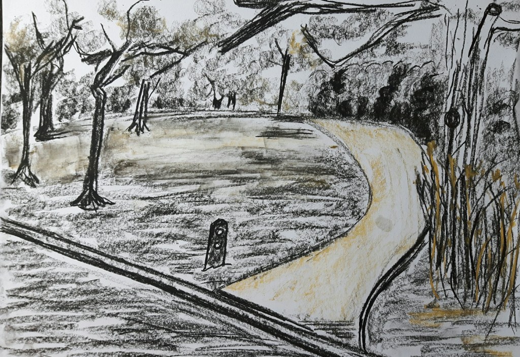
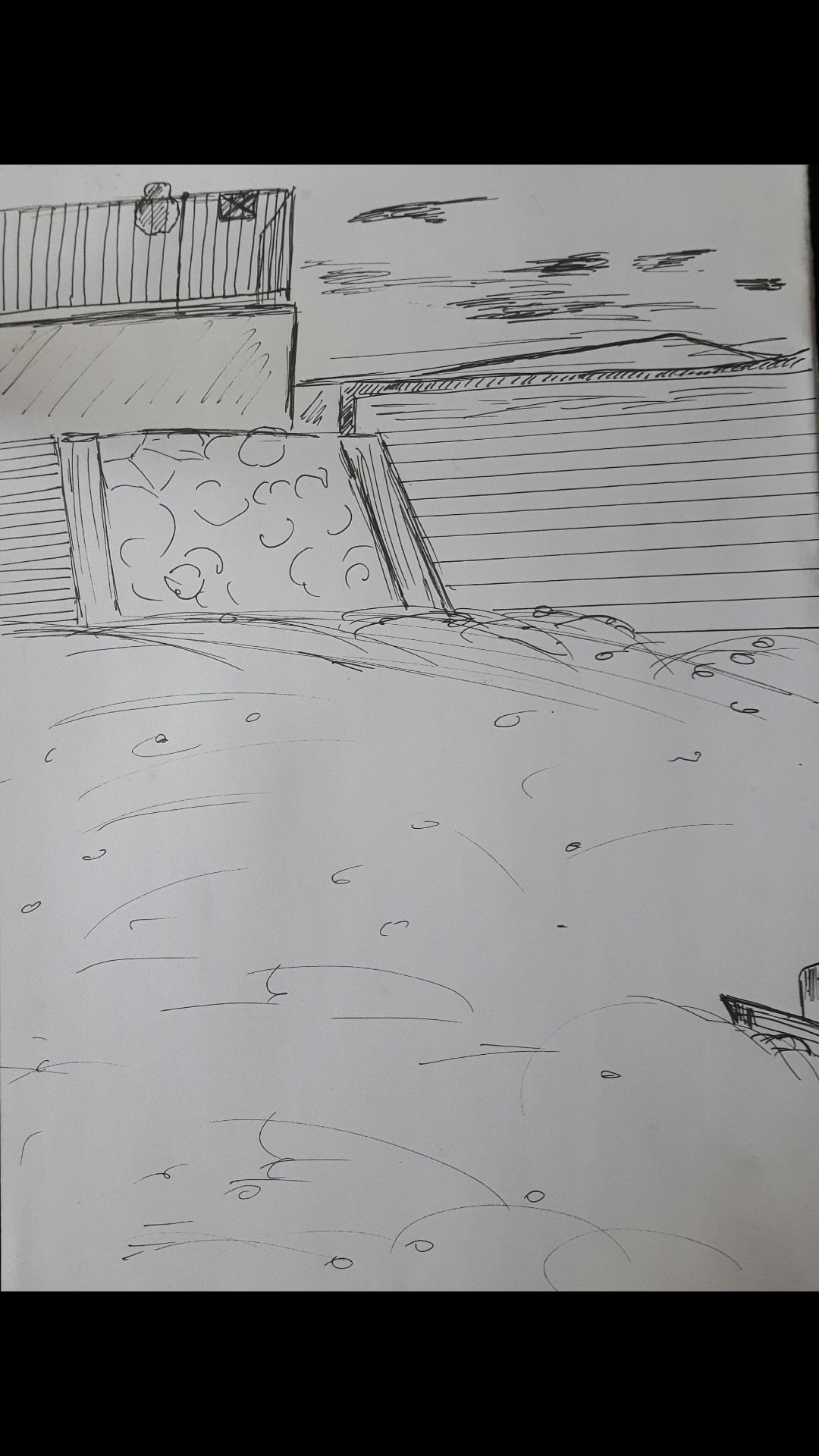
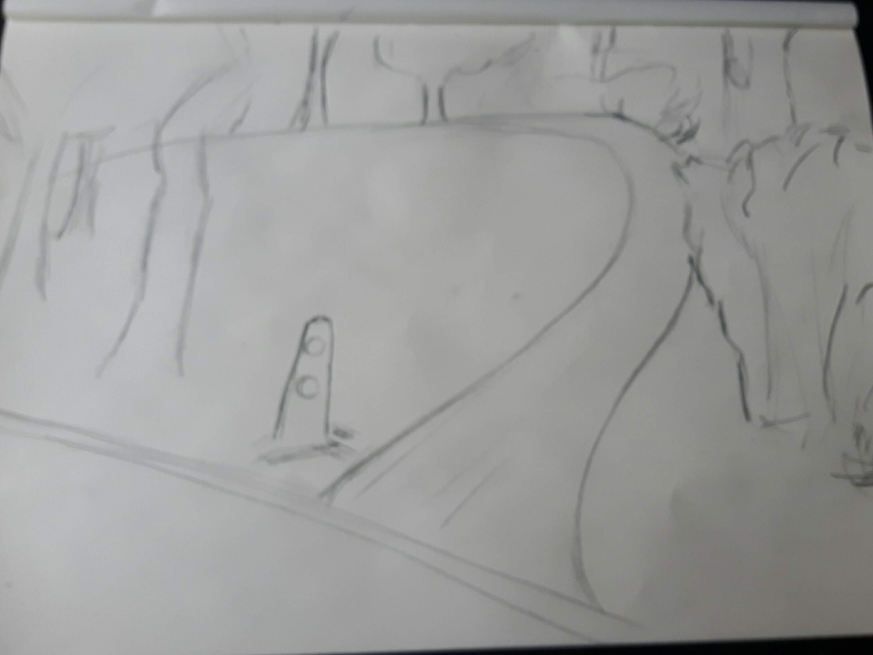
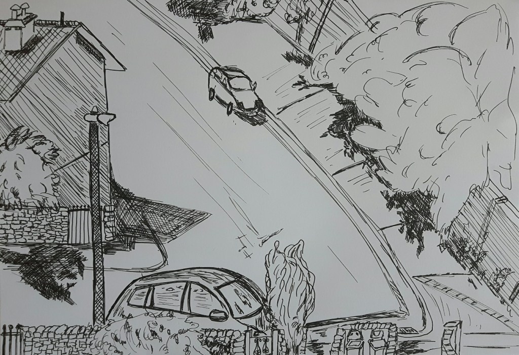
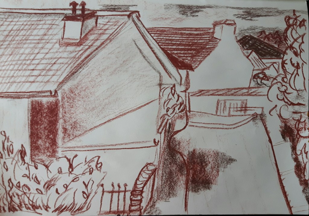
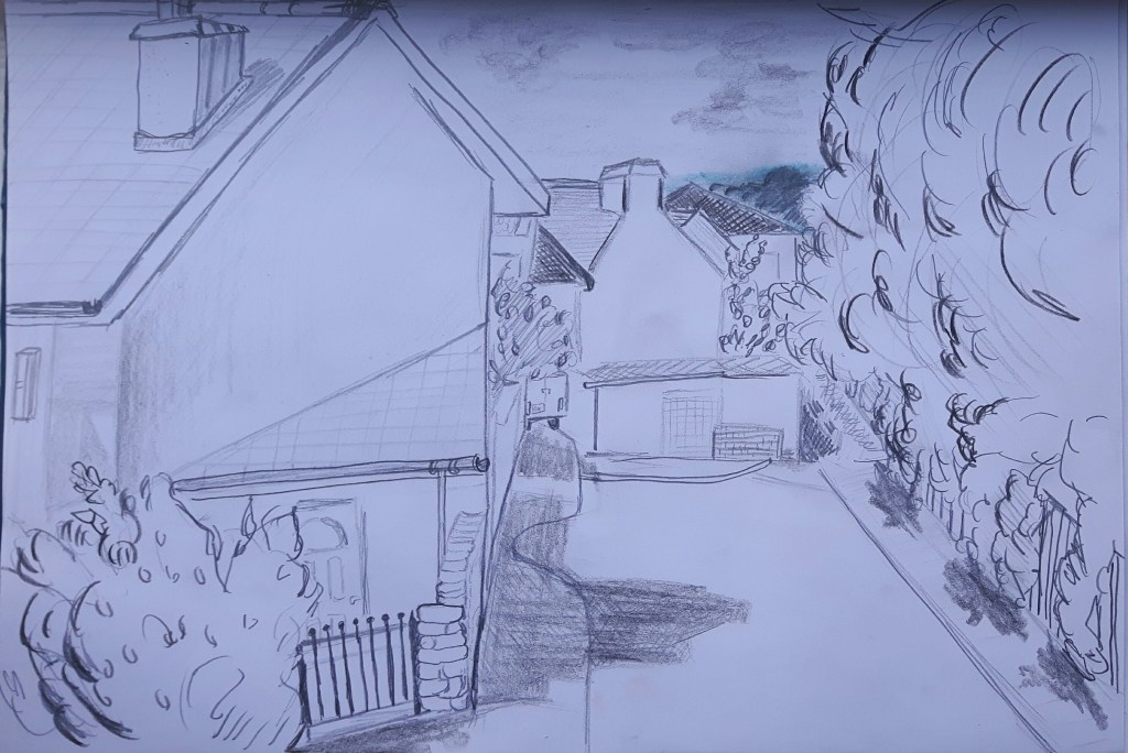
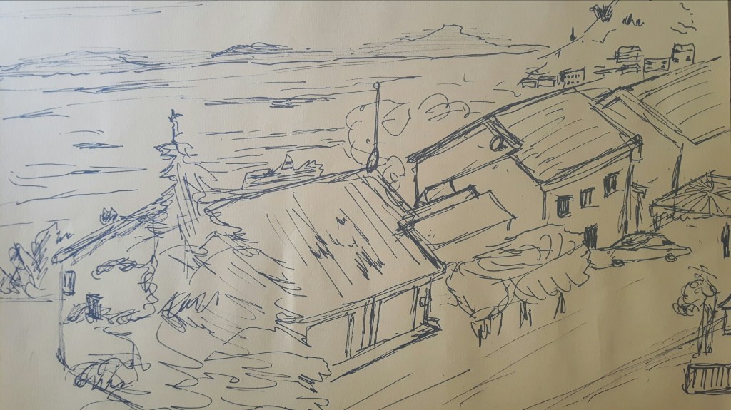
I recently visited a beautiful park where I was stunned by the view so I used that experience for this exercise. The first drawing is a little cottage, the second one is a small road leading to a forest, the third one is another path in the park.
The cottage above was quite old, also this sketch lacks a bit of depth. The small bushes next to the path were almost black on the second one as dusk came soon and that time of a day the background had a sharp silhouette that I could not really catch well but didn’t want to rub out. On the third one, the light comes from left what I tried to indicate with yellowish smear marks on the ground. The fourth one..well, I know that is a bit far from the original exercise (also a bit overworked for this part) but she was there and that was an offer I can’t refuse…
Exercise 3 360° studies
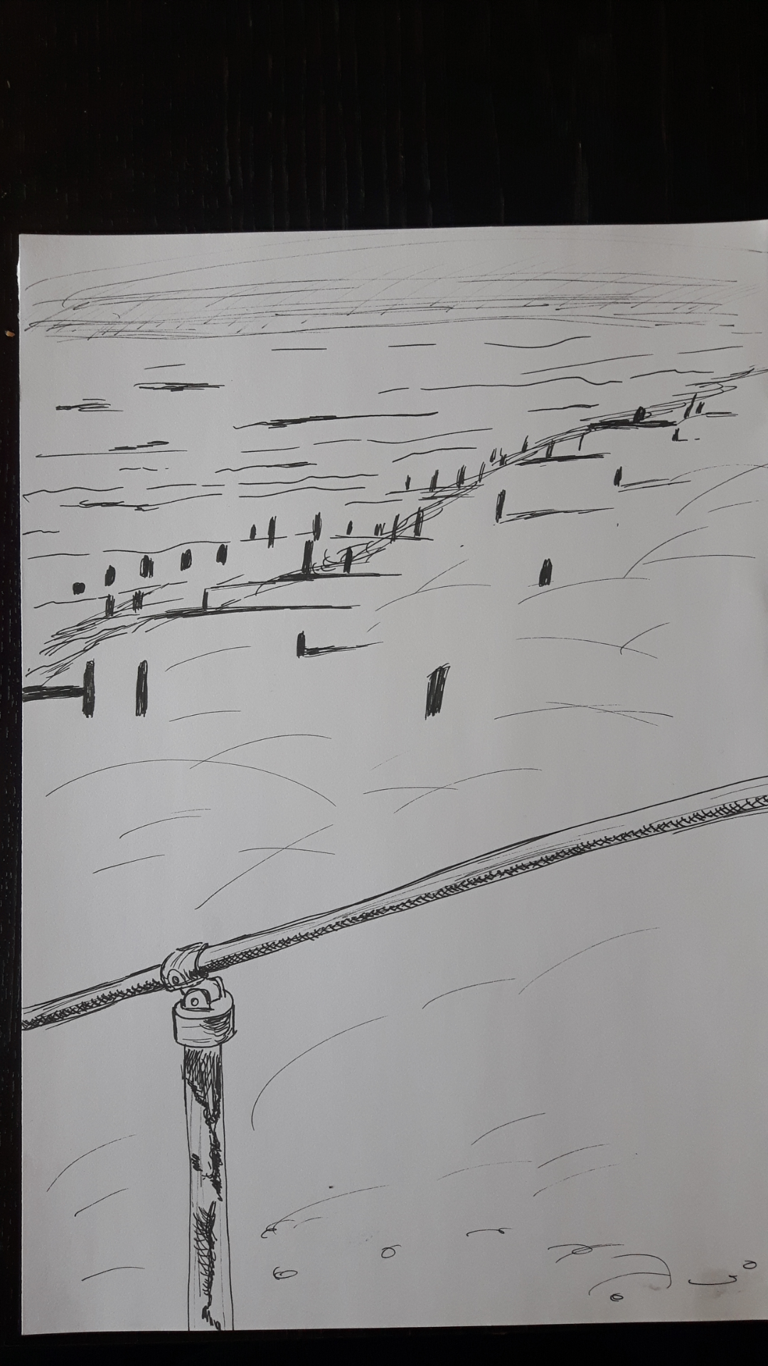
Choose an expansive landscape where you have an open view in all directions. I did this set of sketches when I went to the seaside. Though it seemed convenient and simple I think I struggled with that part the most.
Research Point Historic and Contemporary Artists
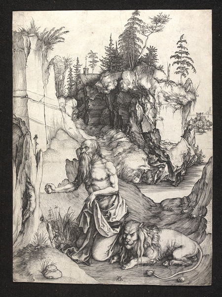
Albrecht Durer (1471-1528) he is best known for his high-quality woodcut prints, also his watercolours made him one of the first landscape painters in Europe. The “St John’s Church one of the earliest landscape paintings. To me it is a limited palette painting with brown tones and the hills at the background are less defined in bluish wash. I’m curious why the houses are so narrow on the left hand side. In the research I couldn’t find any answer, only “…this was because the artist’s focus was on details rather than on the overall effect…”
There is a series of St Jerome, those are not really landscape series, more about this biblical figure, but there is a small masterpiece, the St Jerome in Penitence where he used the subject St. Jerome in a landscape for a small picture which was inspired his travels through the Alps and his studies of cliffs around Nuremberg.
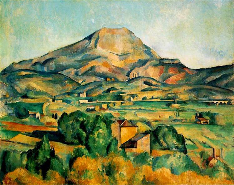
Paul Cezanne (1839-1906)
Cezanne was a French painter who had a major influence on Cubism later. Even though he worked and exhibited with famous Impressionists such as Monet and Cassatt, he didn’t consider himself an Impressionist. His landscapes were not painted in the open air, instead of impressions he focused on symbolism and substance. Cezanne preferred bright colours – especially in his landscape (Mont Sainte-Victoire series), also reduced his forms to their geometric shapes.
Mont Sainte Victoire
David Hockney (1937-
English painter, draftsman, printmaker, stage designer and photographer. He is know by his colourful Californian landscape paintings in Pop-Art style. Also painted many swimming pools catching that certain still moment in a constantly splashing water. Moving Focus Hockney created his largest lithograph series with printer Kenneth Tyler. The series combining two different approach – the multiple viewpoints within the same picture and a fixed viewpoint painting. Later he produced large-scale landscapes inspired by Yorkshire. The East Yorkshire Landscape include five bright large paintings were all painted from the same spot in Woldgate Woods.
Yvonne Coomber (1964-
Coomber is a British abstract Landscape artist. She is best known for her Devon inspired magical English countryside Landscapes. She is using mixed media – such as glitter, gold, leaf, pigments and paint, working with sponges, fingers, paintbrushes to create a delicate and mystical atmosphere. According to the artist “…the result is a kaleidoscopic jewel like composition…”
Love sparkles
Project 3 Composition
Exercise 1 Developing your studies
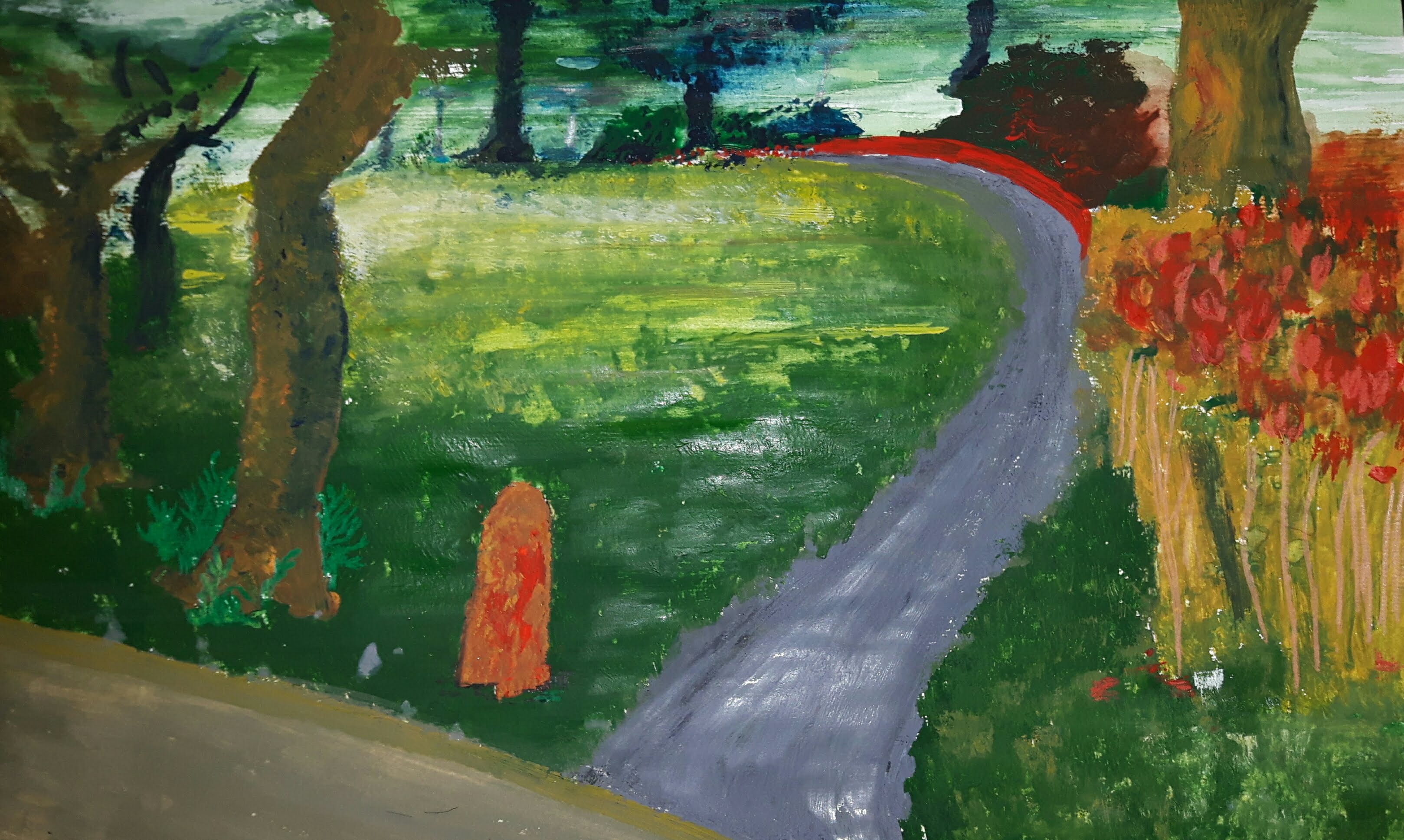
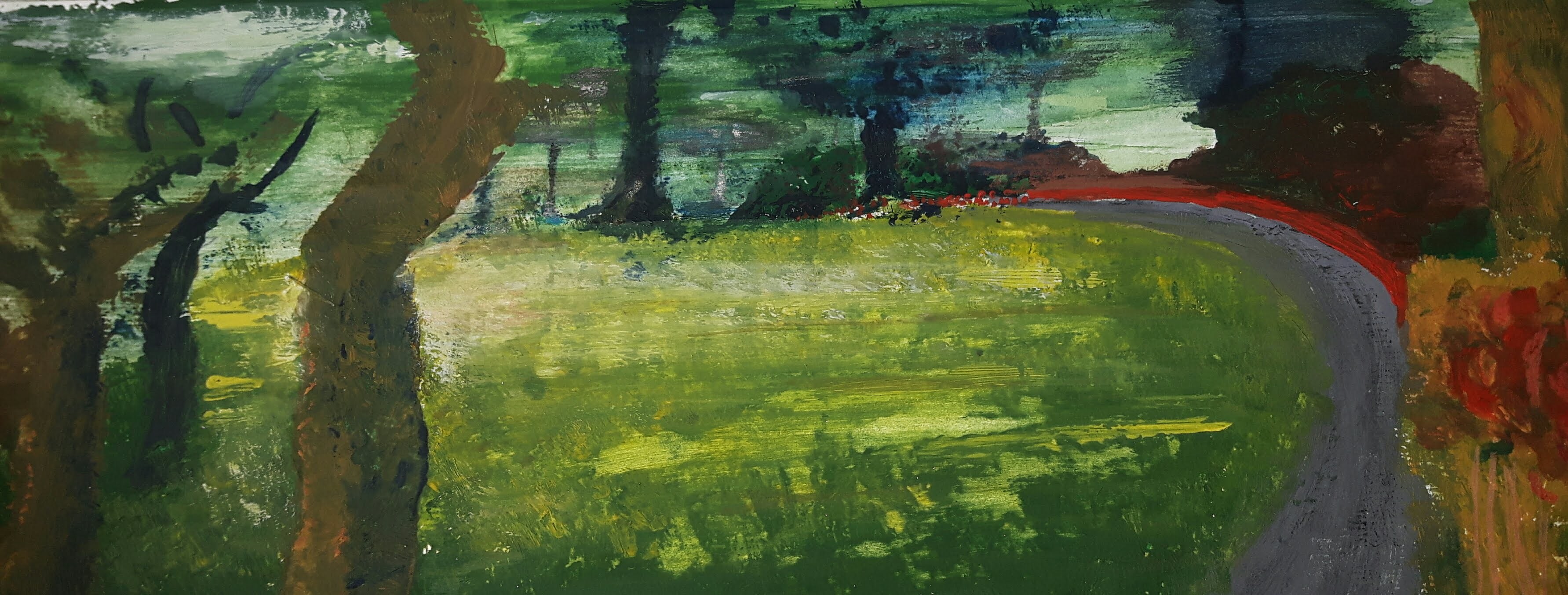
After reviewing my drawings I thought I would like to work on this drawing from the park.
I really liked the composition, also the light falling on the clear through the trees on the left hand side. I wanted to challenge myself and because I’m still kind of insecure with colours – apart from limited palette style – I decided to use tempera. Also, I’ve never used that media before so I felt that would be quite an adventure! When I made this sketch, there was a bright daylight, now I decided to put the scene closer to dusk regarding colours. I started to sketch rough outlines with graphite pencil on watercolour paper.
First attempt…
I decided to rework on it and felt that the piece would be better cropped this way.
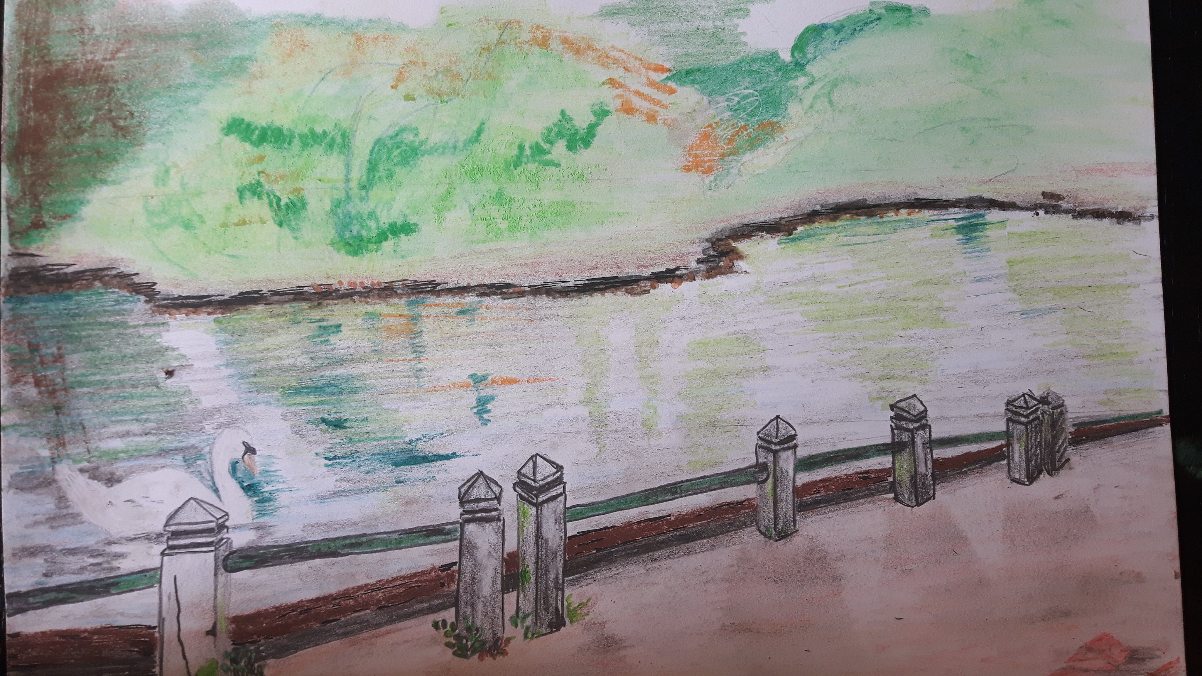
Exercise 2 Foreground, middle ground, background
The aim of this exercise is to establish a foreground, middle ground and background in my drawing. I choose an old photograph with and idyllic lake with a swan on. Resulted a postcard-like image but I tried to distinguish the front -where the swan is – with more details from the middle part – the lake mirroring the trees – and the background with more washed effect.
Reflection
I tried to simplify with repetition of simple forms creating the flowers’ heads on the first and the washed line shaping the edge of the lake on the second drawing. I sharpened the focus on the closer items (the flowers/the small concrete columns) with detailed sketching and used more soft smudging for the background. On the first picture I thought to show a bit more dramatic effect where the light fell on the ground with not only leaving the clear blank white but overemphasizing it with bright yellow strokes and shades. On the second one capturing the shadows of the columns were more successful comparing to the mirrored shades of the trees on the lake’s surface. If I was to do it again I would definitely do more thumbnail sketches to be more confident with the foreground part.
Project 4 Perspective
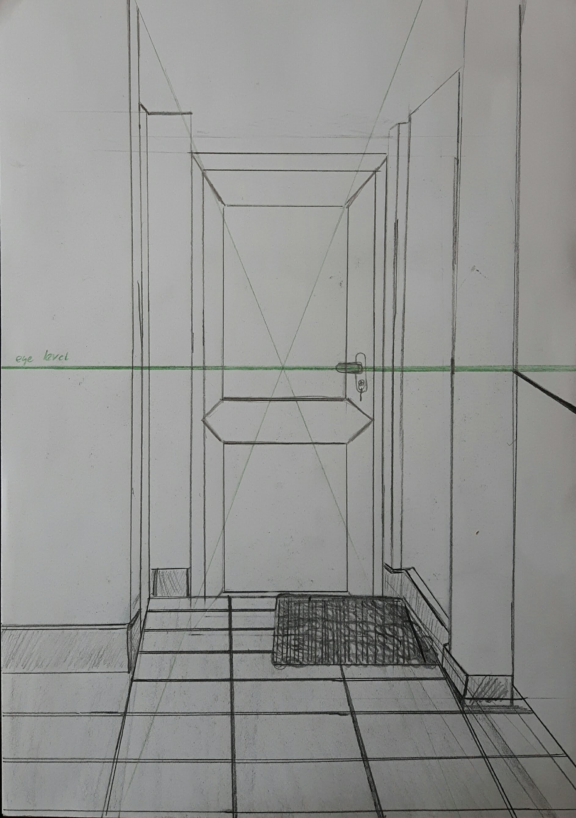
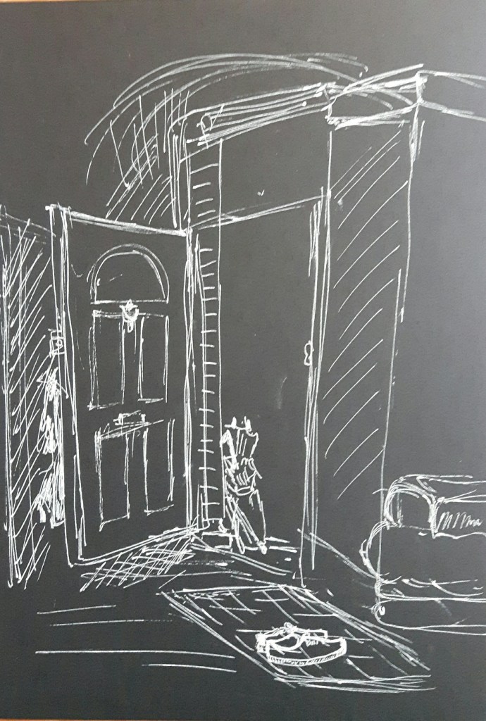
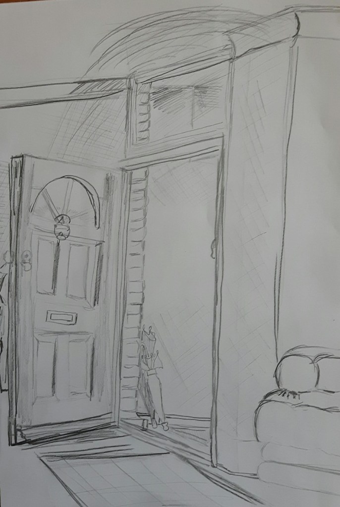
Exercise 1. Parallel perspective – an interior view
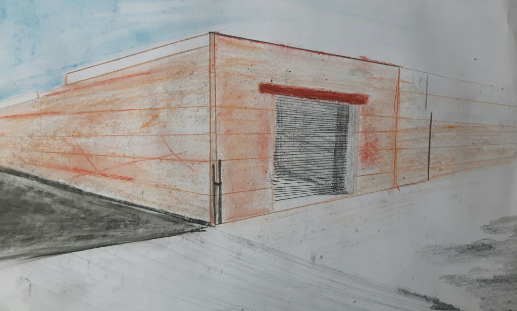
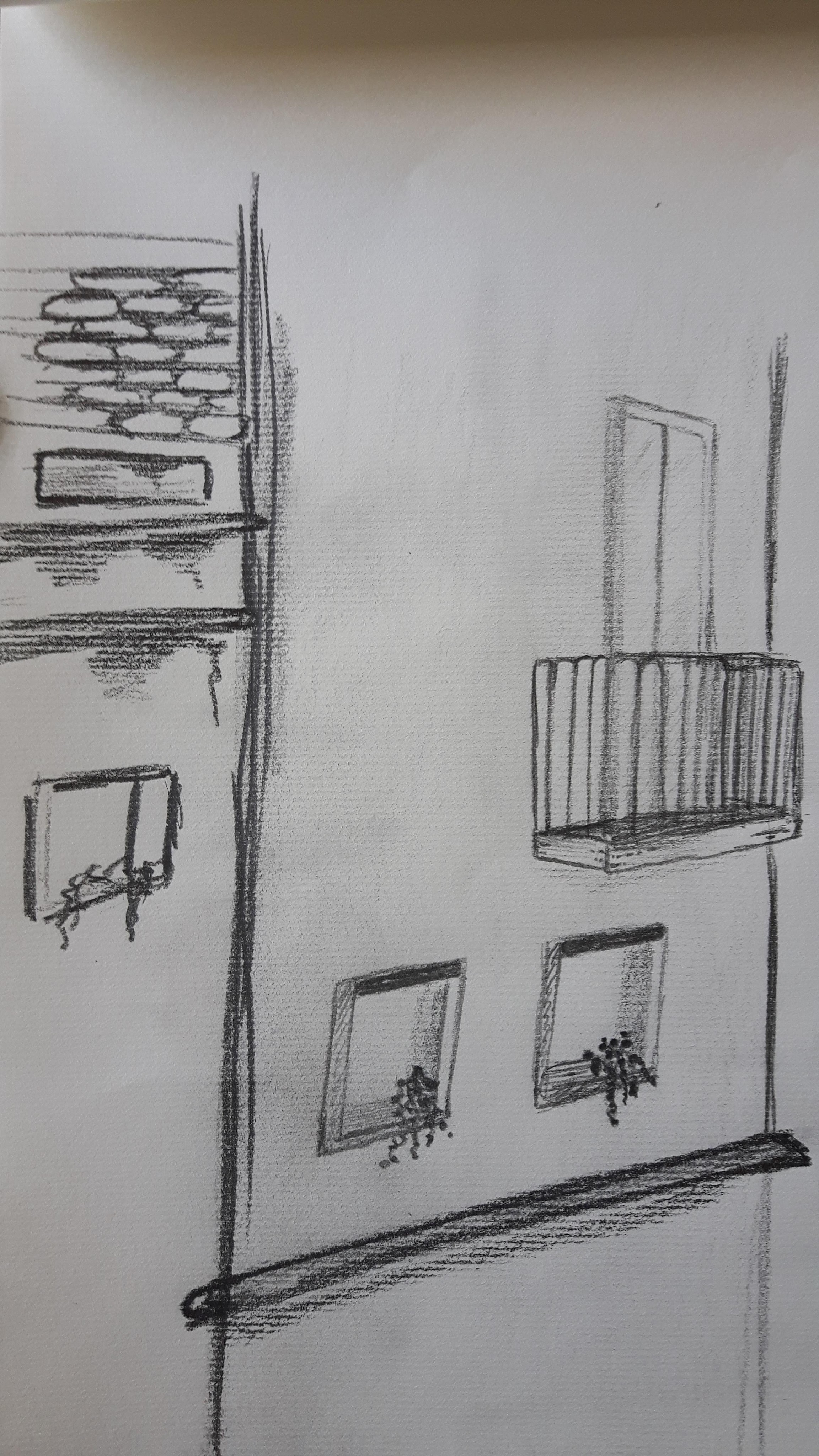
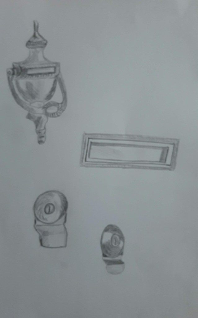
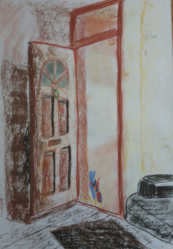
Draw a view through a doorway inside a building.
I used HB-3B pencils. After finishing this I read the exercise through again and found the line “don’t use a ruler or a rubber”….so there is the next one, with a different door.
Exercise 2. Angular perspective
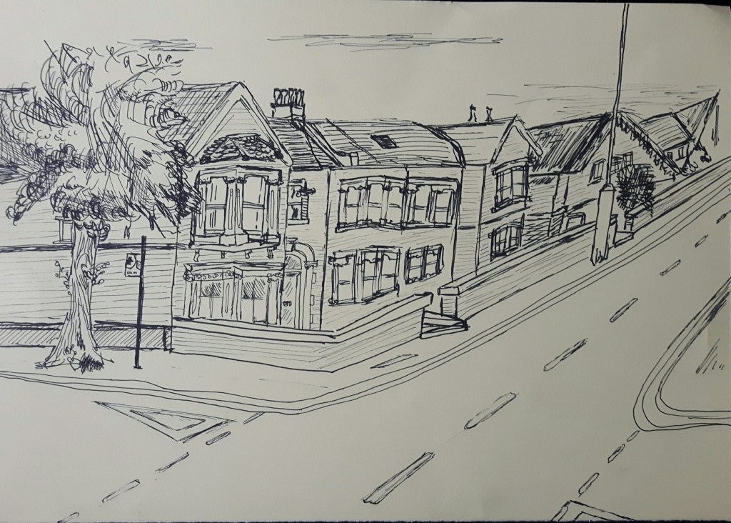
Make a line drawing of a building or several buildings seen corner-on.
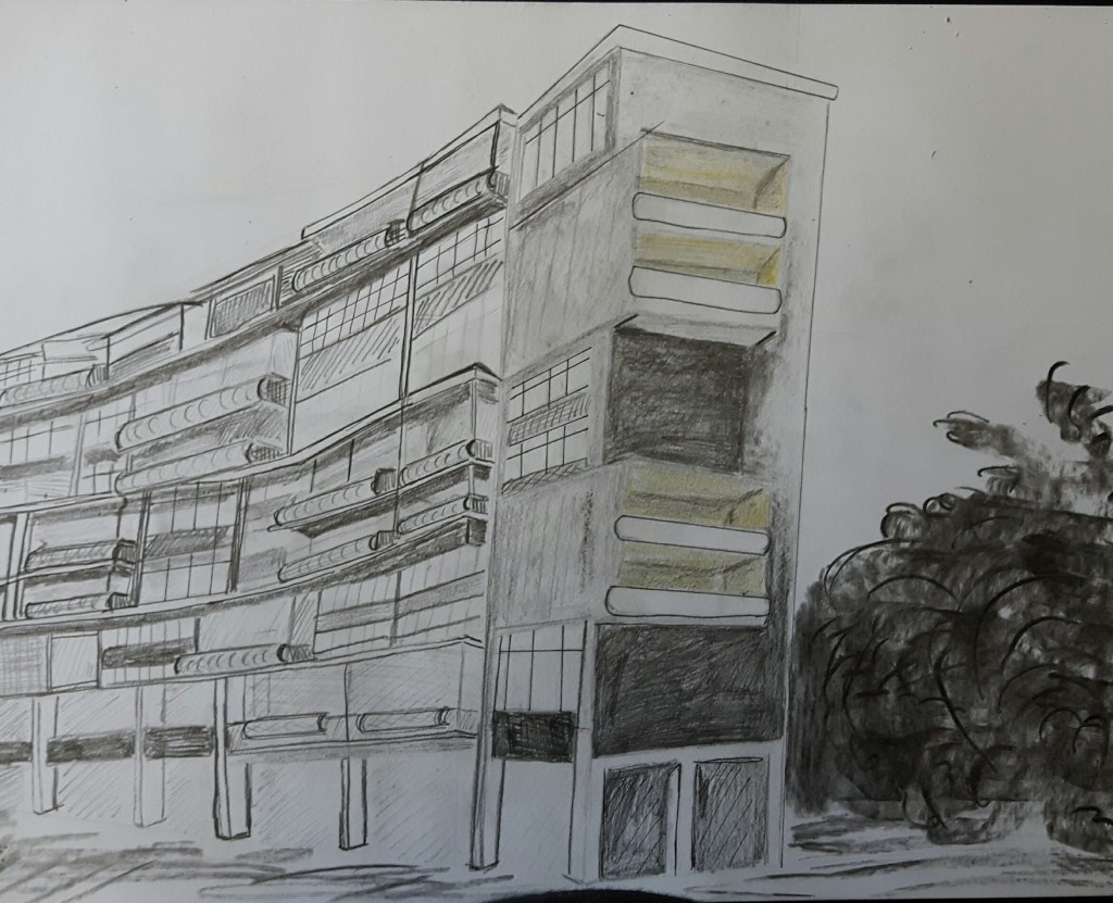
Bauhaus building, Berlin
On the first drawing the vanishing point is on the left hand side, way off my paper. On the second one the vanishing points are on both sides.
Exercise 3. Aerial or atmospheric perspective
This is a view from my bedroom window with fine pen, pastel and pencil. Using soft media worked better than a pen drawing probably because the misty background.
Project 5 Townscapes
Research Point Urban Environment theme by contemporary artists
John Virtue is an English artist best known for his monochrome landscapes. His work “London Paintings” focused on the London skyline, using white acrylic paint, black ink and shellac. His paintings are blurry, some of them are abstract. Even though he is using landmarks build mostly in the 20th century from the capital, his paintings are taking me back to the Victorian era somehow. The city is foggy, rain-soaked and ever so dark.
Andre Derain’s paintings of London are strikingly different. The French artist was a co-founder of Fauvism (strong, pure colours and unconstrained brushwork) with Henri Matisse. He came to London in 1906 to paint a variety of London subjects. Derain’s London series were groundbreaking with their pioneering techniques.
Luckily, there are artists today creating similar bright atmosphere. Barbara Rae is a Scottish painter, who is using pure, unmixed colours to paint her abstract landscapes.
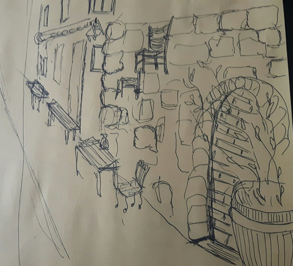
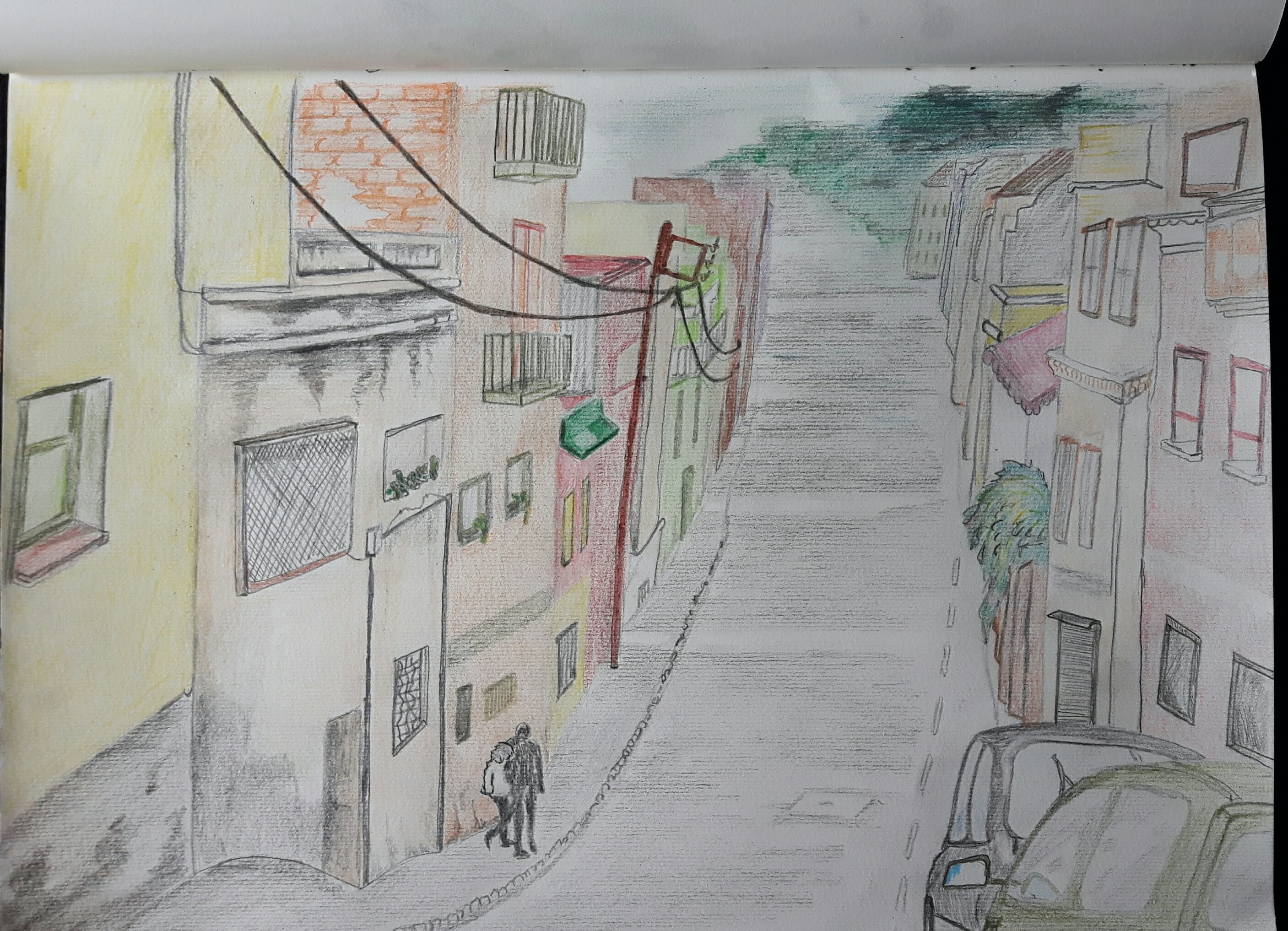
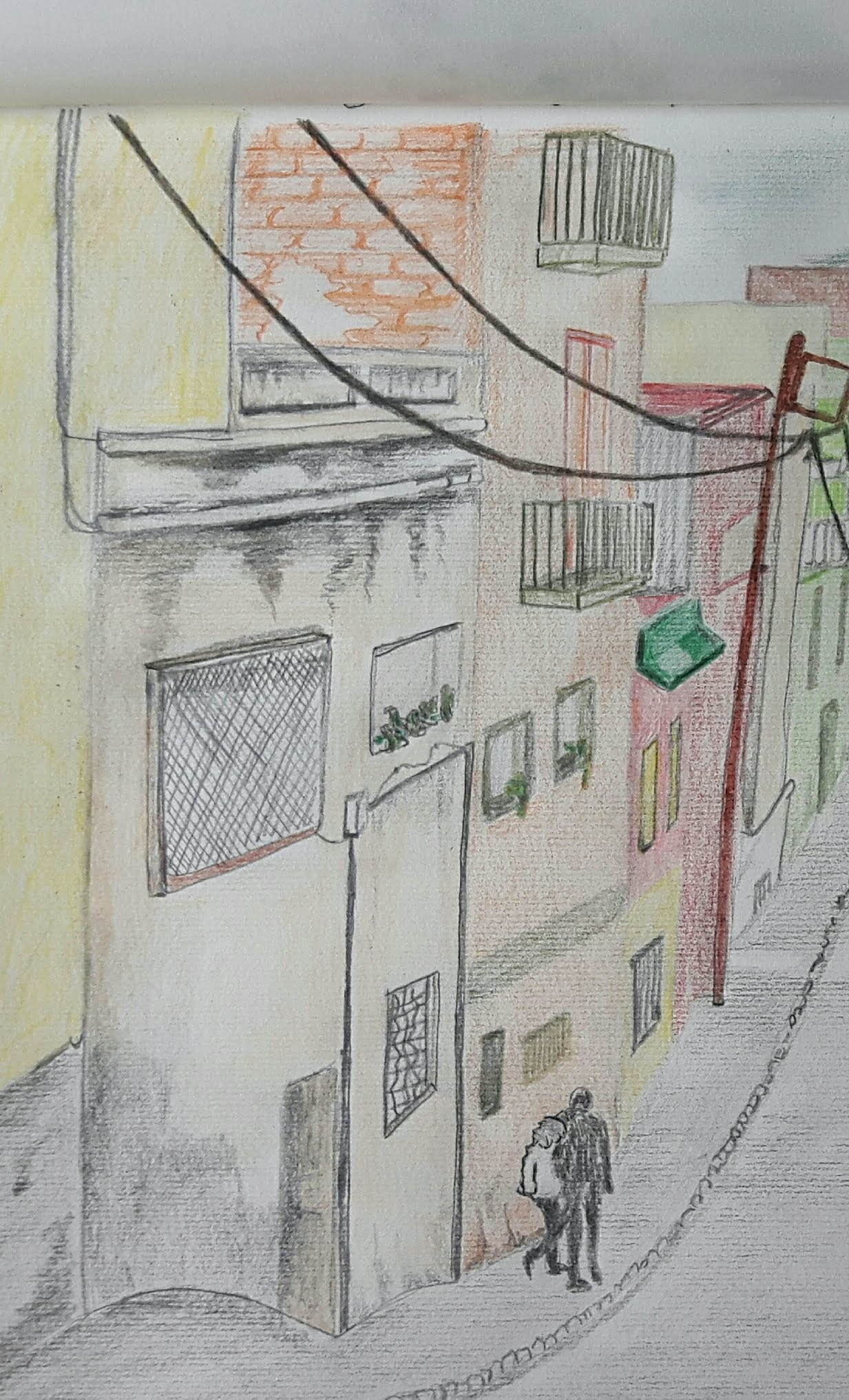
Exercise 1 Sketchbook of townscape drawings
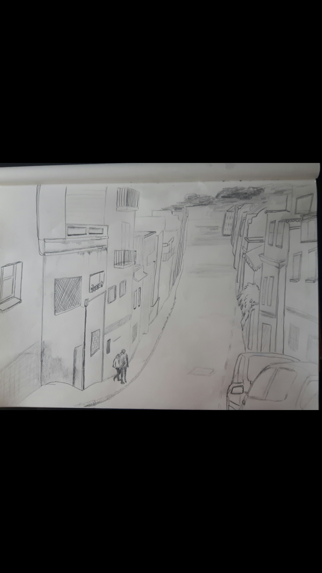
I found a photo of a colourful, long downhill street in Barcelona which I really liked. I put the line drawing in pencil just to get the perspective and proportions.
Detailed study with 3B pencil
I used coloured pencils and HB-4B.
Somehow this side looked more important so I cropped this way
Study of a townscape using line
I used black pen for this exercise. I have a nice photo of a Croatian seaside town and a small English town, too.
I think I haven’t got the perspective right on the second one, I should have used the house on the corner as a start point of a straight descending line for better proportion.
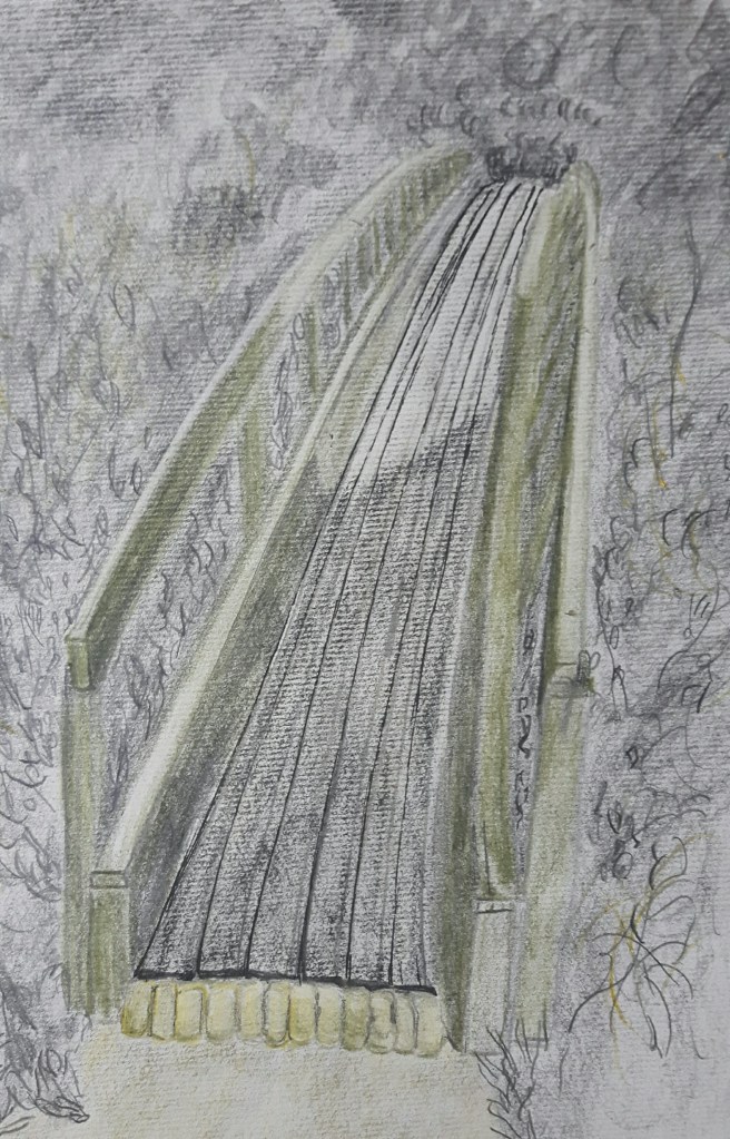
Exercise 3. A limited palette study
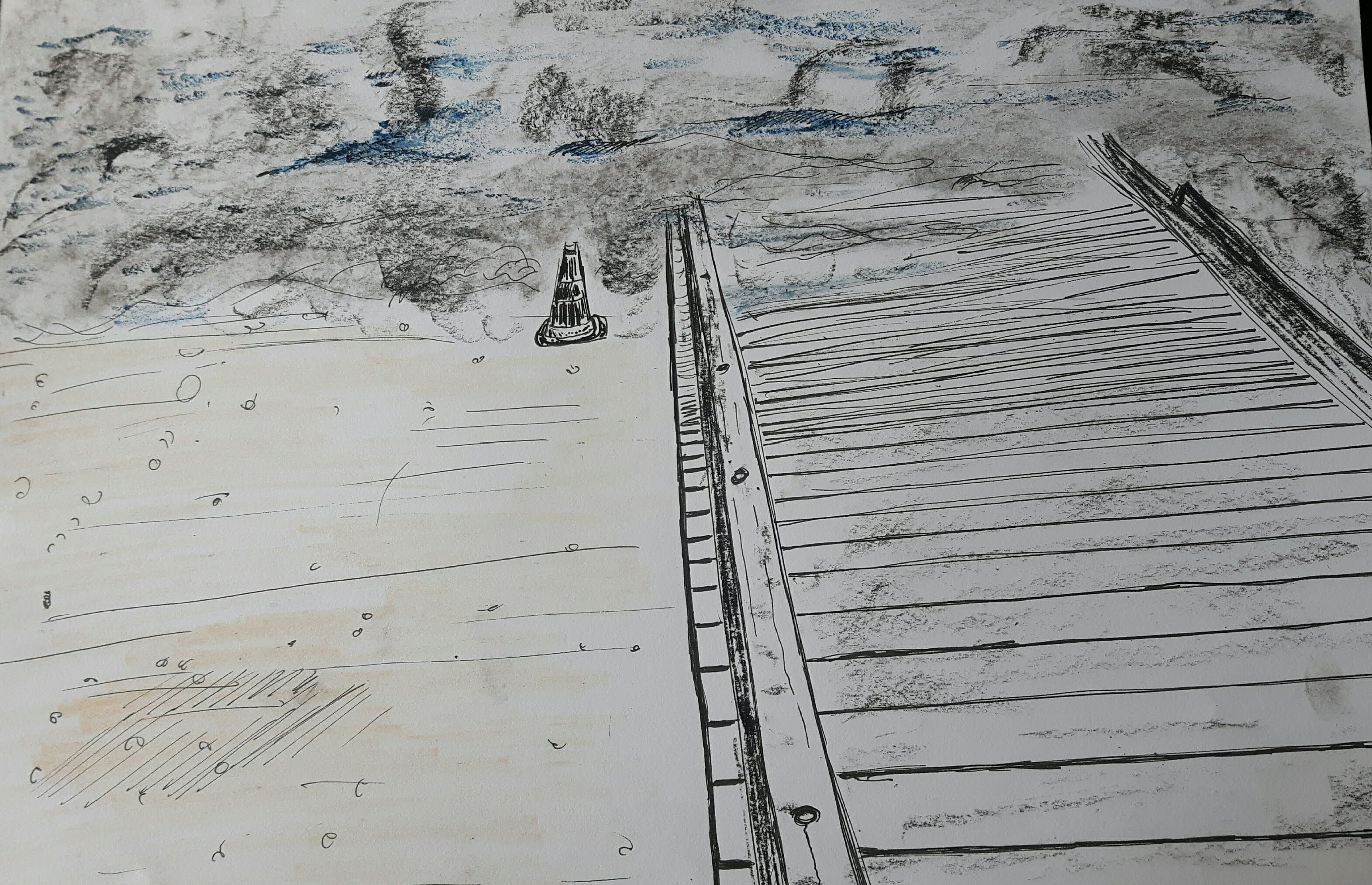
Use a limited palette for this exercise – no more than three colours. I used olive green, yellow and black for this drawing. Did it watercolour pencil, conte stick and ink. That is not exactly a part of the town but I chose it because of the interesting possibilities to create depth.
That’s a really pretty arch, I liked the way the light fell on the middle part of the bridge. I hope I was able to create some sense of depth.
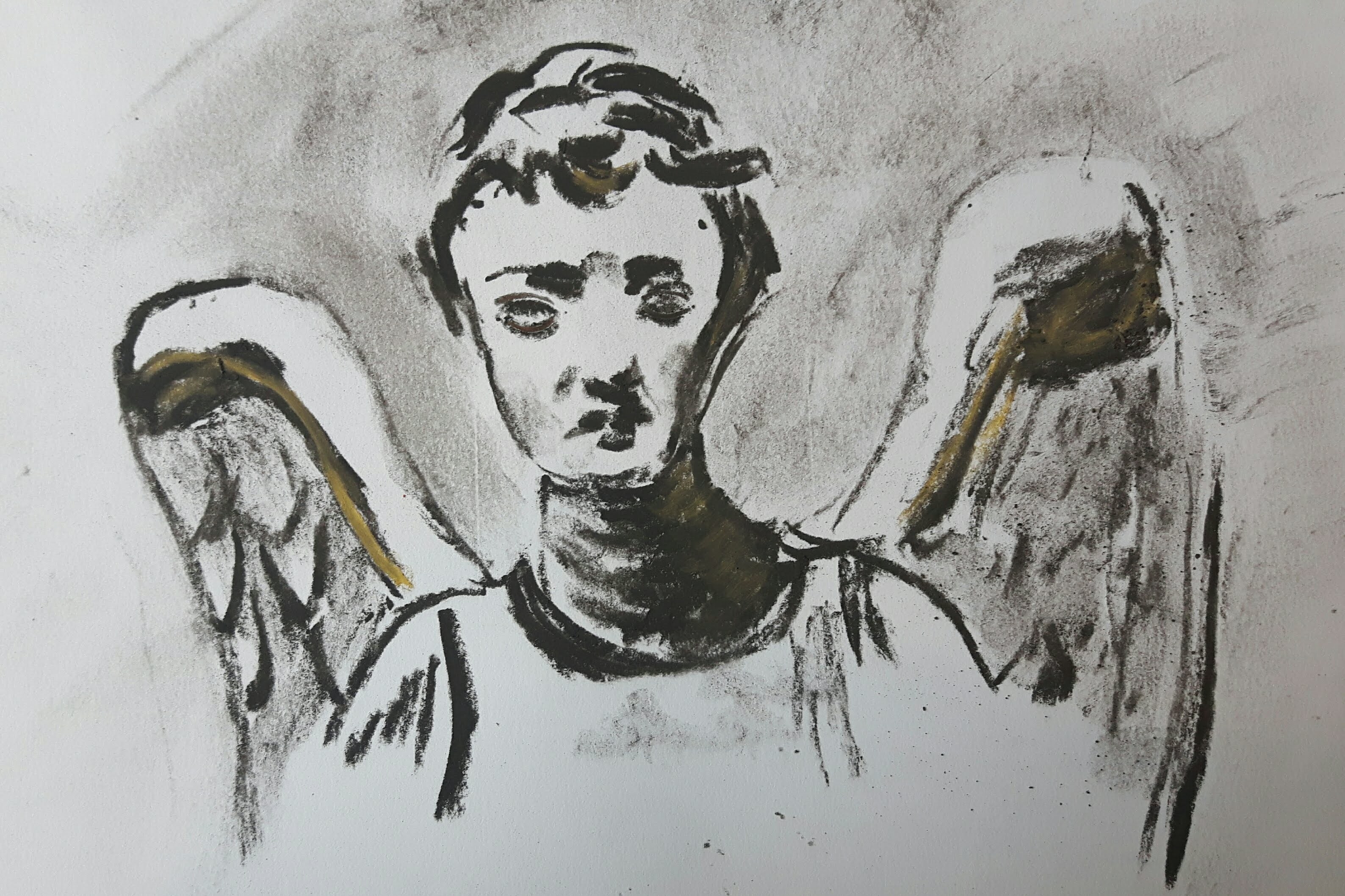
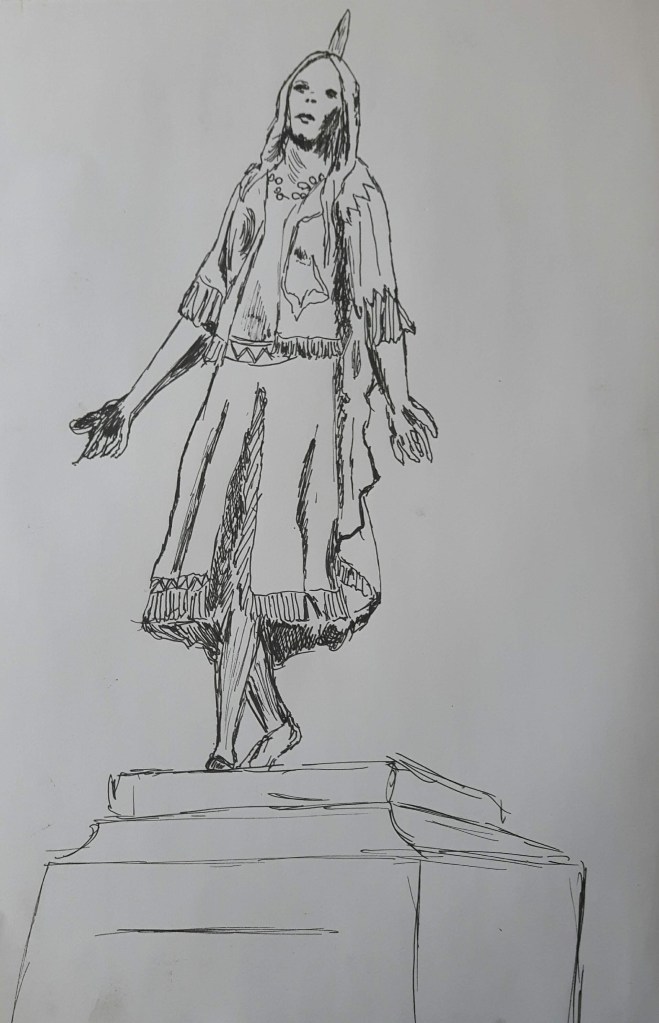
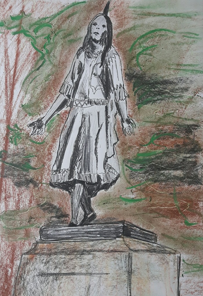
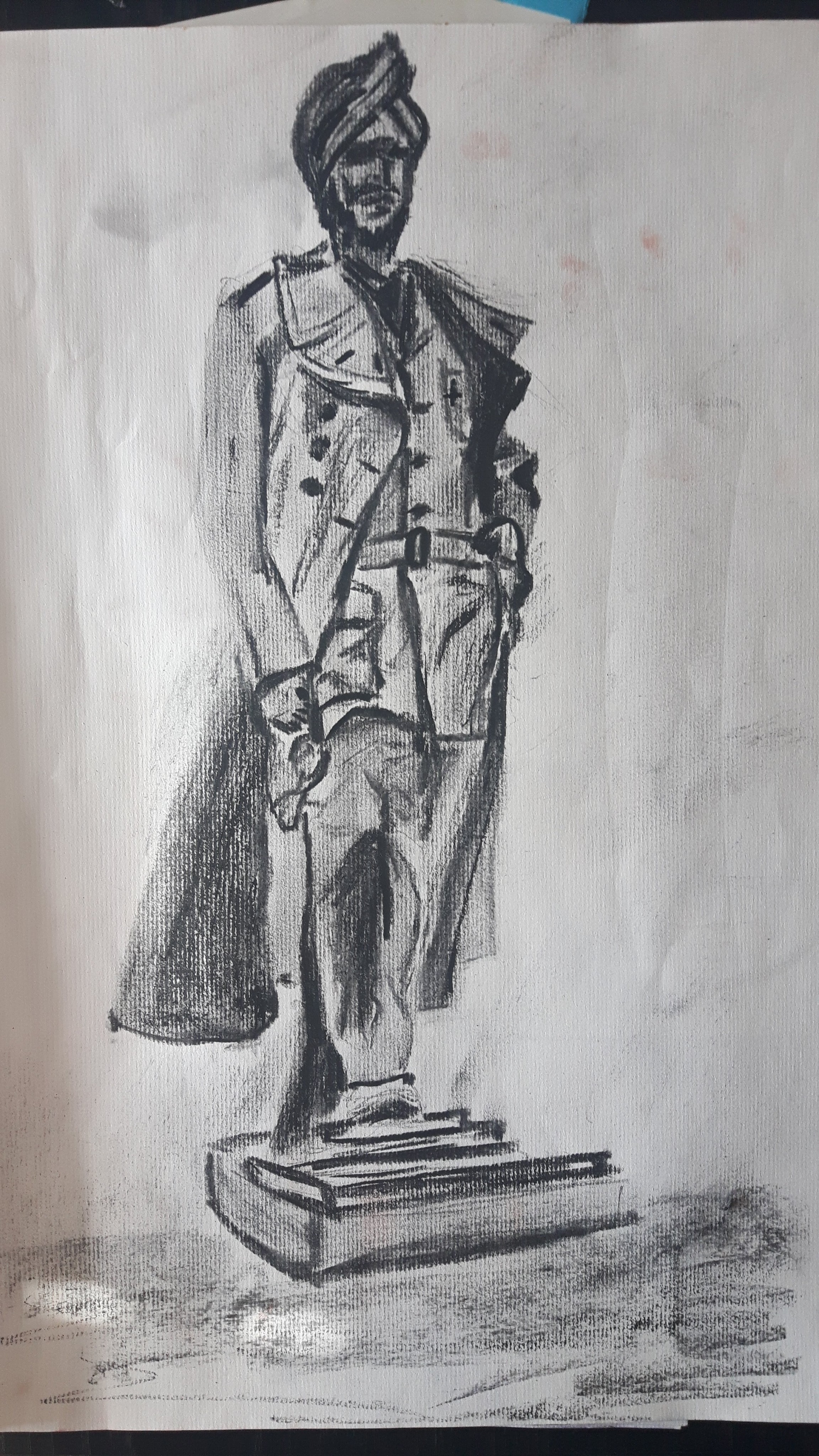
Exercise 4. Statues
In a similar way to drawing trees and drawing figures, statues are great for honing your drawing skills and they don’t (usually) move! After reading this I immediately thought of the obvious choice : The Weeping Angel (Don’t blink!)
Then I realized that my small town is famous for Pocahontas (yes, really) being buried here in St George’s Church.
Even though I tried to concentrate on the folds of the clothing, it still went completely wrong and two-dimensional, desperately hanging in the air. I should have picked smooth medium for better blending. I tried to draw another famous person, Mahinder Singh Pujji, RAF fighter pilot who also died here, therefore a statue of him was erected in 2014.
This one looks better comparing to the previous one which was a bit overworked. However, foreshortening is something that needs to be improved.
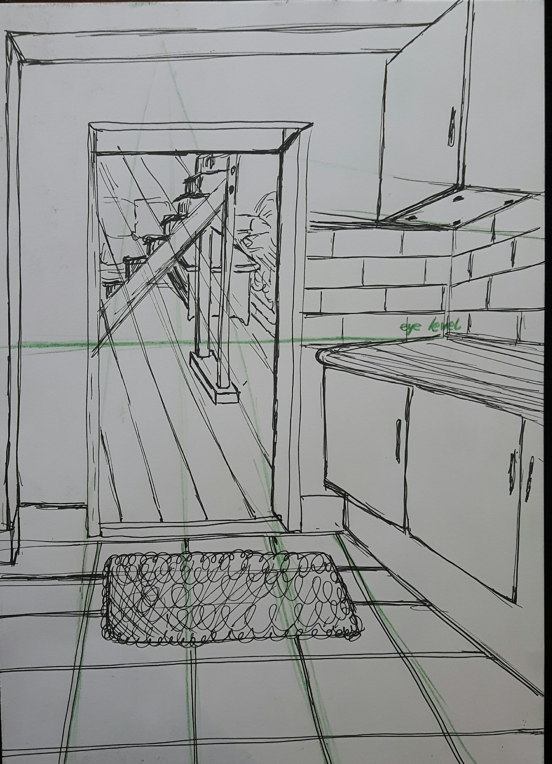
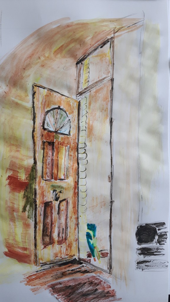
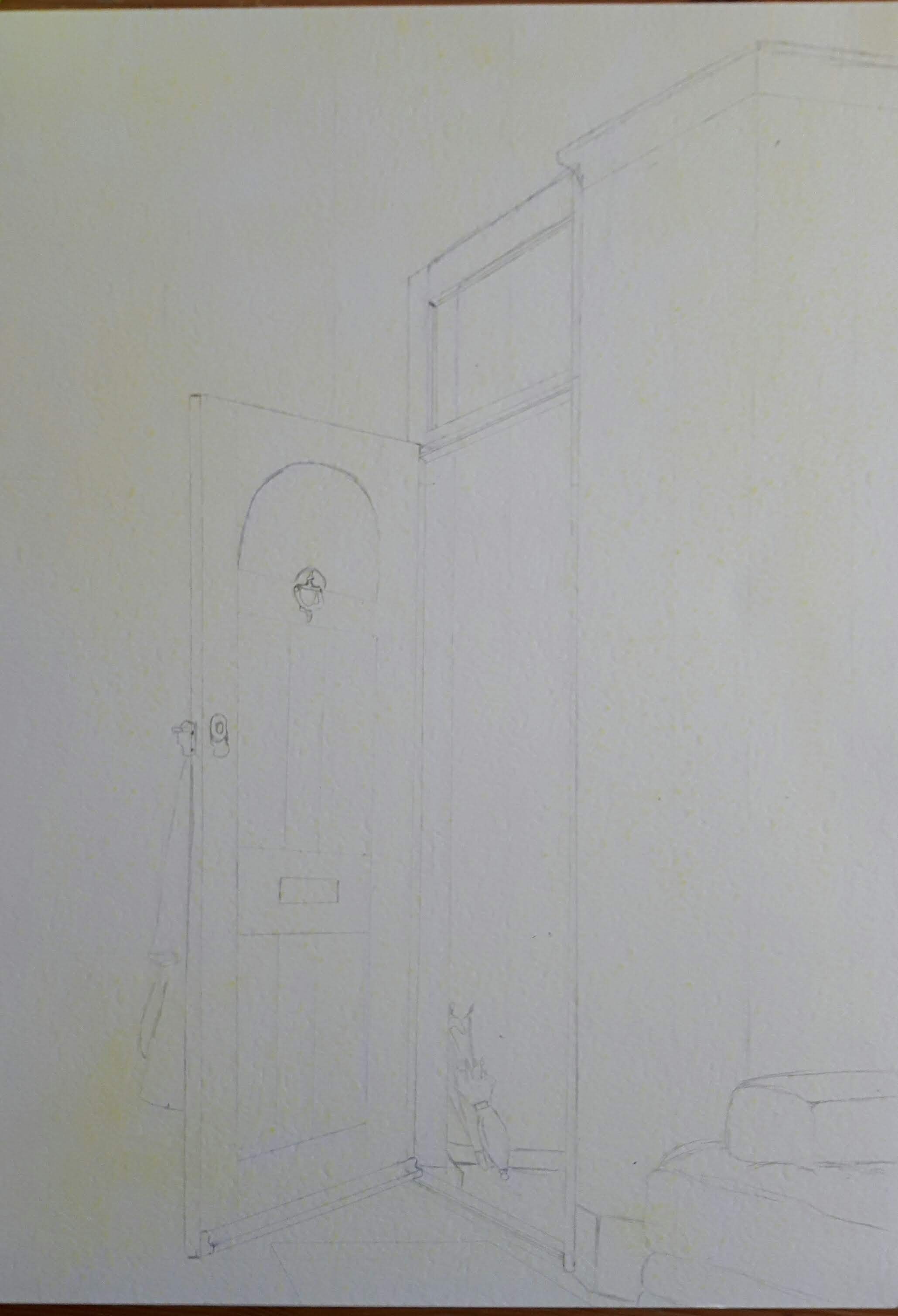
I was sure I’d like to draw an interior for this assignment however for a short time I considered some half-withered flowers in a vase. When I finally decided that it must be something else, I started roaming in the rooms with no success for a while. I sat down helplessly in the living room with a what-am-I-gonna-do face and then I saw it. The door was wide open because I was waiting for the postman (the bell isn’t working) and the lights came through the outer door, two umbrellas peeped out from our ridiculously small ante-room, the scene looked interesting.
First sketches with different media (pen, pencil) and small details..
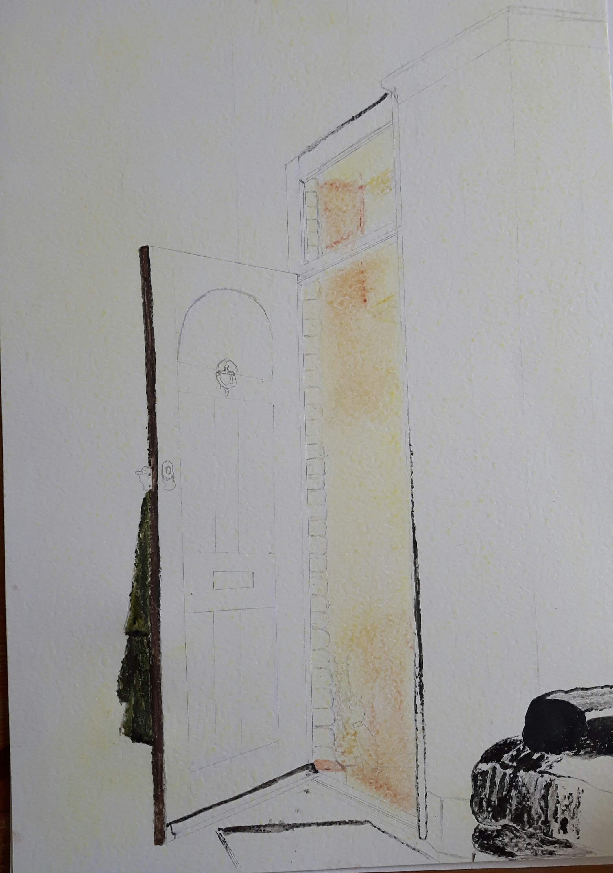
I knew that the real challenge would be using colours, because I hardly ever used them in the past. I didn’t know what to use first, so I tried with pastels then watercolour pencils
I have never used watercolour pencils before, I had to try them out first. I really liked them and even though the pastel looked better, I decided to use watercolour because of the smaller details. Later on I realized that the chance of more smudging was in direct proportion with colour intensity and I could not work the fine details out well.
I started with the line drawing to catch the best perspective and proportion.
Then I started put the colours on. I used water pencils, some pastels for the bigger area and white ink for the small highlights.
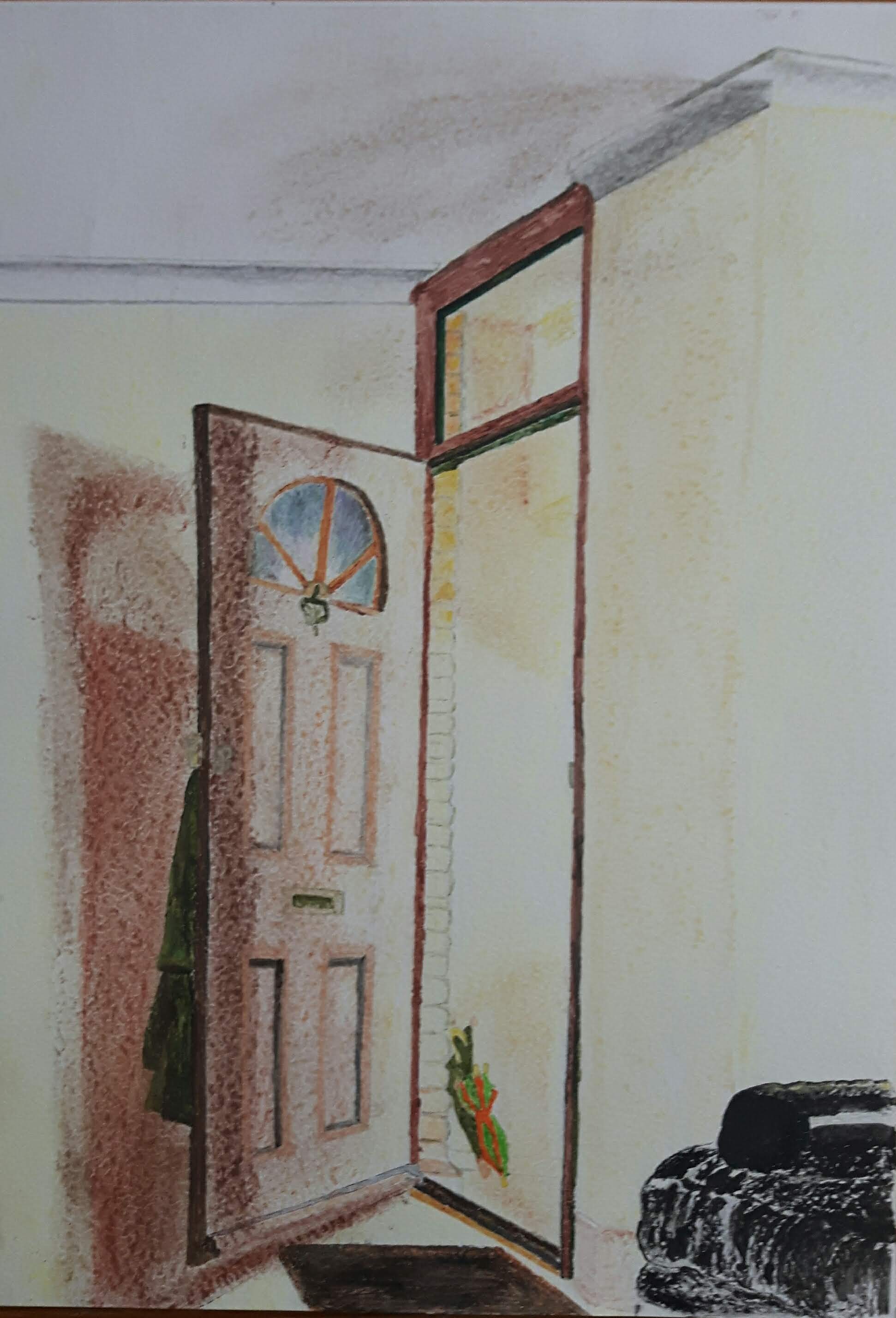
I was quite happy with the chosen colours. Several shades of brown, from the lightest through reddish mahogany to the darkest. The yellow walls and my olive coloured coat hanging at the back created truly beautiful colour composition. The umbrellas are not quite fitting into the scene so I cheated a little. I wanted something a bit harshly sticking out from this harmony and because my son’s umbrella with the red/blue strips (Fireman Sam themed) just looked simply wrong, I changed it into a rather vibrant orange/green stripped one.
The final piece
Self assessment
Visual and technical skills: my compositions seems to be better than at the very beginning, but my technical skills have to improve way more. Also, I missed to work out some details.
Quality of outcome: since I started to communicate my feelings and ideas I keep facing the fact that I do not always draw what I see, it’s rather what I think I see and that’s frustrating and overwhelming sometimes. I am not completely unhappy with this drawing – it taught me more- but it is still far from my intention.
Creativity: I don’t think that was a particularly brave or creative approach to the subject but there are parts of it I like.
Context reflection: I have found amazing works of different artists – through the researches – I have never seen before and in my small spare time I actually tried very different approaches from several inspiring art movements and hardly wait to try some more.
I would like to observe the works of three contemporary artists who focus on domestic interiors.
Anthony Green is an English painter and printmaker. My very first impression was that his pictures are like cut-outs from a colourful magazine. The multiple viewpoints into one image including a very high one is putting me into the room and far from all the elements at the same time. His figures are in distorted, awkward positions due to the irregular form which is the preferential – and only – option for the shape in his work.
The fact that he simultaneously used several perspectives made me think of Paul Cezanne. Seems like the same idea arised and turned into a powerful message by two different artist born exactly a century apart from each other.
Dickon Drury was born in Salisbury. I was really pleased to discover the work of this young artist. He often paints domestic interiors, birds and still life, too. All his work has a hint of absurd comedy with a fresh and playful imagination of a child.
Studio Sunset, 2018 Oil on Flax
This is a mix of domestic interior and still life. The colours and shapes are bold, simple and calm but the peculiar mix of those carefully picked items and snails (!) are there to surprise us, to stop us walking away, to make us say: Wait!…What?! I assume, the leftover bone on the plate is teasing the good old symbol of the Vanitas paintings from the 16th and 17th centuries.
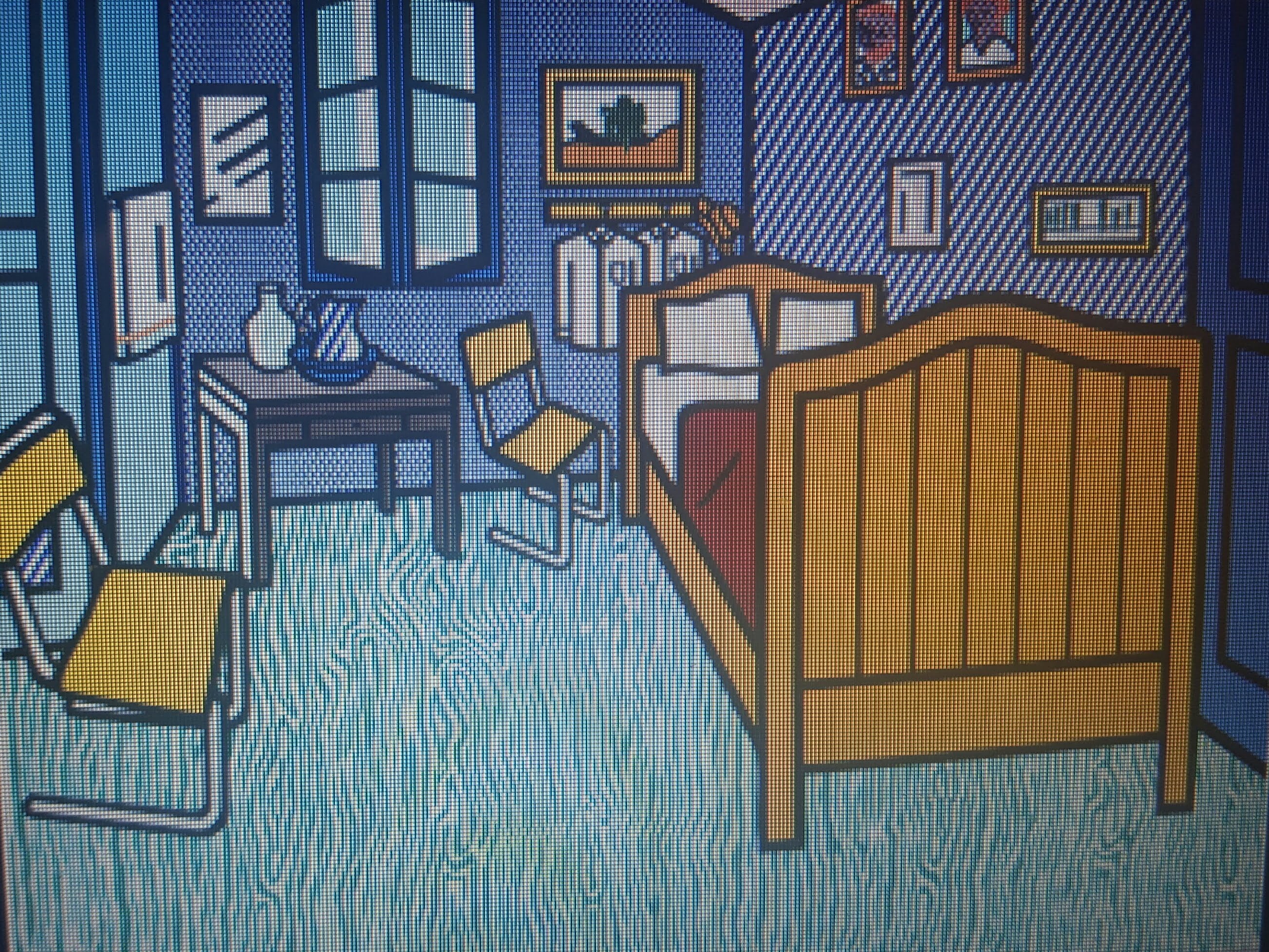
Roy Lichtenstein was an American artist. Alongside Andy Warhol he became an iconic figure of Pop Art. This art movement started in the 1950s expressing images from the modern popular culture. He has a cartoonish style, his best known works, such as “Drowning girl” and “Whaam” based on panels of comic books. He also created series called “Interiors” and “Waterlilies” in the latter he reworked the impressionism of Claude Monet’s waterlilies. He reproduced other famous painters’ work, for example “Bedroom at Arles” from Vincent van Gogh.
For me, it is a “straightened up” version of the original painting. He replaced the chairs with modern flattened chairs and the shirts became somehow crisply ironed businessman-type clothes. In his Arles period, van Gogh’s favourite colour was yellow, in Lichtenstein’s work the yellows are brightening up the room.
This is a fresh, humourous approach with respect. Lichtenstein himself said : ” The things that I have apparently parodied, I actually admire.”
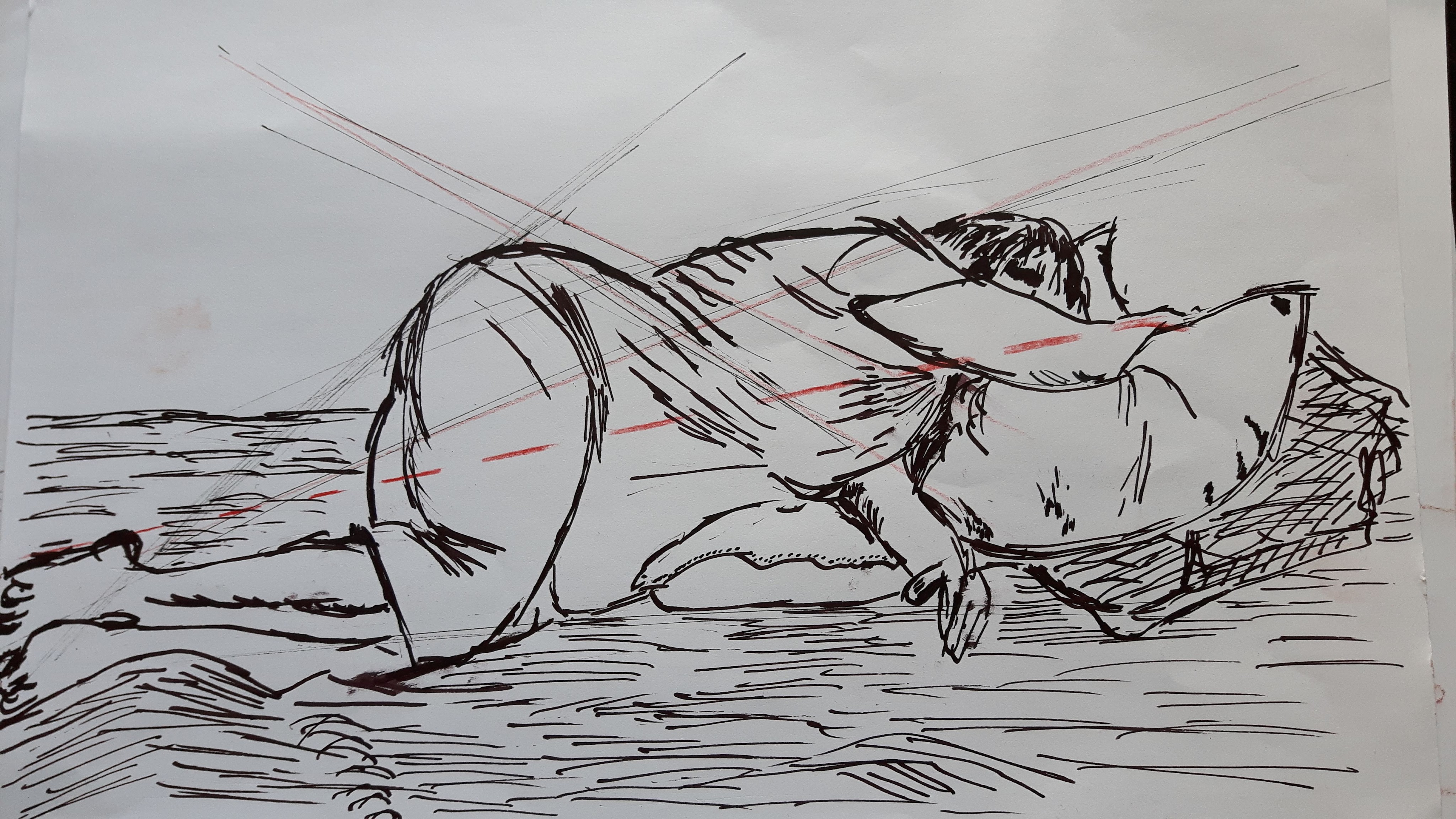
 compositions with different media as a start.