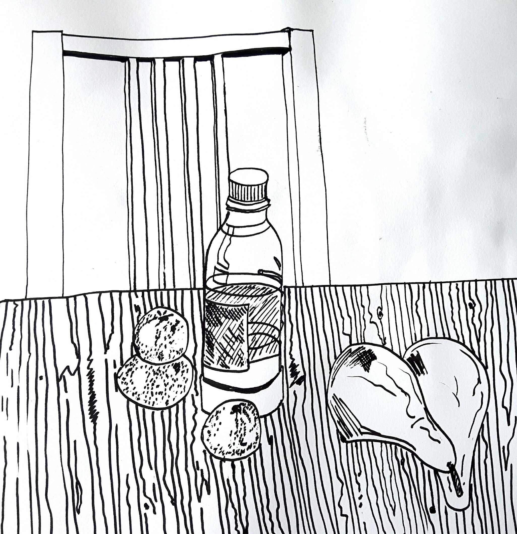
Exercise 1. Still life using line
For this exercise I used fountain pen and biro for the second one. I made the one below with clear lines and no shadows. Somehow restricted to line only did not seem to be that difficult than restricted to tone in the next exercise. It gives me a kind of artificial impression but I like it. I had a (probably wrong) feeling that shadows would distract the balance of the clarity. I’m really curious though so I will redraw it again later with shadows.
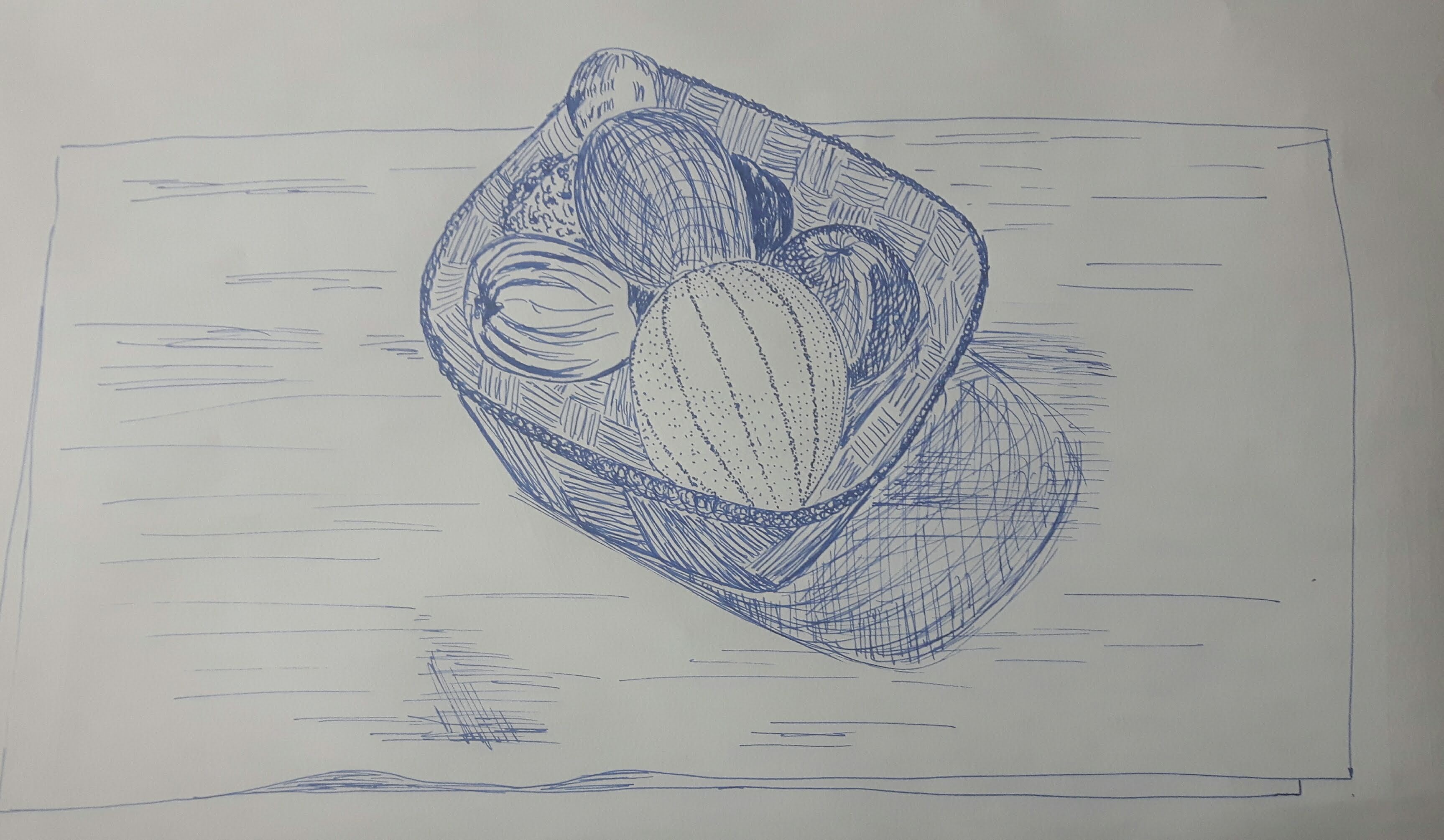
Exercise 2 Still life in tone using colour
I tried a couple of compositions with different media.
I really enjoyed to try hard pastel with the charcoal. I used spiral bound paper for the purpose of better blending.
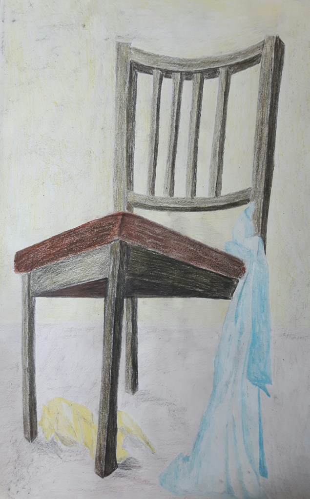
I set up another still life with less fine details. Chair and a blue and a yellow scarf from a viewpoint I tried on one of the previous exercises: sitting on the floor. I chose brown, blueish tones and yellow. I was still working with hard pastel. First sketched the light areas then moved on the dark ones. The proportion is far off but I worked with quick, dynamic moves as was advised and did not want to go back and overwork it.
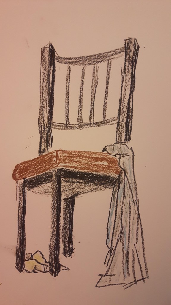
Then I added more colours, tones and background.
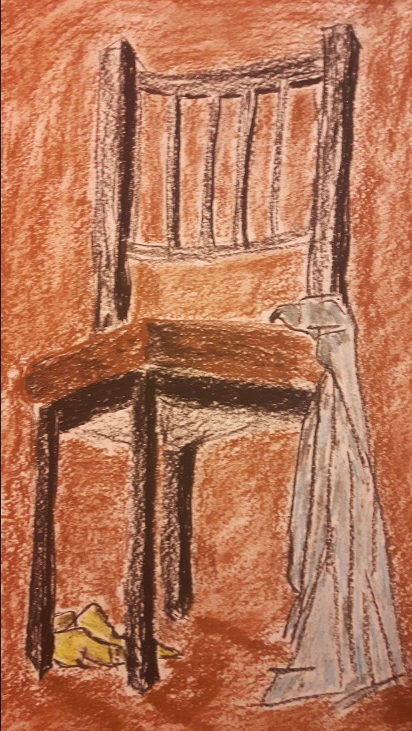
Because of the yellow scarf, adding a bit of yellow blend to the background help to bind the composition together.
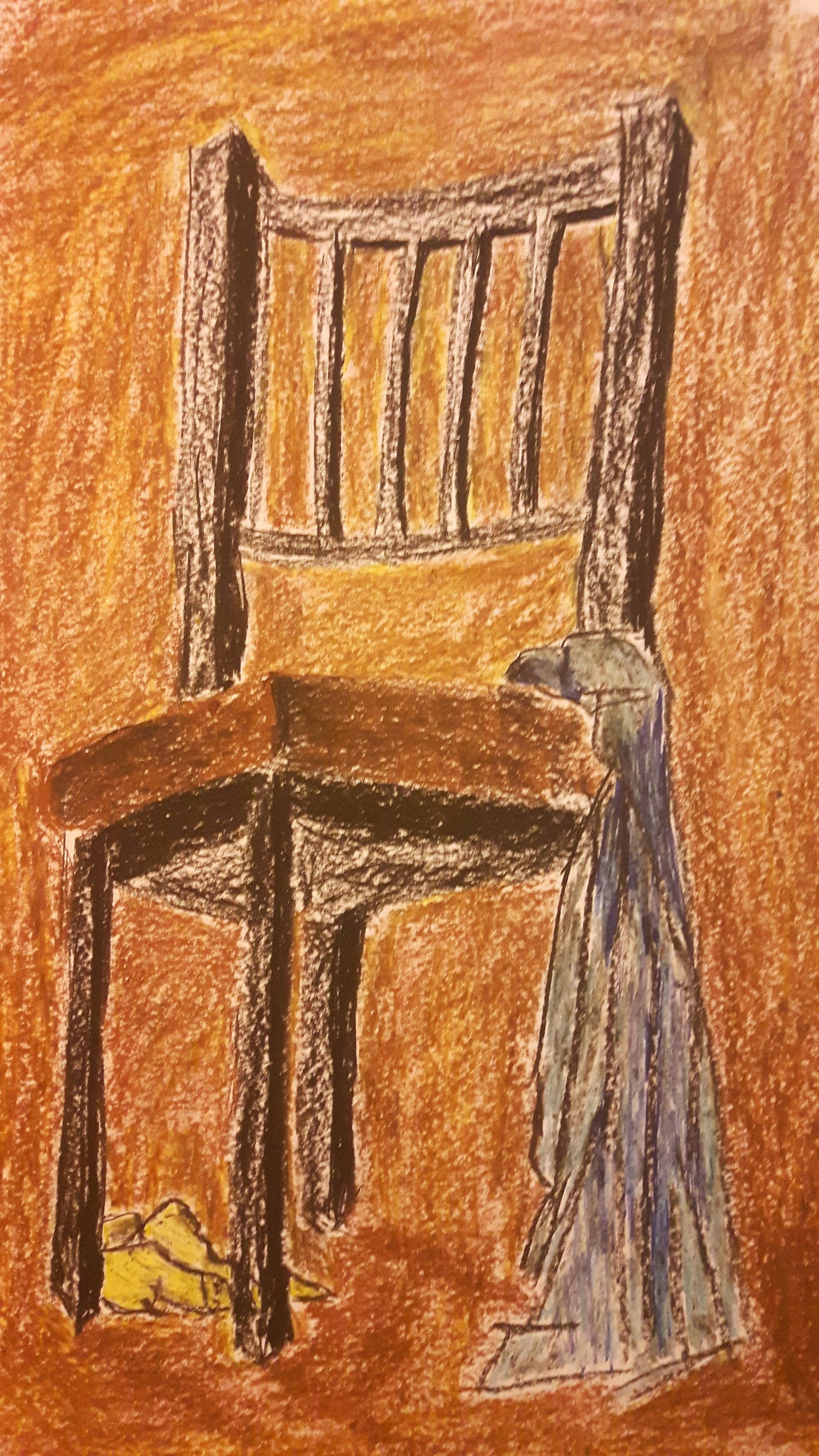
Then I decided to do it all over again with coloured pencils, graphite and oil pastels. The yellow blend moved on the wooden part of the chair.
Well, this one was not a quick sketch, a bit overworked. The colours of the scarves look lifeless comparing to the ones before. More work on tone definitely would have helped to get more sense of depth. I noticed that when I work on black and white drawings I tend to concentrate much more on tone that help to achieve better sense of depth.
Exercise 3 Experiment with mixed media
Use traditional art tools and ‘non-art’ media.
This time I piled as many different tools I could find and used them layering colours on colours. First attempt was with watercolour paint, wax crayons, oil pastels, coloured pencils and marker pens.
The result is a bit poster-like (sadly, child-like too, probably because me and vax crayons are not the best friends yet) due to bright blocks of colours (I wanna say it was on purpose but really it was just one thing led to another…) The watercolour paint was a big challenge for me to try but the effect of using oil pastel strokes over the paint was surprisingly good. Not being restricted to line, colour or media is a great exercise to step out of my comfort zone also gave the flexibility to use different techniques with the exactly suitable media enriching the original concept.
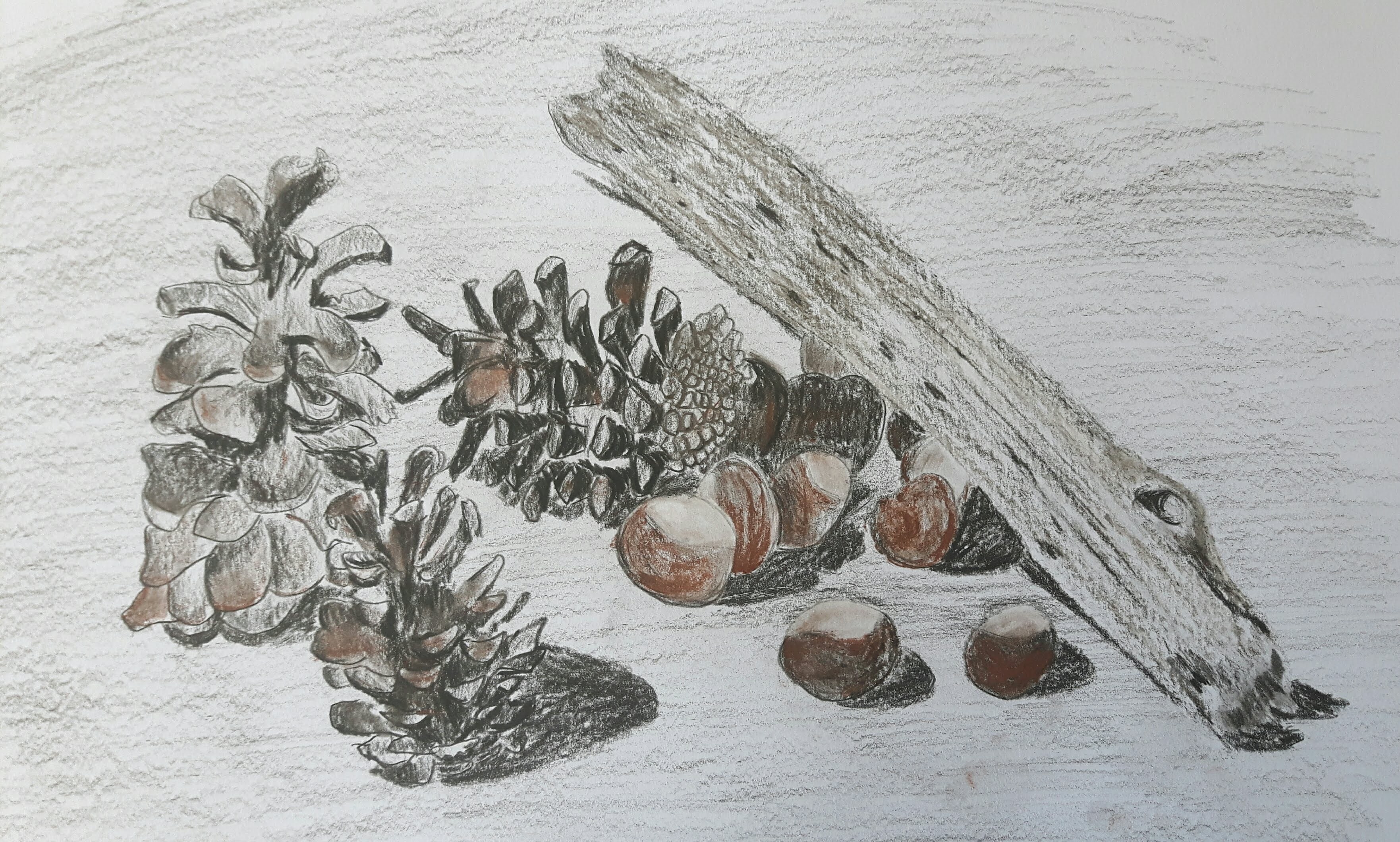
Exercise 4 Monochrome
Creating an image in a single colour – combining natural and man-made objects and contrasting materials. I chose a telescope and a couple of cones. I could have chosen white (colour goes well with the silvery part of the telescope) flowers instead but the cones looked much better in the composition so I made them greyish blue.
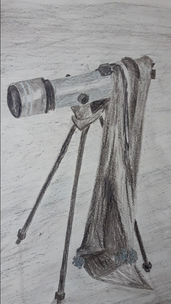
I’m not happy with the balance of the natural and man-made objects, the cones are lost in the picture and I’m also missing stronger contrasts between the parts of the telescope. Probably the most successful part is the telescope tube and I like the perspective too.
