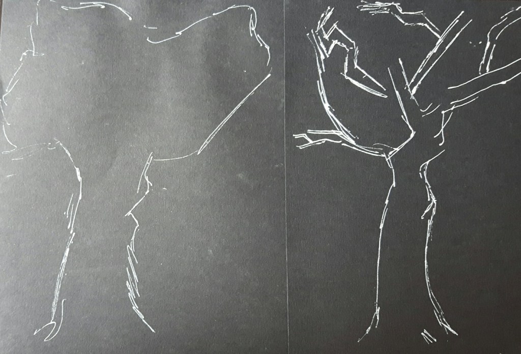
Project 1. Trees
For this exercise I started with some very simplified sketches with white fine pen on black paper.
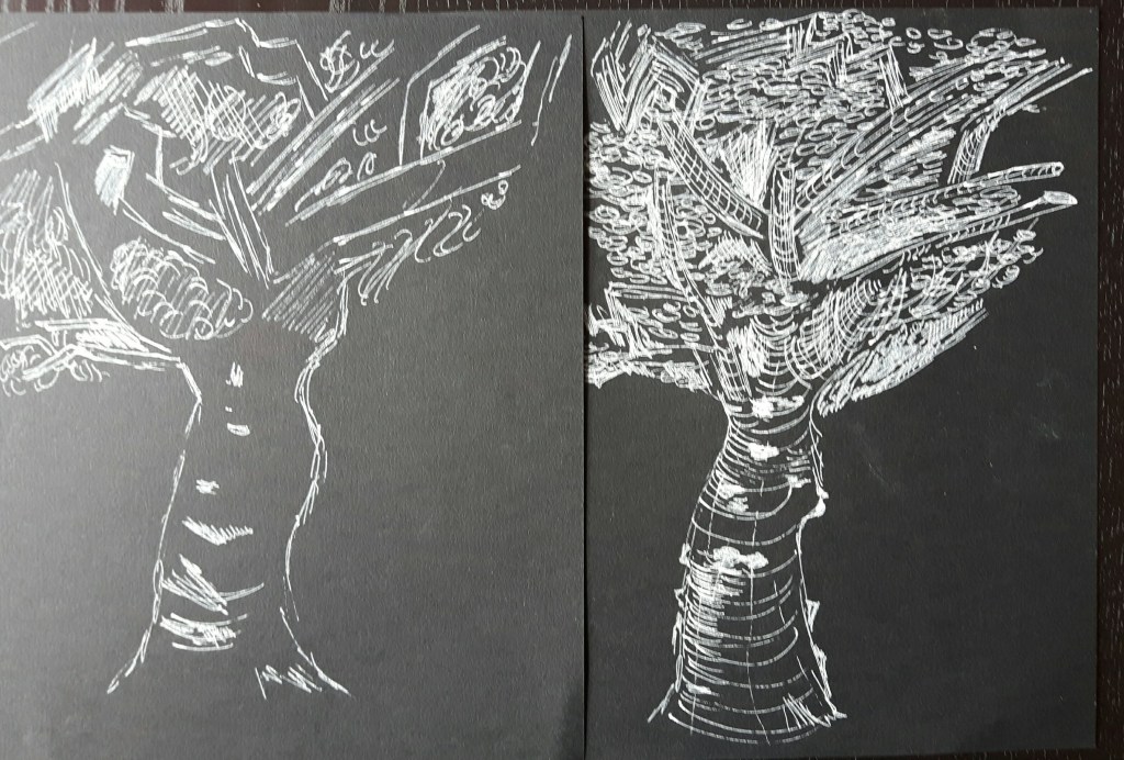
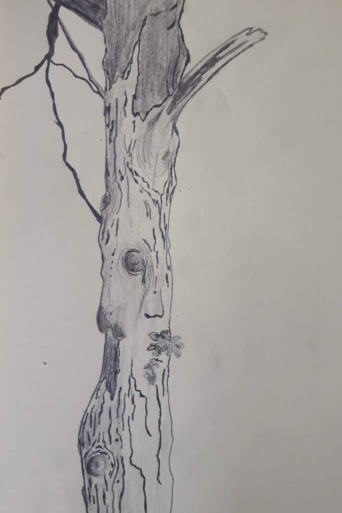
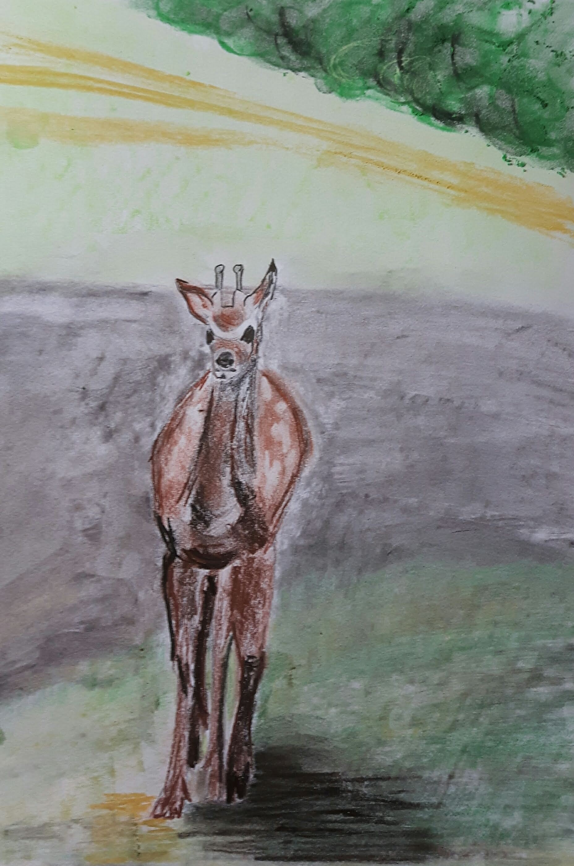
Larger observational study of an individual tree
I found several trees interest me to draw and decided to use fine drawing pen which really helped with the small details. However, on this first drawing the tree trunk seemed to disappear after drawing the fence part.
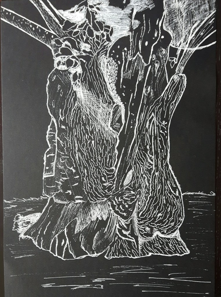
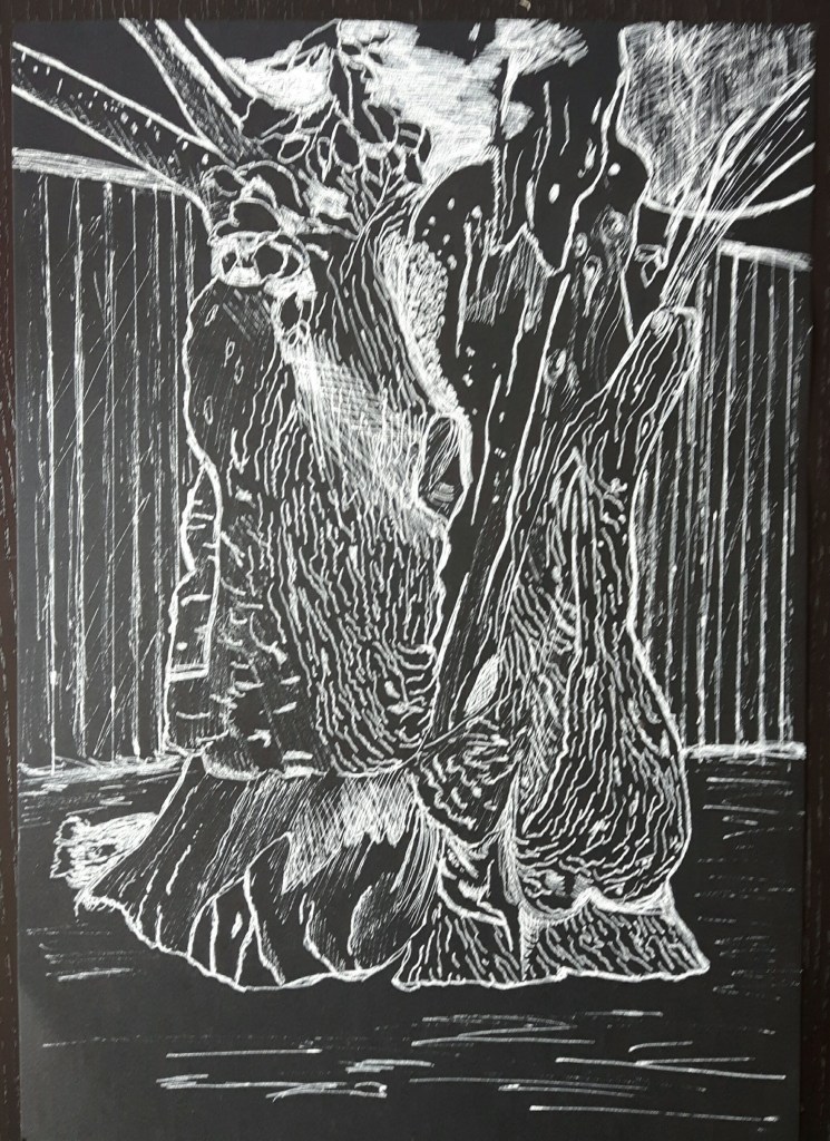
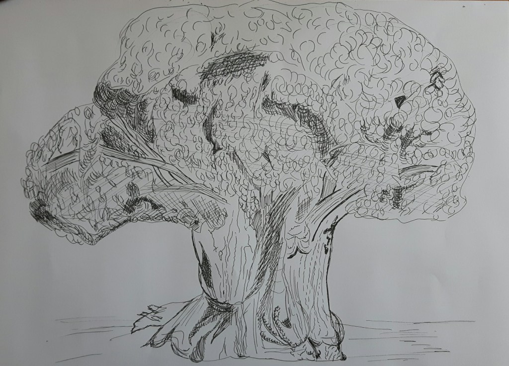
I had to draw the next one from a photo due to this challenging weather and to be honest that applies for most of my drawings in the “Expanse” part for the same sad reason. Luckily I have plenty of pictures of parks, forests and landscapes to choose from. The first was an interesting piece to draw, the second one is a larger tree I tried to add shades with splashing water on the paper with not much success.
Study of several trees
In this exercise I have to work on a group of trees focusing on perspective, lights and introducing colours. I mapped the contours with pencil then worked on it with hard pastel.
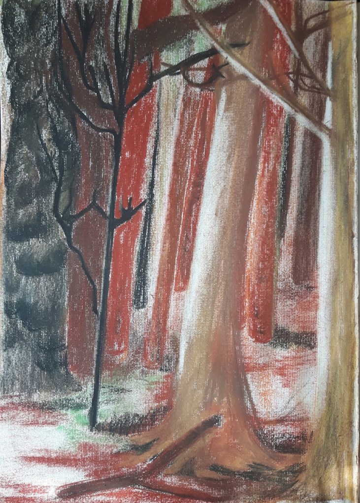
The trees were quite different in shape, size and colour so it was easy to distinguish them by capturing the difference of silhouettes. The picture is rather blurry with no detailed leaves, unfortunately the part I drew did not have any to show so there is only a hint of green represents the foliage between the branches. I indicated the fall of light with making marks with soft rubber. There was not much to simplify since the possibly “mass” part of the picture – the leaves/foliage – was almost completely missing. I definitely could have gone for a better scene that includes the top of the trees as well.
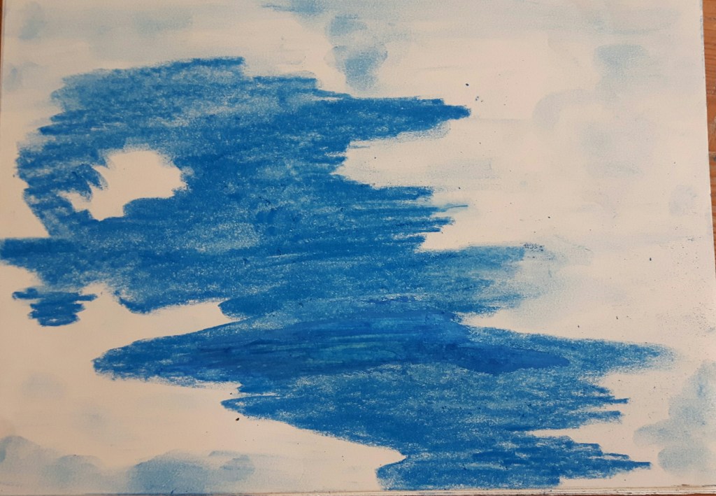
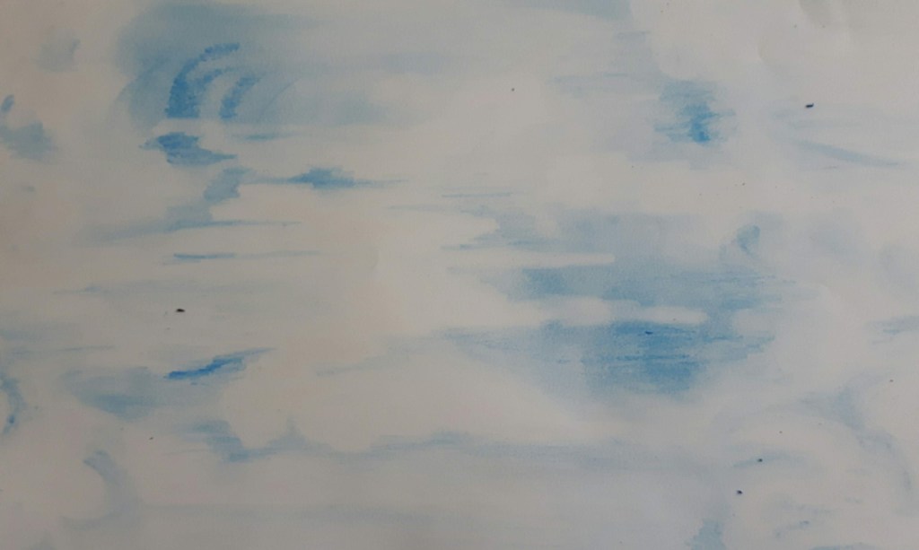
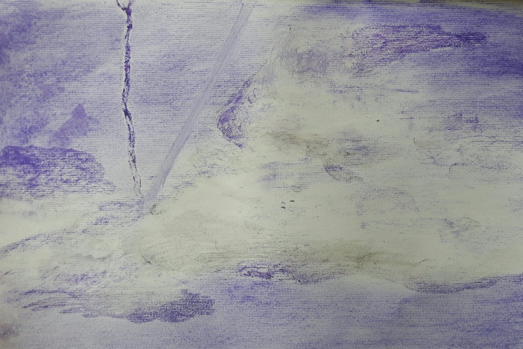
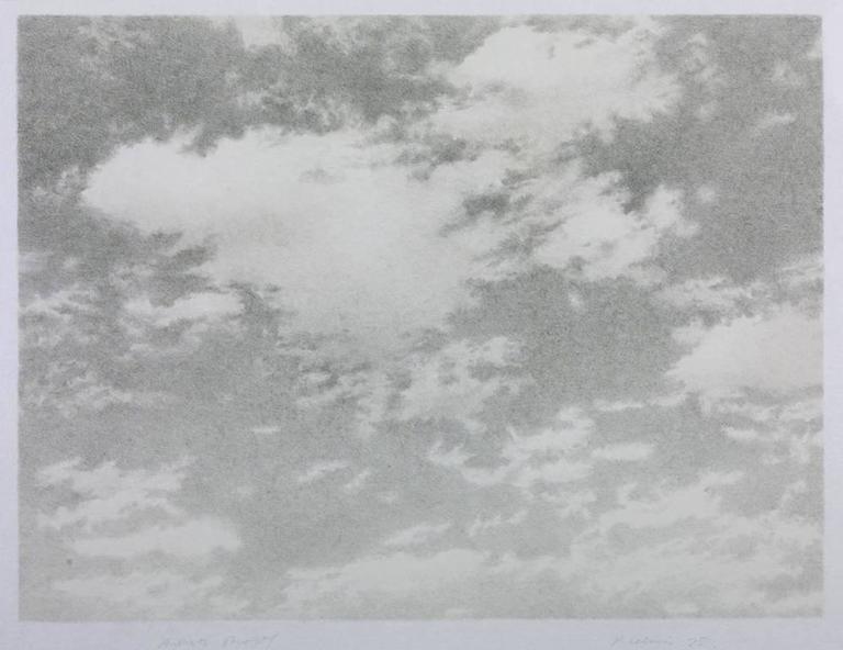
Landscape Exercise 1. Cloud formations and tone
In this exercise I focus on drawing clouds using different tonal media. I used watercolours, crayons, oil pastels. After watching the video of Vija Celmins, I tried to capture the moment only, otherwise that exercise would have been a bit overwhelming.
Research point Landscape
Landscape paintings became really popular through the 18th century following two models: the classical and the Dutch. Many subgenres developed, mostly scenes from villages, farms and woodlands. Richard Wilson – who is known “the father of British landscape” – with Thomas Gainsborough reawakened the landscape genre. The 19th century called the golden age in landscape painting through Europe.
John Constable (1776-1837) was an English landscape painter in the naturalistic tradition. His usual subjects were scenes of daily life, his exceptional sensitivity to beauty is shining through all his paintings.
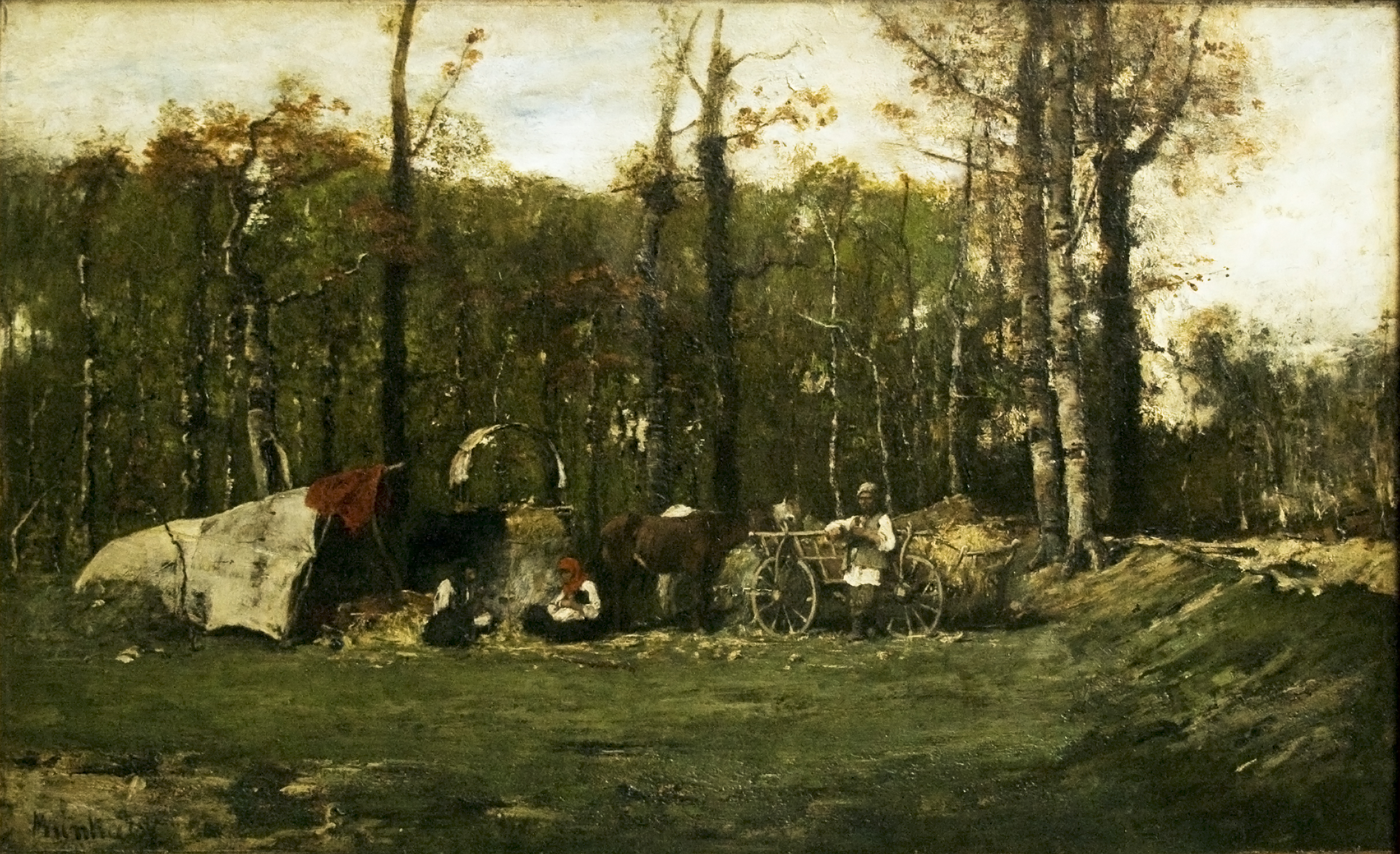
Mihaly Munkacsy (1844-1900) was a Hungarian painter mostly known for his biblical paintings but also had a passion to paint ordinary scenes from peasants/gipsies daily life. His work were always rated highly by critics in his time.
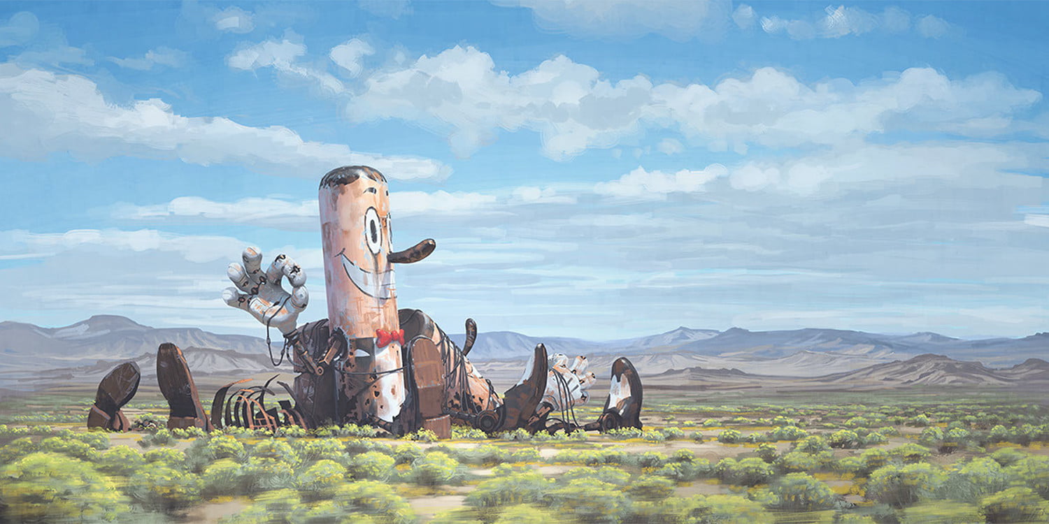
Moving forward into the 20th century landscape genre radically changed, more experimental ways instead of using traditional media and changing the approach with bringing more urban and industrial scenes into it. This century is also bringing great diversity in relationship to the genre from Dora Carrington’s mystical, delicate pictures (Spanish Landscape with Mountains) through Jan Sluijters with a mixture of styles, expressionism and pointillism (October Sun, Laren) to science fiction inspired Simon Stalenhag’s incredible digital paintings.
Research Point: Vija Celmins
Vija Celmins is a Latvian-American visual artist best known of drawings of ocean, rocks, spiderweb and other natural objects. While watching the suggested video of hers, I immediately thought of Jerzy Kosinsky who said once that “The principals of true art is not to portray but to evoke.” This statement probably a bit controversial about an artist who mastered photo-realistic style in her work but she is capturing the essence of the subject – for example one still moment in the continuously splashing ocean or moving clouds – and she makes that precisely caught moment yours forever.
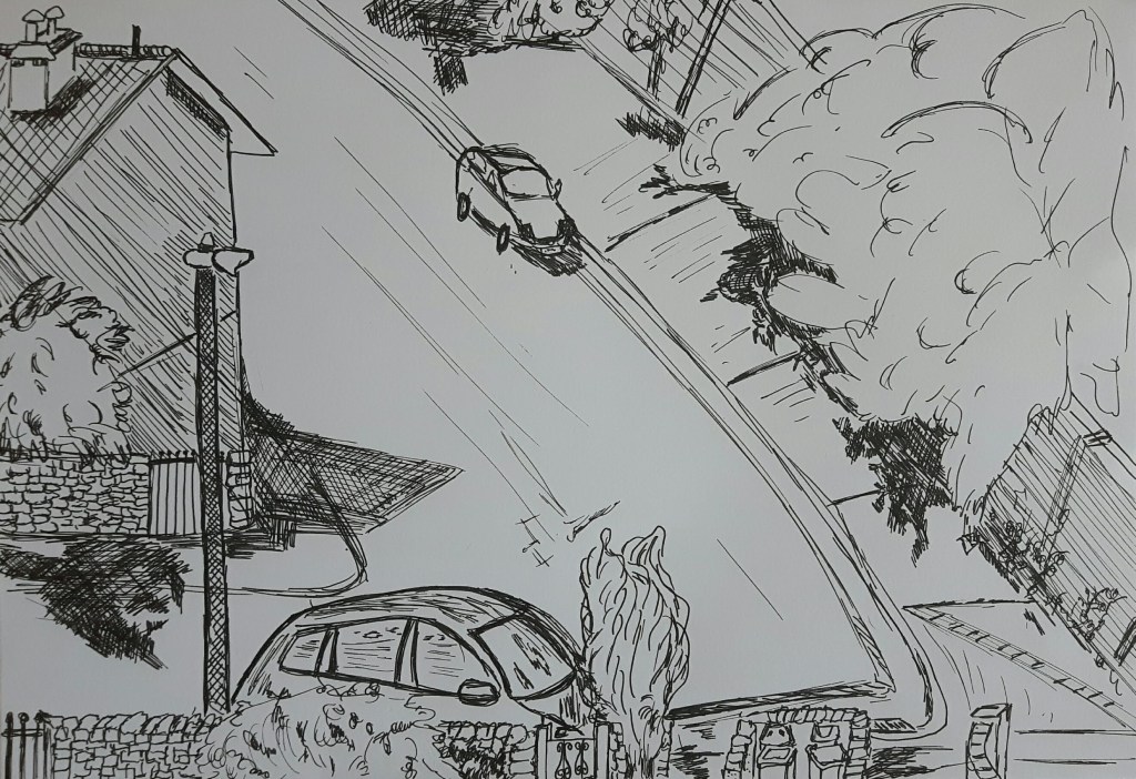
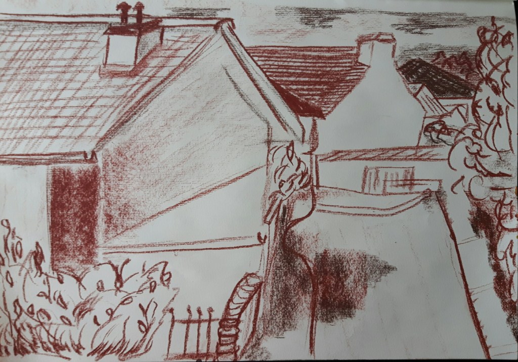
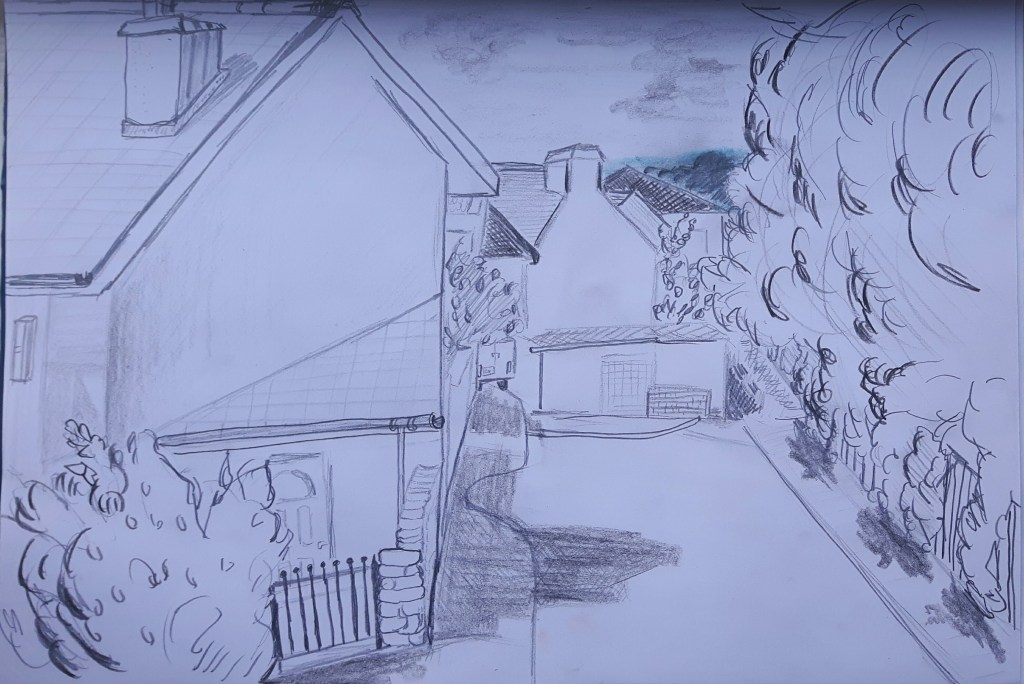
Exercise 2 Sketchbook walk
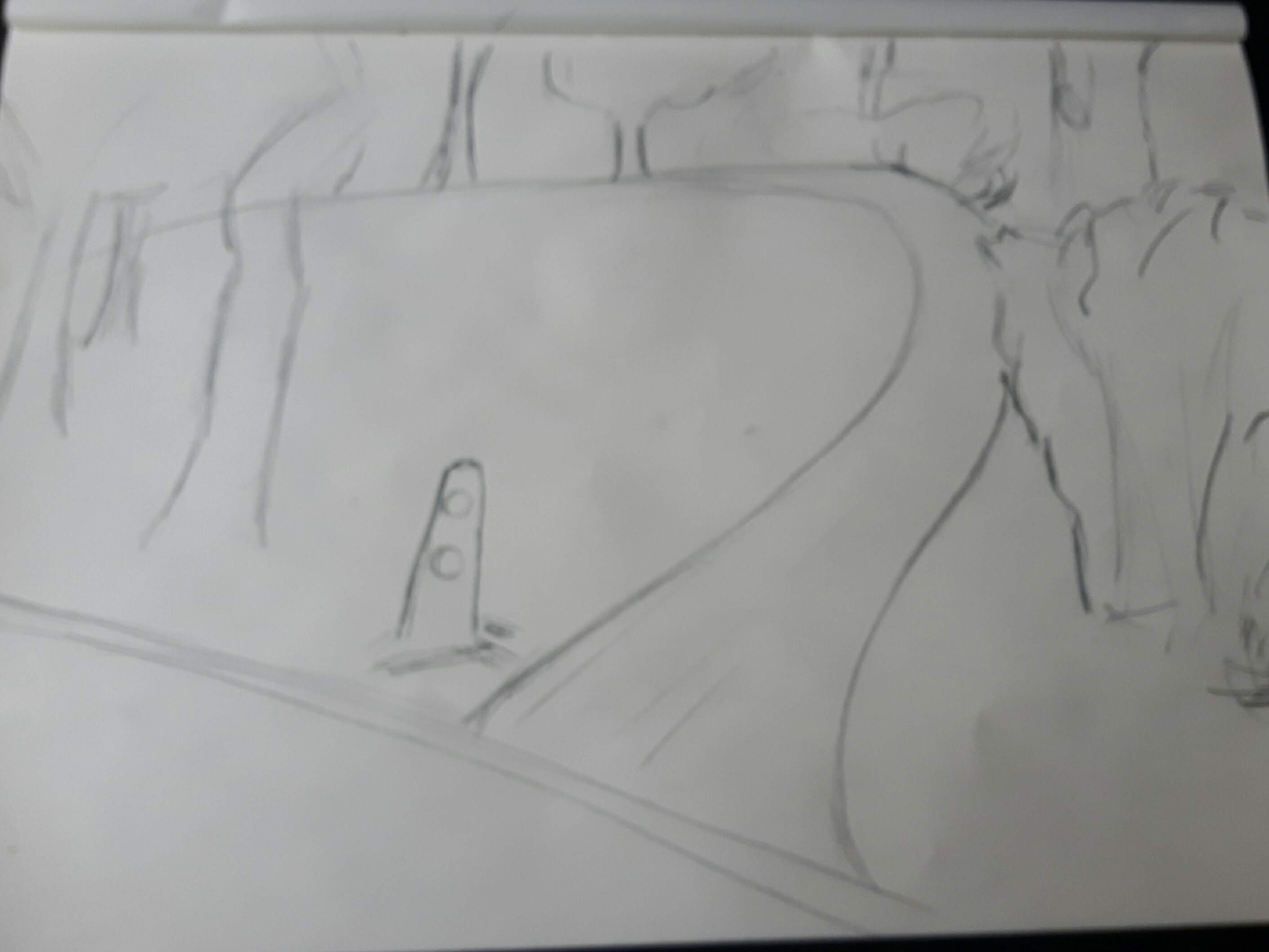
I recently visited a beautiful park where I was stunned by the view so I used that experience for this exercise. The first drawing is a little cottage, the second one is a small road leading to a forest, the third one is another path in the park.
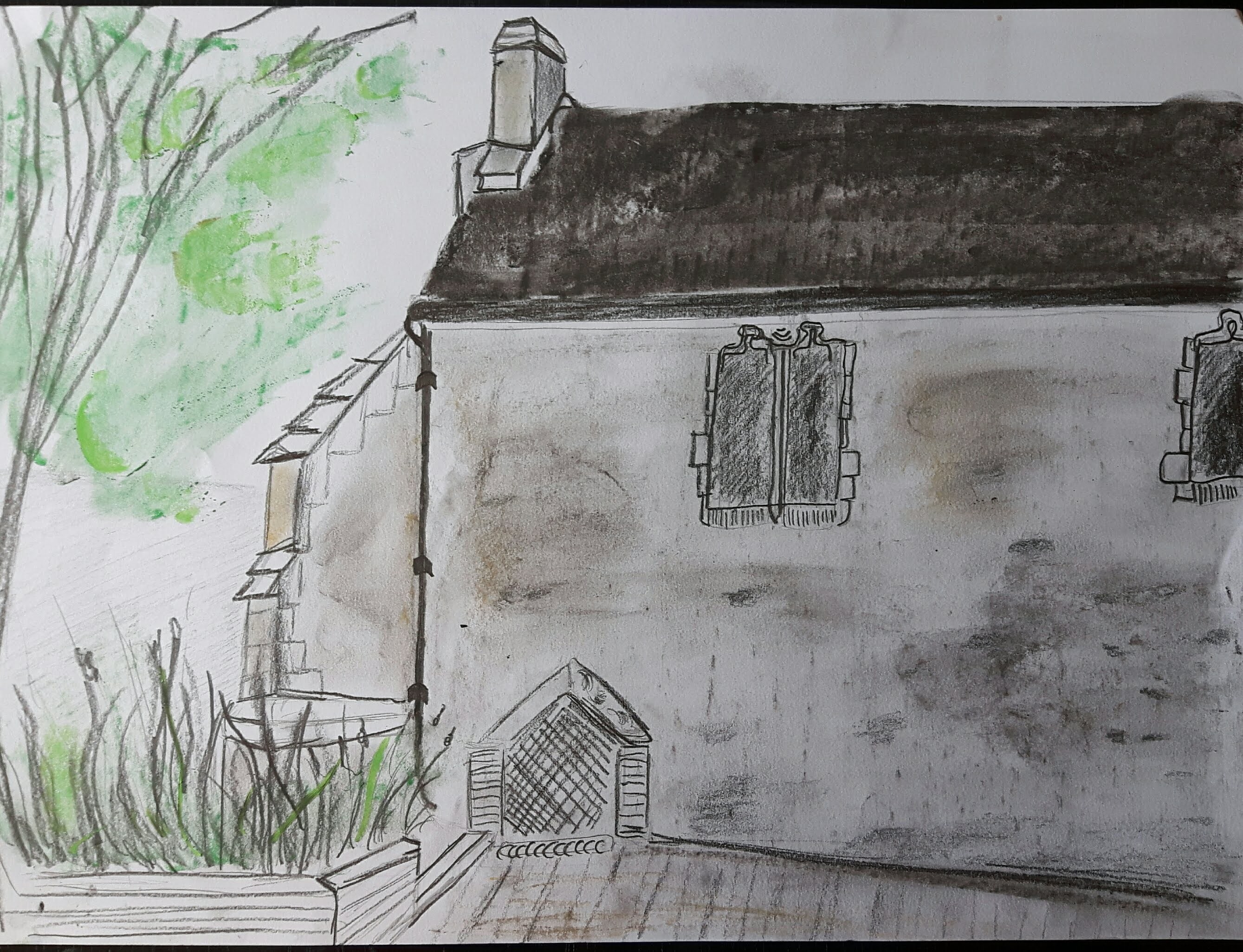
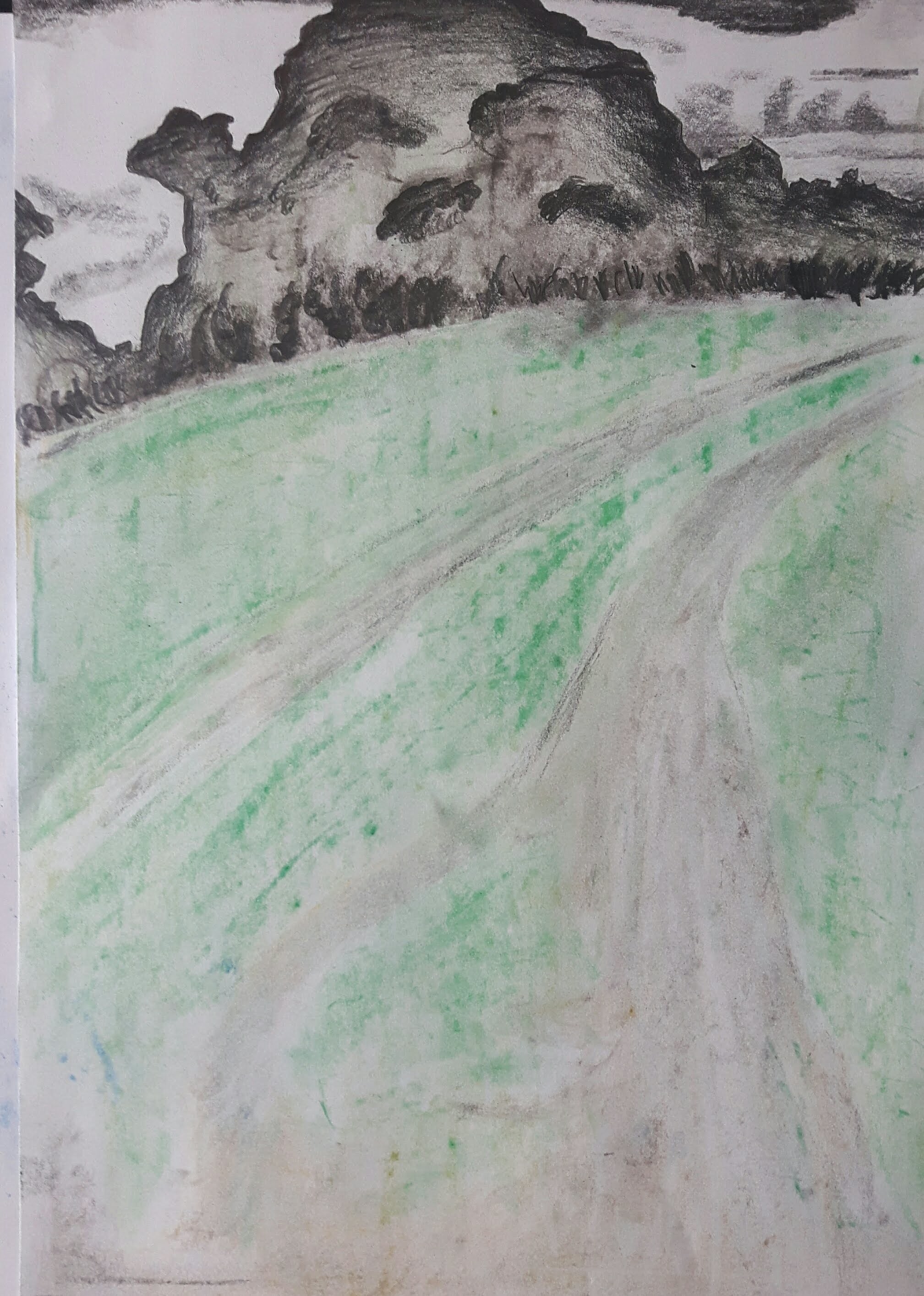
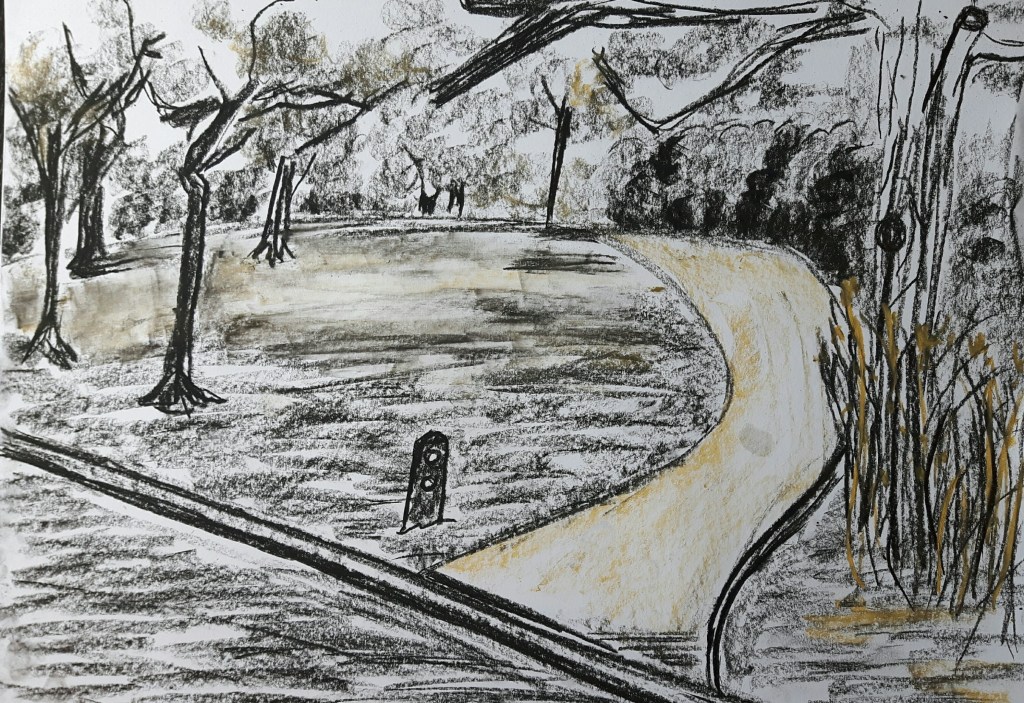
The cottage above was quite old, also this sketch lacks a bit of depth. The small bushes next to the path were almost black on the second one as dusk came soon and that time of a day the background had a sharp silhouette that I could not really catch well but didn’t want to rub out. On the third one, the light comes from left what I tried to indicate with yellowish smear marks on the ground. The fourth one..well, I know that is a bit far from the original exercise (also a bit overworked for this part) but she was there and that was an offer I can’t refuse…
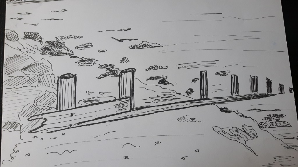
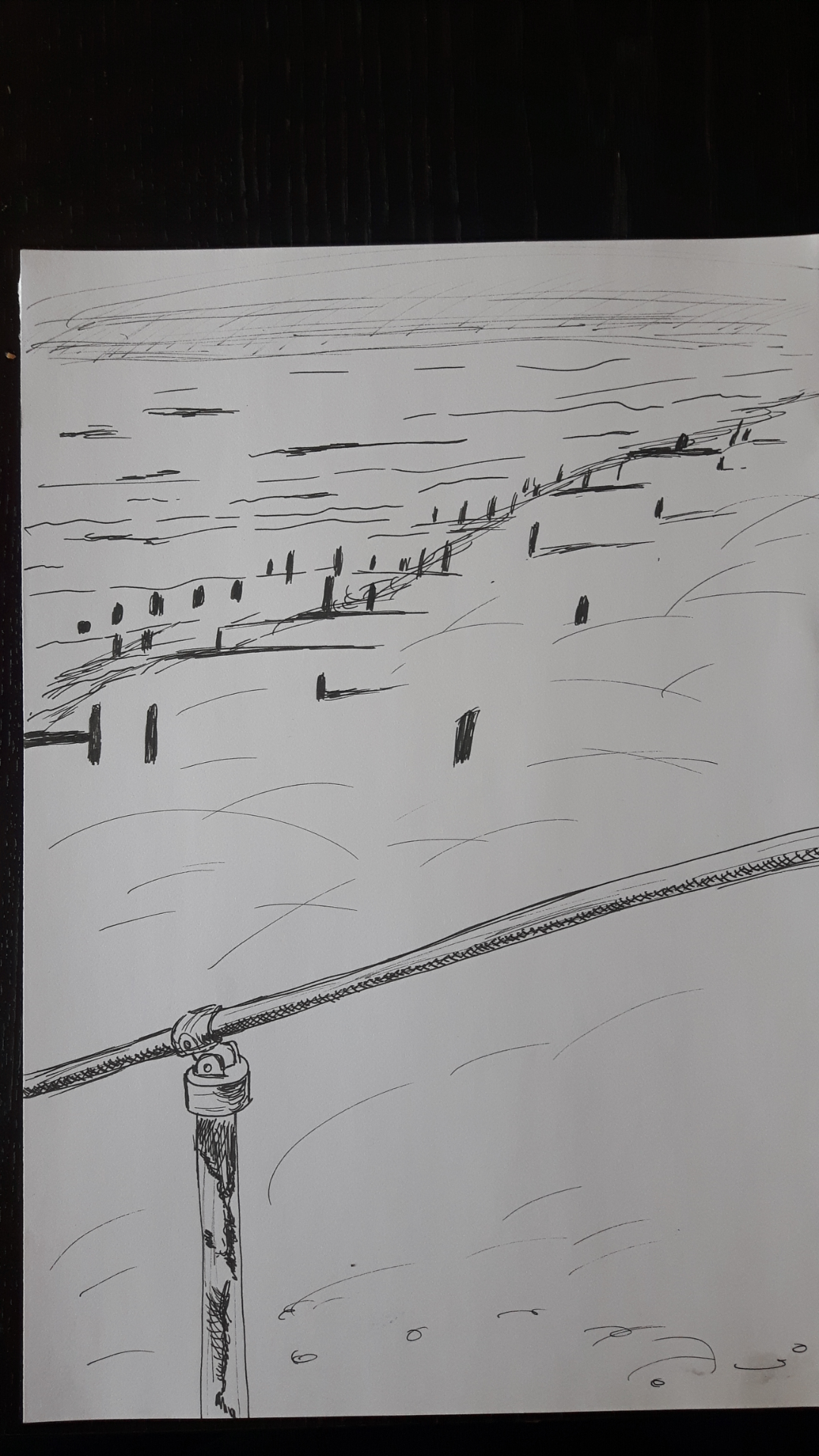
Exercise 3 360° studies
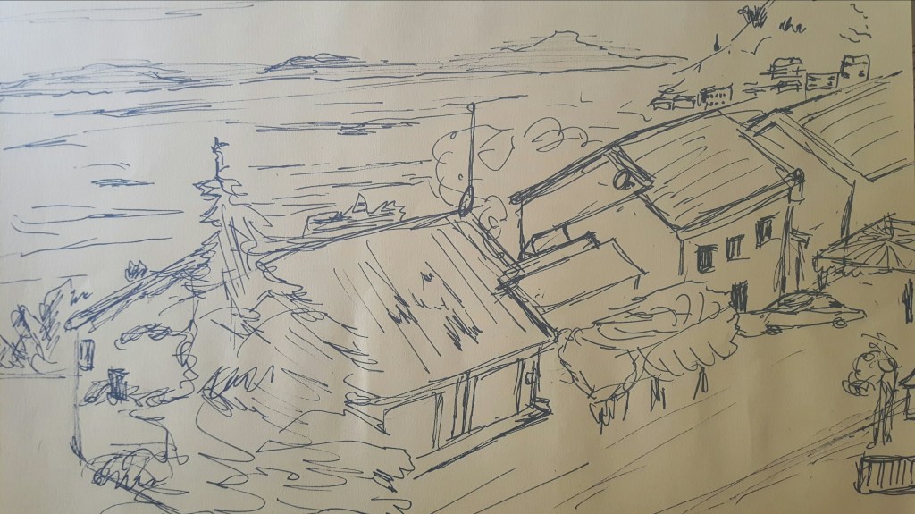
Choose an expansive landscape where you have an open view in all directions. I did this set of sketches when I went to the seaside. Though it seemed convenient and simple I think I struggled with that part the most.
Research Point Historic and Contemporary Artists
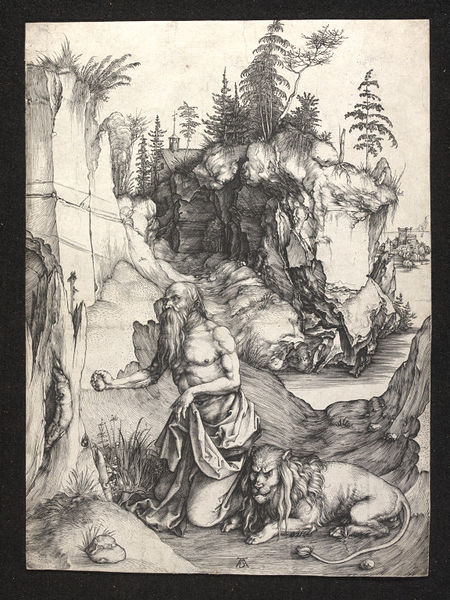
Albrecht Durer (1471-1528) he is best known for his high-quality woodcut prints, also his watercolours made him one of the first landscape painters in Europe. The “St John’s Church one of the earliest landscape paintings. To me it is a limited palette painting with brown tones and the hills at the background are less defined in bluish wash. I’m curious why the houses are so narrow on the left hand side. In the research I couldn’t find any answer, only “…this was because the artist’s focus was on details rather than on the overall effect…”
There is a series of St Jerome, those are not really landscape series, more about this biblical figure, but there is a small masterpiece, the St Jerome in Penitence where he used the subject St. Jerome in a landscape for a small picture which was inspired his travels through the Alps and his studies of cliffs around Nuremberg.
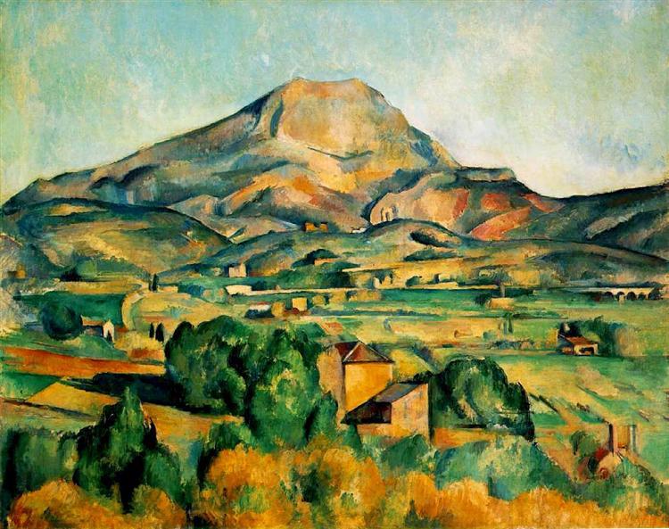
Paul Cezanne (1839-1906)
Cezanne was a French painter who had a major influence on Cubism later. Even though he worked and exhibited with famous Impressionists such as Monet and Cassatt, he didn’t consider himself an Impressionist. His landscapes were not painted in the open air, instead of impressions he focused on symbolism and substance. Cezanne preferred bright colours – especially in his landscape (Mont Sainte-Victoire series), also reduced his forms to their geometric shapes.
David Hockney (1937-
English painter, draftsman, printmaker, stage designer and photographer. He is know by his colourful Californian landscape paintings in Pop-Art style. Also painted many swimming pools catching that certain still moment in a constantly splashing water. Moving Focus Hockney created his largest lithograph series with printer Kenneth Tyler. The series combining two different approach – the multiple viewpoints within the same picture and a fixed viewpoint painting. Later he produced large-scale landscapes inspired by Yorkshire. The East Yorkshire Landscape include five bright large paintings were all painted from the same spot in Woldgate Woods.
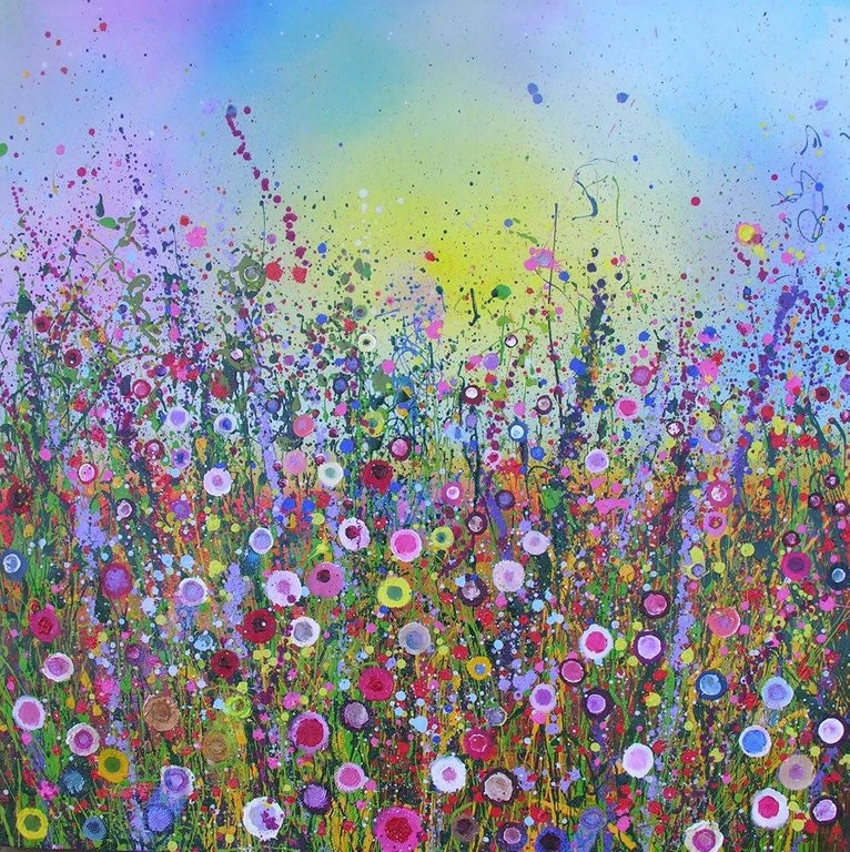
Yvonne Coomber (1964-
Coomber is a British abstract Landscape artist. She is best known for her Devon inspired magical English countryside Landscapes. She is using mixed media – such as glitter, gold, leaf, pigments and paint, working with sponges, fingers, paintbrushes to create a delicate and mystical atmosphere. According to the artist “…the result is a kaleidoscopic jewel like composition…”
Project 3 Composition
Exercise 1 Developing your studies
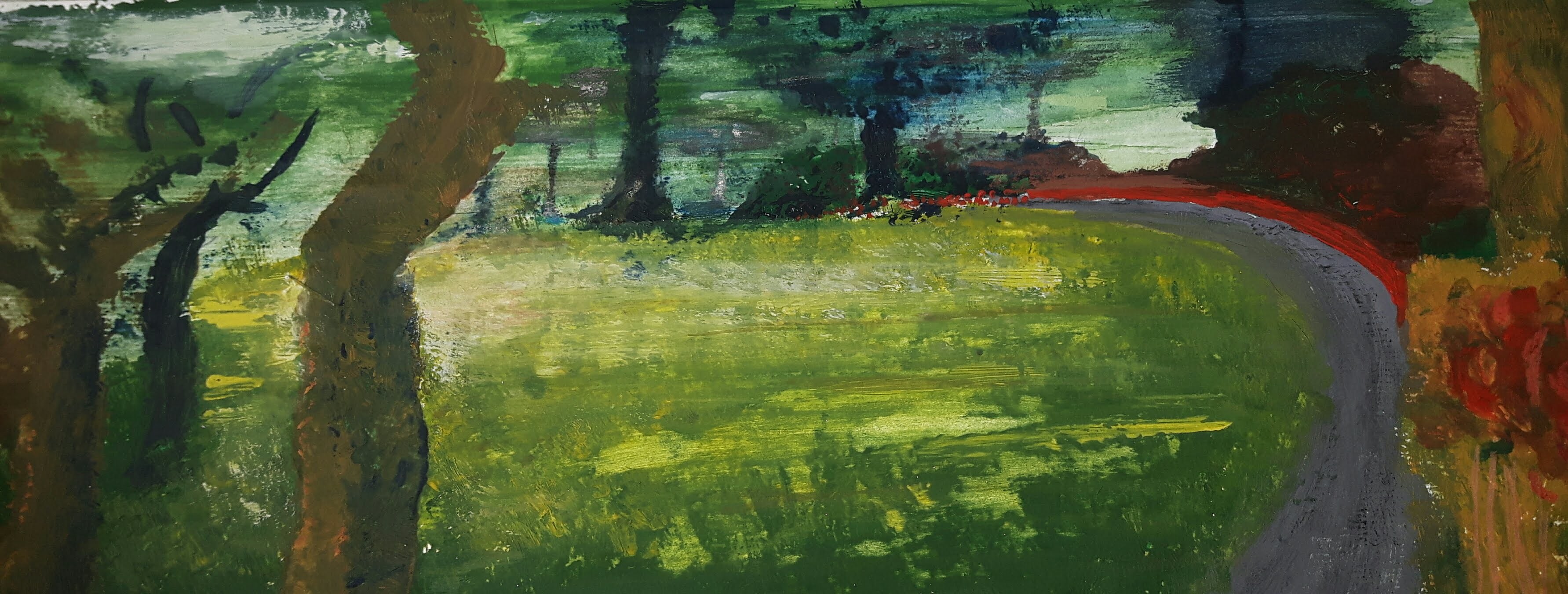
After reviewing my drawings I thought I would like to work on this drawing from the park.
I really liked the composition, also the light falling on the clear through the trees on the left hand side. I wanted to challenge myself and because I’m still kind of insecure with colours – apart from limited palette style – I decided to use tempera. Also, I’ve never used that media before so I felt that would be quite an adventure! When I made this sketch, there was a bright daylight, now I decided to put the scene closer to dusk regarding colours. I started to sketch rough outlines with graphite pencil on watercolour paper.
First attempt…
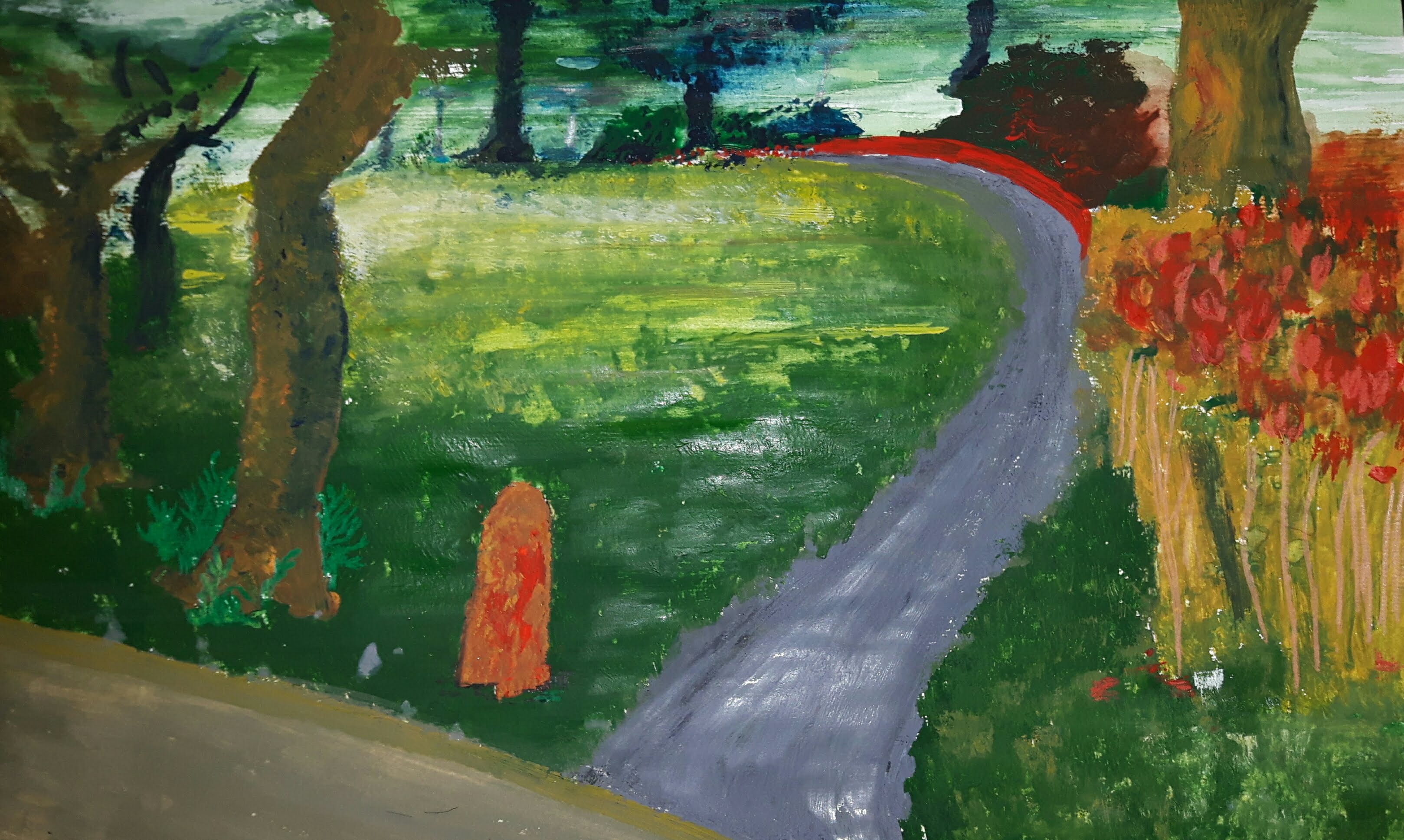
I decided to rework on it and felt that the piece would be better cropped this way.
Exercise 2 Foreground, middle ground, background
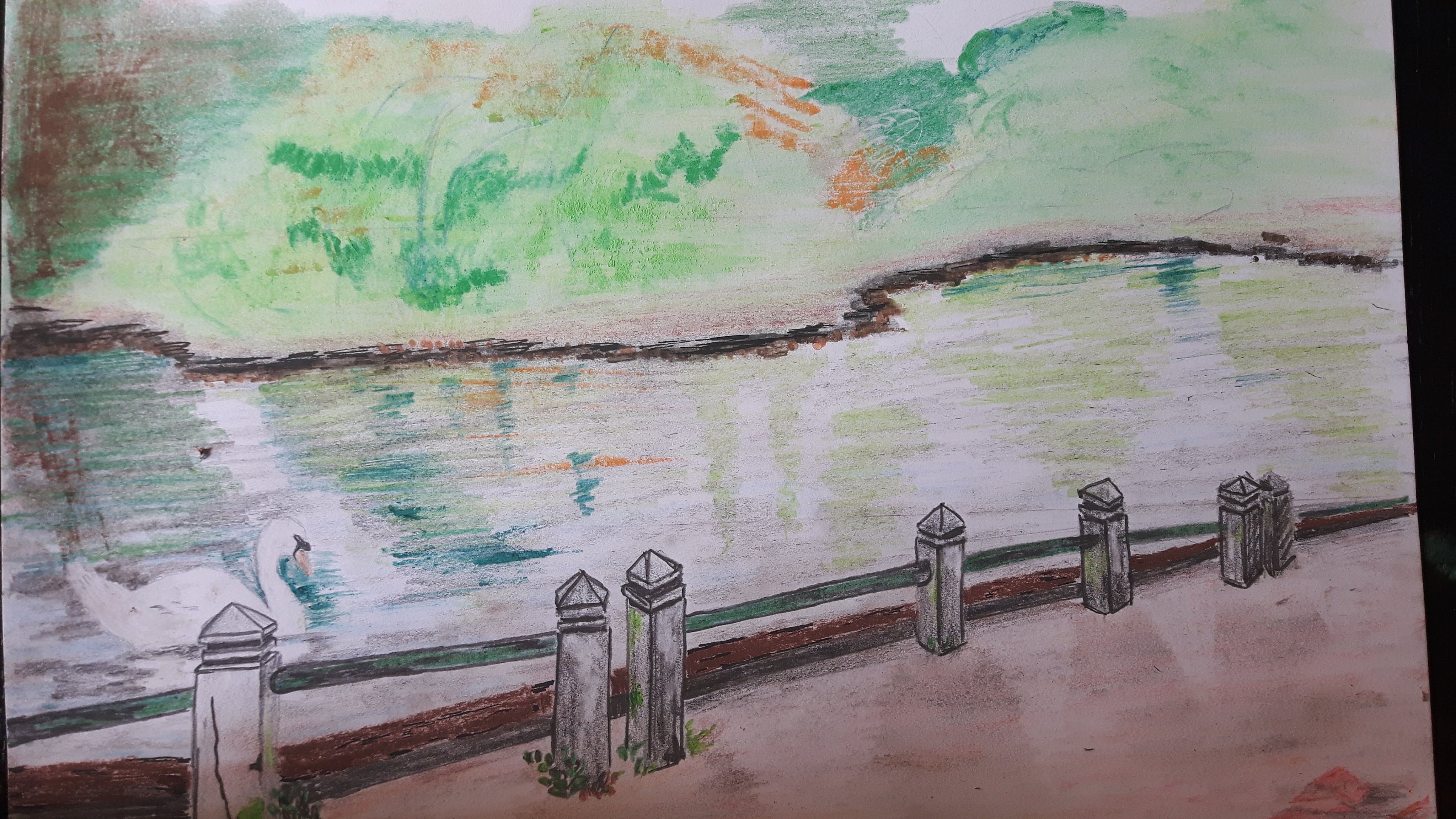
The aim of this exercise is to establish a foreground, middle ground and background in my drawing. I choose an old photograph with and idyllic lake with a swan on. Resulted a postcard-like image but I tried to distinguish the front -where the swan is – with more details from the middle part – the lake mirroring the trees – and the background with more washed effect.
Reflection
I tried to simplify with repetition of simple forms creating the flowers’ heads on the first and the washed line shaping the edge of the lake on the second drawing. I sharpened the focus on the closer items (the flowers/the small concrete columns) with detailed sketching and used more soft smudging for the background. On the first picture I thought to show a bit more dramatic effect where the light fell on the ground with not only leaving the clear blank white but overemphasizing it with bright yellow strokes and shades. On the second one capturing the shadows of the columns were more successful comparing to the mirrored shades of the trees on the lake’s surface. If I was to do it again I would definitely do more thumbnail sketches to be more confident with the foreground part.
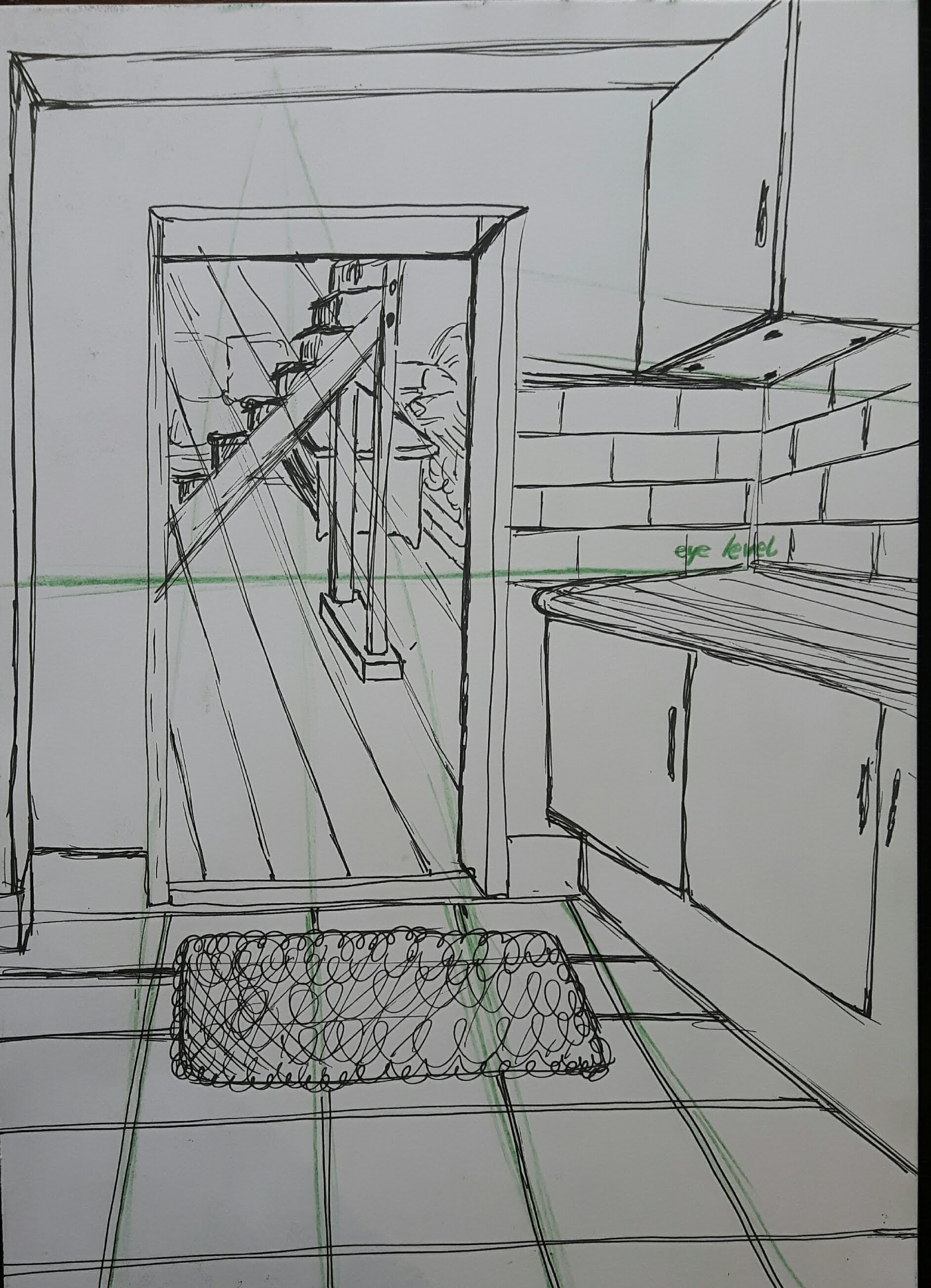
Project 4 Perspective
Exercise 1. Parallel perspective – an interior view
Draw a view through a doorway inside a building.
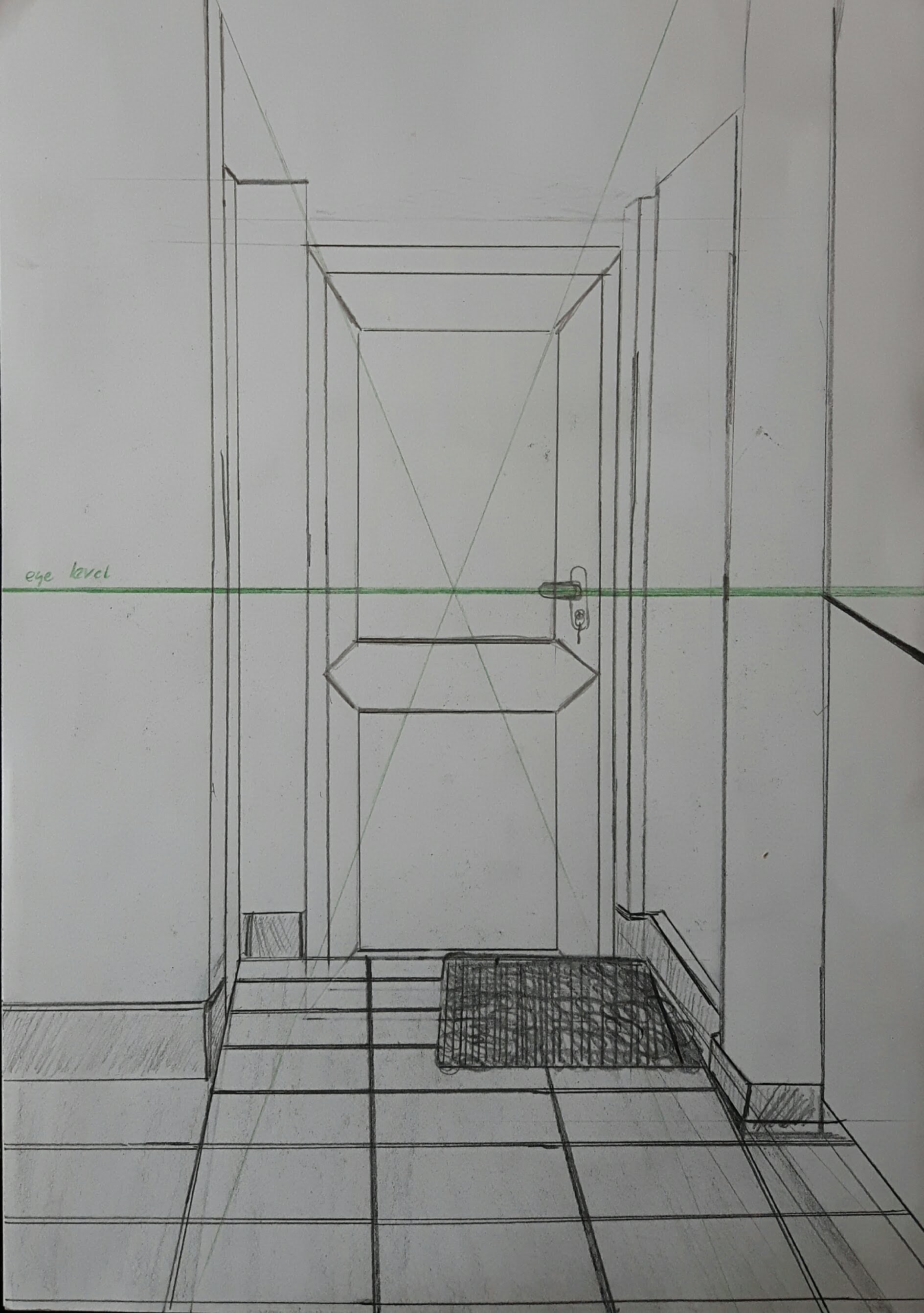
I used HB-3B pencils. After finishing this I read the exercise through again and found the line “don’t use a ruler or a rubber”….so there is the next one, with a different door.
Exercise 2. Angular perspective
Make a line drawing of a building or several buildings seen corner-on.
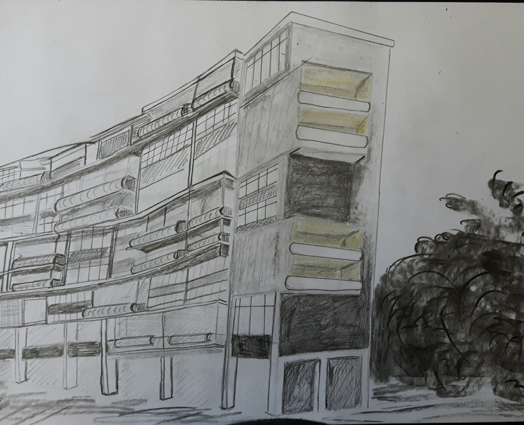
Bauhaus building, Berlin 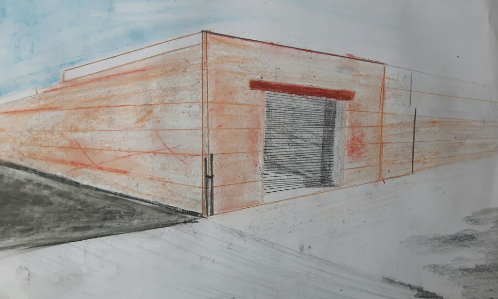
On the first drawing the vanishing point is on the left hand side, way off my paper. On the second one the vanishing points are on both sides.
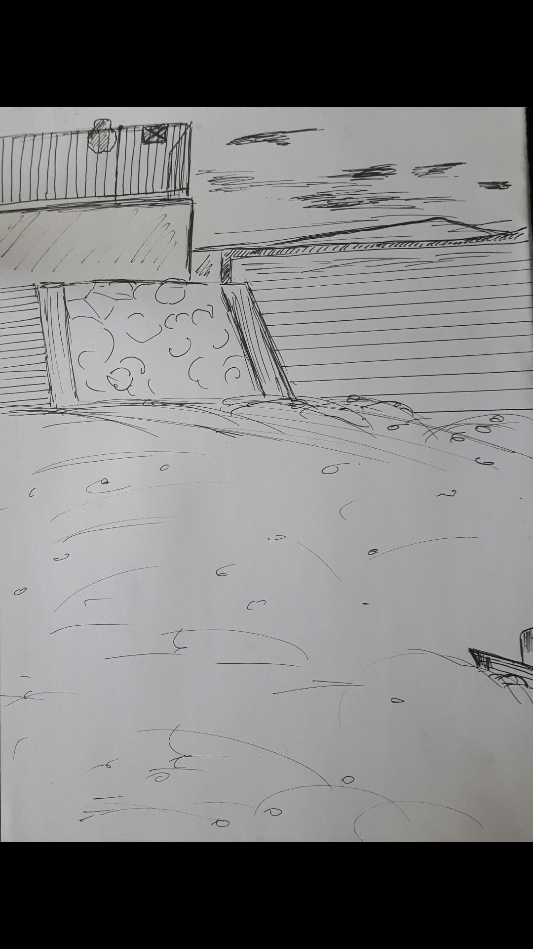
Exercise 3. Aerial or atmospheric perspective
This is a view from my bedroom window with fine pen, pastel and pencil. Using soft media worked better than a pen drawing probably because the misty background.
Project 5 Townscapes
Research Point Urban Environment theme by contemporary artists
John Virtue is an English artist best known for his monochrome landscapes. His work “London Paintings” focused on the London skyline, using white acrylic paint, black ink and shellac. His paintings are blurry, some of them are abstract. Even though he is using landmarks build mostly in the 20th century from the capital, his paintings are taking me back to the Victorian era somehow. The city is foggy, rain-soaked and ever so dark.
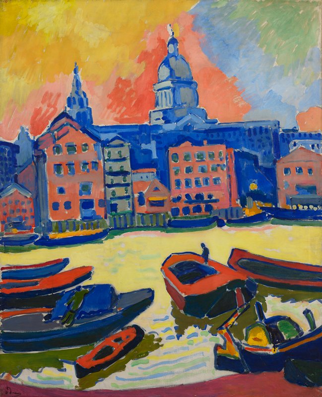
Andre Derain’s paintings of London are strikingly different. The French artist was a co-founder of Fauvism (strong, pure colours and unconstrained brushwork) with Henri Matisse. He came to London in 1906 to paint a variety of London subjects. Derain’s London series were groundbreaking with their pioneering techniques.
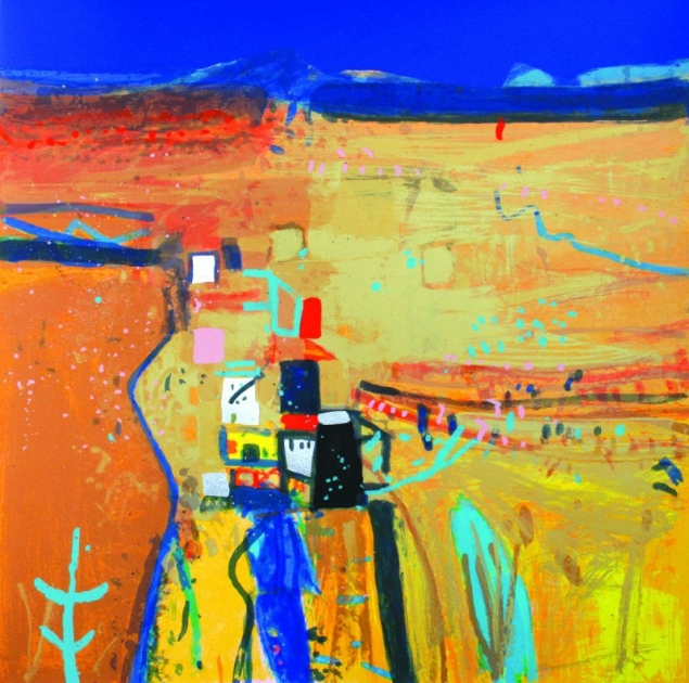
Luckily, there are artists today creating similar bright atmosphere. Barbara Rae is a Scottish painter, who is using pure, unmixed colours to paint her abstract landscapes.
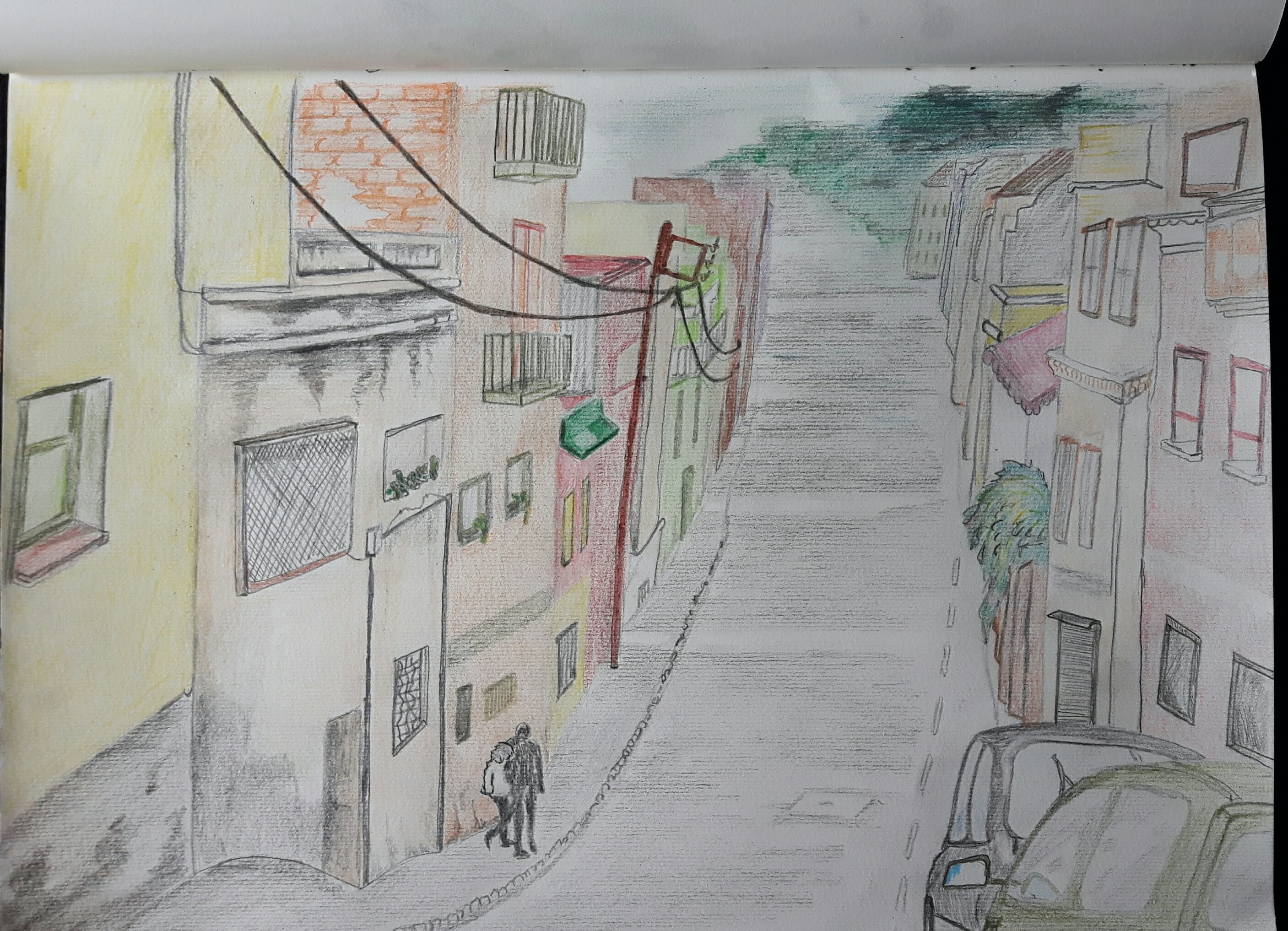
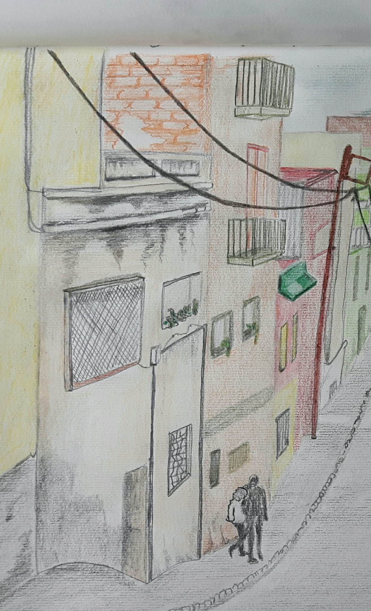
Exercise 1 Sketchbook of townscape drawings
I found a photo of a colourful, long downhill street in Barcelona which I really liked. I put the line drawing in pencil just to get the perspective and proportions.

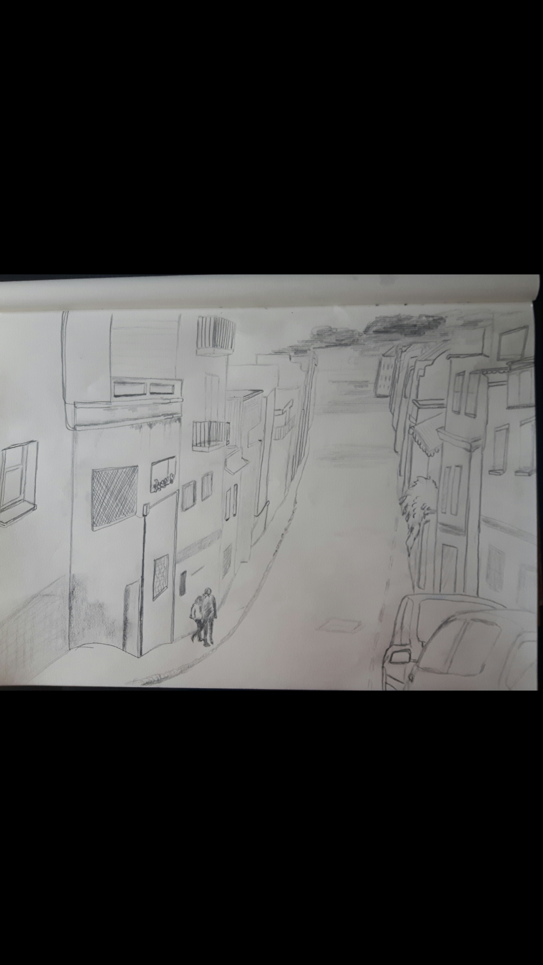
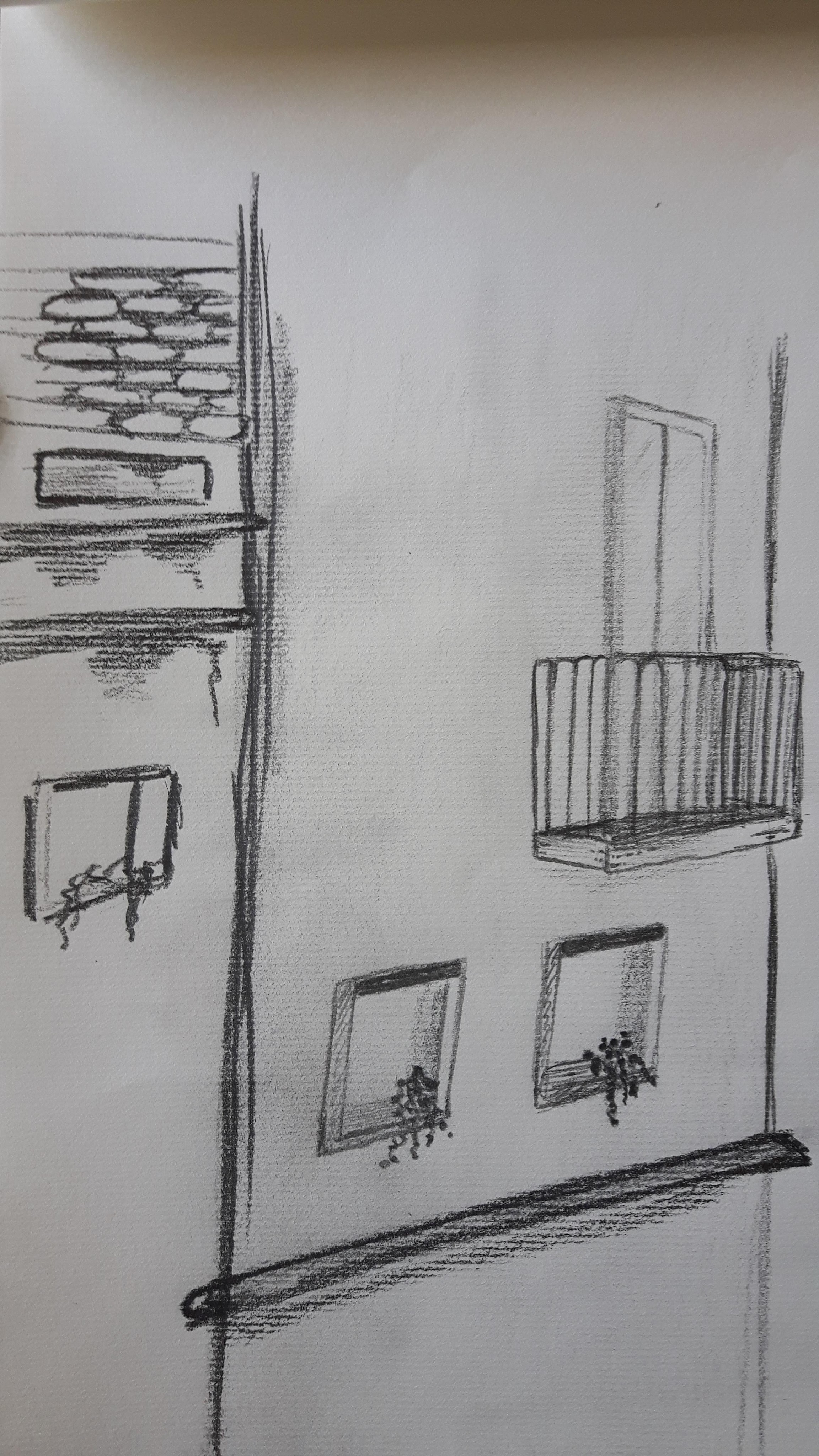
I used coloured pencils and HB-4B.
Study of a townscape using line
I used black pen for this exercise. I have a nice photo of a Croatian seaside town and a small English town, too.
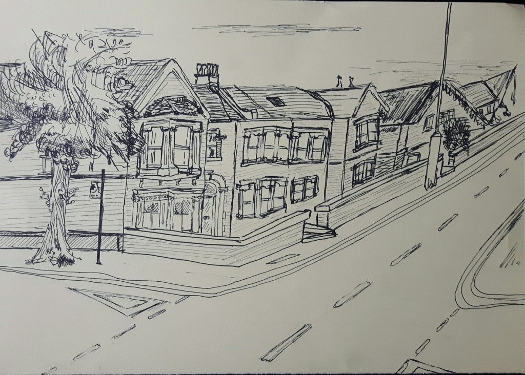
I think I haven’t got the perspective right on the second one, I should have used the house on the corner as a start point of a straight descending line for better proportion.
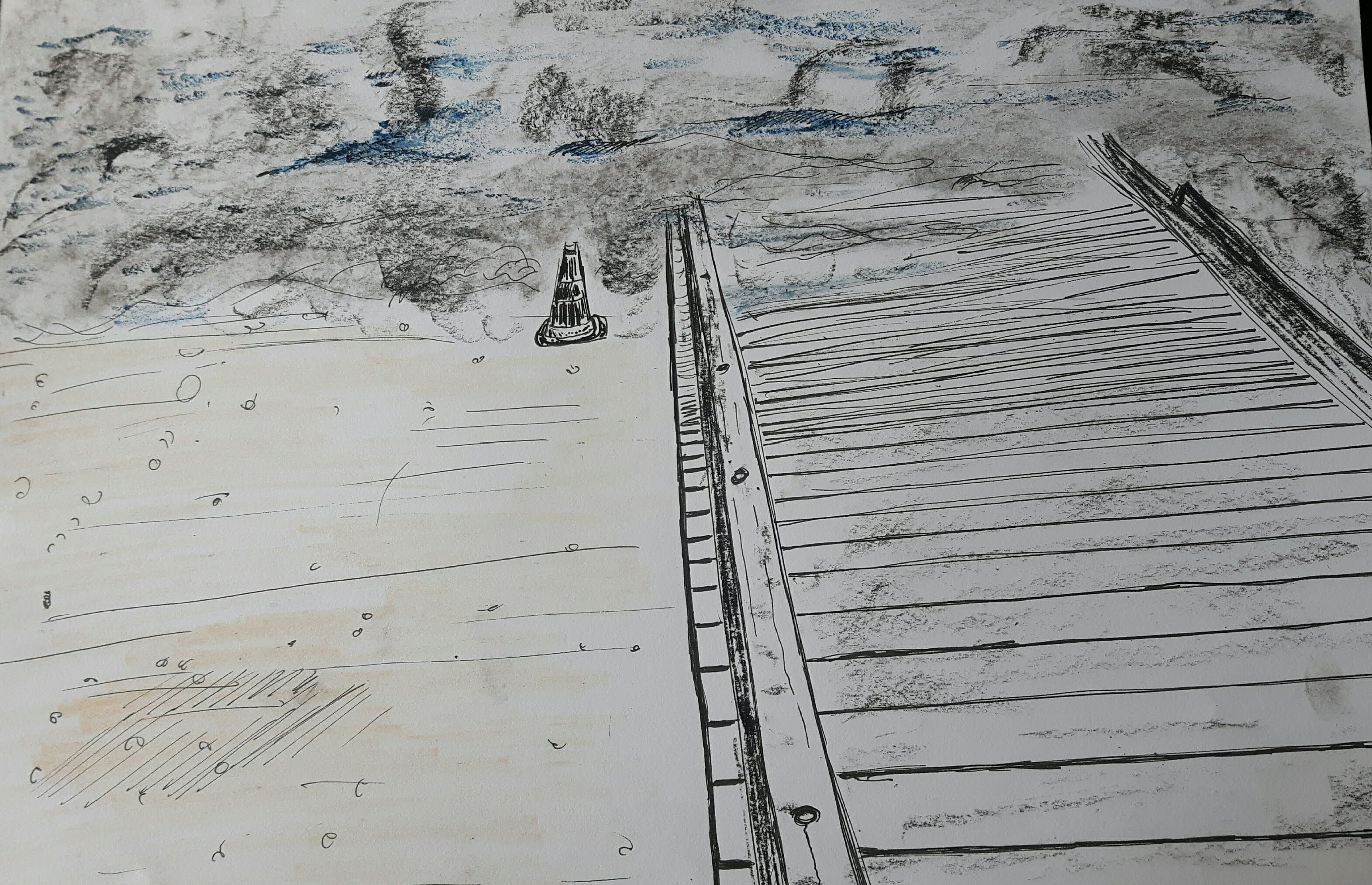
Exercise 3. A limited palette study
Use a limited palette for this exercise – no more than three colours. I used olive green, yellow and black for this drawing. Did it watercolour pencil, conte stick and ink. That is not exactly a part of the town but I chose it because of the interesting possibilities to create depth.
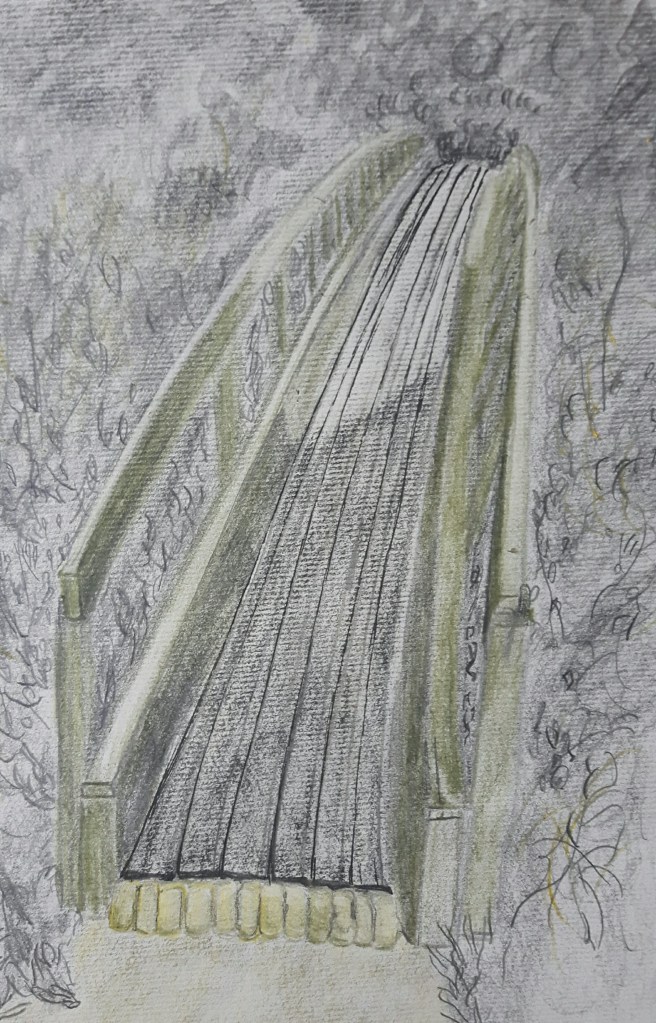
That’s a really pretty arch, I liked the way the light fell on the middle part of the bridge. I hope I was able to create some sense of depth.
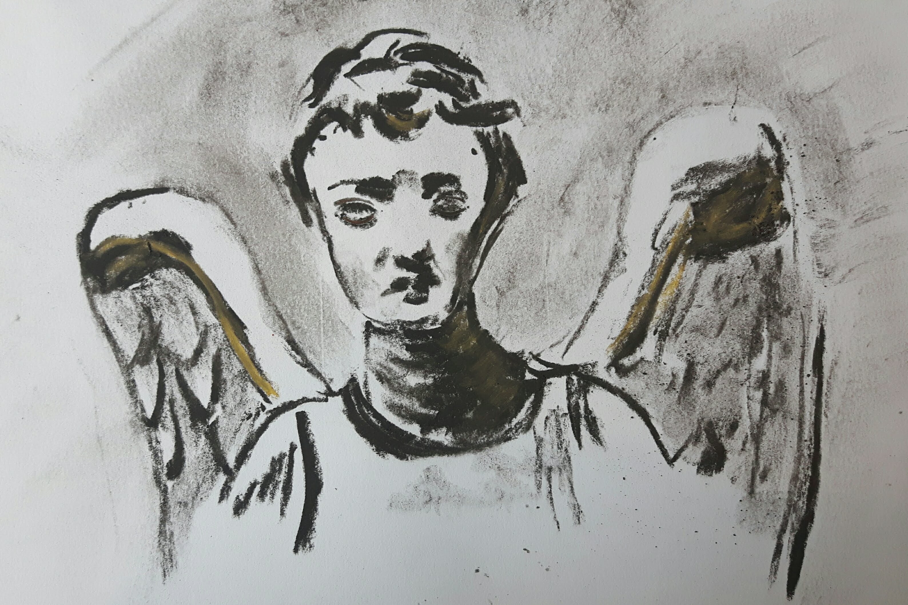
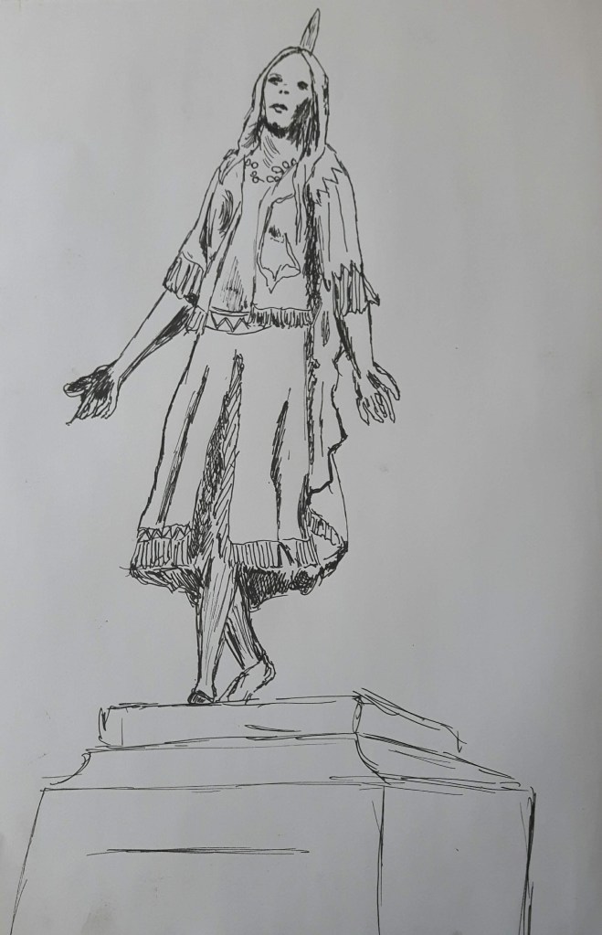
Exercise 4. Statues
In a similar way to drawing trees and drawing figures, statues are great for honing your drawing skills and they don’t (usually) move! After reading this I immediately thought of the obvious choice : The Weeping Angel (Don’t blink!)
Then I realized that my small town is famous for Pocahontas (yes, really) being buried here in St George’s Church.
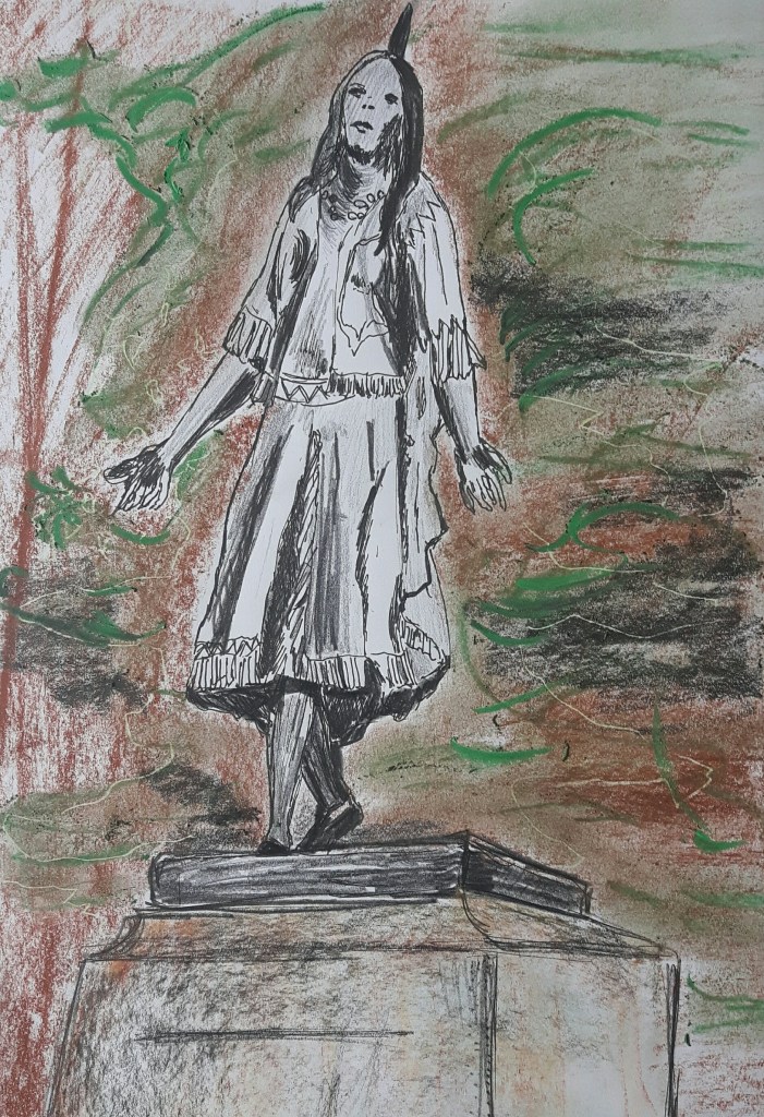
Even though I tried to concentrate on the folds of the clothing, it still went completely wrong and two-dimensional, desperately hanging in the air. I should have picked smooth medium for better blending. I tried to draw another famous person, Mahinder Singh Pujji, RAF fighter pilot who also died here, therefore a statue of him was erected in 2014.
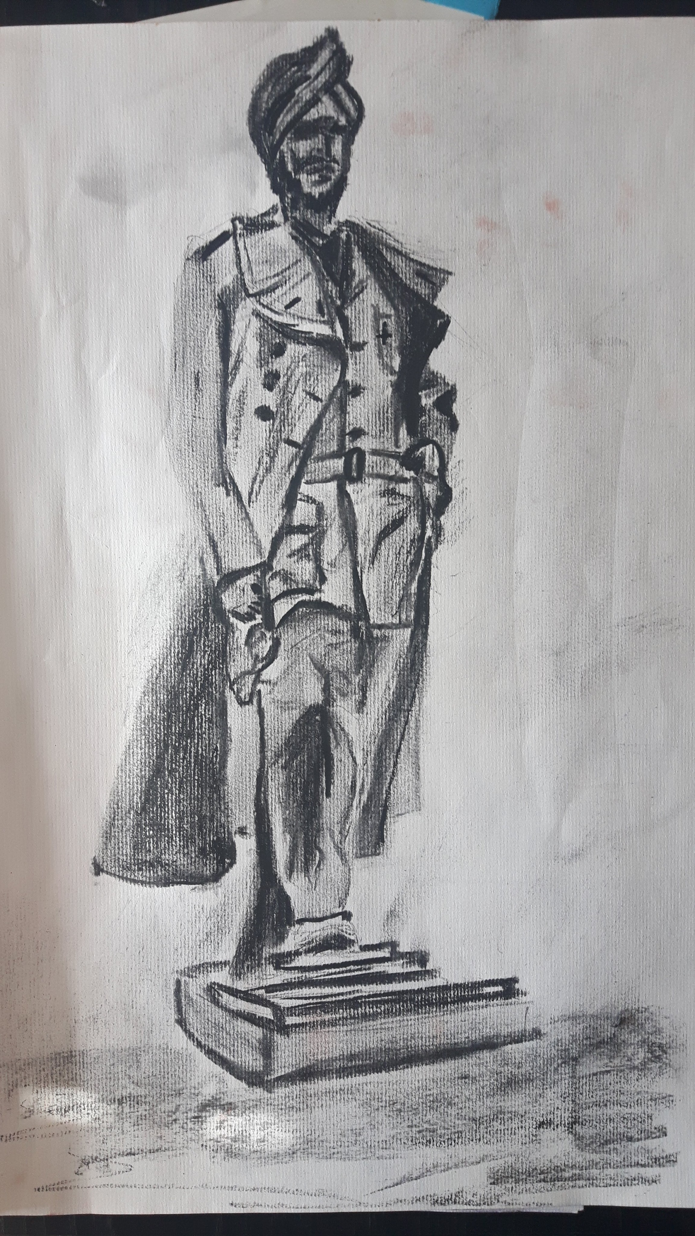
This one looks better comparing to the previous one which was a bit overworked. However, foreshortening is something that needs to be improved.
