COMPOSITION
This part of the course focuses on close observation and interpretation, the use of colour and choice of media. When it comes to colours I always feel a bit uneasy. Actually, I’m terrified. So I decided to take small steps to get used to it…Some of the exercises were such a relief, with a few pleasant surprises and of course terrible mistakes, too.
First I started with quick (under 15 minutes) sketches focusing on composition and playing with colours a little bit. I used charcoal pencil, coloured pencils and oil pastels to start with.
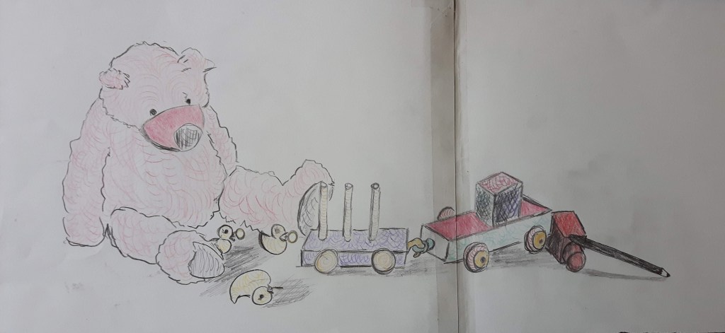
This composition is very long, the first attempt was completely unsuccessful, I had to join two papers together. I tried to highlight some parts with the same tone to see the overall effect but my pencil was not vibrant enough.
Positive and negative space
It was a bit hard to digest that the positive and the negative space equally (or sometimes the latter even more…??) important. Most of the time I concentrate on positive space almost completely ignoring the negative space as if it is just a necessary evil. Completing the drawings below taught me a very good lesson to respect negative space more.
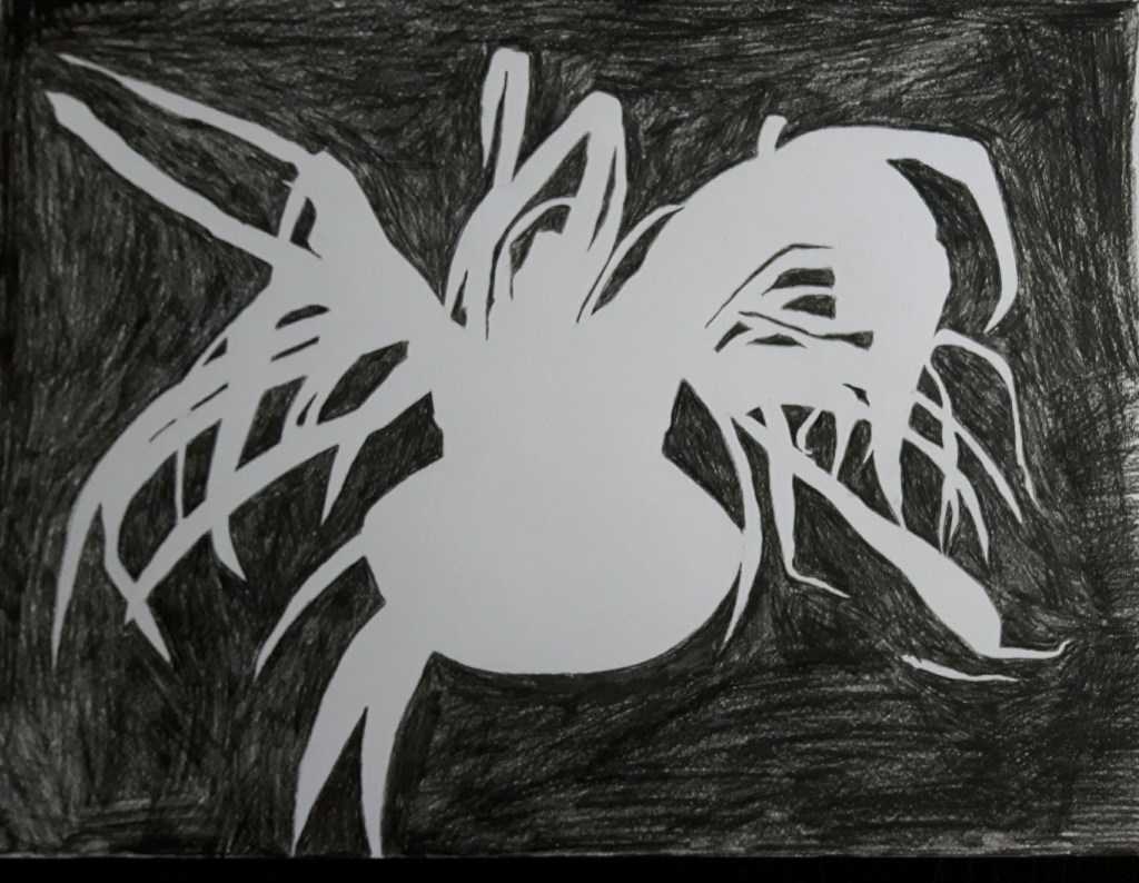
Negative space 1. 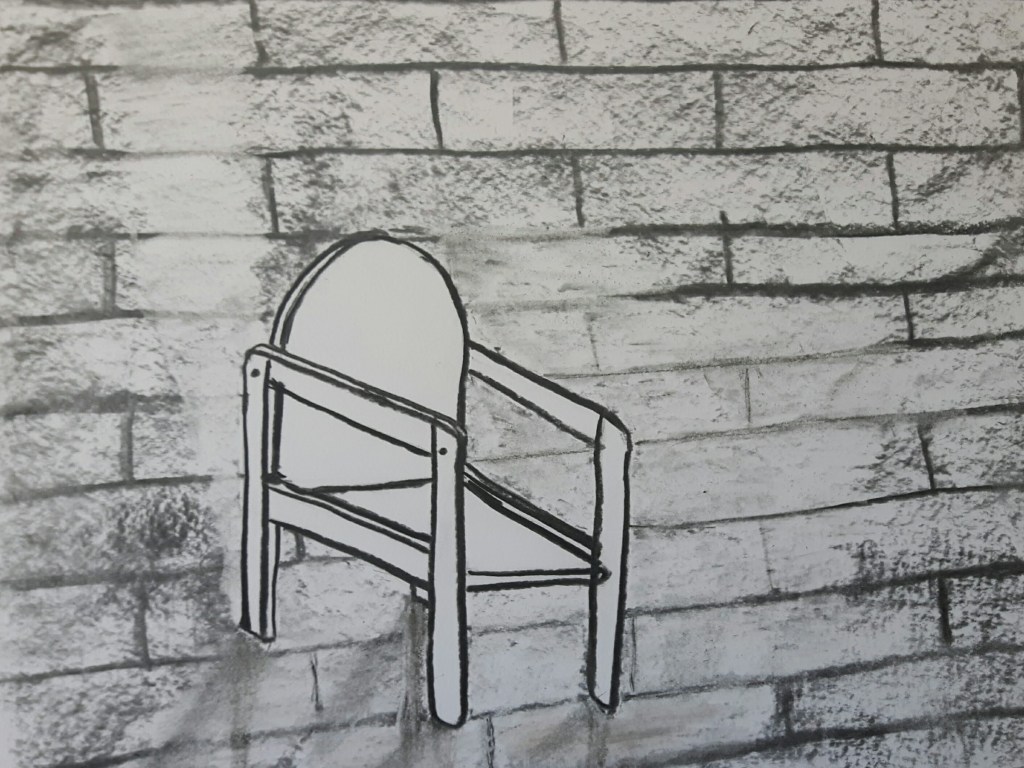
Negative space 2.
Positive and negative space – Research point
Positive and negative space like yin and yang. They can not exist without each other, their differences creating balance and none of them can be perfect on its own. The positive space is the focus of the image and a negative space is surrounding the object.
Gary Hume is an English artist who is known for painting everyday objects using high gloss industrial paint. My favourite is the “Blackbird” from him.
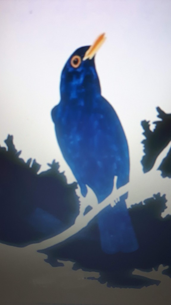
The bird is gently surrounded by the sky. The contrast of the chosen colours make the image so vibrant, you’re actually expecting the bird to fly away in any moment. Beautifully simple like a haiku.
Tang Yau Hoong is an artist and illustrator living in Kuala Lumpur, Malaysia. He is using negative space to create astonishing and powerful images beyond reality.
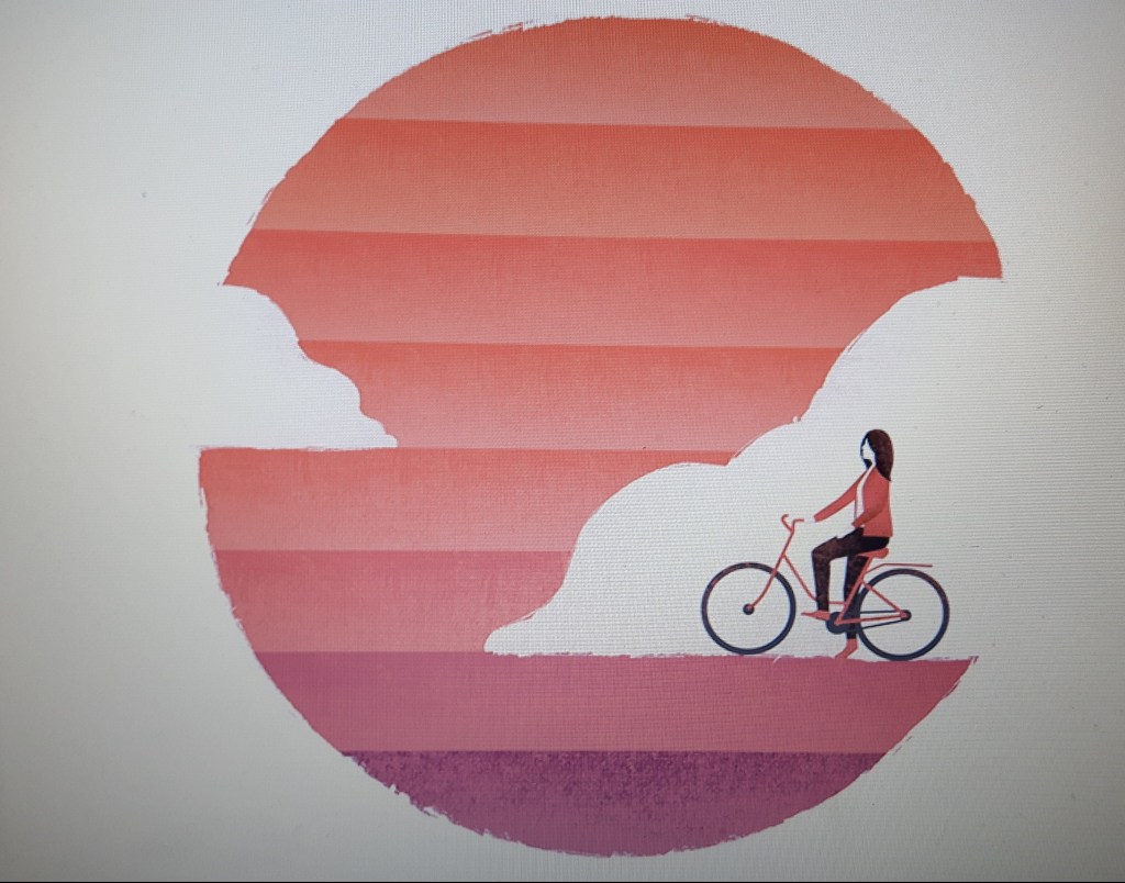
Riding On Sunshine 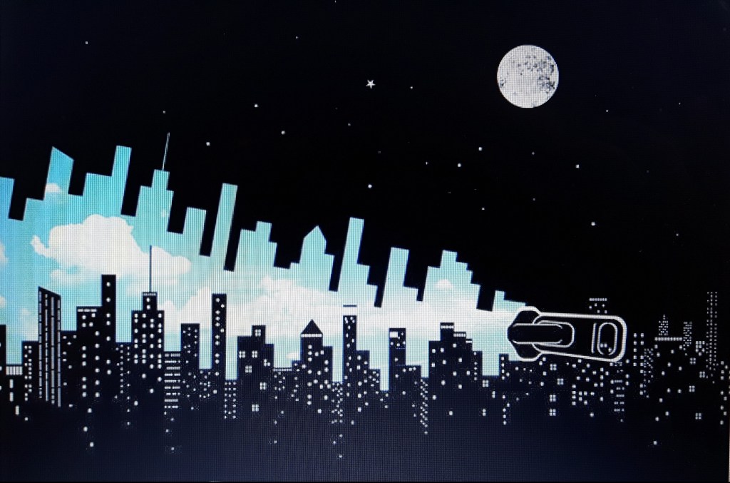
Hello World
Now that’s the time when it is not clear what the main focus of the image is. Very surreal and playful at the same time.
Let’s play a little bit! We probably all remember the most famous positive and negative space illusion from our childhood. Is it a vase? Are there two faces? Which one is the negative space? Mine is black, yours is white perhaps.
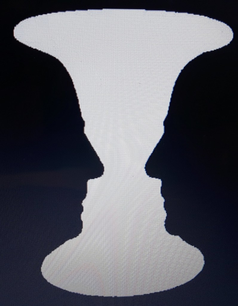
That image is to demonstrate that our perception is not the same. Many times the positive space is quite obvious but this unusual illustration teaches us the importance of the balance and rhythm.
