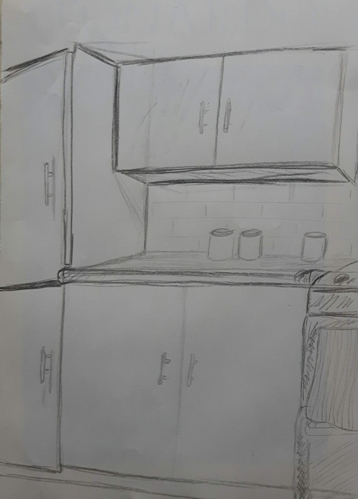
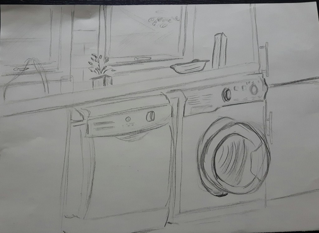
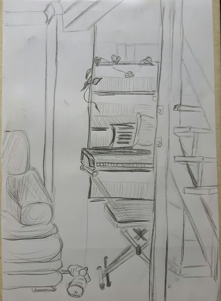
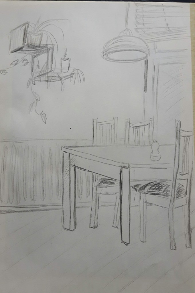
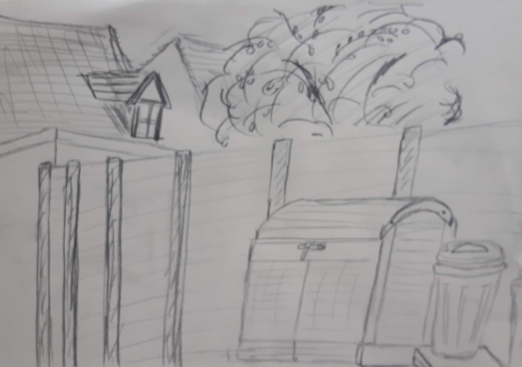
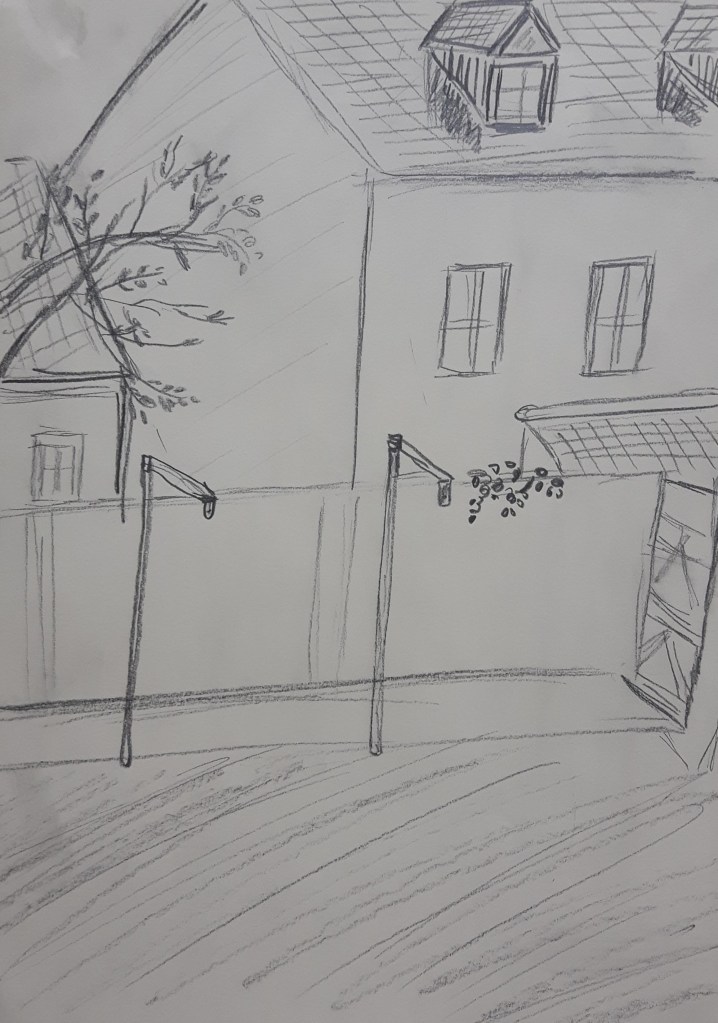
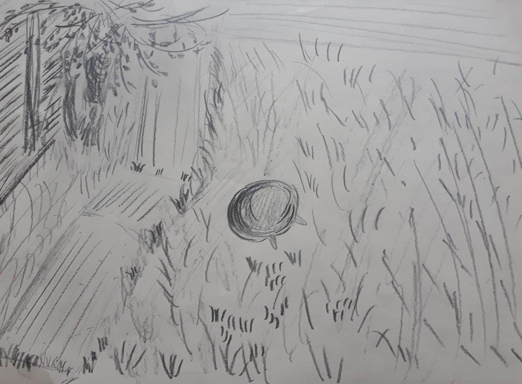
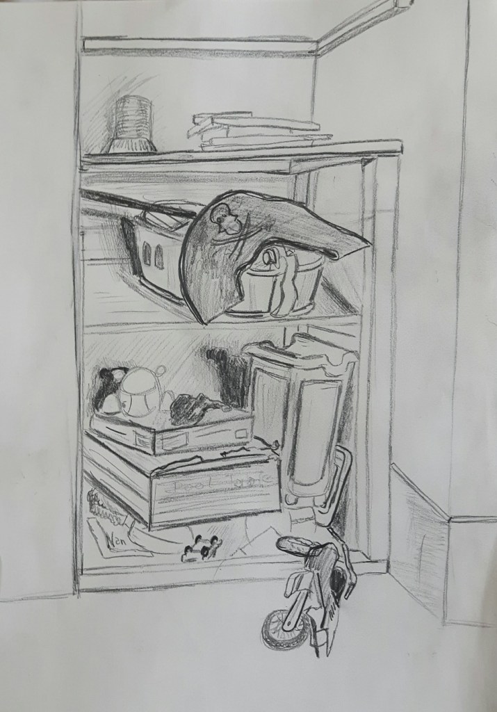
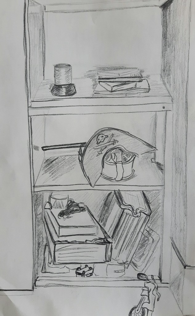
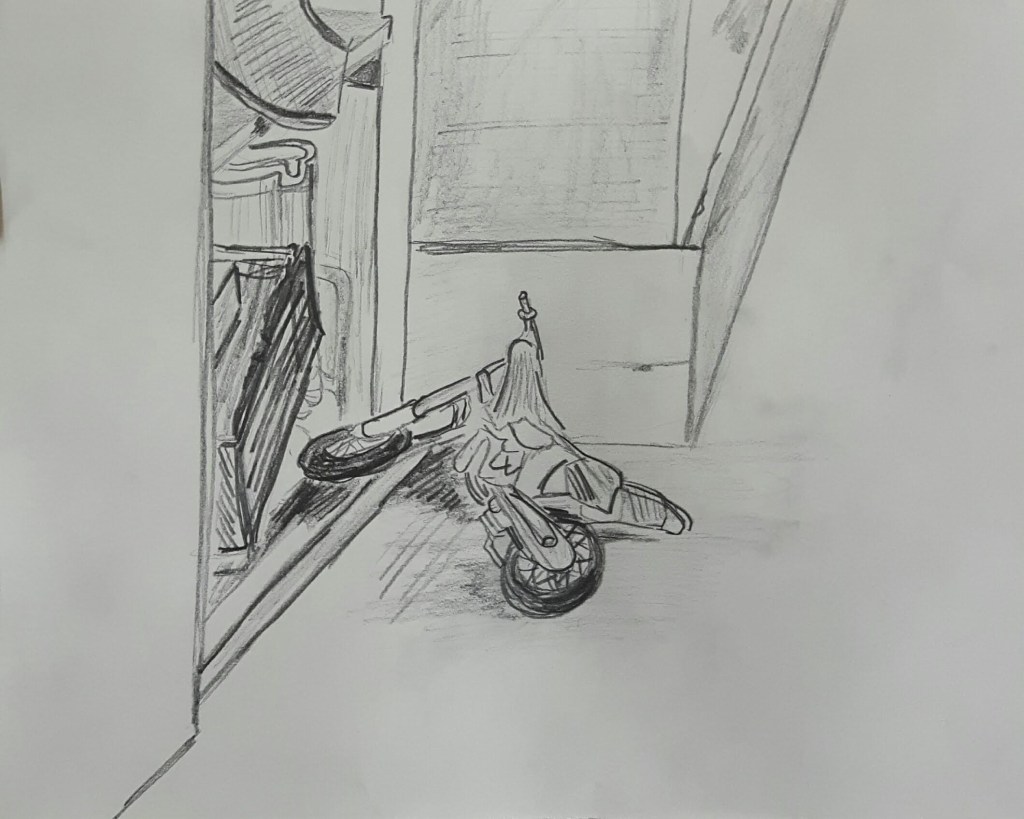
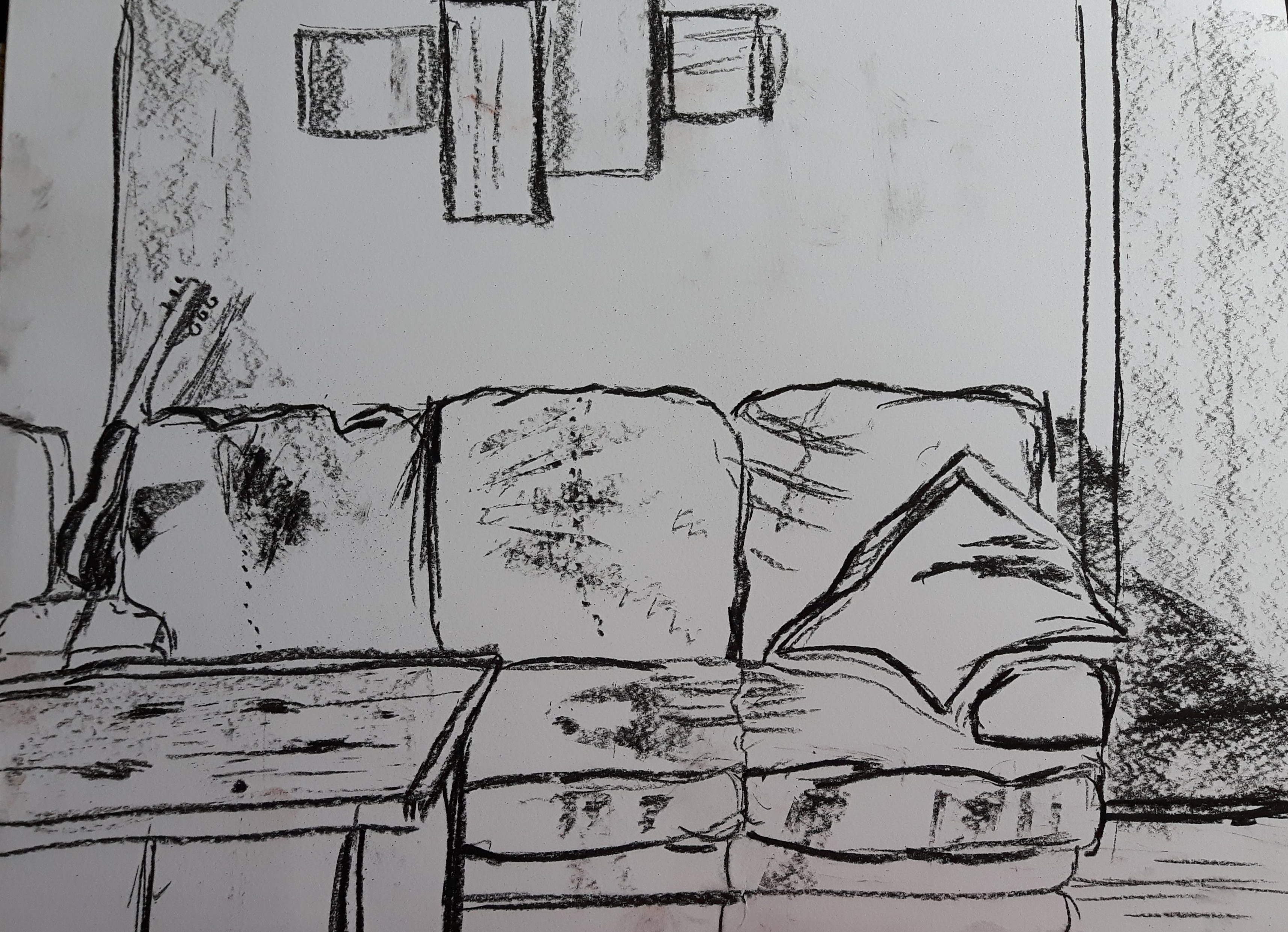
For me, the strongest ones are the living room drawings because I found more interesting angles so it became more detailed than for example in the garden which appeared rather scribbled. Those sketches are mostly out of perspective and no shades but I enjoyed the living room/kitchen the most. I would like to draw the stairs in the living room from a different viewpoint next time.
Exercise 2 Composition – an interior
For this exercise I chose my son’s bedroom. I kept shifting my viewpoint and eye level.
This exercise was fun and refreshing. I did not have to set up a group to draw, they were already in interesting composition.
Material Differences
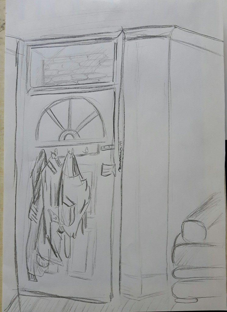
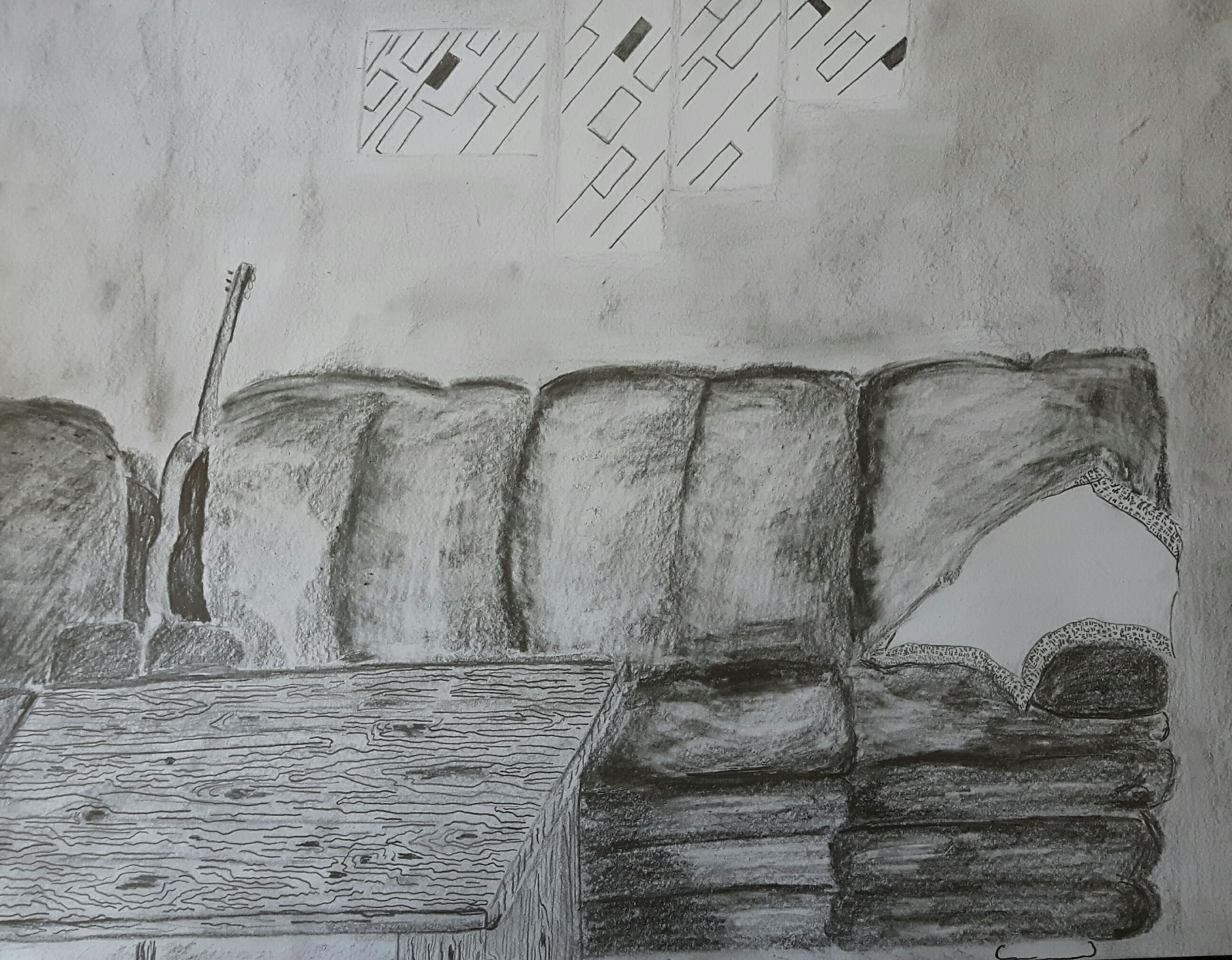
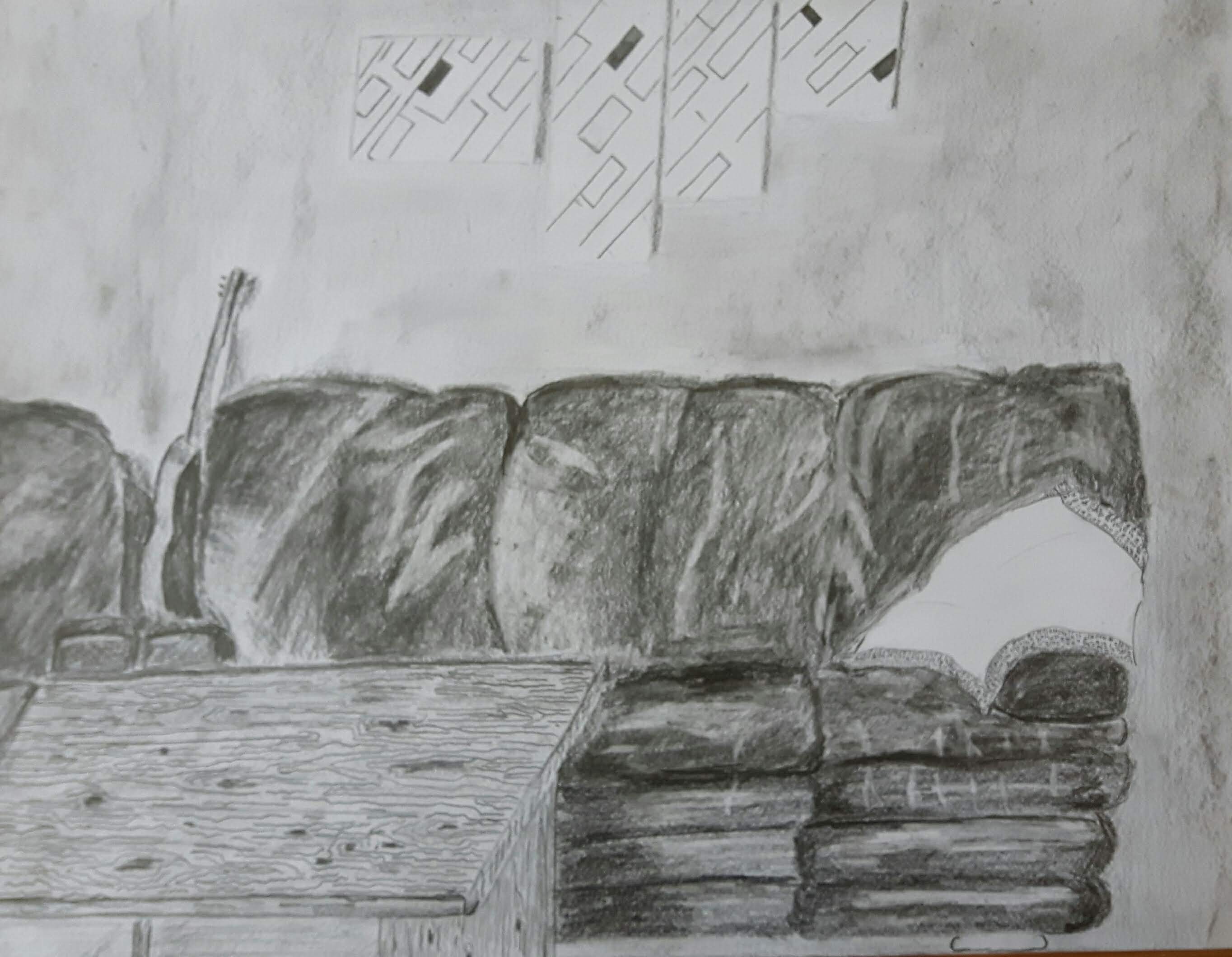
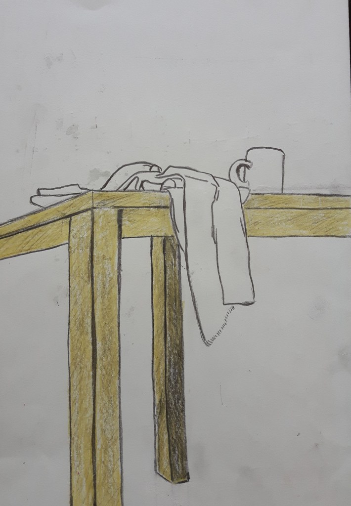
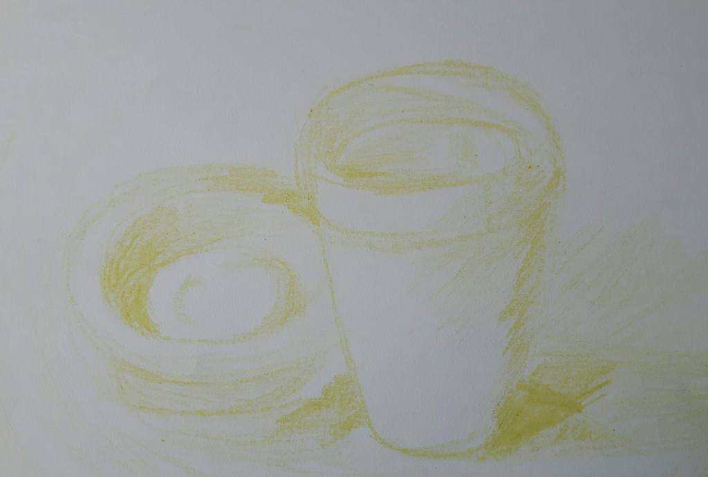
First I was gonna work more on the stairs but then I decided to draw a part of my living room. I made a quick sketch with charcoal but I found it too messy for this subject so I used pencils (HB-4B) and charcoal for the final piece.
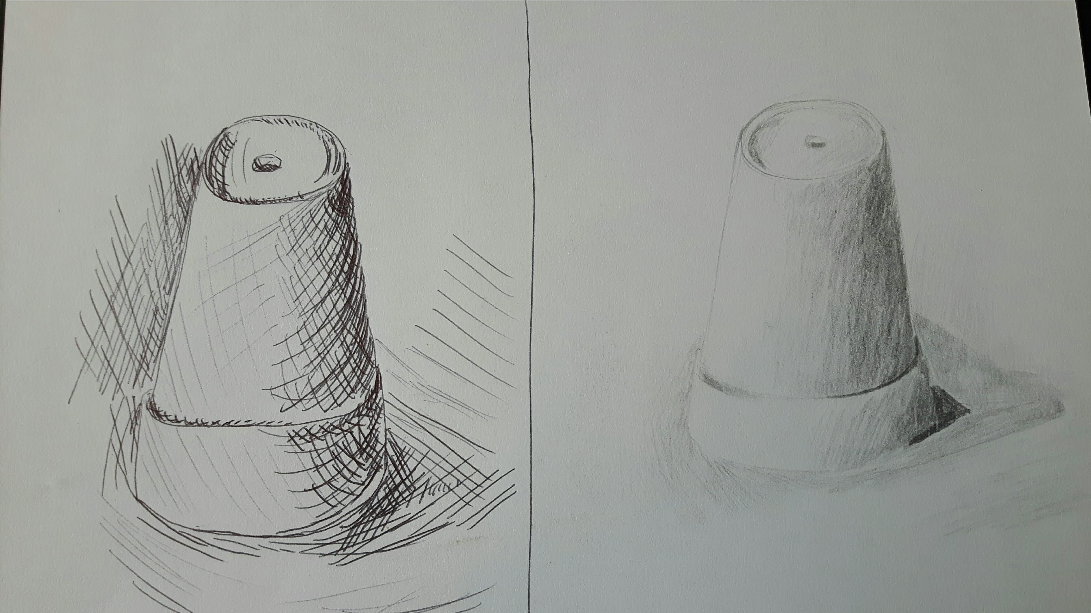
For this exercise I used fountain pen and biro for the second one. I made the one below with clear lines and no shadows. Somehow restricted to line only did not seem to be that difficult than restricted to tone in the next exercise. It gives me a kind of artificial impression but I like it. I had a (probably wrong) feeling that shadows would distract the balance of the clarity. I’m really curious though so I will redraw it again later with shadows.
Drawing with biro really helped with fine details but there is hardly any three-dimension feeling
Exercise 2 Still life in tone using colour
I tried a couple of compositions with different media.
I used hard pastel and charcoal pencil for this drawing
I really enjoyed to try hard pastel with the charcoal. I used spiral bound paper for the purpose of better blending.
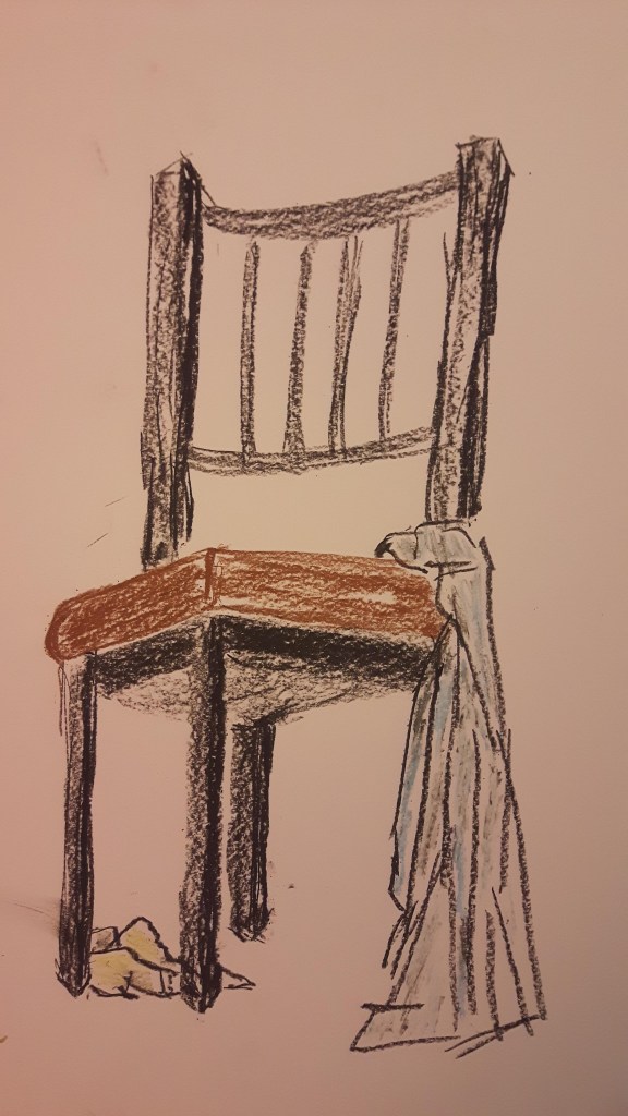
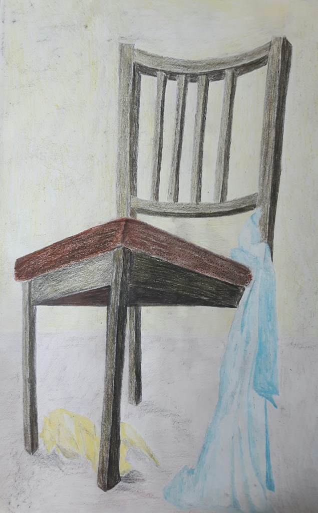
I set up another still life with less fine details. Chair and a blue and a yellow scarf from a viewpoint I tried on one of the previous exercises: sitting on the floor. I chose brown, blueish tones and yellow. I was still working with hard pastel. First sketched the light areas then moved on the dark ones. The proportion is far off but I worked with quick, dynamic moves as was advised and did not want to go back and overwork it.
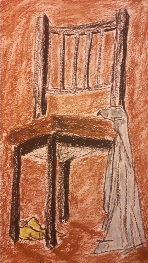
Then I added more colours, tones and background.
Because of the yellow scarf, adding a bit of yellow blend to the background help to bind the composition together.
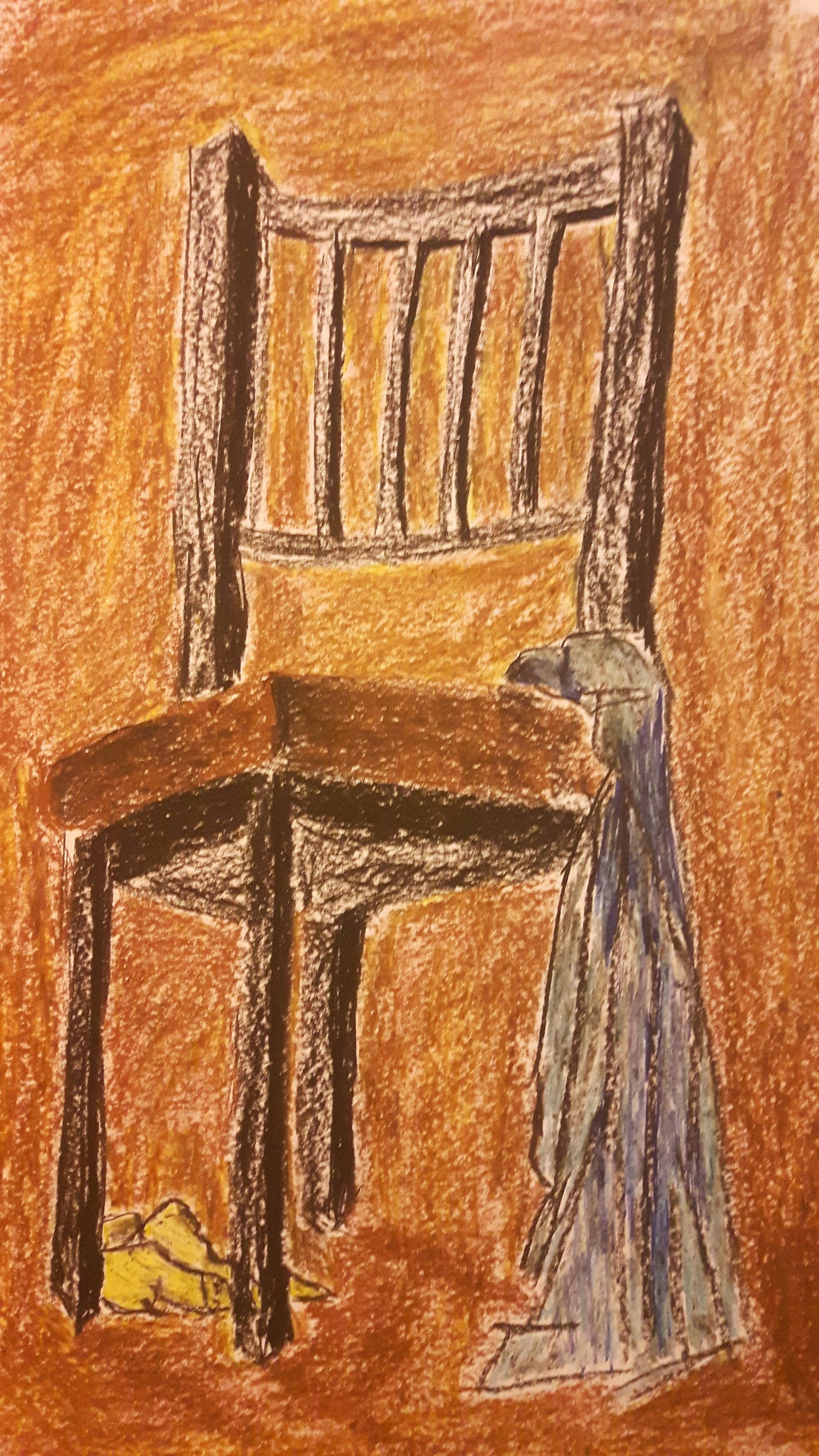
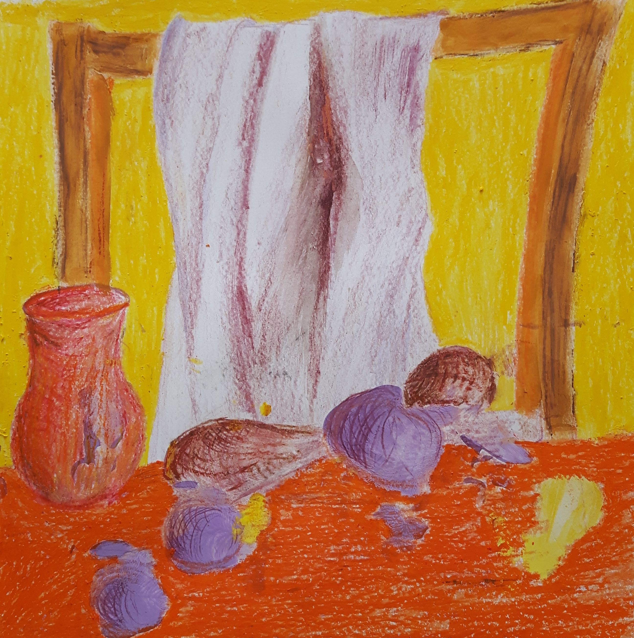
Then I decided to do it all over again with coloured pencils, graphite and oil pastels. The yellow blend moved on the wooden part of the chair.
Well, this one was not a quick sketch, a bit overworked. The colours of the scarves look lifeless comparing to the ones before. More work on tone definitely would have helped to get more sense of depth. I noticed that when I work on black and white drawings I tend to concentrate much more on tone that help to achieve better sense of depth.
Exercise 3 Experiment with mixed media
Use traditional art tools and ‘non-art’ media.
This time I piled as many different tools I could find and used them layering colours on colours. First attempt was with watercolour paint, wax crayons, oil pastels, coloured pencils and marker pens.
The result is a bit poster-like (sadly, child-like too, probably because me and vax crayons are not the best friends yet) due to bright blocks of colours (I wanna say it was on purpose but really it was just one thing led to another…) The watercolour paint was a big challenge for me to try but the effect of using oil pastel strokes over the paint was surprisingly good. Not being restricted to line, colour or media is a great exercise to step out of my comfort zone also gave the flexibility to use different techniques with the exactly suitable media enriching the original concept.
Exercise 4 Monochrome
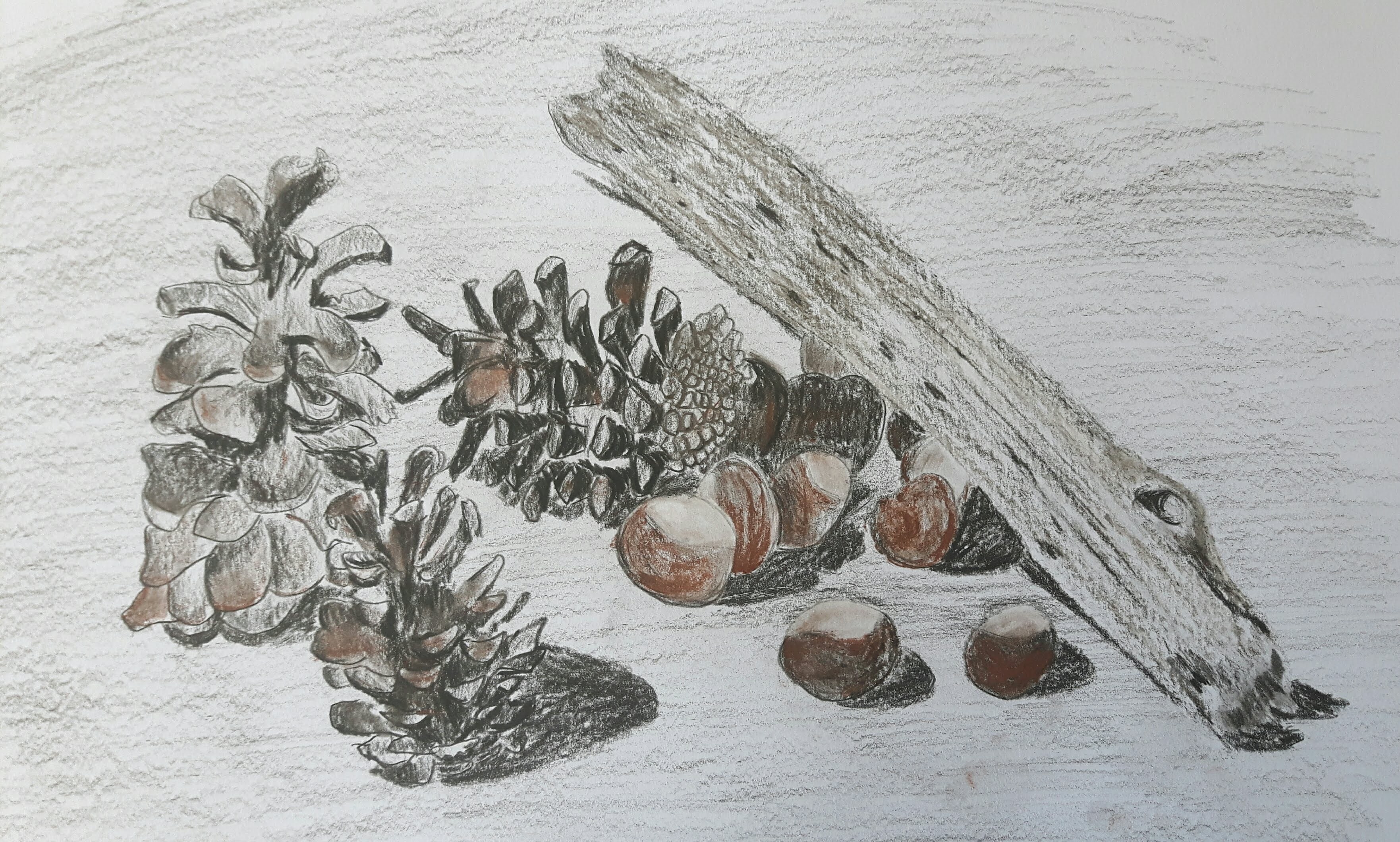
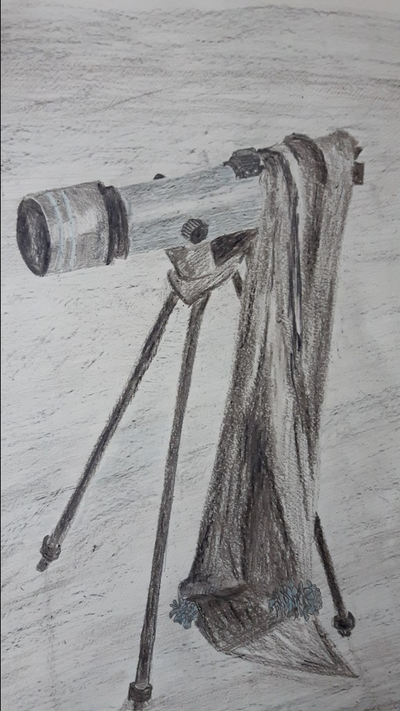
Creating an image in a single colour – combining natural and man-made objects and contrasting materials. I chose a telescope and a couple of cones. I could have chosen white (colour goes well with the silvery part of the telescope) flowers instead but the cones looked much better in the composition so I made them greyish blue.
I’m not happy with the balance of the natural and man-made objects, the cones are lost in the picture and I’m also missing stronger contrasts between the parts of the telescope. Probably the most successful part is the telescope tube and I like the perspective too.
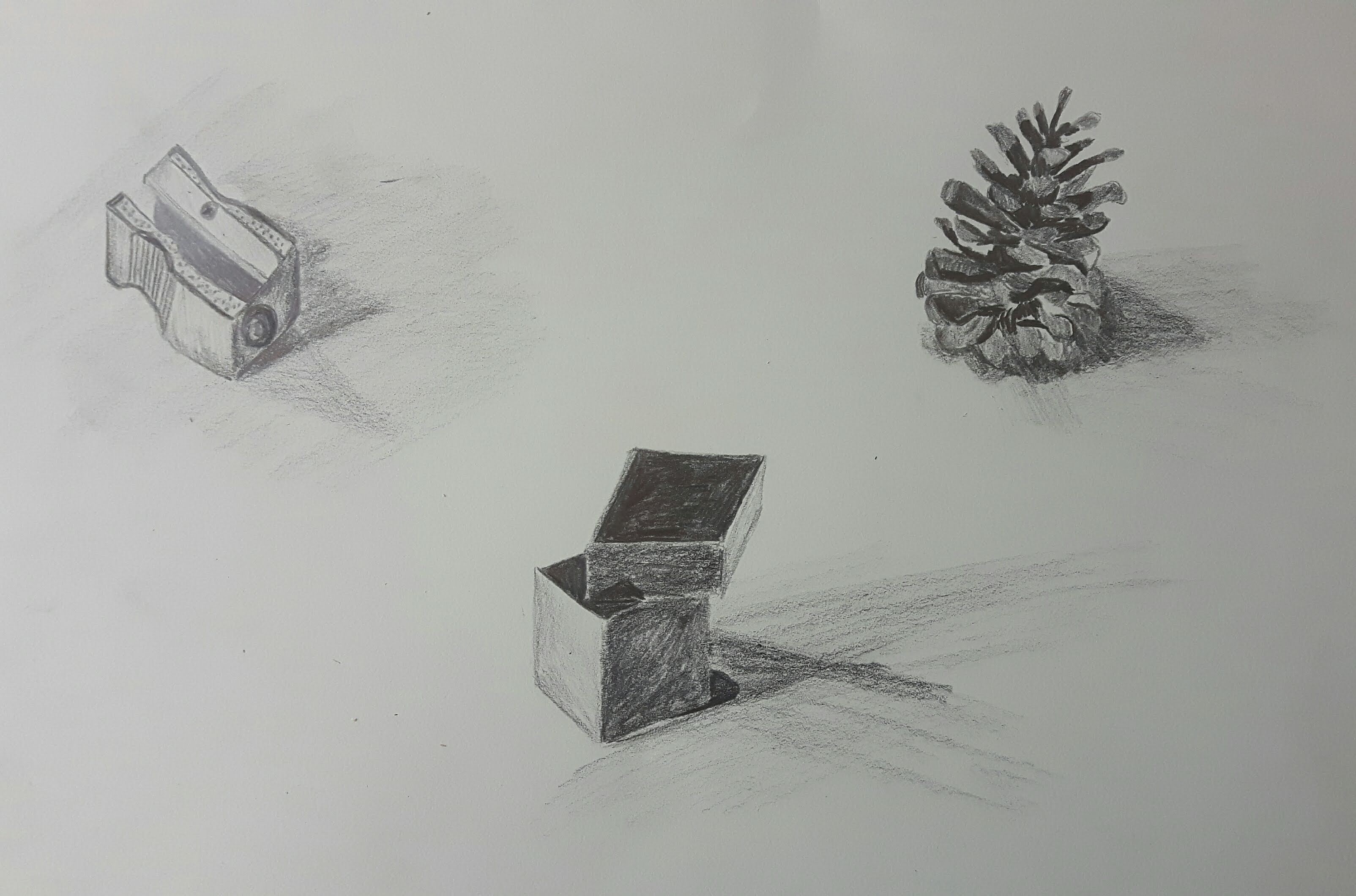
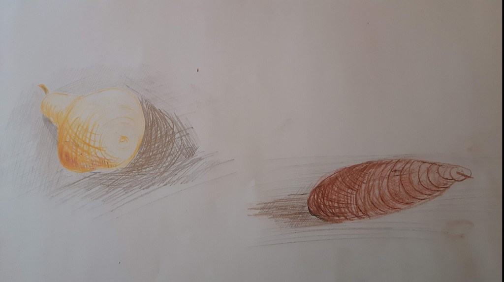
In this exercise I’ll practise building up dark, medium and light tones, using pencils and hatching and cross-hatching techniques. First, I practised drawing single objects using pencils.
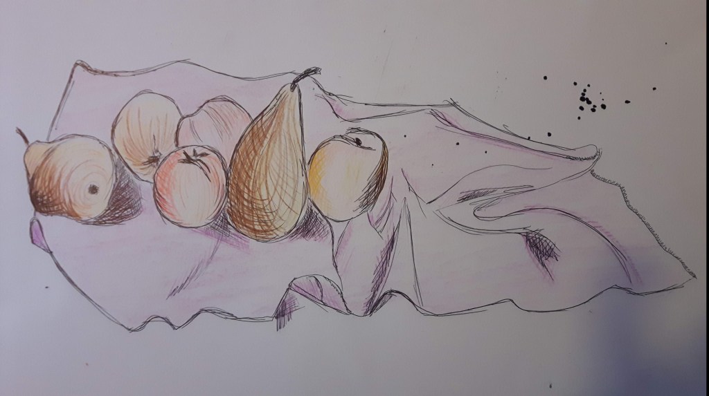
I used pears and apples and a silk scarf for the final piece. I used coloured pencils and fountain pen so I could do more hatching. I was pleased with the composition but overall but I got confused with adding more and more tones with cross-hatching without achieving my goal.
This part of the course focuses on close observation and interpretation, the use of colour and choice of media. When it comes to colours I always feel a bit uneasy. Actually, I’m terrified. So I decided to take small steps to get used to it…Some of the exercises were such a relief, with a few pleasant surprises and of course terrible mistakes, too.
First I started with quick (under 15 minutes) sketches focusing on composition and playing with colours a little bit. I used charcoal pencil, coloured pencils and oil pastels to start with.
This composition is very long, the first attempt was completely unsuccessful, I had to join two papers together. I tried to highlight some parts with the same tone to see the overall effect but my pencil was not vibrant enough.
Positive and negative space
It was a bit hard to digest that the positive and the negative space equally (or sometimes the latter even more…??) important. Most of the time I concentrate on positive space almost completely ignoring the negative space as if it is just a necessary evil. Completing the drawings below taught me a very good lesson to respect negative space more.
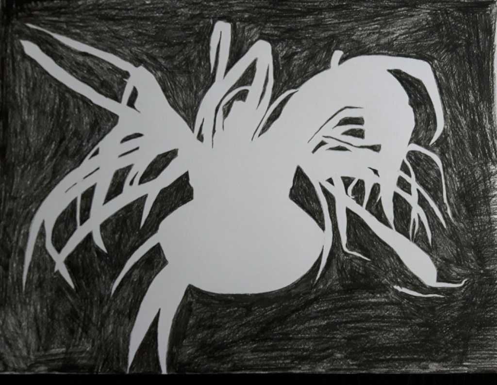
Negative space 1.
Negative space 2.
Positive and negative space – Research point
Positive and negative space like yin and yang. They can not exist without each other, their differences creating balance and none of them can be perfect on its own. The positive space is the focus of the image and a negative space is surrounding the object.
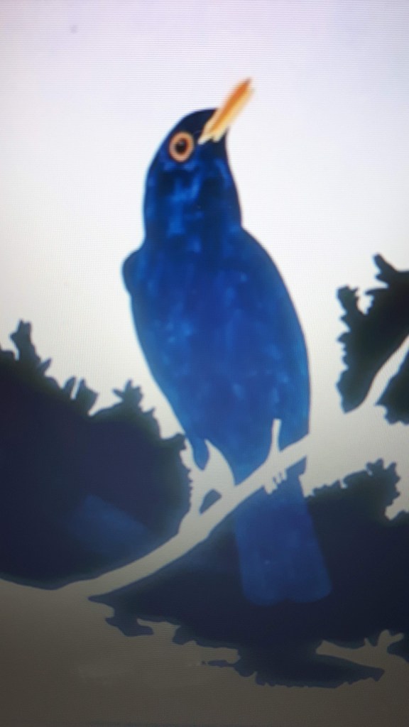
Gary Hume is an English artist who is known for painting everyday objects using high gloss industrial paint. My favourite is the “Blackbird” from him.
The bird is gently surrounded by the sky. The contrast of the chosen colours make the image so vibrant, you’re actually expecting the bird to fly away in any moment. Beautifully simple like a haiku.
Tang Yau Hoong is an artist and illustrator living in Kuala Lumpur, Malaysia. He is using negative space to create astonishing and powerful images beyond reality.
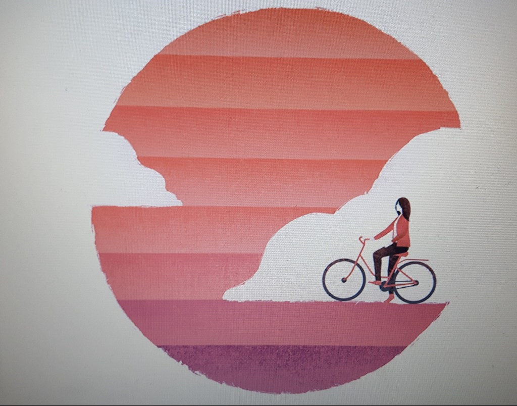
Riding On Sunshine
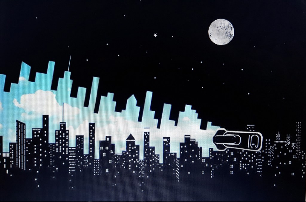
Hello World
Now that’s the time when it is not clear what the main focus of the image is. Very surreal and playful at the same time.
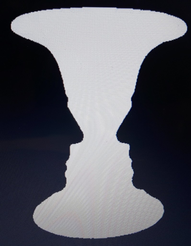
Let’s play a little bit! We probably all remember the most famous positive and negative space illusion from our childhood. Is it a vase? Are there two faces? Which one is the negative space? Mine is black, yours is white perhaps.
That image is to demonstrate that our perception is not the same. Many times the positive space is quite obvious but this unusual illustration teaches us the importance of the balance and rhythm.
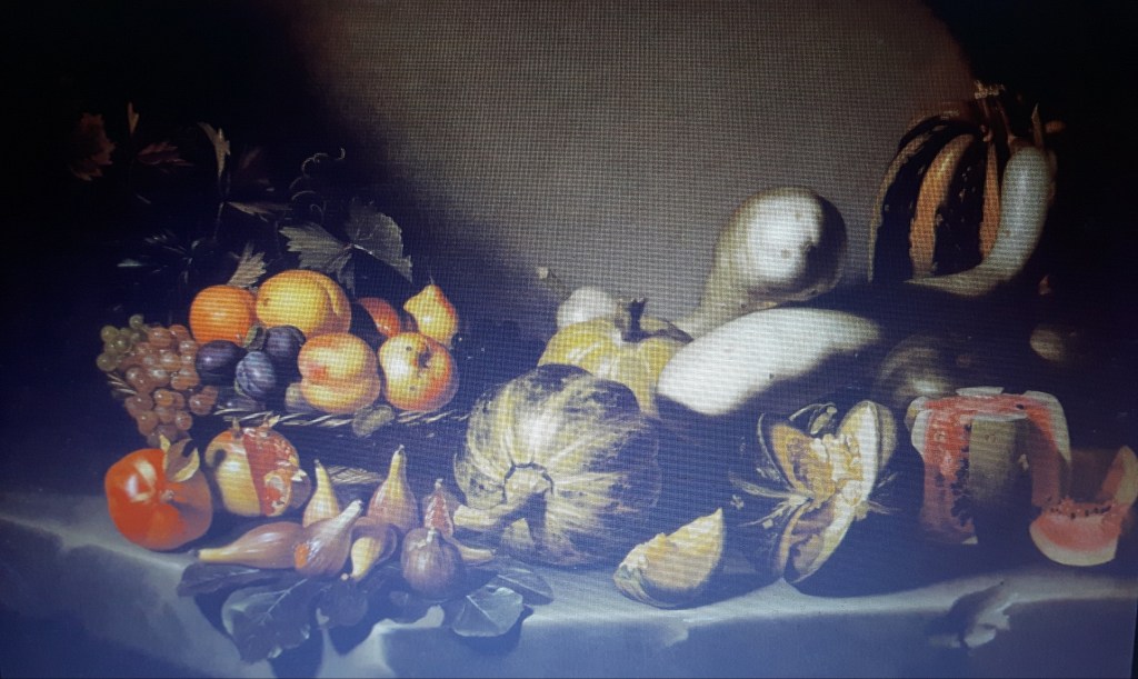
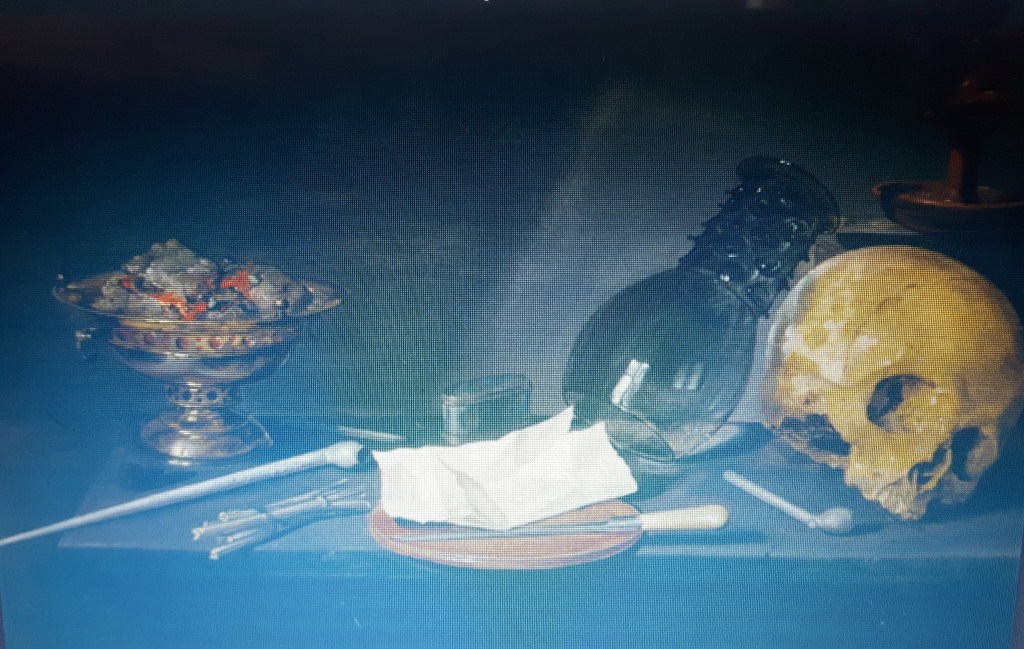
Still life genre remarkably emerged from the 16th Century with roots date back to the Ancient Roman art (e.g. “Still life with Peaches and Water Jar” from Italy, Herculaneum). There were a variety of vegetables, fruits, bread or even dead animals were presented and the paintings usually hung in houses of rich Romans as a sign of a wealthy lifestyle. Michelangelo Merisi da Caravaggio (1571-1610) is noted for a number of the first incredibly realistic masterpieces.
It is like Fortuna has just emptied her cornucopia leaving us in a complete awe. Traditionally Still life paintings always carried an allegorical message, religious symbols or sometimes objects linked with mortality for example skulls, hourglass, withered flowers.
W.C. Heda: Vanitas
Willem Claeszoon Heda (1593/94-1680/82) was a Dutch painter who focused on still life later in his career. He was a master of rendering reflections on glass and metal textures and became one of the most famous still life painter of his time.
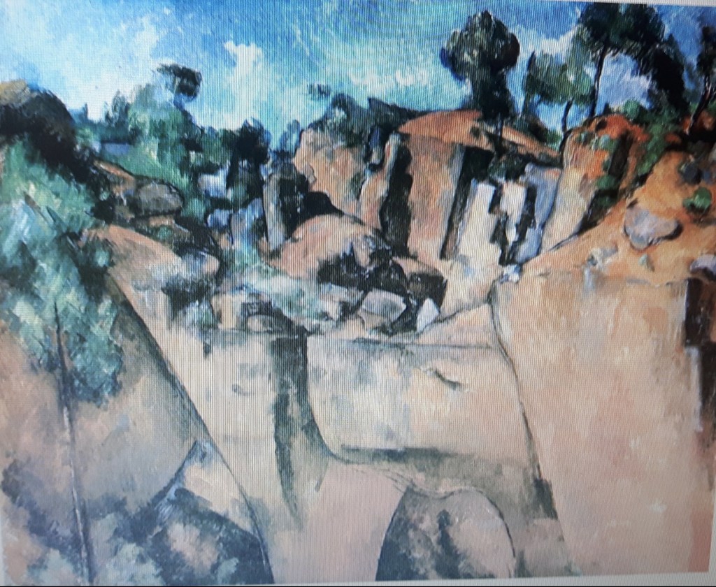
Later on Still Life moved from symbolic meanings towards more experimental ways. Paul Cezanne (1839-1906) was a Post-Impressionist painter who was a real rulebreaker here – not only changing the single-point perspective but reducing forms to their geometric essentials that in fact led to Cubism, an avantgarde art movement in the early 20th century. He focused on form and light and compared to the previous artists, his approach was less realistic than theirs.
Paul Cezanne: Bibemus Quarry (1895)
There are many brilliant artists found Cubism the best to express themselves but probably the two most remarkable were Georges Braque and Pablo Picasso. In the 20th Century Still life genre became more adventurous with vivid colours, the abstract arrangement, also an interesting approach of representing objects from different viewpoints simultaneously.
In contemporary art there are no boundaries anymore. As they say, anything and everything at the same time. While one is taking us back straight to the 17th Century with his precise virtuosity (“The love of strawberries” – Tim Gustard) somebody else is giving you the overwhelming desire to get lost in those mesmerizing colours of the alley…(“Melody of the night” – Leonid Afremov).
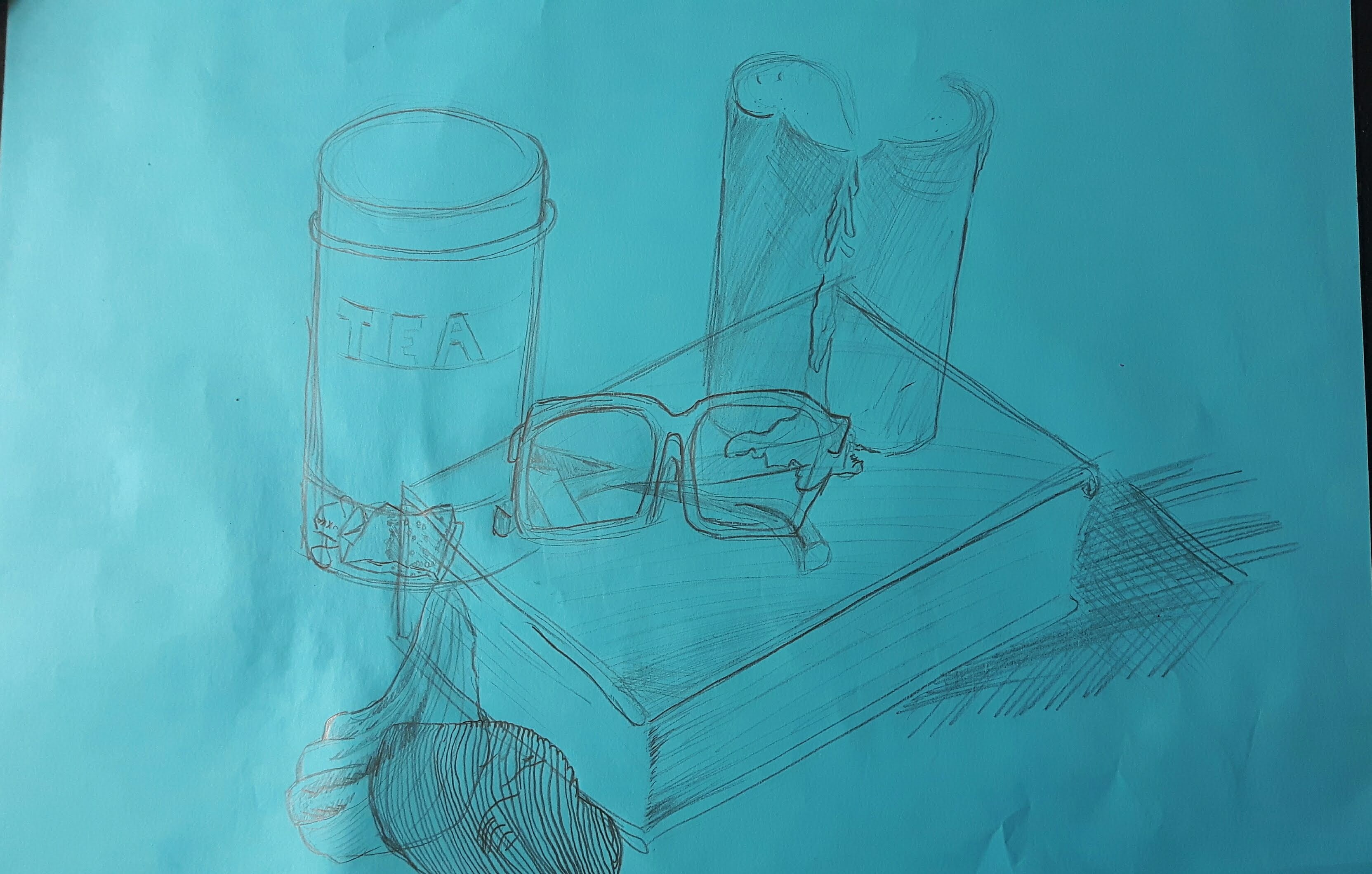
I had to choose at least six objects using one colour.
I chose a tea container, pair of glasses, used candle, book and seashells. I thought pencil would be good for this exercise but (probably because of the blue coloured paper) for my disappointment the drawing became quite invisible and lifeless.
REFLECTION
Liked the idea of the objects being transparent but later I struggled to visualize the teabag in the container although I feel that was the most enjoyable part of this and learned from it. I wish to do more detailed pictures than this one because the forms look weightless and two-dimensional.
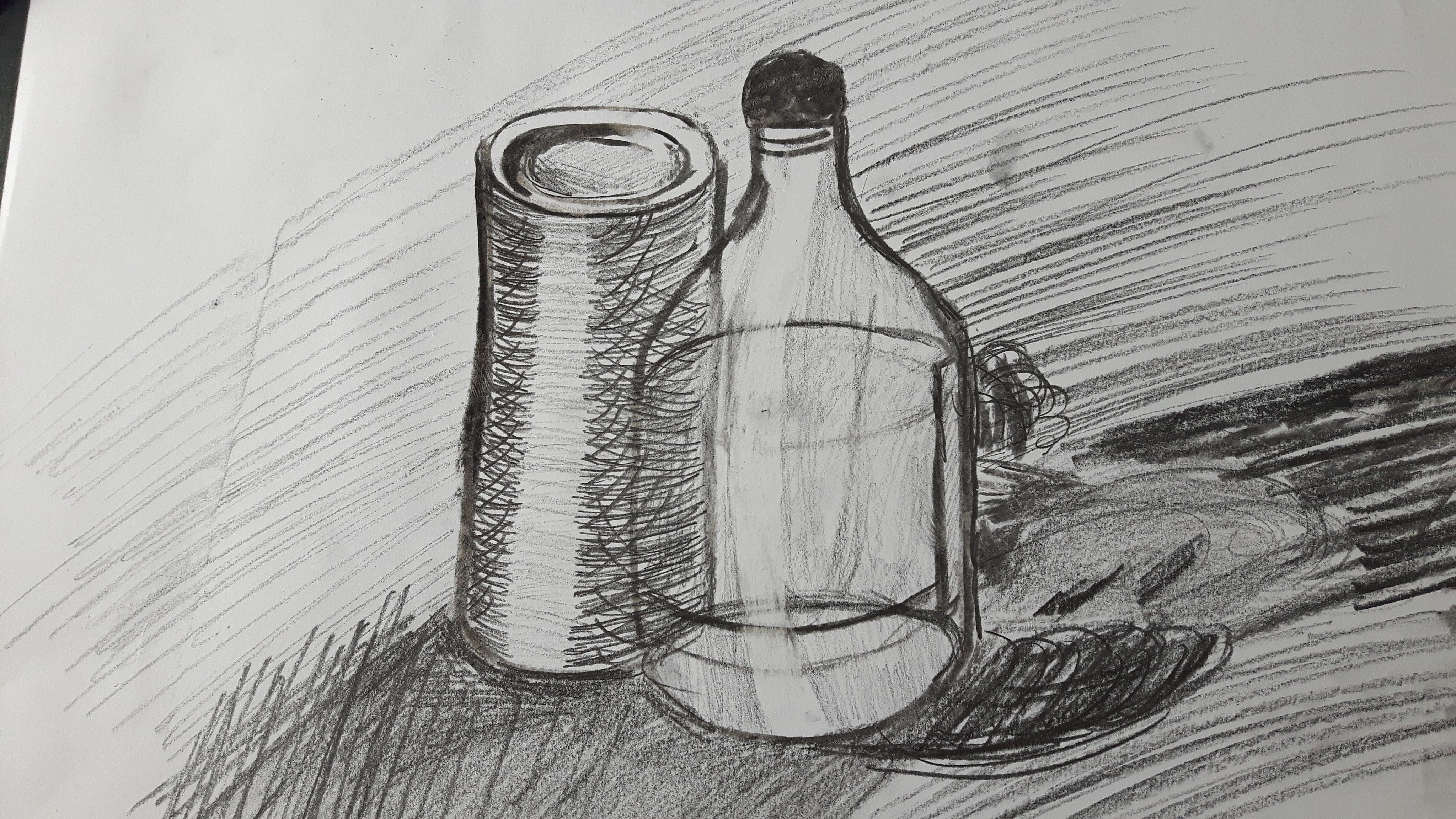
Exercise 2 Observing shadow using blocks of tone
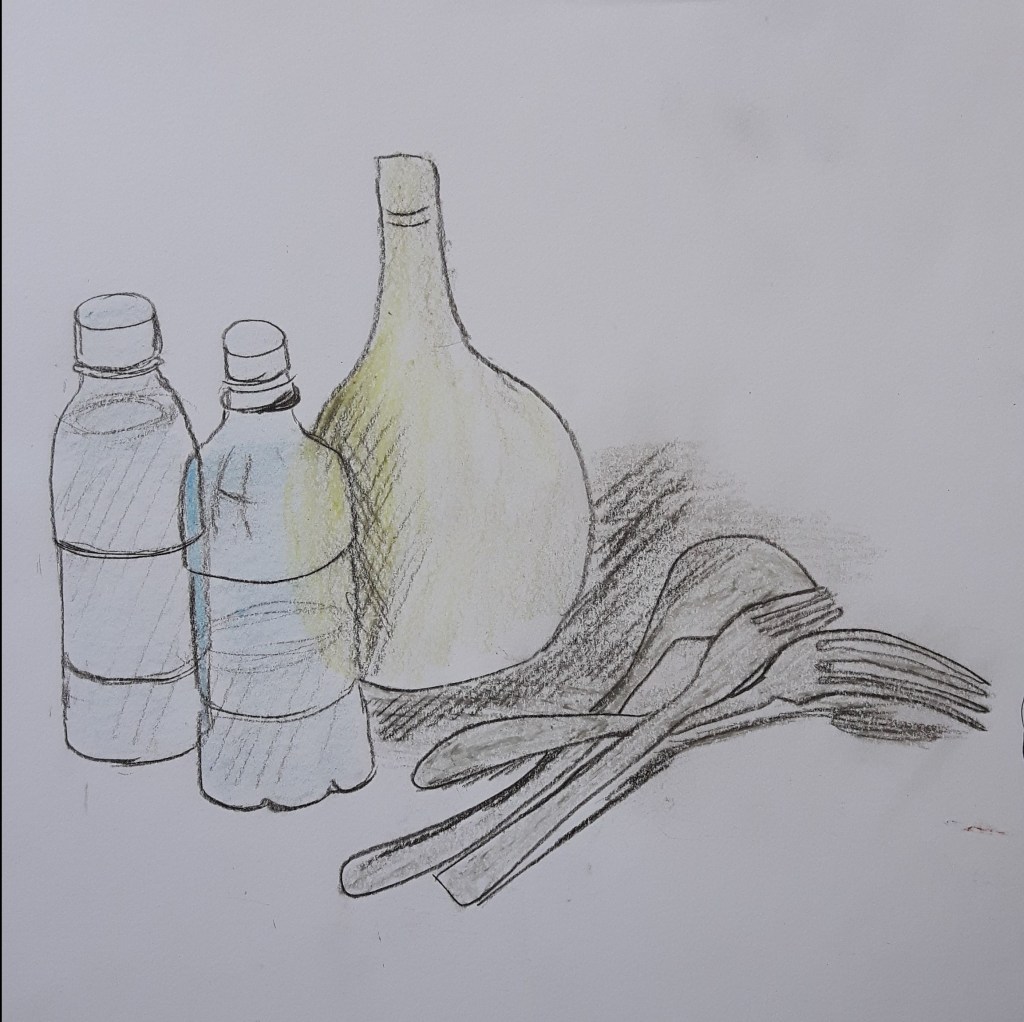
For this exercise I had to place two pale simple-shaped objects together and position a lamp so that they are lit from just one side. I chose a vase and a vinegar bottle and used natural light as it was a bright sunny day. I used pencils (variation of F,HB and 2-4B), charcoal and conte stick. The wind moved the clouds constantly but it just made that experiment more interesting, though I can see the shadows are everywhere which is a bit confusing.
Exercise 3 Creating shadow using lines and marks
Choose a couple of objects and make a very quick and loose line drawing using hatching or spotting techniques to create tonal shadows.
The objects I have used were a flower pot and a small plate. (pen, pencil and crayons) I did not care about proportion and tried to focus on the shadows instead. I could see the forms coming alive with the crayon only, the pen gave me a cartoon-y feeling as usual.
Shadows and reflected light
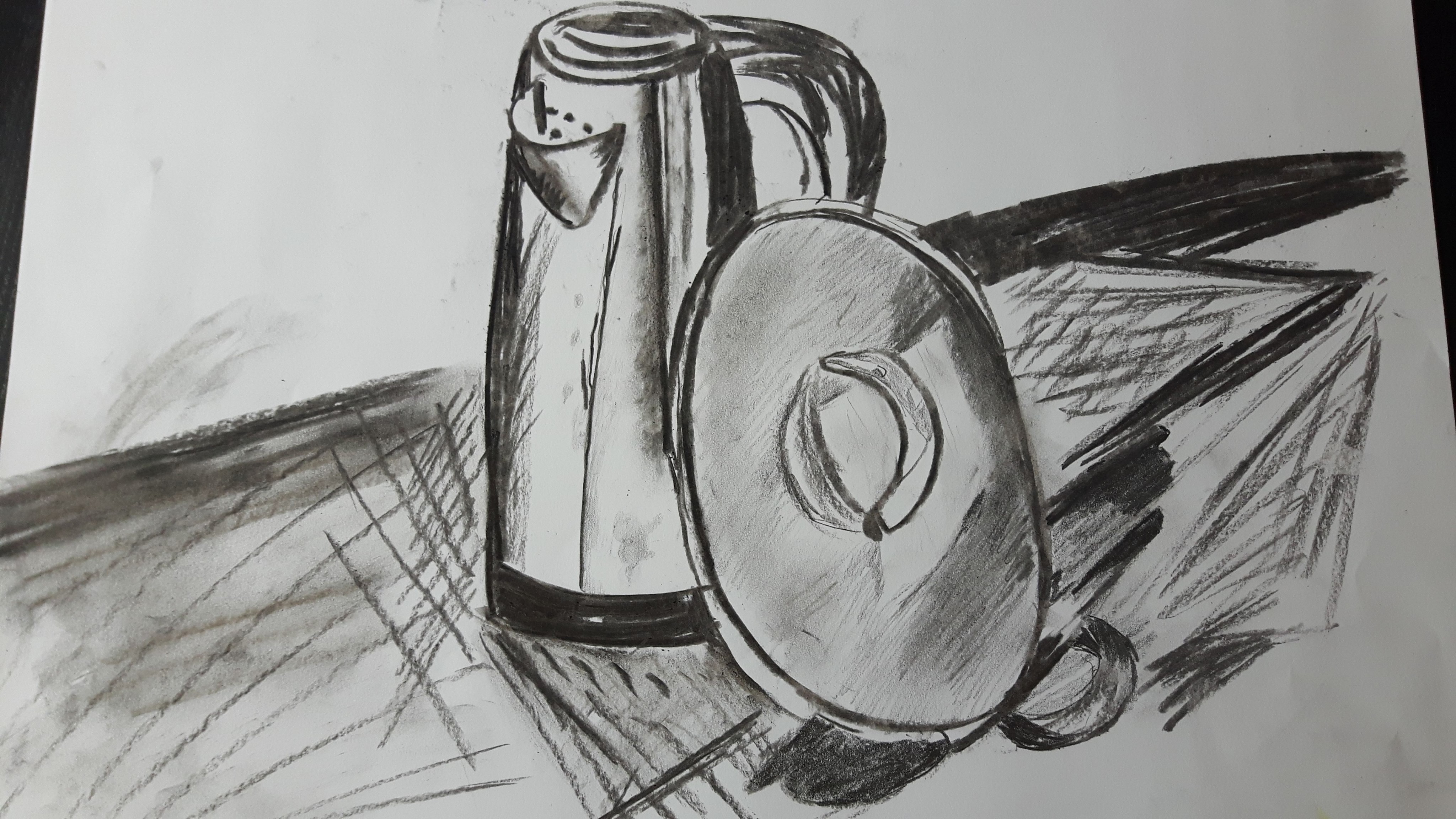
For this composition, I have used two objects with reflective surfaces. I used charcoal.
Motto: “Light! More light!” (Goethe)
I chose a metal kettle and a shiny lid. Natural light fell from the left. I used the edge of the charcoal to describe the shades and the contour itself. At the end smudged some part with my fingers – though I promised myself not to muddy this drawing but the charcoal decided otherwise. The proportions were okay but I clearly need more practice to catch the light.
Exercise 1. Experimenting with expressive lines and marks
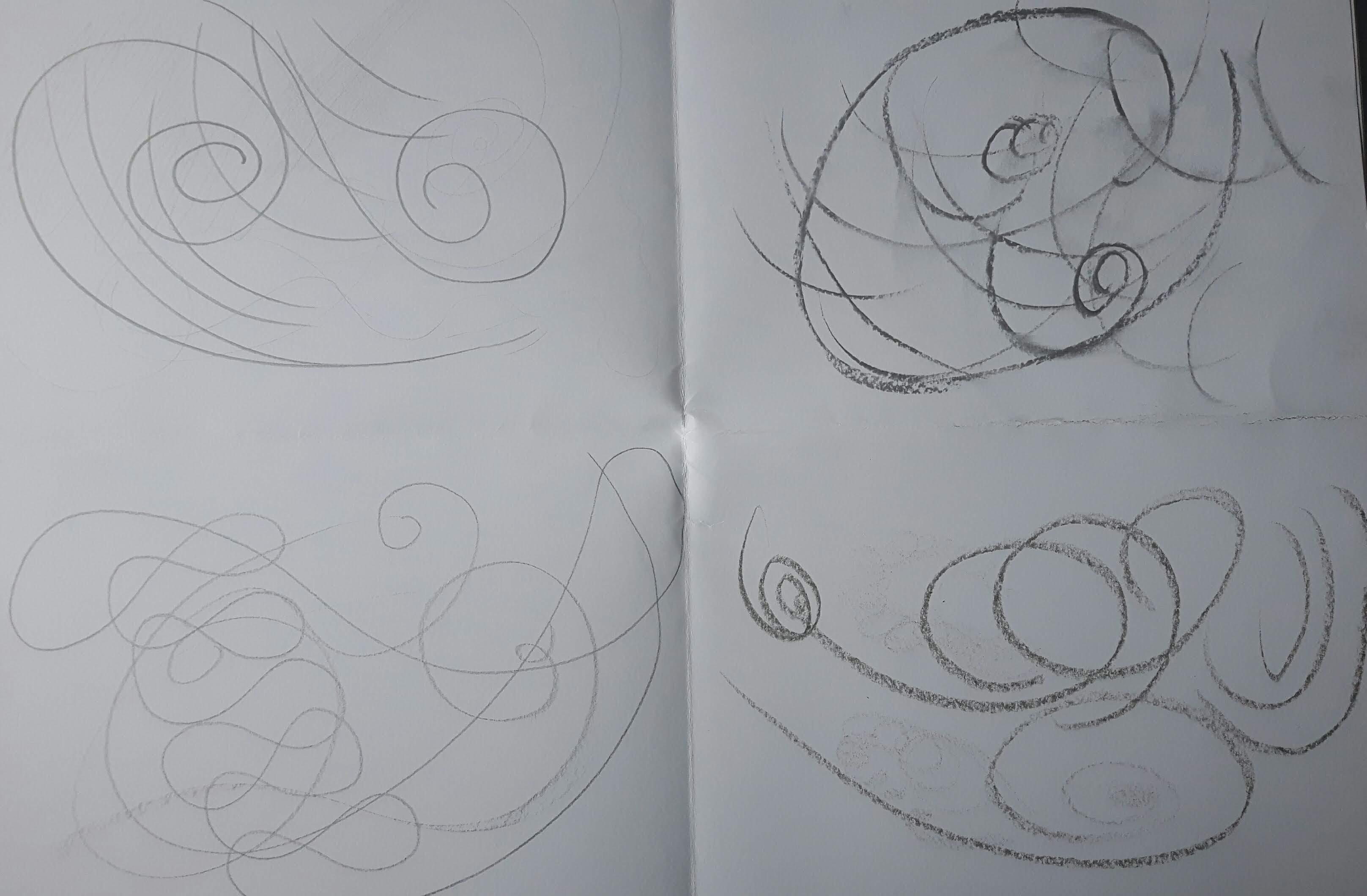
In this exercise I try to express a feeling using single words as a starting point. I chose pencil (HB-6B), black chalk, oil pastel crayon and black conte stick. (Top left -pencil, top right – chalk, bottom left – conte stick, bottom right – crayon)
CALM
I tried not to give so much thought about it just do it very spontaneously with a flowing slow movement. I quickly realized that the best marks to express my feelings are spirals, fine lines, waves and delicate shadows. The easiest tool to use for that was the conte stick.
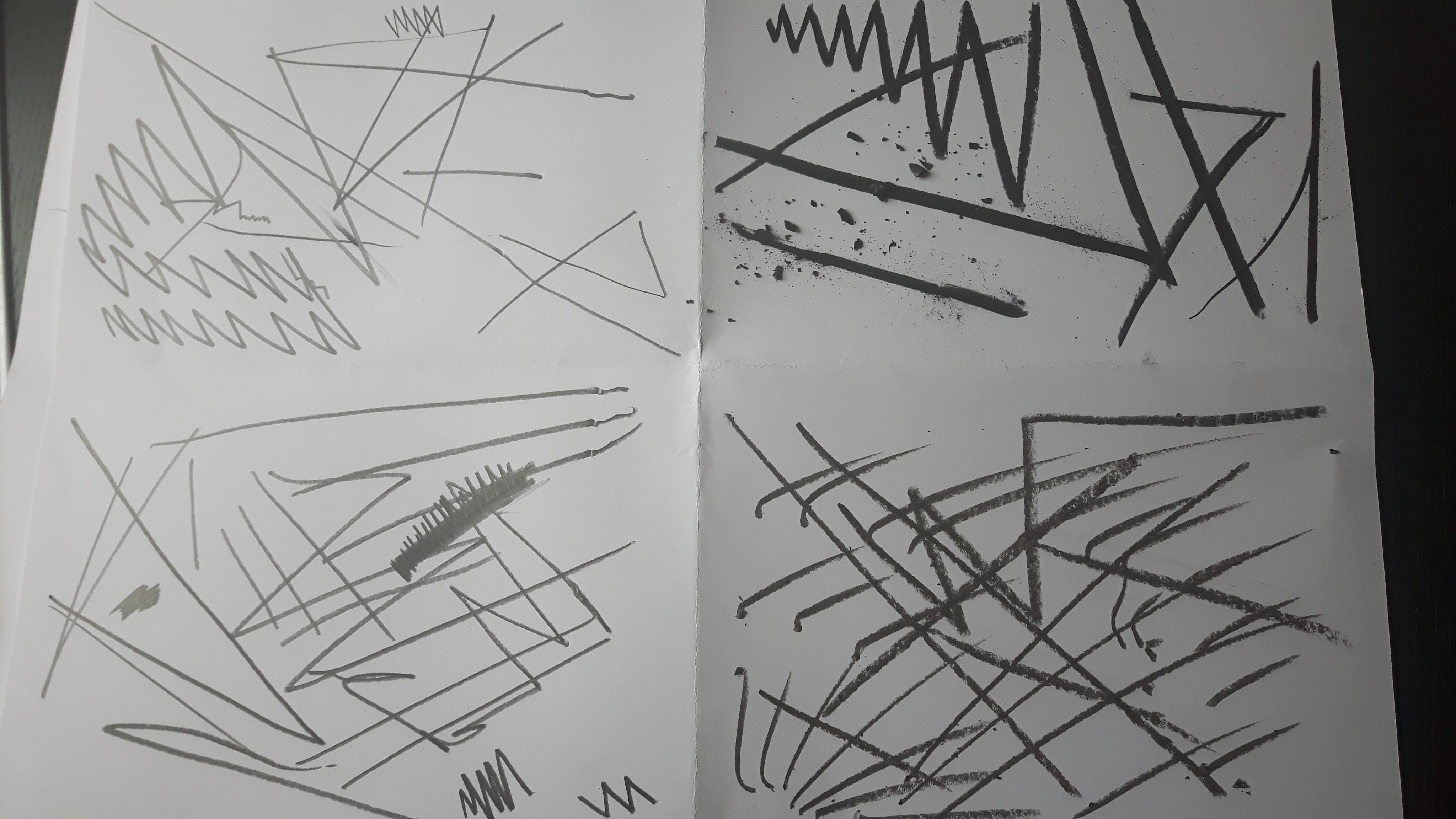
ANGER
What a ride! No shapes, no shadows, no bent/wavy lines (not intentionally at least) only sharp, tooth-like edges and cruel wires. Surprisingly the chalk did very well. I thought -being so soft- that would be an issue to express such a feeling but when I accidently broke it while I was drawing I got relieved and left it as it was. Those little victim-like black crumbles tell me the story I want to hear from this experiment.
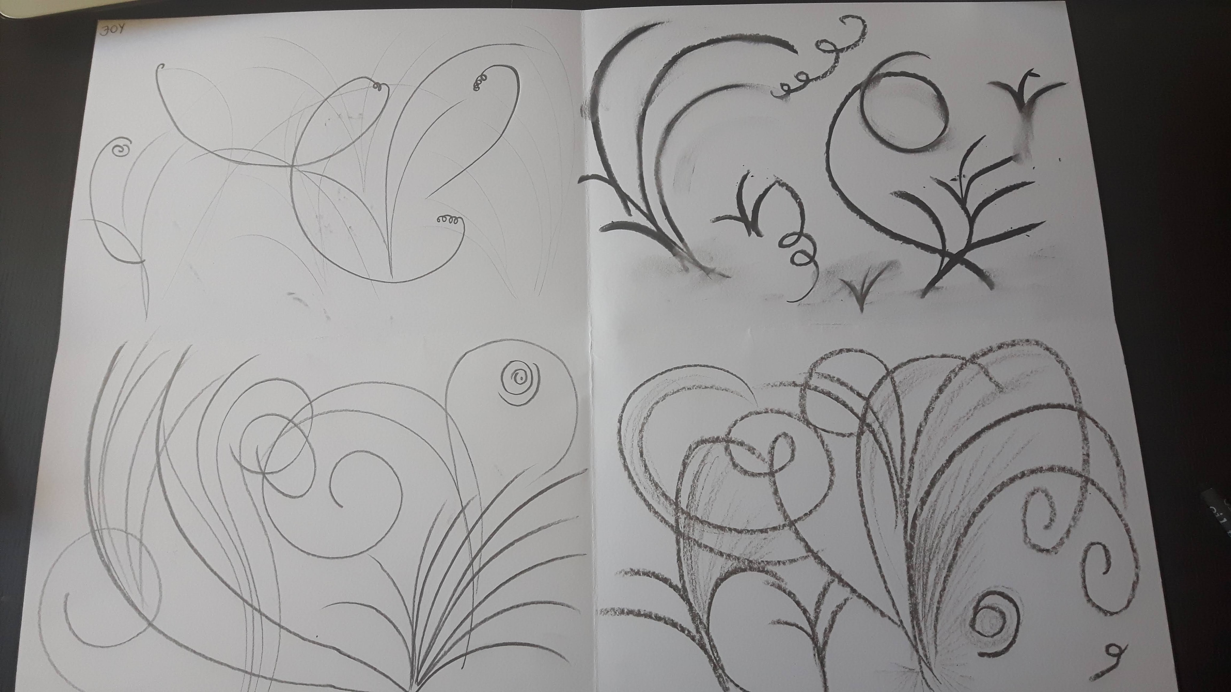
Fireworks, fountains, volcanos, laughs and drumbeats…drawing “joy” without colours tied my hands a bit but the swirls and upward arches still quite well represented what I felt.
CONFUSION
Here’s my choice. I hesitated between fear/surprise or confusion to draw but because the latter was the most different from the previous drawings I decided to have a go with “confusion”. I (involuntarily and immediately) sunk into some cubist chaos which is strange because for me the most attractive feature of cubism is the harmony of the elements. Still, it happened.
Form and Gesture – Exercise 1 Warm-up – temporary drawings
Before I started this exercise I had ambivalent feelings about it. I liked the idea of “temporary” it felt so free and playful, not to mention it took the pressure off (of the desire of making impression). But on the other hand, freedom is pretty much just jumping into abyss so if you remember “Beyond Good and Evil” then you know “…if you gaze long into an abyss, the abyss will also gaze into you….” (F. Nietzsche)
So here we go…
Originally this was not a part of this exercise but I found it interesting so did not want to leave out